What is an animated menu in Flutter?
An animated menu in Flutter is a user interface element that allows users to access a list of options or actions by sliding or fading in from a designated area of the screen, usually a button or an icon. The animation of the menu opening and closing can be created using various Flutter widgets such as AnimatedContainer, Positioned, GestureDetector, etc.
The animation can be customized to suit the desired look and feel of the app. The menu can contain a list of items, such as buttons or text, that the user can interact with. These items can perform different actions when tapped such as navigating to a new screen or displaying a dialog box. An animated menu is a useful way to provide easy access to a set of options or actions while keeping the main screen free of clutter.
Where the animated menu can be used in Flutter
Animated menus in Flutter can be used in various places in a Flutter app to provide easy access to options or actions. Some common places where an animated menu can be used include:
- Navigation: As a navigation drawer that slides in from the side of the screen to provide access to different sections of the app.
- Toolbars: As a toolbar at the bottom of the screen that provides access to frequently used actions.
- Bottom Sheets: As a bottom sheet that slides up from the bottom of the screen to provide access to additional options or actions.
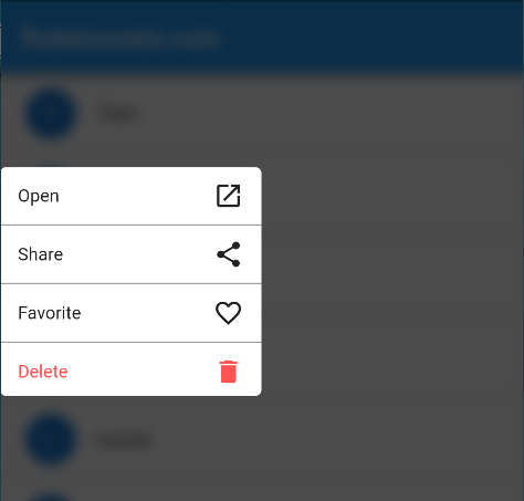
- Pop-up menus: As a pop-up menu that appears when a button or icon is tapped, providing access to a set of options or actions related to that button or icon.
- Overflow menus: As an overflow menu that appears when there are more options or actions than can be displayed on the screen.
These are some common examples, but an animated menu can be used in many other places in a Flutter app as well, it depends on the design and the flow of the app. The main idea is to provide an easy and intuitive way for users to access options or actions.
Why use the bottom menu in Flutter
There are several reasons why you might use a bottom menu in a Flutter app:
- Accessibility: A bottom menu is placed at the bottom of the screen, which is within easy reach of the user’s thumb while holding a phone. This makes it more accessible than a top menu, which might require the user to stretch their thumb to reach it.
- Screen real estate: A bottom menu takes up less screen space than a top menu, which means it doesn’t interfere with the main content of the app. This allows users to focus on the content without being distracted by the menu.
- Navigation: A bottom menu can be used as a way for users to quickly navigate between different sections of the app. This improves the overall navigation experience and makes it more efficient for users to find what they’re looking for.
- Consistency: Bottom menus are commonly used in mobile apps, and users are familiar with this design pattern. By using a bottom menu in your app, you can take advantage of this familiarity and improve the overall user experience.
- User flow: A bottom menu can be used to provide quick access to frequently used actions within the app, which can improve the user flow and make it more convenient for users to accomplish their tasks.
- Tabbed Interface: A bottom menu can be used to create a tabbed interface in an application where the user can switch between different tabs, this can be useful in apps where multiple views are needed.
In summary, using a bottom menu in a Flutter app can improve the accessibility, screen real estate, navigation, consistency, and user flow and create a tabbed interface, making it a more user-friendly and efficient app.
Animated Bottom Menu in Flutter
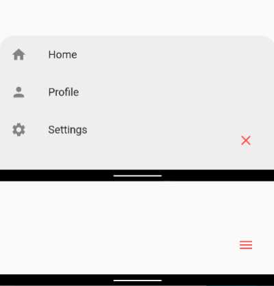
Here is an example of how you can build an animated menu with an Icon button to open and close it in Flutter.
Stack(
  children: [
    Positioned(
      bottom: 0,
      left: 0,
      right: 0,
      child: AnimatedContainer(
        duration: Duration(milliseconds: 500),
        height: _isMenuOpen ? 200 : 0,
        decoration: BoxDecoration(
          color: Colors.grey.shade200,
          borderRadius: BorderRadius.only(
            topLeft: Radius.circular(20),
            topRight: Radius.circular(20),
          ),
        ),
        child: _isMenuOpen
            ? ListView(
            children: [
              ListTile(
                leading: Icon(Icons.home),
                title: Text("Home"),
                onTap: () {
                  setState(() {
                    _isMenuOpen = false;
                  });
                  // Perform action for home
                },
              ),
              ListTile(
                leading: Icon(Icons.person),
                title: Text("Profile"),
                onTap: () {
                  setState(() {
                    _isMenuOpen = false;
                  });
                  // Perform action for profile
                },
              ),
              ListTile(
                leading: Icon(Icons.settings),
                title: Text("Settings"),
                onTap: () {
                  setState(() {
                    _isMenuOpen = false;
                  });
                // Perform action for settings
              },
            ),
          ],
        )
            : Container(),
      ),
    ),
    Positioned(
      bottom: 20,
      right: 20,
      child: IconButton(
        icon: Icon(_isMenuOpen ? Icons.close : Icons.menu, color: Colors.redAccent),
        onPressed: () {
          setState(() {
            _isMenuOpen = !_isMenuOpen;
          });
        },
      ),
    ),
  ],
)
In the example above we are using a Stack widget to lay out the menu and the Icon button on top of each other.
We are using the AnimatedContainer widget to create the animation for the menu. The AnimatedContainer widget takes a duration property which controls the length of the animation. We are also using the Positioned widget to position the menu on the screen. We set the bottom property to 0 to position the menu at the bottom of the screen.
We are also using the ListView widget to create a list of items in the menu, each ListTile is an item of the menu, In this example, we have three items “Home”, “Profile”, and “Settings” with the respective icons, and also, we added an onTap function for each item, when the user tap on an item the menu will close and the corresponding action will be performed.
We are also using an IconButton with the icon for opening and closing the menu, this button is positioned always in the same place and the icon colour is redAccent, and the user can use it to open or close the menu at any time. The background colour of the menu is grey.shade200
In summary, we have created an animated menu in Flutter that can be opened and closed by tapping on an icon button. The menu is positioned at the bottom of the screen and contains a list of items. The menu background colour is grey.shade200, icon colour is redAccent. When the user taps on an item, the menu will close and the corresponding action will be performed.
Creating a Dynamic Bottom Menu in Flutter
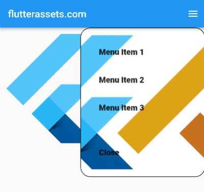
The code below is for a bottom menu in a Flutter app. The menu can be opened and closed by tapping on the menu icon in the app bar. When opened, the menu slides up from the bottom of the screen and takes up a portion of the screen specified by the _menuHeight variable.
The menu has three items, each represented by an InkWell widget which will trigger the onMenuItemSelected function when tapped on. The currently selected menu item is highlighted differently from the unselected items. The menu also uses the AnimatedSwitcher widget to animate between the selected and unselected menu items.

import 'package:flutter/material.dart';

void main() {
  runApp(MyApp());
}

class MyApp extends StatelessWidget {

  @override
  Widget build(BuildContext context) {
    return MaterialApp(
      debugShowCheckedModeBanner: false,
      title: 'Flutter Demo',
      theme: ThemeData(
        primarySwatch: Colors.blue,
      ),
      home: MyHomePage(),
    );
  }
}

class MyHomePage extends StatefulWidget {

  @override
  State<MyHomePage> createState() => _MyHomePageState();
}

class _MyHomePageState extends State<MyHomePage> with SingleTickerProviderStateMixin{

  bool _isMenuOpen = false;
  int _selectedIndex = 0;
  double _menuHeight = 0;
  bool _showMenuContent = false;

  @override
  Widget build(BuildContext context) {

    double screenWidth = MediaQuery.of(context).size.width;

    return Scaffold(
      appBar: AppBar(
        title: Text('flutterassets.com'),
        actions: [
          IconButton(
            icon: Icon(Icons.menu),
            onPressed: () {
              setState(() {
                _isMenuOpen = !_isMenuOpen;
                _menuHeight = _isMenuOpen ? 200 : 0;
                _showMenuContent = false;
              });
            },
          ),
        ],
      ),
      body: Column(
        children: [
          Expanded(
            child: Container(),
          ),
          AnimatedContainer(
            padding: EdgeInsets.all(12),
            duration: Duration(milliseconds: 300),
            height: _isMenuOpen ? 200 : 0,
            width: _isMenuOpen ? screenWidth : 0,
            // color: Colors.black54,
            decoration: BoxDecoration(
                color: Colors.grey.shade300,
                borderRadius: const BorderRadius.only(
                  topLeft: Radius.circular(20),
                  topRight: Radius.circular(20),
                ),
                border: Border.all(color: Colors.grey)
            ),
            onEnd: () {
              setState(() {
                _showMenuContent = _isMenuOpen;
              });
            },
            child: Visibility(
              visible: _showMenuContent,
              child: Menu(
                onMenuItemSelected: (index) {
                  setState(() {
                    _selectedIndex = index;
                    _isMenuOpen = false;
                    _menuHeight = 0;
                    _showMenuContent = false;
                  });
                },
                selectedIndex: _selectedIndex, showMenuContent: true,
              ),
            ),
          ),
        ],
      )
    );
  }
}

class Menu extends StatelessWidget {
  final int? selectedIndex;
  final Function? onMenuItemSelected;
  final bool showMenuContent;

  const Menu({Key? key, this.selectedIndex, this.onMenuItemSelected, required this.showMenuContent})
      : super(key: key);

  @override
  Widget build(BuildContext context) {
    return Visibility(
      visible: showMenuContent!,
      child: Column(
        children: [
          for (int i = 0; i < 3; i++)
            InkWell(
              onTap: () => onMenuItemSelected!(i),
              child: AnimatedSwitcher(
                duration: Duration(milliseconds: 300),
                child: i == selectedIndex
                    ? SelectedMenuItem()
                    : UnselectedMenuItem(),
              ),
            ),
        ],
      ),
    );
  }
}

class SelectedMenuItem extends StatelessWidget {
  @override
  Widget build(BuildContext context) {
    return Container(
      margin: EdgeInsets.symmetric(horizontal: 20, vertical: 5),
      height: 50,
      width: double.infinity,
      decoration: BoxDecoration(
        color: Colors.white,
        borderRadius: BorderRadius.circular(10),
      ),
      child: Center(
        child: Text(
          'Selected Menu Item',
          style: TextStyle(
            color: Colors.black,
            fontWeight: FontWeight.bold,
          ),
        ),
      ),
    );
  }
}

class UnselectedMenuItem extends StatelessWidget {
  @override
  Widget build(BuildContext context) {
    return Container(
      height: 50,
      width: double.infinity,
      decoration: BoxDecoration(
        color: Colors.black54,
        borderRadius: BorderRadius.circular(10),
      ),
      child: Center(
        child: Text(
          'Unselected Menu Item',
          style: TextStyle(
            color: Colors.white,
            fontWeight: FontWeight.bold,
          ),
        ),
      ),
    );
  }
}
Explanations of the code, broken down by section:
class _MyHomePageState extends State<MyHomePage> with SingleTickerProviderStateMixin{
Title: “Handling the state of the home page”
This class is responsible for handling the state of the home page, including the state of the menu. The with SingleTickerProviderStateMixin mixin is used to provide a Ticker for the animation of the menu.
In this section, there are 4 main variables that handle the state of the menu:
bool _isMenuOpen = false;: This variable keeps track of whether the menu is open or closed.int _selectedIndex = 0;: This variable keeps track of the currently selected menu item.double _menuHeight = 0;: This variable keeps track of the height of the menu.bool _showMenuContent = false;: This variable keeps track of whether the menu content should be visible or not.
The build method of this class is responsible for creating the layout of the home page, including the app bar and the menu. The app bar contains the title of the app and the menu icon, which when pressed will toggle the state of the menu.
class Menu extends StatelessWidget {
Title: “Rendering the menu items”
This class is responsible for rendering the menu items. It’s a stateless widget, which means it doesn’t hold any state and can be easily rendered. It takes three arguments in its constructor:
final int? selectedIndex;: The index of the currently selected menu item.final Function? onMenuItemSelected;: A callback function for when a menu item is selected.final bool showMenuContent;: A flag indicating whether the menu content should be visible.
The build method of this class is responsible for rendering the menu items. It uses a for loop to iterate over the menu items and for each item, it creates an InkWell widget. The InkWell widget is used to add tap gesture to a child, in this case, the menu item. It also uses the AnimatedSwitcher widget to animate between the selected and unselected menu items.
class SelectedMenuItem extends StatelessWidget {
Title: “Rendering the selected menu item”
This class is responsible for rendering the selected menu item. It’s a stateless widget, which means it doesn’t hold any state and can be easily rendered.
The build method of this class is responsible for creating the layout of the selected menu item. It returns a Container widget with a fixed height and width, and a decoration that makes it look different from the unselected menu items.
class UnselectedMenuItem extends StatelessWidget {
Title: “Rendering the unselected menu item”
This class is responsible for rendering the unselected menu item. It’s a stateless widget, which means it doesn’t hold any state and can be easily rendered.
The build method of this class is responsible for creating the layout of the unselected menu item. It returns a Container widget with a fixed height and width, and a decoration that makes it look different from the selected menu items.
Open the bottom menu with FloatingActionButton in Flutter
here is an example of how you can create a floating action button that opens and closes the bottom menu:
class _MyHomePageState extends State<MyHomePage> with SingleTickerProviderStateMixin{
  // existing state variables
  IconData _menuIcon = Icons.menu;
  // ...

  @override
  Widget build(BuildContext context) {
    return Scaffold(
      // existing Scaffold
      floatingActionButton: FloatingActionButton(
        onPressed: () {
          setState(() {
            _isMenuOpen = !_isMenuOpen;
            _menuHeight = _isMenuOpen ? 200 : 0;
            _showMenuContent = false;
            _menuIcon = _isMenuOpen ? Icons.close : Icons.menu;
          });
        },
        child: Icon(_menuIcon),
      ),
    );
  }
}
In this example, I created a FloatingActionButton widget and added it to the Scaffold widget. The onPressed callback is set to toggle the state of the menu and change the icon of the button.
When the button is pressed, the setState method is called, which updates the state variables and causes the app to rebuild the widgets. This updates the AnimatedContainer widget’s height and visibility, and changes the icon of the floating action button.
You can place this button anywhere you want to according to your requirement, like on top right, top left or bottom center. You can also change the icon, the size and the colour of the button as per your requirement.


