What is Flutter AppBar
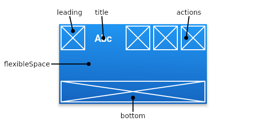
The Flutter AppBar is the most used app component. The AppBar is a top app bar that appears at the top of an app’s screen. It is usually used to display important information such as the app’s title, and to provide actions that are relevant to the current screen.
Here’s an example of how to use an AppBar in a Flutter app:
Scaffold(
  appBar: AppBar(
    title: Text('My App'),
  ),
  body: Center(
    child: Text('Hello World'),
  ),
)
The AppBar widget has a number of properties that you can use to customize its appearance and behaviour. For example, you can use the title property to specify the text that should be displayed in the app bar, and the actions property to specify a list of widgets that should be displayed in the app bar. You can also use the backgroundColor property to specify the background colour of the app bar, and the leading property to specify a widget that should be displayed at the start of the app bar.

There are many other properties that you can use to customize the AppBar widget, such as the elevation property which controls the shadow of the app bar, and the centerTitle property which determines whether the title should be centred within the app bar.
Below you can find different ways of customizing the AppBar widget.
How to change AppBar background colour in Flutter
To change the background colour of an AppBar in Flutter, you can use the backgroundColor property. Here’s an example of how to use the backgroundColor property to change the background colour of an AppBar:
appBar: AppBar(
        title: const Text('Title'),
        backgroundColor: Colors.green,
      ),
In this example, the AppBar widget has a backgroundColor property set to Colors.green, which will cause the app bar to have a green background colour.
You can use any colour value as the backgroundColor of an AppBar. For example, you can use a specific colour code such as Color(0xFFFF0000) for red, or you can use one of the predefined colours in the Colors class, such as Colors.red or Colors.blue.
Flutter AppBar gradient background colour
The flexibleSpace property is another way to customize the appearance of the AppBar in Flutter. It allows you to specify a widget that will be displayed behind the app bar and will be stretched to fill the available space.
You can read more about colour gradients in another article: How do you add a gradient background colour in Flutter?
To use the flexibleSpace property, you can specify a widget in the AppBar like this:
appBar: AppBar(
        centerTitle: true,
        title: Text("Title"),
        flexibleSpace: Container(
          decoration: BoxDecoration(
              gradient: LinearGradient(
                  begin: Alignment.topLeft,
                  end: Alignment.bottomRight,
                  colors: <Color>[
                    Colors.red,
                    Colors.blue
                  ])
          ),
        ),
      ),
In this example, the AppBar widget has a flexibleSpace property set to a Container widget with a BoxDecoration that has a gradient set to a LinearGradient. The LinearGradient has a colors property set to a list of colours ([Colors.red, Colors.blue]), which defines the start and end colours of the gradient. The begin and end properties of the LinearGradient define the start and end points of the gradient, respectively.
How to change the text colour, fontSize, fontWeight, and fontFamily in AppBar
To change the text colour, font size, font weight, and font family of the title in an AppBar in Flutter, you can use the title property of the AppBar and specify a Text widget with the desired properties.
Here’s an example of how to change the text colour, font size, font weight, and font family of the title in an AppBar:
appBar: AppBar(
        title: const Text(
          'Title',
          style: TextStyle(
              fontSize:30.0,
              color: const Color(0xFF8200CC),
              fontWeight: FontWeight.w900,
              fontFamily: "Roboto"
          ),
        ),
        backgroundColor: Colors.orangeAccent,
      ),
In this example, the AppBar widget has a title property set to a Text widget with a style property set to a TextStyle that specifies the text colour, font size, font weight, and font family.
How to centre the title on the AppBar in Flutter
To centre the title in the AppBar in Flutter, you can use the centerTitle property of the AppBar and set it to true. Here’s an example of how to centre the title in an AppBar:
appBar: AppBar(
        title: Text("Title"),
        centerTitle: true,
      ),
In this example, the AppBar widget has a centerTitle property set to true, which will cause the title to be centered within the app bar.
How to add the back button to AppBar in Flutter
To add a back button to the AppBar in Flutter, you can use the leading property of the AppBar and specify a widget that will be displayed at the start of the app bar.
Back button with BackButton in Flutter
One way to add a back button to the AppBar is to use the BackButton widget, which is a predefined widget that displays a back arrow icon and handles the back button functionality. Here’s an example of how to use the BackButton widget to add a back button to the AppBar:
appBar: AppBar(
  leading: BackButton(),
  title: Text(widget.title),
  centerTitle: true,
  backgroundColor: Color(0xFFFF0000),
),
When the user taps the back button, the BackButton widget will automatically handle the back button functionality, which typically means navigating to the previous screen in the app.
Back button with IconButton in Flutter
You can use an IconButton widget with a custom icon and an onPressed callback to replace the BackButton widget in the AppBar and handle the back button functionality.
Here’s an example of how to use an IconButton widget with a custom icon and an onPressed callback to replace the BackButton widget in the AppBar:
appBar: AppBar(
        leading: IconButton(
          icon: Icon(Icons.arrow_back, color: Colors.black),
          onPressed: () => Navigator.of(context).pop(),
        ),
        title: Text("Title"),
        centerTitle: true,
      ),
In this example, the AppBar widget has a leading property set to an IconButton widget with an arrow_back icon. When the user taps the icon, the onPressed callback will be called, and you can specify the desired back button functionality in the callback.
How to add padding to AppBar title in Flutter
To add padding to the title in an AppBar in Flutter, you can use the title property of the AppBar and wrap the title widget in a Padding widget.
Here’s an example of how to add padding to the title in an AppBar:
appBar: AppBar(
        title: Padding(
          padding: const EdgeInsets.only(left: 25.0),
          child: const Text(
            'Title',
          ),
        ),
        backgroundColor: Colors.deepPurple,
      ),
In this example, the AppBar widget has a title property set to a Padding widget with a child property set to a Text widget. The Padding widget has a padding property set to EdgeInsets.only(left: 25.0), which will add 25 pixels of padding on the left-hand side of the Text widget.
You can also use a Container widget with a padding property instead of a Padding widget to add padding to the title in the AppBar.
appBar: AppBar(
        title: Container(
          padding: const EdgeInsets.only(left: 25.0),
          child: const Text(
            'Title',
          ),
        ),
        backgroundColor: Colors.deepPurple,
      ),
You can use either the Padding widget or the Container widget with a padding property to add padding to the title in the AppBar. The choice depends on your specific needs and preferences.
How to add the centre logo image to AppBar in Flutter
To add a logo image to the centre of the AppBar in Flutter, you can use the title parameter of the AppBar widget and set it to a Widget that displays the logo image.
Here’s an example of how you can do this:
appBar: AppBar(
        leading: IconButton(
          icon: Icon(Icons.arrow_back, color: Colors.black),
          onPressed: () => Navigator.of(context).pop(),
        ),
        title: Image.asset('assets/FlutterAssets_logo.png',
          fit: BoxFit.contain,
          height: 50,
        ),
        centerTitle: true,
      ),
This will display the image located at assets/FlutterAssets_logo.png in the center of the AppBar. You can also use the Image.network constructor to load the image from a URL.

Alternatively, you can use the leading parameter to add the logo image to the left side of the AppBar, or the actions parameter to add the logo image to the right side of the AppBar.
Here’s an example of how you can use the leading parameter to add the logo image to the left side of the AppBar:
AppBar(
  leading: Image.asset('assets/FlutterAssets_logo.png',),
  title: Text('flutterassets.com'),
),
And here’s an example of how you can use the actions parameter to add the logo image to the right side of the AppBar:
AppBar(
  title: Text('flutterassets.com'),
  actions: <Widget>[
    Image.asset('assets/FlutterAssets_logo.png',),
  ],
),
You can find more about images in Flutter in another article: Flutter Basics – How to use an image in Flutter.
Use PreferedSize to change AppBar size in Flutter
You can use the PreferredSize widget to specify the preferred size of the AppBar. This can be helpful if you want to set the preferredSize based on the dimensions of another widget, or if you want to wrap the AppBar in a parent widget that requires a specific size.
Here’s an example of how you can use the PreferredSize widget to set the size of an AppBar:
appBar: PreferredSize(
        preferredSize: Size.fromHeight(100.0),
        child: AppBar(
          title: Text("Title"),
        ),
      ),

appBar: PreferredSize(
        preferredSize: Size.fromHeight(30.0),
        child: AppBar(
          title: Text("Title"),
        ),
      ),
In this examples, the AppBar will have a height of 100 pixels and 30 pixels.
appBar: PreferredSize(
          preferredSize: Size.fromHeight(100.0),
          child: AppBar(
            automaticallyImplyLeading: false, // hides leading widget
            flexibleSpace: Image.asset('assets/FlutterAssets_logo.png',
              fit: BoxFit.fitHeight,
            ),
          )
      ),
appBar: PreferredSize(
        preferredSize: Size(100, 70), //width and height
        // The size the AppBar would prefer if there were no other constraints.
        child: SafeArea(
          child: Container(
            height: 100,
            color: Colors.redAccent,
            child: Center(child: Text('TITLE',
              style: TextStyle(
                fontWeight: FontWeight.w900,
                fontSize: 50,
                color: Colors.white
              ),
            ),
            ),
          ),
        ),
      ),
Use toolbarHeight to change AppBar size in Flutter
To change the size of an AppBar in Flutter, you can use the toolbarHeight property. This property allows you to specify the height of the AppBar‘s toolbar, which includes the title and any actions.
Here’s an example of how you can use toolbarHeight to set the height of an AppBar:
appBar: AppBar(
        toolbarHeight: 120, // Set this height
        flexibleSpace: SafeArea(
          child: Container(
            color: Colors.orange,
            child: Column(
              children: [
                Icon(Icons.insert_emoticon,size: 30.0, color: Colors.blue,),
                Icon(Icons.insert_emoticon,size: 30.0, color: Colors.green,),
                Icon(Icons.insert_emoticon,size: 30.0, color: Colors.red,),
                Icon(Icons.insert_emoticon,size: 30.0, color: Colors.white,),
              ],
            ),
          ),
        ),
      ),
appBar: AppBar(
        toolbarHeight: 120, // Set this height
        title: Text('Title'),
      ),
How to add actions buttons to AppBar in Flutter
To add action buttons to an AppBar in Flutter, you can use the actions property. This property takes a list of widgets, which will be displayed in the AppBar as action buttons.
Here’s an example of how you can add action buttons to an AppBar:
appBar: AppBar(
        title: Text("Title"),
        actions: [
          IconButton(
              icon: Icon(
                  Icons.login,
                  color: const Color(0xFF0000FF),
                  size: 34.0),
              onPressed: (){}
          ),
          IconButton(
              icon: Icon(
                  Icons.favorite,
                  color: const Color(0xFFFF0000),
                  size: 34.0),
              onPressed: (){}
          ),
          IconButton(
              icon: Icon(
                  Icons.settings,
                  color: const Color(0xFF00FF00),
                  size: 34.0),
              onPressed: (){}
          ),
        ],
      ),
You can find more examples of how to use icons in Flutter in another post: Flutter Basics – How to use Icons in Flutter
You can also use other types of widgets, such as TextButton or PopupMenuButton, as action buttons in the AppBar.
AppBar(
  // leading: Image.asset('assets/FlutterAssets_logo.png',),
  title: Text('flutterassets.com'),
  actions: [
    TextButton(
      child: Text('LOGOUT', style: TextStyle(color: Colors.white),),
      onPressed: () {
        // Log out the user
      },
    ),
    PopupMenuButton<String>(
      itemBuilder: (context) => [
        PopupMenuItem(
          value: 'settings',
          child: Text('Settings'),
        ),
        PopupMenuItem(
          value: 'about',
          child: Text('About'),
        ),
      ],
      onSelected: (value) {
        // Handle menu item selection
      },
    ),
  ],
),
In this example, the AppBar has a logout button and a dropdown menu with two options: “settings” and “about”. When the user taps on the logout button, the onPressed callback for the FlatButton will be called, and when the user selects an option from the dropdown menu, the onSelected callback for the PopupMenuButton will be called.
AppBar home button, title, and actions buttons in Flutter
The AppBar widget in Flutter allows you to customize the appearance and behavior of the app bar at the top of your app. You can set the home button, title, and action buttons in the AppBar to provide easy access to common tasks and navigation options for your users.
To set the home button in the AppBar, you can use the leading property. This property takes a widget that will be displayed as the home button in the AppBar. The home button is usually an icon that represents the app or a back arrow to return to the previous screen.
Here’s an example of how you can set the home button in the AppBar:
appBar: AppBar(
        centerTitle: true,
        title: Text('Title'),
        leading: IconButton(
          onPressed: () {},
          icon: Icon(Icons.home),
        ),
        actions: [
          IconButton(
            onPressed: () {},
            icon: Icon(Icons.call),
          ),
          IconButton(
            onPressed: () {},
            icon: Icon(Icons.more_vert),
          ),
        ],
      ),
Appbar with bottom element in Flutter
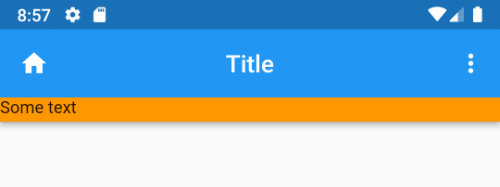
The bottom property of the AppBar widget in Flutter allows you to add a bottom element to the AppBar. This can be useful if you want to display additional information or controls below the main toolbar of the AppBar.
The bottom property takes a widget, which will be displayed as the bottom element of the AppBar. The height of the AppBar will be adjusted to accommodate the bottom element.
Here’s an example of how you can use the bottom property of the AppBar:
appBar: AppBar(
        centerTitle: true,
        title: Text('Title'),
        leading: IconButton(
          onPressed: () {},
          icon: Icon(Icons.home),
        ),
        actions: [
          IconButton(
            onPressed: () {},
            icon: Icon(Icons.more_vert),
          ),
        ],
        bottom: PreferredSize(
            child: Container(
              width: MediaQuery.of(context).size.width,
              color: Colors.orange,
              height: 20.0,
              child: Text("Some text"),
            ),
            preferredSize: Size.fromHeight(20.0)),
      ),
Appbar with PopupMenuButton in Flutter
To add a PopupMenuButton to an AppBar in Flutter, you can use the actions property of the AppBar and add the PopupMenuButton as one of the action buttons.
The PopupMenuButton widget displays a dropdown menu with a list of items that the user can select from. When the user selects an item, the onSelected callback of the PopupMenuButton is called with the value of the selected item.
Here’s an example of how you can add a PopupMenuButton to an AppBar:
AppBar(
  // leading: Image.asset('assets/FlutterAssets_logo.png',),
  title: Text('flutterassets.com'),
  actions: [
    PopupMenuButton<String>(
      itemBuilder: (context) => [
        PopupMenuItem(
          value: 'settings',
          child: Text('Settings'),
        ),
        PopupMenuItem(
          value: 'about',
          child: Text('About'),
        ),
      ],
      onSelected: (value) {
        // Handle menu item selection
      },
    ),
  ],
),
In this example, the AppBar has a PopupMenuButton with two options: “settings” and “about”. When the user selects one of the options, the onSelected callback will be called with the value of the selected option.
Here is another example:
appBar: AppBar(
        centerTitle: true,
        title: Text("App Dropdown Menu"),
        actions: [
          //list if widget in appbar actions
          PopupMenuButton(
            icon: Icon(Icons.menu),  //don't specify icon if you want 3 dot menu
            color: Colors.blue,
            itemBuilder: (context) => [
              PopupMenuItem<int>(
                value: 0,
                child: Text("Setting",style: TextStyle(color: Colors.white),),
              ),
              PopupMenuItem<int>(
                  value: 1, child: Text("Privacy Policy"),
              ),
              PopupMenuItem<int>(
                  value: 2,
                  child: Row(
                    children: [
                      Icon(
                        Icons.logout,
                        color: Colors.yellow,
                      ),
                      const SizedBox(
                        width: 7,
                      ),
                      Text("Logout")
                    ],
                  )),
            ],
            onSelected: (item) => {print(item)},
          ),
        ],
      ),


//outside of build

void SelectedItem(BuildContext context, item) {
    switch (item) {
      case 0:
        print("Settings");
        // Navigator.of(context)
        //     .push(MaterialPageRoute(builder: (context) => SettingPage()));
        break;
      case 1:
        print("Privacy Clicked");
        break;
      case 2:
        print("User Logged out");
        // Navigator.of(context).pushAndRemoveUntil(
        //     MaterialPageRoute(builder: (context) => LoginPage()),
        //         (route) => false);
        break;
    }
  }
Search field in AppBar in Flutter
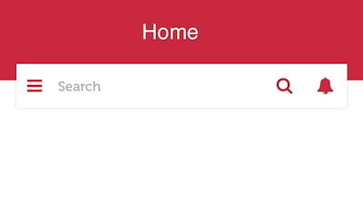
The code below creates a custom search bar, but it does not utilize the elements of the AppBar. Instead, all the elements are placed within the body section of the Scaffold.

GlobalKey<ScaffoldState> _scaffoldKey = GlobalKey();

  @override
  Widget build(BuildContext context) {
    return Scaffold(
      key: _scaffoldKey,
      body: Container(
        height: 160.0,
        child: Stack(
          children: <Widget>[
            Container(
              color: Colors.red,
              width: MediaQuery.of(context).size.width,
              height: 100.0,
              child: Center(
                child: Text(
                  "Home",
                  style: TextStyle(color: Colors.white, fontSize: 18.0),
                ),
              ),
            ),
            Positioned(
              top: 80.0,
              left: 0.0,
              right: 0.0,
              child: Container(
                padding: EdgeInsets.symmetric(horizontal: 20.0),
                child: DecoratedBox(
                  decoration: BoxDecoration(
                      borderRadius: BorderRadius.circular(1.0),
                      border: Border.all(
                          color: Colors.grey.withOpacity(0.5), width: 1.0),
                      color: Colors.white),
                  child: Row(
                    children: [
                      IconButton(
                        icon: Icon(
                          Icons.menu,
                          color: Colors.red,
                        ),
                        onPressed: () {
                          print("your menu action here");
                        },
                      ),
                      Expanded(
                        child: TextField(
                          decoration: InputDecoration(
                            hintText: "Search",
                          ),
                        ),
                      ),
                      IconButton(
                        icon: Icon(
                          Icons.search,
                          color: Colors.red,
                        ),
                        onPressed: () {
                          print("your menu action here");
                        },
                      ),
                      IconButton(
                        icon: Icon(
                          Icons.notifications,
                          color: Colors.red,
                        ),
                        onPressed: () {
                          print("your menu action here");
                        },
                      ),
                    ],
                  ),
                ),
              ),
            )
          ],
        ),
      ),
    );
  }
More detail of the AppBar class you can find on the official flutter website.


