
What is a colour gradient?
In computer graphics, a colour gradient specifies a range of position-dependent colours, usually used to fill a region. In other words, it starts with one colour and position and ends with another colour and position.
A colour gradient is also known as a colour ramp or a colour progression. In assigning colours to a set of values, a gradient is a continuous colour map, a type of colour scheme.
In Flutter, a colour gradient is a progression of colours that smoothly blend into each other to create a visual effect. You can use a colour gradient to add a sense of depth and complexity to your user interface or to create a visually appealing background for your app.
Container(
  width: 100,
  height: 50,
  decoration: BoxDecoration(
    gradient: LinearGradient(
      begin: Alignment.topLeft,
      end: Alignment.bottomRight,
      colors: [Colors.red, Colors.yellow, Colors.green],
    ),
  ),
),
This code creates a container with a linear gradient that starts at the top left corner and ends at the bottom right corner. The gradient is composed of three colours: red, yellow, and green. As the gradient progresses from the top left to the bottom right, the colours will smoothly blend into each other, creating a visual effect.
You can also use a RadialGradient to create a colour gradient that radiates out from a central point, or a SweepGradient to create a colour gradient that sweeps around a central point. There are many options for customizing the appearance of your colour gradients, such as the direction, spread, and colour stops.
Where we can use colour gradient in Flutter
Colour gradients can be used in a variety of ways in Flutter. Here are a few examples of where you might use a colour gradient in your Flutter app:
- As a background for a container or widget: You can use a colour gradient as the background for a container or widget by setting the
gradientproperty of theBoxDecorationobject. This is a common way to add visual interest to the background of your app. - As a foreground colour for text or icons: You can use a colour gradient as the foreground colour for text or icons by setting the
colorproperty of theTextorIconwidget. This can add depth and complexity to your text or icons. - As a progress indicator: You can use a colour gradient to create a progress indicator that shows the progress of a task. For example, you could use a linear gradient that changes colour as the progress increases, or a radial gradient that grows in size as the progress increases.
- As a transition between pages or screens: You can use a colour gradient to create a smooth transition between pages or screens in your app. For example, you could use a sweeping gradient to create a visual effect as the user navigates between screens.
In Flutter we probably can use it everywhere if we can use Container and BoxDecoration.
The one exception I know of is the Scaffold which can accept only a colour.
Add the colour gradient to Container using BoxDecoration
To add a colour gradient to a Container widget in Flutter, you can use the BoxDecoration class and set the gradient property.
Here’s an example of how to do it:
Container(
  height: 200,
  decoration: BoxDecoration(
    gradient: LinearGradient(
      begin: Alignment.topCenter,
      end: Alignment.bottomCenter,
      colors: [Colors.red, Colors.orange, Colors.yellow]
    ),
  ),
)
This will create a Container with a vertical linear gradient that goes from red at the top to yellow at the bottom.
You can also customize the gradient further by setting the stops property, which allows you to specify the location of each colour in the gradient. For example:
Container(
  height: 200,
  decoration: BoxDecoration(
    gradient: LinearGradient(
      begin: Alignment.topCenter,
      end: Alignment.bottomCenter,
      colors: [Colors.red, Colors.orange, Colors.yellow],
      stops: [0.1, 0.5, 0.9],
    ),
  ),
)
This will create a gradient with the same colours, but with the red colour occupying the first 10% of the gradient, orange occupying the next 40%, and yellow occupying the last 50%.
You can also use the RadialGradient class to create a radial gradient, which radiates out from a central point.
Another example.
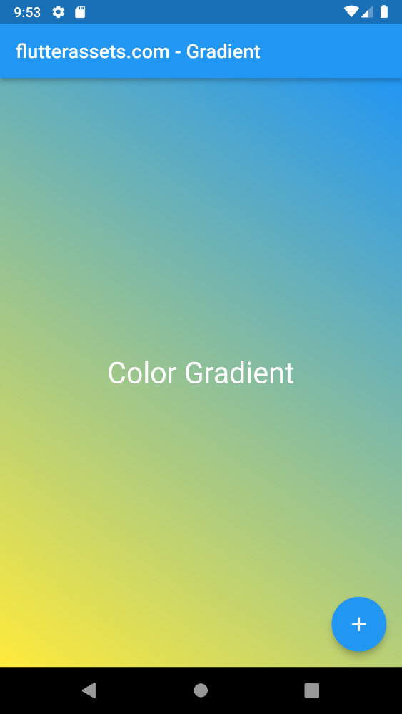
      body: Center(
        child: Container(
            height: MediaQuery.of(context).size.height,
            width: MediaQuery.of(context).size.width,
          alignment: Alignment.center,
          decoration: BoxDecoration(
            gradient: LinearGradient(
              begin: Alignment.topRight,
              end: Alignment.bottomLeft,
              colors: [
                Colors.blue,
                Colors.yellow,
              ],
            )
          ),
          child: Text(
            'Color Gradient',
            style: TextStyle(
              fontSize: 30,
              color: Colors.white
            ),
          )
        ),
      ),
Use multiple colours in gradient in Flutter
To create a gradient with multiple colours in Flutter, you can use the LinearGradient widget. The LinearGradient widget takes in a list of colours and a list of stops. The colours list specifies the colours that the gradient should use, and the stops list specifies at what point each colour should be used in the gradient.
Here’s an example of how you can use the LinearGradient widget to create a gradient with three colours:
LinearGradient(
  colors: [
    Colors.red,
    Colors.yellow,
    Colors.green,
  ],
  stops: [
    0.0,
    0.5,
    1.0,
  ],
)
This will create a gradient that starts with red, transitions to yellow at the halfway point, and then transitions to green at the end.
You can also specify the direction of the gradient using the begin and end properties. For example, to create a gradient that goes from left to right, you can set begin: Alignment.topLeft and end: Alignment.topRight
LinearGradient(
  begin: Alignment.topLeft,
  end: Alignment.topRight,
  colors: [
    Colors.red,
    Colors.yellow,
    Colors.green,
  ],
  stops: [
    0.0,
    0.5,
    1.0,
  ],
)
You can then use the LinearGradient widget as the background for a container or any other widget by using the BoxDecoration widget and setting the background property.
Container(
  height: 100,
  decoration: BoxDecoration(
    gradient: LinearGradient(
      begin: Alignment.topLeft,
      end: Alignment.topRight,
      colors: [
        Colors.red,
        Colors.yellow,
        Colors.green,
      ],
      stops: [
        0.0,
        0.5,
        1.0,
      ],
    ),
  ),
)
body: Center(
child: Container(
height: MediaQuery.of(context).size.height,
width: MediaQuery.of(context).size.width,
alignment: Alignment.center,
decoration: BoxDecoration(
gradient: LinearGradient(
begin: Alignment.topRight,
end: Alignment.bottomLeft,
colors: [
Colors.blue,
Colors.red,
Colors.yellow,
Colors.white,
],
)
),
child: Text(
'Color Gradient',
style: TextStyle(
fontSize: 30,
color: Colors.white
),
)
),
),
How to use stops in gradient in Flutter
In Flutter, you can use the Stop class to define a gradient stop, which is a point in a gradient colour ramp that specifies the colour at that point and the position of the point along the gradient axis. You can then use the stops property of a LinearGradient or RadialGradient object to specify the stops for the gradient.
Stops defined where the transition between colours should be.
Here is an example of how you can use stops in a linear gradient in Flutter:
LinearGradient gradient = LinearGradient(
  begin: Alignment.topCenter,
  end: Alignment.bottomCenter,
  stops: [0.1, 0.5, 0.7, 0.9],
  colors: [Colors.red, Colors.orange, Colors.yellow, Colors.green],
);
// You can then use the gradient as the background color for a widget:
Container(
height: 200.0,
width: 200.0,
decoration: BoxDecoration(
gradient: gradient,
),
),In this example, the gradient will transition from red to orange to yellow to green as it moves from the top to the bottom of the container. The stops are specified as a list of values between 0.0 and 1.0, where 0.0 is the start of the gradient axis and 1.0 is the end. The colours are specified in the same order as the stops, so the colour at the first stop (0.1) will be red, the colour at the second stop (0.5) will be orange, and so on.
You can use a similar approach to specify stops in a radial gradient, using the RadialGradient class and the stops property.
Please note, the array of stops must be the same as colours so, 4 colours = for stops.
      body: Center(
        child: Container(
            height: MediaQuery.of(context).size.height,
            width: MediaQuery.of(context).size.width,
          alignment: Alignment.center,
          decoration: BoxDecoration(
            gradient: LinearGradient(
              begin: Alignment.topRight,
              end: Alignment.bottomLeft,
              stops: [
                0.05,
                0.2,
                0.8,
                0.95,
              ],
              colors: [
                Colors.blue,
                Colors.red,
                Colors.yellow,
                Colors.white,
              ],
            )
          ),
          child: Text(
            'Color Gradient',
            style: TextStyle(
              fontSize: 30,
              color: Colors.white
            ),
          )
        ),
      ),
How to add a colour gradient to AppBar in Flutter
To add a colour gradient to the AppBar in Flutter, you can use the BoxDecoration widget to set the background of the AppBar to a gradient.
Here’s an example of how you can do this:
appBar: AppBar(
  backgroundColor: Colors.transparent,
  elevation: 0,
  flexibleSpace: Container(
    decoration: BoxDecoration(
      gradient: LinearGradient(
        begin: Alignment.topCenter,
        end: Alignment.bottomCenter,
        colors: [
          Colors.orange.shade900,
          Colors.orange.shade500,
          Colors.orange.shade100,
        ],
      ),
    ),
  ),
),
In this example, we’re using a LinearGradient to create a gradient that goes from the top of the AppBar to the bottom. The begin and end properties specify the start and end points of the gradient and the colours property specifies the colours to use in the gradient.
You can customize the gradient by changing the colours, the start and end points, and the type of gradient (e.g. linear, radial, etc.) to suit your needs.
Again, we can use the Container and the BoxDecoration.
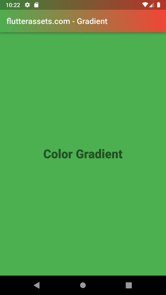
    return Scaffold(
      appBar: AppBar(
        title: Text('flutterassets.com - Gradient'),
        flexibleSpace: Container(
          decoration: BoxDecoration(
              gradient: LinearGradient(
                begin: Alignment.topRight,
                end: Alignment.bottomLeft,
                colors: [
                  Colors.red,
                  Colors.green,
                ],
              )
          ),
        ),
      ),
      body: Center(
        child: Container(
            height: MediaQuery.of(context).size.height,
            width: MediaQuery.of(context).size.width,
          color: Colors.green,
          alignment: Alignment.center,
          child: Text(
            'Color Gradient',
            style: TextStyle(
              fontSize: 30,
              color: Colors.black54,
              fontWeight: FontWeight.w900
            ),
          )
        ),
      ),
    );
Add a colour gradient to AppBar in Flutter with an additional package
Yo can also use a package called new_gradient_app_bar which can use widout BoxDecoration.
Installing new_gradient_app_bar widget
Add a line like this to your package’s pubspec.yaml.
dependencies:
  new_gradient_app_bar: ^0.2.0
And then import it
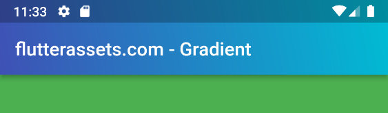
import 'package:new_gradient_app_bar/new_gradient_app_bar.dart'; appBar: NewGradientAppBar(
title: Text('flutterassets.com - Gradient'),
gradient: LinearGradient(
begin: Alignment.topRight,
end: Alignment.bottomLeft,
colors: [
Colors.cyan,
Colors.indigo,
],
),
),
How to add the colour gradient to the icon in Flutter
To use a ShaderMask with an icon in Flutter, you can wrap the Icon widget in a ShaderMask widget and set the shaderCallback property to a callback function that returns a Shader.
Here’s an example of how you can do this:
ShaderMask(
  shaderCallback: (Rect bounds) {
    return LinearGradient(
      begin: Alignment.topCenter,
      end: Alignment.bottomCenter,
      colors: [Colors.red, Colors.orange],
    ).createShader(bounds);
  },
  child: Icon(
    Icons.favorite,
    color: Colors.white,
    size: 60.0,
  ),
)
In this example, we’re using the LinearGradient class to define the gradient, and the createShader method to create a Shader from the gradient. We pass this Shader to the shaderCallback parameter of the ShaderMask widget, which defines the colour filter to be applied to the child widget.
Create a GradientIcon widget.
class GradientIcon extends StatelessWidget {
  GradientIcon(
      this.icon,
      this.size,
      this.gradient,
      );

  final IconData icon;
  final double size;
  final Gradient gradient;

  @override
  Widget build(BuildContext context) {
    return ShaderMask(
      child: SizedBox(
        width: size * 1.2,
        height: size * 1.2,
        child: Icon(
          icon,
          size: size,
          color: Colors.white,
        ),
      ),
      shaderCallback: (Rect bounds) {
        final Rect rect = Rect.fromLTRB(0, 0, size, size);
        return gradient.createShader(rect);
      },
    );
  }
}
And then you can use it anywhere in your code
      body: Center(
        child: Container(
            height: MediaQuery.of(context).size.height,
            width: MediaQuery.of(context).size.width,
          color: Colors.green,
          alignment: Alignment.center,
          child: GradientIcon(
            Icons.add_alert,
            250.0,
            LinearGradient(
              colors: [
                Colors.lightBlueAccent,
                Colors.indigo,
              ],
              begin: Alignment.topLeft,
              end: Alignment.bottomRight,
            ),
          )
        ),
      ),
Here is another post where I spend a bit more time describing Icon colour gradient.
How to add the colour gradient to the Text in Flutter
To add a colour gradient to text in Flutter, you can use the ShaderMask widget. The ShaderMask widget takes a gradient shader and applies it to its child widget, which in this case, would be the text.
Here’s an example of how you can use the ShaderMask widget to apply a linear gradient to text:
ShaderMask(
          shaderCallback: (Rect bounds) {
            return LinearGradient(
              colors: [Colors.yellow, Colors.red],
            ).createShader(bounds);
          },
          child: Text(
            'Hello World',
            style: TextStyle(
              fontSize: 30.0,
              color: Colors.white,
            ),
          ),
        ),
This will create a text widget with a linear gradient that transitions from yellow to red. You can customize the gradient by using different colours and different gradient types, such as RadialGradient or SweepGradient.
Create a custom GradientText widget
class GradientText extends StatelessWidget {
  const GradientText(
      this.text, {
        required this.gradient,
        this.style,
      });

  final String text;
  final TextStyle? style;
  final Gradient gradient;

  @override
  Widget build(BuildContext context) {
    return ShaderMask(
      blendMode: BlendMode.srcIn,
      shaderCallback: (bounds) => gradient.createShader(
        Rect.fromLTWH(0, 0, bounds.width, bounds.height),
      ),
      child: Text(text, style: style),
    );
  }
}
body: Center(
child: Container(
height: MediaQuery.of(context).size.height,
width: MediaQuery.of(context).size.width,
color: Colors.green,
alignment: Alignment.center,
child: GradientText(
'flutterassets.com',
style: const TextStyle(fontSize: 40, fontWeight: FontWeight.w900),
gradient: LinearGradient(colors: [
Colors.red,
Colors.indigo,
]),
),
),
),
Here is another post where I spend a bit more time describing Text colour gradient.
How to add the colour gradient to the Text in Flutter with the package
Installing simple_gradient_text widget
Add a line like this to your package’s pubspec.yaml.
dependencies:
  simple_gradient_text: ^1.2.2
And then import it
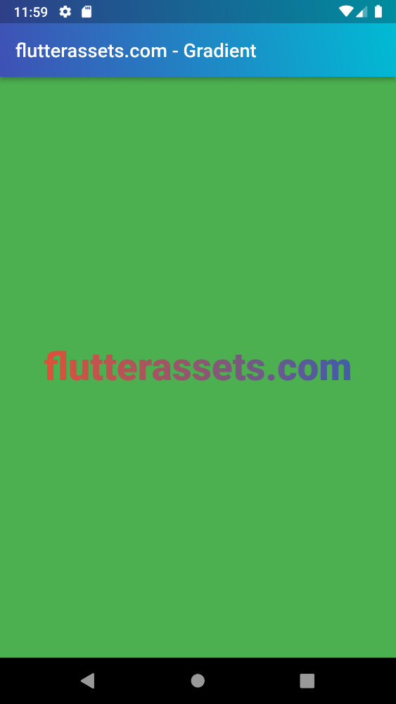
import 'package:simple_gradient_text/simple_gradient_text.dart'; body: Center(
child: Container(
height: MediaQuery.of(context).size.height,
width: MediaQuery.of(context).size.width,
color: Colors.green,
alignment: Alignment.center,
child: GradientText(
'flutterassets.com',
style: TextStyle(
fontSize: 40.0,
fontWeight: FontWeight.w900
),
colors: [
Colors.blue,
Colors.red,
Colors.teal,
],
),
),
),
How to create a colour gradient button in Flutter
To create a gradient button in Flutter, you can use the Container widget and set the decoration property to a BoxDecoration with a LinearGradient.
Here’s an example of how you could do this:
Container(
  decoration: BoxDecoration(
    gradient: LinearGradient(
      colors: [Colors.red, Colors.orange, Colors.yellow],
      begin: Alignment.topLeft,
      end: Alignment.bottomRight,
    ),
  ),
  child: TextButton(
    onPressed: () {
      // Do something when the button is pressed
    },
    child: Text('Button'),
  ),
)
This will create a button with a gradient that goes from red at the top left to yellow at the bottom right. You can adjust the begin and end values to change the direction of the gradient. You can also adjust the list of colours to use different colours for the gradient.
Use ElevatedButton with Ink and Container
          ElevatedButton(
            style: ElevatedButton.styleFrom(
                padding: EdgeInsets.zero,
              elevation: 5,
              shape: RoundedRectangleBorder(
                borderRadius: BorderRadius.circular(30)
              )
            ),
            onPressed: () {},
            child: Ink(
              decoration: BoxDecoration(
                gradient: LinearGradient(colors: [Colors.lightBlueAccent, Colors.indigo]),
                  borderRadius: BorderRadius.circular(30)
              ),
              child: Container(
                padding: const EdgeInsets.symmetric(vertical: 20, horizontal: 40),
                child: const Text('flutterassets.com', textAlign: TextAlign.center),
              ),
            ),
          )
How to add the colour gradient to the border
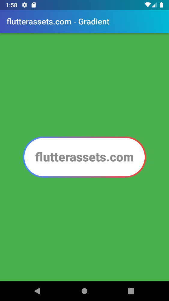
To add the colour gradient to the border you can use two overlapping containers. If you change the border-radius in one container you need to change the border-radius in the second container too: BorderRadius.circular(55). The thickness of the border can be changed by changing padding: const EdgeInsets.all(3.5),
body: Center(
  child: Container(
      height: MediaQuery.of(context).size.height,
      width: MediaQuery.of(context).size.width,
    color: Colors.green,
    alignment: Alignment.center,
    child:
    Container(
      decoration: BoxDecoration(
        gradient: LinearGradient(
          colors: [
            Colors.blueAccent,
            Colors.red,
          ],
        ),
        borderRadius: BorderRadius.circular(55),
      ),
      height: 100,
      width: 300,
      child: Padding(
        padding: const EdgeInsets.all(3.5),
        child: Container(
          decoration: BoxDecoration(
            color: Colors.white,
            borderRadius: BorderRadius.circular(55),
          ),
          child: Center(
            child: Text('flutterassets.com',style: TextStyle(
                fontSize: 30,
                fontWeight: FontWeight.w900,
                color: Colors.black45,
            ),
            ),
          ),
        ),
      ),
    ),
  ),
),
