What is Flutter Drawer
The Flutter Drawer is a panel that slides out from the side of the screen. It’s often used to show a list of options or to navigate to different parts of the app. To use the Drawer, you can add it to your app’s Scaffold (a widget that provides a consistent visual structure).
You can then customize the Drawer by adding items to it, such as a header or a list of options. To open the Drawer, you can tap the hamburger menu icon. To close it, you can swipe in the opposite direction or tap the back button.
@override
  Widget build(BuildContext context) {
    return Scaffold(
      appBar: AppBar(),

      body: Container(),
      drawer: Drawer(),
    );
  }
How to use Flutter Drawer
To create a drawer in Flutter, you can use the Drawer widget. Here’s an example of how you can use it:
  @override
  Widget build(BuildContext context) {
    return Scaffold(
      appBar: AppBar(
        title: Text('flutterassets.com'),
      ),
      body: Center(
        child: Text('Home Page'),
      ),
      drawer: Drawer(
        child: ListView(
          // Important: Remove any padding from the ListView.
          padding: EdgeInsets.zero,
          children: <Widget>[
            DrawerHeader(
              child: Text('flutterassets.com'),
              decoration: BoxDecoration(
                color: Colors.blue,
              ),
            ),
            ListTile(
              title: Text('Item 1'),
              onTap: () {
                // Update the state of the app
                // ...
                // Then close the drawer
                Navigator.pop(context);
              },
            ),
            ListTile(
              title: Text('Item 2'),
              onTap: () {
                // Update the state of the app
                // ...
                // Then close the drawer
                Navigator.pop(context);
              },
            ),
          ],
        ),
      ),
    );
  }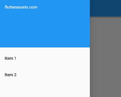
This will create a drawer with a header and two items. You can customize the drawer by modifying the widgets in the children list and by changing the properties of the Drawer widget. To open the drawer, you can tap the hamburger menu icon in the app bar. To close the drawer, you can tap the back button or swipe in the opposite direction.
What is the DrawerHeader in Flutter
In Flutter, the DrawerHeader is a widget that is used to create a header for the Drawer widget. It is typically placed at the top of the Drawer and is used to display information about the user or the app, such as a profile picture, a name, and a bio.
drawer: Drawer(
  child: ListView(
    padding: EdgeInsets.zero,
    children: const <Widget>[
      DrawerHeader(
        child: Text('flutterassets.com'),
      ),
    ],
  ),
),
How to change the height of DrawerHeader in Flutter
The DrawerHeader widget does not have a height property. To change the height of the DrawerHeader, you can wrap it in a SizedBox widget and set the height of the SizedBox using the height property.
Here’s an example of how you can use the SizedBox to change the height of the DrawerHeader:
drawer: Drawer(
  child: ListView(
    padding: EdgeInsets.zero,
    children: const <Widget>[
      SizedBox(
        height: 300,
        child: DrawerHeader(
          child: Text('flutterassets.com'),
          decoration: BoxDecoration(
            color: Colors.blue,
          ),
        ),
      ),
    ],
  ),
),
This will make the DrawerHeader 300 pixels tall. You can adjust the value of the height property of the SizedBox to change the height of the DrawerHeader as needed.
Why use Flutter Drawer with the header image
There are several reasons why you might want to use a Drawer with a header image and a user profile element:
- To create a visually appealing design: A header image and a user profile element can help to make the
Drawerlook more visually appealing and can help to give it a unique look and feel. - To provide a clear separation between the header and the rest of the
Drawer: Using a header image can help to visually separate the header of theDrawerfrom the rest of the content, making it easier for users to understand the structure of theDrawer. - To add branding or personalization to the
Drawer: If you have a logo or other visual assets that you want to use to represent your brand, you can use a header image to incorporate those assets into theDrawer. Additionally, adding a user profile element can help to personalize theDrawerand make it feel more welcoming to the user. - To create a consistent look and feel across different screens: If you are using a
Draweron multiple screens in your app, you can use a header image and a user profile element to create a consistent look and feel across those screens. - To provide quick access to user-specific functionality: By adding a user profile element to the
Drawer, you can make it easier for users to access functionality that is specific to their account, such as settings or profile information.
Overall, using a header image and a user profile element in a Drawer can be a useful way to add visual interest, create a more cohesive design, and provide quick access to user-specific functionality for your app.
Flutter Drawer with the header image
To create a Drawer with a header image in Flutter, you can use the DrawerHeader widget. Here’s an example of how you can use it:
drawer: Drawer(
  child: ListView(
    // Important: Remove any padding from the ListView.
    padding: EdgeInsets.zero,
    children: <Widget>[
      const DrawerHeader(
        child: Text('flutterassets.com', style: TextStyle(color: Colors.white),),
        decoration: BoxDecoration(
          color: Colors.blue,
          image: DecorationImage(
            image: NetworkImage('https://picsum.photos/250?image=9'),
            fit: BoxFit.cover,
          ),
        ),
      ),
      ListTile(
        title: Text('Item 1'),
        onTap: () {
          // Update the state of the app
          // ...
          // Then close the drawer
          Navigator.pop(context);
        },
      ),
      ListTile(
        title: Text('Item 2'),
        onTap: () {
          // Update the state of the app
          // ...
          // Then close the drawer
          Navigator.pop(context);
        },
      ),
    ],
  ),
),
This will create a Drawer with a header that displays an image and a title.
Flutter Drawer with user profile
To create a Drawer with a user profile that includes an image, a badge, a bio, and social media links in Flutter, you can use the DrawerHeader, CircleAvatar, and Row widgets. Here’s an example of how you can use them:
drawer: Drawer(
  child: ListView(
    padding: EdgeInsets.zero,
    children: <Widget>[
      SizedBox(
        height: 400,
        child: DrawerHeader(
          child: Column(
            mainAxisAlignment: MainAxisAlignment.spaceBetween,
            children: [
              CircleAvatar(
                radius: 50,
                backgroundImage: NetworkImage('https://picsum.photos/250?image=9'),
              ),
              Text('John Doe'),
              Text('Bio: Lorem ipsum dolor sit amet, consectetur adipiscing elit. Mauris rutrum lacus id ligula congue, euismod congue ex elementum.'),
              Row(
                mainAxisAlignment: MainAxisAlignment.spaceEvenly,
                children: [
                  IconButton(
                    icon: Icon(Icons.person),
                    onPressed: () {
                      // Navigate to user profile
                    },
                  ),
                  IconButton(
                    icon: Icon(Icons.mail),
                    onPressed: () {
                      // Navigate to contact form
                    },
                  ),
                  IconButton(
                    icon: Icon(Icons.share),
                    onPressed: () {
                      // Share app
                    },
                  ),
                ],
              ),
            ],
          ),
        ),
      ),
      ListTile(
        title: Text('Item 1'),
        onTap: () {
          // Update the state of the app
          // ...
          // Then close the drawer
          Navigator.pop(context);
        },
      ),
      ListTile(
        title: Text('Item 2'),
        onTap: () {
          // Update the state of the app
          // ...
          // Then close the drawer
          Navigator.pop(context);
        },
      ),
    ],
  ),
),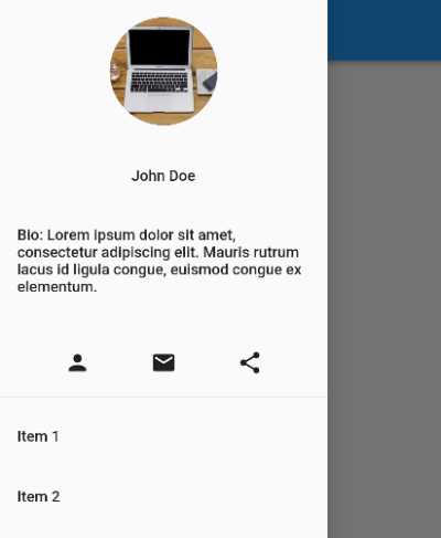
This will create a Drawer with a header that displays a user profile image, a name, a bio, and social media icons.
Flutter Drawer with UserAccountsDrawerHeader
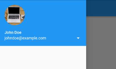
UserAccountsDrawerHeader is a widget in Flutter that displays a header in a Material Design drawer. It typically consists of a user’s name, email, and profile picture. It also includes a background color and an optional onDetailsPressed callback that is called when the header is tapped.
Here’s an example of how to use UserAccountsDrawerHeader:
drawer: Drawer(
  child: ListView(
    padding: EdgeInsets.zero,
    children: [UserAccountsDrawerHeader(
      accountName: Text('John Doe'),
      accountEmail: Text('johndoe@example.com'),
      currentAccountPicture: CircleAvatar(
        backgroundImage: NetworkImage(
            'https://picsum.photos/250?image=9'),
      ),
      onDetailsPressed: () {
          // Navigate to user profile screen
        },
    ),
  ]
  )
),
Customize UserAccountsDrawerHeader in Flutter Drawer
To costomize the UserAccountsDrawerHeader you can use a few available parameters. Here is an examples how to customize the Drawer a little.
drawer: Drawer(
  child: ListView(
    padding: EdgeInsets.zero,
    children: [
      SizedBox(
        height: 250,
        child: UserAccountsDrawerHeader(
        accountName: Row(
          children: [
            Icon(Icons.person, color: Colors.white,),
            Text('John Doe', style: TextStyle(fontSize: 20),),
          ],
        ),
        accountEmail: Row(
          children: [
            Icon(Icons.email, color: Colors.red,),
            Text('johndoe@example.com', style: TextStyle(color: Colors.red),),
          ],
        ),
        currentAccountPictureSize: Size(120, 120),
        currentAccountPicture: CircleAvatar(
          backgroundImage: NetworkImage(
              'https://picsum.photos/250?image=9'),
        ),
        decoration: BoxDecoration(
          color: Colors.green
        ),
        onDetailsPressed: (){
          // ...
        },
    ),
      ),
  ]
  )
),
Here is another example of how you can use the ExpansionTile widget to show more account details when the onDetailsPressed callback is called in a UserAccountsDrawerHeader:
drawer: Drawer(
  child: ListView(
    padding: EdgeInsets.zero,
    children: [
      SizedBox(
        height: 250,
        child: UserAccountsDrawerHeader(
          accountName: Row(
            children: const [
              Icon(Icons.person, color: Colors.white,),
              Text('John Doe', style: TextStyle(fontSize: 20),),
            ],
          ),
          accountEmail: Row(
            children: const [
              Icon(Icons.email, color: Colors.red,),
              Text('johndoe@example.com', style: TextStyle(color: Colors.red),),
            ],
          ),
          currentAccountPictureSize: Size(120, 120),
          currentAccountPicture: const CircleAvatar(
            backgroundImage: NetworkImage(
                'https://picsum.photos/250?image=9'),
          ),
          otherAccountsPicturesSize: Size(60,60),
          otherAccountsPictures: const [
            CircleAvatar(
              backgroundImage: NetworkImage(
                  'https://picsum.photos/250?image=9'),
            ),
            CircleAvatar(
              backgroundImage: NetworkImage(
                  'https://picsum.photos/250?image=9'),
            ),
          ],
          decoration: const BoxDecoration(
            color: Colors.green,
            // image: DecorationImage(
            //   image: AssetImage('assets/FlutterAssets_logo.png'),
            //   fit: BoxFit.cover,
            // ),
          ),
          arrowColor: Colors.red,
          onDetailsPressed: (){
            showModalBottomSheet(
            context: context,
            builder: (context) {
              return Container(
                child: Column(
                  children: const [
                    ListTile(
                      title: Text('Account Details'),
                      subtitle: Text('More information about your account'),
                    ),
                    ExpansionTile(
                      title: Text('Account Balance'),
                      children: [
                        Text('Your current account balance is \$100'),
                      ],
                    ),
                    ExpansionTile(
                      title: Text('Account Number'),
                      children: [
                        Text('Your account number is 123456'),
                      ],
                    ),
                  ],
                ),
              );
            }
            );
          },
        ),
      ),
  ]
  )
),
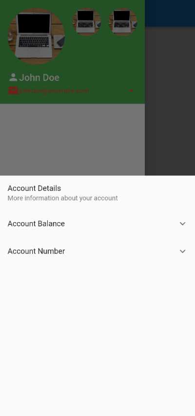
In this example, when the “details” icon is pressed in the UserAccountsDrawerHeader, a modal bottom sheet will be displayed showing more account details such as the account balance and account number. The ExpansionTile widgets are used to show the more detailed information, and can be expanded and collapsed by the user.
How to use elevated Buttons in the Flutter Drawer
Flutter Drawer with a list and ElevatedButtons with icons
To create a Flutter Drawer with a list of ElevatedButtons with icons, you can use the following code:
drawer: Drawer(
  child: Column(
    children: [
      UserAccountsDrawerHeader(
        accountName: Text('John Doe'),
        accountEmail: Text('johndoe@example.com'),
        currentAccountPicture: CircleAvatar(
          backgroundImage: NetworkImage(
              'https://picsum.photos/250?image=9'),
        ),
      ),
      ListTile(
        leading: Icon(Icons.mail),
        title: Text('Inbox'),
        onTap: () {
          // Navigate to Inbox screen
        },
      ),
      ListTile(
        leading: Icon(Icons.calendar_today),
        title: Text('Calendar'),
        onTap: () {
          // Navigate to Calendar screen
        },
      ),
      ListTile(
        leading: Icon(Icons.settings),
        title: Text('Settings'),
        onTap: () {
          // Navigate to Settings screen
        },
      ),
      SizedBox(height: 30),
      Expanded(
        child: Align(
          alignment: FractionalOffset.bottomCenter,
          child: Column(
            children: [
              ElevatedButton.icon(
                icon: Icon(Icons.exit_to_app),
                label: Text('Sign Out'),
                onPressed: () {
                  // Sign out
                },
              ),
            ],
          ),
        ),
      ),
    ],
  ),
),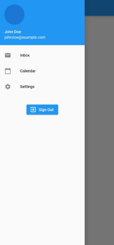
This will create a Drawer with a header that includes the user’s name, email, and profile picture. The Drawer will also have a list of options, each with a leading icon and a title. At the bottom of the Drawer, there will be an ElevatedButton with an icon (an exit icon) and a label (Sign Out). When the button is pressed, the onPressed callback will be executed.
Flutter Drawer with a column of ElevatedButtons and icons
To create a Flutter Drawer with a column of ElevatedButtons with icons, you can use the following code:
drawer: Drawer(
  child: Column(
    children: [
      UserAccountsDrawerHeader(
        accountName: Text('John Doe'),
        accountEmail: Text('johndoe@example.com'),
        currentAccountPicture: CircleAvatar(
          backgroundImage: NetworkImage(
              'https://picsum.photos/250?image=9'),
        ),
      ),
      Column(
        children: [
          SizedBox(
            width: 200,
            child: ElevatedButton.icon(
              icon: Icon(Icons.mail),
              label: Text('Inbox'),
              onPressed: () {
                // Navigate to Inbox screen
              },
            ),
          ),
          SizedBox(
            width: 200,
            child: ElevatedButton.icon(
              icon: Icon(Icons.calendar_today),
              label: Text('Calendar'),
              onPressed: () {
                // Navigate to Calendar screen
              },
            ),
          ),
          SizedBox(
            width: 200,
            child: ElevatedButton.icon(
              icon: Icon(Icons.settings),
              label: Text('Settings'),
              onPressed: () {
                // Navigate to Settings screen
              },
            ),
          ),
        ],
      ),
      SizedBox(height: 30),
      Expanded(
        child: Align(
          alignment: FractionalOffset.bottomCenter,
          child: ElevatedButton.icon(
            icon: Icon(Icons.exit_to_app),
            label: Text('Sign Out'),
            onPressed: () {
              // Sign out
            },
          ),
        ),
      ),
    ],
  ),
),
This will create a Drawer with a header that includes the user’s name, email, and profile picture. The Drawer will also have a column of ElevatedButtons with icons and labels. At the bottom of the Drawer, there will be another ElevatedButton with an icon (an exit icon) and a label (Sign Out). When the button is pressed, the onPressed callback will be executed.
Flutter drawer with Icons
To create a Drawer with a list of ListTile widgets that have icons and text, you can use the following code:
drawer: Drawer(
  child: ListView(
    children: [
      ListTile(
        leading: Icon(Icons.home),
        title: Text('Home'),
        onTap: () {
          // Navigate to home screen
        },
      ),
      ListTile(
        leading: Icon(Icons.settings),
        title: Text('Settings'),
        onTap: () {
          // Navigate to settings screen
        },
      ),
      ListTile(
        leading: Icon(Icons.favorite),
        title: Text('Favorites'),
        onTap: () {
          // Navigate to favorites screen
        },
      ),
      ListTile(
        leading: Icon(Icons.exit_to_app),
        title: Text('Logout'),
        onTap: () {
          // Logout the user
        },
      ),
    ],
  ),
),
This will create a Drawer with a list of ListTile widgets, each with an icon and text. The leading property of the ListTile is used to specify the icon, and the title property is used to specify the text. The onTap property is used to specify an action that should be performed when the ListTile is tapped.
You can customize the Drawer by modifying the widgets in the children list and by changing the properties of the Drawer widget. For example, you can use the header property to specify a DrawerHeader widget, or you can use the drawerBackgroundColor property to specify a background color for the Drawer.
How to change Flutter Drawer Icon
Flutter Drawer IconButton with Icon
To change the hamburger icon in the app bar of a Flutter app and open the drawer when the icon is pressed, you can use the leading property of the AppBar widget and the Scaffold widget’s drawer property.
The IconButton widget can be wrapped in the Builder widget to gain access to the Scaffold and open the drawer.
Here’s an example of how you can change the icon to a custom icon and open the drawer:
appBar: AppBar(
  title: Text('flutterassets.com'),
  leading: Builder(
    builder: (BuildContext context) {
      return IconButton(
        icon: const Icon(
          Icons.home,
        ),
        onPressed: () {
          Scaffold.of(context).openDrawer();
        },
        // tooltip: MaterialLocalizations.of(context).openAppDrawerTooltip,
      );
    },
  ),
),
@override
Widget build(BuildContext context) {
  return Scaffold(
    appBar: AppBar(
      title: Text('flutterassets.com'),
      leading: Builder(
        builder: (BuildContext context) {
          return IconButton(
            icon: const Icon(
              Icons.home,
            ),
            onPressed: () {
              Scaffold.of(context).openDrawer();
            },
            // tooltip: MaterialLocalizations.of(context).openAppDrawerTooltip,
          );
        },
      ),
    ),
    body: Center(
      child: Text('Home Page'),
    ),
    drawer: Drawer(
      child: ListView(
        children: [
          // ...
        ],
      ),
    ),
  );
}
In this example, the leading property is used to specify an IconButton widget, which displays a custom icon. When the icon button is pressed, the openDrawer method of the Scaffold widget is called to open the drawer.
You can then use the Scaffold widget’s drawer property to specify the drawer that should be displayed when the hamburger icon is pressed.
Flutter Drawer IconButton with Image
You can use any widget as the leading property, so you can use a custom icon by using an ImageIcon widget or any other widget that displays an icon.
AppBar(
  title: Text('flutterassets.com'),
  leading: Builder(
    builder: (BuildContext context) {
      return IconButton(
        icon: ImageIcon(
            AssetImage("assets/FlutterAssets_logo.png")
        ),
        onPressed: () {
          Scaffold.of(context).openDrawer();
        },
        // tooltip: MaterialLocalizations.of(context).openAppDrawerTooltip,
      );
    },
  ),
),
In this example the code works exactly as the code in my above section but it is using the ImageIcon.
Change Flutter Drawer Icon size and colour
To change Flutter Drawer Icon size and colour use properties of the Icon widget,
Here ias an example with the Icon:
appBar: AppBar(
  title: Text('flutterassets.com'),
  leading: Builder(
    builder: (BuildContext context) {
      return IconButton(
        icon: const Icon(
          Icons.home,
          size: 50,
          color: Colors.red,
        ),
        onPressed: () {
          Scaffold.of(context).openDrawer();
        },
        // tooltip: MaterialLocalizations.of(context).openAppDrawerTooltip,
      );
    },
  ),
),
Here ias an example with the ImageIcon:
appBar: AppBar(
  title: Text('flutterassets.com'),
  leading: Builder(
    builder: (BuildContext context) {
      return IconButton(
        icon: ImageIcon(
            AssetImage("assets/FlutterAssets_logo.png"),
          size: 50,
          color: Colors.red,
        ),
        onPressed: () {
          Scaffold.of(context).openDrawer();
        },
        // tooltip: MaterialLocalizations.of(context).openAppDrawerTooltip,
      );
    },
  ),
),
You can also add the iconTheme propertie to the AppBar. The effect will be the same as in my abobe axamples.
Here is an example:
AppBar(
  iconTheme: IconThemeData(color: Colors.red, size: 50),
)
appBar: AppBar(
iconTheme: IconThemeData(color: Colors.red, size: 50),
title: Text('flutterassets.com'),
leading: Builder(
builder: (BuildContext context) {
return IconButton(
icon: ImageIcon(
AssetImage("assets/FlutterAssets_logo.png"),
),
onPressed: () {
Scaffold.of(context).openDrawer();
},
// tooltip: MaterialLocalizations.of(context).openAppDrawerTooltip,
);
},
),
),How and where you can use the Drawer widget in Flutter
Few examples of creative ways you can use the Drawer widget in Flutter
- Personalized dashboard: You can use the
Drawerto create a personalized dashboard for the user, with widgets that display information that is specific to the user’s account, such as their name, profile picture, and bio. You can also add widgets that provide quick access to frequently used features or functions, such as a search bar, a list of recent activities, or a list of favourite items. - Navigation menu: You can use the
Drawerto create a navigation menu for your app, with links to different screens or sections of the app. You can use theDrawerHeaderto display a logo or other branding elements, and you can use the rest of theDrawerto list the various screens or sections of the app. - Settings screen: You can use the
Drawerto create a settings screen for your app, with options for configuring the app’s behaviour or appearance. You can use theDrawerHeaderto display a header image or other branding elements, and you can use the rest of theDrawerto list the various settings options.
- Contextual menu: You can use the
Drawerto create a contextual menu that appears in response to a user action, such as a long press or a swipe. For example, you can use theDrawerto display a list of options or actions that are relevant to the current context, such as a list of options for a selected item or a list of actions that can be performed on a particular screen. - Onboarding screens: You can use the
Drawerto create a series of onboarding screens that introduce users to your app and its features. You can use theDrawerHeaderto display a logo or other branding elements, and you can use the rest of theDrawerto display each onboarding screen, with a brief description of the app and its features.
- To-do list: You can use the
Drawerto create a to-do list that is accessible from anywhere in the app. You can use theDrawerHeaderto display a header image or other branding elements, and you can use the rest of theDrawerto display a list of to-do items, with options for adding, editing, or deleting items. - Notifications screen: You can use the
Drawerto create a notifications screen that displays alerts or updates from the app or other sources. You can use theDrawerHeaderto display a header image or other branding elements, and you can use the rest of theDrawerto display a list of notifications, with options for dismissing or marking them as read.
- User profile: You can use the
Drawerto create a user profile screen that displays information about the user, such as their name, profile picture, and bio. You can use theDrawerHeaderto display the user’s profile picture and name, and you can use the rest of theDrawerto display the user’s bio and other information, such as their location, occupation, or interests. - Contact list: You can use the
Drawerto create a contact list that displays a list of contacts, with options for adding, editing, or deleting contacts. You can use theDrawerHeaderto display a header image or other branding elements, and you can use the rest of theDrawerto display a list of contacts, with options for calling, texting, or emailing each contact.
- Bookmarks: You can use the
Drawerto create a bookmarks screen that displays a list of saved items, such as articles, videos, or images. You can use theDrawerHeaderto display a header image or other branding elements, and you can use the rest of theDrawerto display a list of bookmarks, with options for deleting or organizing them. - Product catalogue: You can use the Drawer to create a product catalogue that displays a list of products, with options for filtering, sorting, or searching for products. You can use the
DrawerHeaderto display a header image or other branding elements.
- Recipe database: You can use the
Drawerto create a recipe database that displays a list of recipes, with options for filtering, sorting, or searching for recipes. You can use theDrawerHeaderto display a header image or other branding elements, and you can use the rest of theDrawerto display a list of recipes, with options for viewing the ingredients and instructions for each recipe. - Music player: You can use the
Drawerto create a music player that displays a list of songs, with options for playing, pausing, or skipping songs. You can use theDrawerHeaderto display a header image or other branding elements, and you can use the rest of theDrawerto display a list of songs, with options for adding or removing songs from the playlist.
- Shopping cart: You can use the
Drawerto create a shopping cart that displays a list of items that the user has added to their cart, with options for removing or updating the quantities of each item. You can use theDrawerHeaderto display a header image or other branding elements, and you can use the rest of theDrawerto display a list of items in the cart, with options for checking out or continuing to shop. - Game menu: You can use the
Drawerto create a game menu that displays a list of options or settings for a game, such as sound effects, difficulty level, or control settings. You can use theDrawerHeaderto display a header image or other branding elements, and you can use the rest of theDrawerto display a list of options or settings for the game.


