What is the Flutter Stack widget?
The Flutter Stack widget in Flutter is a basic layout element that arranges other widgets on top of one another. It’s called a “stack” because the widgets are stacked on top of each other, with the most recently added widget appearing on top.
The Stack widget takes in a list of children and positions them on top of one another. You can specify how the children should be aligned within the Stack using the alignment property.
One common use for the Stack widget is to overlap a number of children, with some partially or fully transparent, to create a composite effect. You can use the Positioned widget within the Stack to position each child absolutely within the Stack.
Here’s an example of a Stack with three children:
Stack(
  alignment: Alignment.topRight,
  children: [
    Container(
      width: 300,
      height: 300,
      color: Colors.red,
    ),
    Container(
      width: 250,
      height: 250,
      color: Colors.green,
    ),
    Container(
      width: 200,
      height: 200,
      color: Colors.blue,
    ),
  ],
),
How to position children with Stack in Flutter
To position children within a Stack in Flutter, you can use the Positioned widget. The Positioned widget allows you to specify the top, right, bottom and left edges of the child widget relative to the Stack.
Here’s an example of using the Positioned widget to position children within a Stack:
Container(
  height: 100,
  width: 200,
  color: Colors.grey.shade200,
  child: Stack(
    children: const [
      Text('I am stacked'),
      Positioned(
        left: 50,
        top: 50,
        child: Text('I am over here'),
      ),
    ],
  ),
)
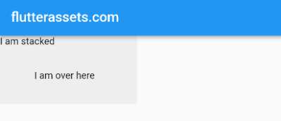
In this example, the second child, a Text widget with the text “I am over here”, is positioned 50 pixels from the left and 50 pixels from the top of the Stack.
Use Flutter Stack widget alignment
To specify the alignment of children within a Stack in Flutter, you can use the alignment property of the Stack widget. The alignment property takes in an Alignment value, which specifies the position of the children within the Stack.
Here’s an example of using the alignment property to align children within a Stack:
Container(
  height: 100,
  width: 200,
  color: Colors.grey.shade200,
  child: Stack(
    alignment: Alignment.topRight,
    children: const [
      Text('I am stacked'),
      Positioned(
        left: 50,
        top: 50,
        child: Text('I am over here'),
      ),
    ],
  ),
)
In this example, the children are aligned to the top-right corner of the Stack.
You can also use the Align widget to specify the alignment of children within a Stack. The Align widget allows you to specify an alignment for a single child, rather than all the children in the Stack.
Here’s an example of using the Align widget to align a single child within a Stack:
Container(
  height: 100,
  width: 200,
  color: Colors.grey.shade200,
  child: Stack(
    alignment: Alignment.topRight,
    children: const [
      Text('I am stacked'),
      Align(
        alignment: Alignment.bottomLeft,
        child: Text('I am over here'),
      ),
    ],
  ),
)
In this example, the second child, a Text widget with the text “I am over here”, is aligned to the bottom-left corner of the Stack.
Use the Flutter Stack widget with profile image and badge
Here’s an example of using the Stack widget to display a profile image with a badge overlaid on top of it:
Stack(
  children: [
    // The profile image
    Container(
      width: 100,
      height: 100,
      decoration: BoxDecoration(
        shape: BoxShape.circle,
        image: DecorationImage(
          image: NetworkImage('https://picsum.photos/250?image=9'),
          fit: BoxFit.cover,
        ),
      ),
    ),
    // The badge
    Positioned(
      right: 0,
      bottom: 0,
      child: Container(
        width: 30,
        height: 30,
        decoration: BoxDecoration(
          shape: BoxShape.circle,
          color: Colors.red,
        ),
        child: Center(
          child: Text(
            '1',
            style: TextStyle(
              color: Colors.white,
              fontSize: 22,
            ),
          ),
        ),
      ),
    ),
  ],
)
In this example, a Container with a circular BoxDecoration is used to display the profile image. The Positioned widget is used to position a second Container with a red circular BoxDecoration at the bottom-right corner of the Stack. The second Container contains a white Text widget with the text “1”, which serves as the badge.
You can adjust the position of the badge by changing the values of the right and bottom properties of the Positioned widget. You can also adjust the size and appearance of the badge by modifying the width, height, and decoration properties of the second Container.
Create profile page with Flutter Stack widget
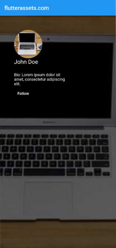
To create a profile screen in Flutter, you can follow these steps:
- Create a
Stackwidget as the root of your screen. This will allow you to overlap different widgets on top of each other. - Inside the
Stack, add a background colour or image using aContainerwidget. I added theColorFilteredwidget to blend black colour with the background image. You can also use aBoxDecorationto add a gradient, border, or other visual effects to the background. - Add a circle avatar for the profile picture using a
CircleAvatarwidget. You can specify the background image or color using thebackgroundImageorbackgroundColorproperty, respectively. - Overlap the avatar on top of the background using the
Positionedwidget. You can use thetopandleftproperties to specify the position of the avatar. - Add other information such as the user’s name, bio, and social media links using text and button widgets. You can use the
Positionedwidget to position these widgets relative to the avatar.
Here is an example of a profile screen in Flutter:
Stack(
  children: [
    ColorFiltered(
      colorFilter: ColorFilter.mode(Colors.black.withOpacity(0.6), BlendMode.srcOver),
      child: Container(
        decoration: BoxDecoration(
          color: Colors.black.withOpacity(0.5),
          image: DecorationImage(
            image: NetworkImage('https://picsum.photos/250?image=9'),
            fit: BoxFit.cover,
          ),
        ),
      ),
    ),
    Positioned(
      top: 50,
      left: 50,
      child: CircleAvatar(
        radius: 50,
        backgroundImage: NetworkImage('https://picsum.photos/250?image=9'),
      ),
    ),
    Positioned(
      top: 150,
      left: 50,
      child: Text(
        'John Doe',
        style: TextStyle(
          color: Colors.white,
          fontSize: 20,
        ),
      ),
    ),
    Positioned(
      top: 200,
      left: 50,
      child: Container(
        width: 200,
        child: Text(
          maxLines: 3,
          overflow: TextOverflow.ellipsis,
          'Bio: Lorem ipsum dolor sit amet, consectetur adipiscing elit.',
          style: TextStyle(
            color: Colors.white,
            fontSize: 14,
          ),
        ),
      ),
    ),
    Positioned(
      top: 250,
      left: 50,
      child: TextButton(
        onPressed: () {},
        child: Text(
          'Follow',
          style: TextStyle(
            color: Colors.white,
            fontSize: 14,
          ),
        ),
      ),
    ),
  ],
)
How to display text over the image in Flutter?
To display text over the image in Flutter, you can follow these steps:
- Create a
Stackwidget as the root of your screen. This will allow you to overlap different widgets on top of each other. - Inside the
Stack, add anImagewidget to display the image. You can specify the image using theimageproperty and set thefitproperty to determine how the image should be resized to fit the available space. - Overlap a text widget on top of the image using the
Positionedwidget. You can use thebottomandleftproperties to position the text widget relative to the image. - Use the
Textwidget to display the caption. You can use thestyleproperty to specify the font size, color, and other styling options for the text.
Here is an example of how you can display an image with a caption in Flutter:
Stack(
  children: const [
    Image(
      image: NetworkImage('https://picsum.photos/250?image=9'),
      fit: BoxFit.cover,
    ),
    Positioned(
      bottom: 10,
      left: 10,
      child: Text(
        'Caption',
        style: TextStyle(
          color: Colors.white,
          fontSize: 20,
        ),
      ),
    ),
  ],
)
You can also use a Container widget with a BoxDecoration and the image property to achieve the same result. In this case, you can use the alignment property to position the text widget relative to the image.
Container(
  height: 250,
  width: 250,
  padding: EdgeInsets.all(10),
  decoration: BoxDecoration(
    image: DecorationImage(
      image: NetworkImage('https://picsum.photos/250?image=9'),
      fit: BoxFit.cover,
    ),
  ),
  child: Align(
    alignment: Alignment.bottomLeft,
    child: Text(
      'Caption',
      style: TextStyle(
        color: Colors.white,
        fontSize: 20,
      ),
    ),
  ),
)
How to display Button over the image in Flutter?
To display Button over the image in Flutter, you can follow these steps:
- Create a
Stackwidget as the root of your screen. This will allow you to overlap different widgets on top of each other. - Inside the
Stack, add anImagewidget to display the image. You can specify the image using theimageproperty and set thefitproperty to determine how the image should be resized to fit the available space. - Overlap an interactive widget, such as a button or a
GestureDetector, on top of the image using thePositionedwidget. You can use thebottomandrightproperties to position the widget relative to the image. - Use the interactive widget to display the call-to-action and specify the action to be taken when the widget is tapped or clicked.
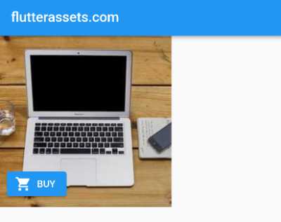
Here is an example of how you can display an image with a call-to-action button in Flutter:
Stack(
  children: [
    Image(
      image: NetworkImage('https://picsum.photos/250?image=9'),
      fit: BoxFit.cover,
    ),
    Positioned(
      bottom: 10,
      left: 10,
      child: ElevatedButton.icon(
        onPressed: () {  },
        icon: Icon(Icons.shopping_cart),
        label: Text('BUY'),
      ),
    ),
  ],
)
You can also use a Container widget with a BoxDecoration and the image property to achieve the same result. In this case, you can use the alignment property to position the interactive widget relative to the image.
Container(
  height: 250,
  width: 250,
  padding: EdgeInsets.all(10),
  decoration: BoxDecoration(
    image: DecorationImage(
      image: NetworkImage('https://picsum.photos/250?image=9'),
      fit: BoxFit.cover,
    ),
  ),
  child: Align(
    alignment: Alignment.bottomLeft,
    child: ElevatedButton.icon(
      onPressed: () {  },
      icon: Icon(Icons.shopping_cart),
      label: Text('BUY'),
    ),
  ),
)
Flutter Stack widgets usage ideas
Below is a list of some ideas wher the Stack widget can be used. Some of these ideas are with the examples in the post above.
- Overlaying a series of widgets: You can use the
Stackwidget to overlay a series of widgets on top of one another. For example, you could use it to display a profile picture with a badge or icon overlaid on top. - Creating a parallax effect: You can use the
Stackwidget to create a parallax effect by layering a series of images and using thePositionedwidget to offset them slightly. This can give the appearance of depth as the user scrolls. - Creating a card layout: You can use the
Stackwidget to create a card layout by overlaying a series of widgets on top of a background image or colour. This can be used to create visually appealing layouts for things like product listings or blog posts. - Displaying a progress indicator: You can use the
Stackwidget to display a progress indicator by overlaying a circular progress bar on top of an image. This can be used to show the progress of a download or other operation.
- Creating a splash screen: You can use the
Stackwidget to create a splash screen by overlaying a logo or other graphic on top of a background colour. This can be used to create a visually appealing entry point for your app. - Displaying a full-screen image: You can use the
Stackwidget to display a full-screen image by overlaying it on top of a background colour. This can be used to create a visually striking home screen or landing page. - Displaying a loading spinner: You can use the
Stackwidget to display a loading spinner by overlaying it on top of a transparent background. This can be used to indicate to the user that data is being loaded or an operation is in progress. - Creating a profile screen: You can use the
Stackwidget to create a profile screen by overlaying a profile picture and other information on top of a background colour or image. - Displaying an image with a caption: You can use the
Stackwidget to display an image with a caption by overlaying a text widget on top of the image. This can be used to provide context or additional information about the image. - Creating a photo gallery: You can use the
Stackwidget to create a photo gallery by overlaying a series of images on top of one another and using thePositionedwidget to offset them slightly. This can give the appearance of a stack of photos that the user can scroll through. - Creating a news feed: You can use the
Stackwidget to create a news feed by overlaying a series of widgets on top of a background colour or image. This can be used to create a visually appealing layout for a list of articles or other items. - Displaying a notification: You can use the
Stackwidget to display a notification by overlaying it on top of the screen. This can be used to alert the user to important information or events. - Creating a map view: You can use the
Stackwidget to create a map view by overlaying a map image on top of a background colour or image. This can be used to create a visually appealing layout for a map-based app. - Displaying an image with a call-to-action: You can use the
Stackwidget to display an image with a call-to-action by overlaying a button or other interactive widget on top of the image. This can be used to encourage the user to take a specific action, such as signing up for a newsletter or purchasing a product.


