What is the footer in mobile apps?
In a mobile app, a footer is a graphical element that appears at the bottom of a screen or page. It is often used to display information such as credits, copyright notices, and links to additional resources.
A footer can be used to navigate between different pages or sections of an app or to provide access to auxiliary features or functions. For example, a footer may contain icons that allow the user to access their account settings, view notifications, or share content.
The design and functionality of a footer can vary depending on the app and the specific needs of the user. Some common features of a footer in a mobile app include:
- Navigation icons: Icons that allow the user to navigate between different pages or sections of the app.
- Links: Links to additional resources, such as a support page or privacy policy.
- Copyright notice: A notice indicating the app’s copyright information.
- Social media links: Links to the app’s social media accounts or profiles.
A footer is typically located at the bottom of the app’s main screen, but it can also appear on individual pages or screens as needed.
Flutter bottomNavigationBar property
The Flutter bottomNavigationBar is a property of the Scaffold widget in Flutter that allows you to create a bottom navigation bar as part of the app’s main screen. The bottomNavigationBar property takes any widget as its value, so you can use any widget that you want as the bottom navigation bar of your app.
For example, you can use a Container widget to create a simple footer with a fixed height and a background colour:
return Scaffold(
  appBar: AppBar(
    title: Text('flutterassets.com'),
  ),
  body: Container(
    // your app content goes here
  ),
  bottomNavigationBar: Container(
    padding: EdgeInsets.all(12),
    height: 50.0,
    color: Colors.grey[200],
    child: Text('Footer'),
  ),
);
You can also use other layout widgets, such as Row or Column, to arrange the elements of the footer.
Flutter bottomNavigationBar with copyright notice
In this example, you can use a Row widget to create a footer with multiple elements, such as icons and a copyright notice:
@override
Widget build(BuildContext context) {
  return Scaffold(
    appBar: AppBar(
      title: Text('flutterassets.com'),
    ),
    body: Container(
      // your app content goes here
    ),
    bottomNavigationBar: Container(
      child: Row(
        mainAxisAlignment: MainAxisAlignment.spaceBetween,
        children: [
          IconButton(
            icon: Icon(Icons.home),
            onPressed: () {
              // navigate to home page
            },
          ),
          Text(
            'Copyright © Your Company 2023',
            style: TextStyle(fontSize: 14.0),
          ),
          IconButton(
            icon: Icon(Icons.info),
            onPressed: () {
              // navigate to about page
            },
          ),
        ],
      ),
      height: 50.0,
      color: Colors.grey[200],
    ),
  );
}
Flutter bottomNavigationBar with social media links
To add a social media icons to the flutter project first you should use one of the packages that offer the social media icons. In this example you can use font_awesome_flutter.
First you need to add it to the dependencies in your pubspec.yaml and than import into your Dart file.
dependencies:
  font_awesome_flutter: ^10.3.0
import 'package:font_awesome_flutter/font_awesome_flutter.dart';Here’s an example of how you can use a Container and a Row of social media icons to create a custom bottom navigation bar in Flutter:
int _selectedIndex = 0;

void _onItemTapped(int index) {
  setState(() {
    _selectedIndex = index;
  });
}

@override
Widget build(BuildContext context) {
  return Scaffold(
    body: Container(
      alignment: Alignment.bottomCenter,
      child: Text('Selected tab: $_selectedIndex'),
    ),
    bottomNavigationBar: Container(
      height: 50,
      child: Row(
        mainAxisAlignment: MainAxisAlignment.spaceEvenly,
        children: [
          IconButton(
            icon: Icon(FontAwesomeIcons.facebook),
            onPressed: () => _onItemTapped(0),
          ),
          IconButton(
            icon: Icon(FontAwesomeIcons.twitter),
            onPressed: () => _onItemTapped(1),
          ),
          IconButton(
            icon: Icon(FontAwesomeIcons.instagram),
            onPressed: () => _onItemTapped(2),
          ),
          IconButton(
            icon: Icon(FontAwesomeIcons.pinterest),
            onPressed: () => _onItemTapped(3),
          ),
        ],
      ),
    ),
  );
}
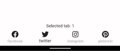
This code creates a custom bottom navigation bar using a Container widget and a Row of IconButton widgets. The IconButton widgets represent the tabs in the navigation bar, and the _onItemTapped function is called when the user taps on a tab. The _selectedIndex variable is used to keep track of the selected tab, and the body of the Scaffold widget displays the index of the selected tab.
You can customize the appearance and behavior of the bottom navigation bar by using various properties of the Container and Row widgets. For example, you can change the background color, add padding or margins to the container, and specify the alignment of the icons within the row.
You can also use BottonNavigationBar widget to display the social media icons:
int _selectedIndex = 0;

void _onItemTapped(int index) {
  setState(() {
    _selectedIndex = index;
  });
}

@override
Widget build(BuildContext context) {
  return Scaffold(
    body: Container(
      alignment: Alignment.bottomCenter,
      child: Text('Selected tab: $_selectedIndex'),
    ),
    bottomNavigationBar: BottomNavigationBar(
      selectedItemColor: Colors.black87,
      unselectedItemColor: Colors.grey.shade500,
      type: BottomNavigationBarType.fixed,
      items: [
        BottomNavigationBarItem(
          icon: Icon(FontAwesomeIcons.facebook, color: Colors.black87,),
          label: 'facebook',
        ),
        BottomNavigationBarItem(
          icon: Icon(FontAwesomeIcons.twitter, color: Colors.black87,),
          label: 'twitter',
        ),
        BottomNavigationBarItem(
          icon: Icon(FontAwesomeIcons.instagram, color: Colors.black87,),
          label: 'instagram',
        ),
        BottomNavigationBarItem(
          icon: Icon(FontAwesomeIcons.pinterest, color: Colors.black87,),
          label: 'pinterest',
        ),
      ],
      currentIndex: _selectedIndex,
      onTap: _onItemTapped,
    ),
  );
}
Flutter BottomNavigationBar
The BottomNavigationBar is a widget in Flutter that allows you to create a bottom navigation bar with a set of icons and corresponding destinations. It is often used to navigate between different pages or sections of an app.
The BottomNavigationBar widget is a material design widget that displays a horizontal row of tabs at the bottom of the screen. Each tab is represented by an icon and a label, and the user can tap on a tab to navigate to the corresponding destination.
Here’s an example of how you can use the BottomNavigationBar widget to create a simple bottom navigation bar:
bottomNavigationBar: BottomNavigationBar(
  items: const [
    BottomNavigationBarItem(
      icon: Icon(Icons.home),
      label: 'Home',
    ),
    BottomNavigationBarItem(
      icon: Icon(Icons.info),
      label: 'About',
    ),
  ],
  onTap: (int index) {
    // handle tap events
  },
),
This will create a bottom navigation bar with two icons, “Home” and “About”, that the user can tap to navigate between different pages or sections of the app.
Customize Flutter BottomNavigationBar
To customize the appearance and behavior of the BottomNavigationBar widget in Flutter, you can use various properties of the widget. Here are some examples of how you can customize the BottomNavigationBar:
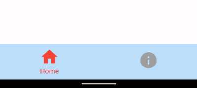
- Change the background colour: You can use the backgroundColor property to specify the background colour of the bottom navigation bar. For example:
BottomNavigationBar(
  backgroundColor: Colors.blue.shade100,
  ...
),- Add a fixed width for each tab: You can use the
fixedColorandiconSizeproperties to specify the width of each tab. ThefixedColorproperty specifies the colour of the selected tab, and theiconSizeproperty specifies the size of the icon within the tab. For example:
BottomNavigationBar(
  fixedColor: Colors.red,
  iconSize: 30,
  ...
),- Specify the type of animation to use when switching between tabs: You can use the
typeproperty to specify the type of animation to use when switching between tabs. There are three possible values for thetypeproperty:fixed,shifting. For example:
BottomNavigationBar(
  type: BottomNavigationBarType.shifting,
  ...
),- Show labels for each tab: You can use the
showSelectedLabelsandshowUnselectedLabelsproperties to specify whether to show labels for the selected and unselected tabs, respectively. For example:
BottomNavigationBar(
  showSelectedLabels: true,
  showUnselectedLabels: false,
  ...
),
Full example code:
int _selectedIndex = 0;

void _onItemTapped(int index) {
  setState(() {
    _selectedIndex = index;
  });
}

@override
Widget build(BuildContext context) {
  return Scaffold(
    body: Container(

    ),
    bottomNavigationBar: BottomNavigationBar(
      backgroundColor: Colors.blue.shade100,
      fixedColor: Colors.red,
      unselectedItemColor: Colors.grey.shade500,
      // type: BottomNavigationBarType.shifting,
      iconSize: 40,
      showSelectedLabels: true,
      showUnselectedLabels: false,
      items: const [
        BottomNavigationBarItem(
          icon: Icon(Icons.home),
          label: 'Home',
        ),
        BottomNavigationBarItem(
          icon: Icon(Icons.info),
          label: 'About',
        ),

      ],
      currentIndex: _selectedIndex,
      onTap: _onItemTapped,
    ),
  );
}
Notice: I do not know how this happend and cannot resolve this right now, but every time I use type property with the BottomNavigationBar, the backgroundColor stops working. Also the elevation is not working for me eighter.
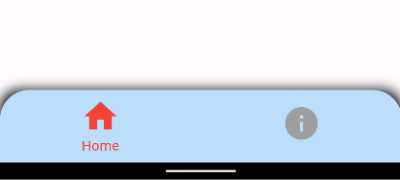
For additional customization, you can wrap your BottomNavigationBar in a container and use the decoration property to further customize its appearance.
int _selectedIndex = 0;

void _onItemTapped(int index) {
  setState(() {
    _selectedIndex = index;
  });
}

@override
Widget build(BuildContext context) {
  return Scaffold(
    body: Container(

    ),
    bottomNavigationBar: Container(
      decoration: BoxDecoration(
        borderRadius: BorderRadius.only(
            topLeft: Radius.circular(20.0),
            topRight: Radius.circular(20.0)
        ),
        boxShadow: <BoxShadow>[
          BoxShadow(
            color: Colors.black,
            blurRadius: 10,
          ),
        ],
      ),
      child: ClipRRect(
        borderRadius: BorderRadius.only(
          topLeft: Radius.circular(30.0),
          topRight: Radius.circular(30.0),
        ),
        child: BottomNavigationBar(
          // elevation: 5,
          backgroundColor: Colors.blue.shade100,
          fixedColor: Colors.red,
          unselectedItemColor: Colors.grey.shade500,
          // type: BottomNavigationBarType.shifting,
          iconSize: 40,
          showSelectedLabels: true,
          showUnselectedLabels: false,
          items: const [
            BottomNavigationBarItem(
              icon: Icon(Icons.home),
              label: 'Home',
            ),
            BottomNavigationBarItem(
              icon: Icon(Icons.info),
              label: 'About',
            ),

          ],
          currentIndex: _selectedIndex,
          onTap: _onItemTapped,
        ),
      ),
    ),
  );
}


