All apps on the market need to use some sort of menu and the menu is one most widely used in software development. When we want to develop an app in flutter plenty of time we use menus on the appBar. AppBar is the first thing we see when we open any application.
Menu types in Flutter.
In flutter, we can use a few different menus in our project. The list below is showing a few menu names we can find online. Some of the items on this list mean exactly the same and might be used interchangeably.
- Action Bar Menu
- Navigation/Drawer Menu
- Bottom Bar Menu / Bottom Navigation Bar
- Drop Down Menu
- Hamburger menu
- Tabber
- Popup Menu
- Options Menu
- Context menu

What is the Context menu?
A context menu is a pop-up menu which offers shortcuts for actions that the software developer predicts the user will perform. In a Windows system, the context menu is accessed by right-clicking the mouse. This way, the users can click on the item and can select an appropriate action.
In mobile applications, we simply click on the screen or long-press and the context menu or pop-up menu might appear. From that menu, we can select the action we need.
Add a Context menu or Focused pop-up menu to almost any widget in Flutter.
So, in my example, I will be using the focused_menu_custom package. This is an updated version of a bit older package called focused_menu. These packages are almost identical and the same people are involved in the development.
Then, what is the difference between those two packages? I think at this moment the focused_menu_custom lets you use a click and a long-press, and the older version was designed for long-press only.
To install this, add the plugin to dependencies in your pubspec.yaml and run flutter pub get.
dependencies:
  focused_menu_custom: ^1.1.1
Now you can add it to your Dart code.
import 'package:focused_menu_custom/focused_menu.dart';
import 'package:focused_menu_custom/modals.dart';
Add Flutter Focused Menu to a text
How to add focused many to a text. You can wrap your text with the FocusedMenuHolder. Below I use the widget without the additional properties. This example works with a long-press on the Text widget. This is a snippet of a stripped code from the project page.
FocusedMenuHolder(
  menuItems: <FocusedMenuItem>[
    FocusedMenuItem(
        title: Text("Share"),
        trailingIcon: Icon(Icons.share),
        onPressed: (){}),
  ],
  onPressed: (){},
  child: Text('Open - flutterassets.com'),
),
In order to work with a click or tap we need to add another parameter to your code. We can add openWithTap. This uses a boolean value. If we set this to true the context menu will open on tap. But if we change it to false it will work with a long-press.
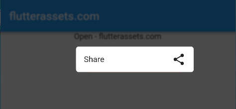
FocusedMenuHolder(
  openWithTap: true, // Open Focused-Menu on Tap rather than Long Press
  menuItems: <FocusedMenuItem>[
    FocusedMenuItem(
        title: Text("Share"),
        trailingIcon: Icon(Icons.share),
        onPressed: (){}),
  ],
  onPressed: (){},
  child: Text('Open - flutterassets.com'),
),
While using this code I was wondering why we have two onPressed() parameters. If we disable the first one the code still will work, but maybe it has a secret functionality too. The only mandatory item inside the FocusedMenuItem is the Text, so you can skip the icon if you need.
What are the other properties of the Focused Pop-up Menu?
The widget provides a few options for customization.
- openWithTap: true, as I mentioned before, it opens Focused-Menu on Tap rather than Long Press
- menuWidth: MediaQuery.of(context).size.width*0.50, this is the width of the menu, it uses the double value
- blurSize: 5.0 – this changes the amount of blur behind the context menu.
- menuBoxDecoration: BoxDecoration(color: Colors.red, borderRadius: BorderRadius.all( Radius.circular(10.0))), so it uses the BoxDecoration inside.
- duration: Duration(milliseconds: 200), determines how fast the context menu will appear
- animateMenuItems: true, this is additional menu animation
- blurBackgroundColor: Colors.black54, this is the colour of the background
- menuOffset: 10.0, Offset value to show menuItem from the selected item
- bottomOffsetHeight: 10.0, Offset height to consider, for showing the menu item ( for example bottom navigation bar), so that the popup menu will be shown on top of the selected item.
Add more items to the Focused Pop-up Menu
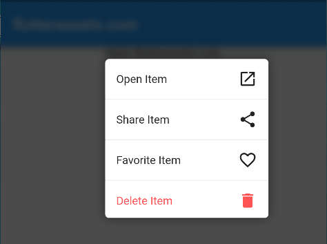
You can add more to the menu by simply adding more FocusedMenuItems. If you set up the animateMenuItems: true, you should see the menu animation in action.
FocusedMenuHolder(
  openWithTap: true,
  menuItems: <FocusedMenuItem>[
    FocusedMenuItem(
        title: Text("Open"),
        trailingIcon: Icon(Icons.open_in_new),
        onPressed: (){
          Navigator.push(context, MaterialPageRoute(builder: (context)=>ScreenTwo()));
        }),
    FocusedMenuItem(
        title: Text("Share"),
        trailingIcon: Icon(Icons.share),
        onPressed: (){}),
    FocusedMenuItem(
        title: Text("Favorite"),
        trailingIcon: Icon(Icons.favorite_border),
        onPressed: (){}),
    FocusedMenuItem(
        title: Text("Delete",
          style: TextStyle(color: Colors.redAccent),),
        trailingIcon: Icon(Icons.delete,color: Colors.redAccent,),
        onPressed: (){}),
  ],
  onPressed: (){},
  child: Text('Open - flutterassets.com'),
),
Now it is time for all the parameters in action. The Text which is a child of FocusedMenuHolder can be wrapped with Container, Card, Column, Row or almost anything you want.

FocusedMenuHolder(
  menuWidth: MediaQuery.of(context).size.width*0.50,
  blurSize: 1.0,
  menuItemExtent: 45,
  menuBoxDecoration: BoxDecoration(
      color: Colors.red,
      borderRadius: BorderRadius.all(Radius.circular(10.0))),
  duration: Duration(milliseconds: 100),
  animateMenuItems: true,
  blurBackgroundColor: Colors.black54,
  openWithTap: true,
  menuOffset: 10.0,
  bottomOffsetHeight: 10.0,
  menuItems: <FocusedMenuItem>[
    FocusedMenuItem(
        title: Text("Open"),
        trailingIcon: Icon(Icons.open_in_new),
        onPressed: (){
          Navigator.push(context,
              MaterialPageRoute(builder: (context)=>ScreenTwo()));
        }),
    FocusedMenuItem(
        title: Text("Share"),
        trailingIcon: Icon(Icons.share),
        onPressed: (){}),
    FocusedMenuItem(
        title: Text("Favorite"),
        trailingIcon: Icon(Icons.favorite_border),
        onPressed: (){}),
    FocusedMenuItem(
        title: Text("Delete",
          style: TextStyle(color: Colors.redAccent),),
        trailingIcon: Icon(Icons.delete,color: Colors.redAccent,),
        onPressed: (){}),
  ],
  onPressed: (){},
  child: Text('Open - flutterassets.com'),
),
How to add the Focused Pop-up Menu to the Icon
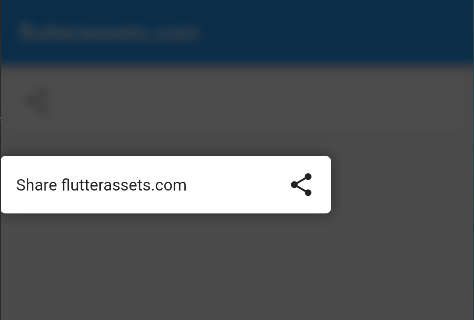
As I showed you in the text above, the Focussed Pop-up menu can be used with other widgets too. So, what do we do now? We can replace the text with an icon. In the case below I also wrapped the icon with the card for better visual representation. You can wrap it with Container and add a nice background colour.
FocusedMenuHolder(
  openWithTap: true,
  menuItems: <FocusedMenuItem>[
    FocusedMenuItem(
        title: Text("Share"),
        trailingIcon: const Icon(Icons.share),
        onPressed: (){}),
  ],
  onPressed: (){},
  child: const Card(
      child: ListTile(
        leading: Icon(Icons.share),
      )
  ),
),
How to add the Focused Pop-up Menu to the Image
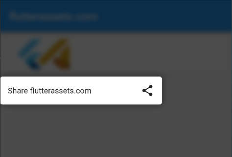
To add the Focused Pop-up Menu to the image do the same as above. Wrap the image with the FocusedMenuHolder. You can also wrap the image with another widget the same as I did in my example below.
FocusedMenuHolder(
  openWithTap: true,
  menuItems: <FocusedMenuItem>[
    FocusedMenuItem(
        title: Text("Share"),
        trailingIcon: const Icon(Icons.share),
        onPressed: (){}),
  ],
  onPressed: (){},
  child: Container(
    // height: 120,
    child: Card(
        child: Padding(
          padding: const EdgeInsets.all(8.0),
          child: ListTile(
            leading: SizedBox(
              width: 100,
                // height: 100,
                child: Image.asset('assets/flutterassets_logo.png',
                    fit: BoxFit.cover)),
          ),
        )
    ),
  ),
),
How to add the Focused Pop-up Menu to a ListView
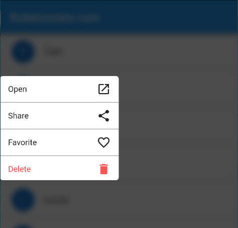
To add this Context Menu we do exactly the same steps as we did with our Text, Icon, and Image widget. First, we can create a list with some names. This list will be populated in the ListViev. Inside the list, I use a Card with a text widget.
final List<String> _names = [
  'Tom', 'Sam', 'Oli', 'Will', 'Lucas',
  'Elon', 'Ben', 'Abby', 'Emma', 'Emily', 'Alexandra'
];
ListView.builder(
itemBuilder: (_, i) {
String name = _names[i];
return Card(
child: ListTile(
leading: CircleAvatar(
child: Text('${name[0]}'),
),
title: Text('$name'),
)
);
},
itemCount: _names.length,
),Now, we can wrap the card with our FocusedMenuHolder with the nenuItems: [] and onPressed(){}. Into menuItems add the FocusedMenuItem with the item title. You can also add the openWithTap: true, so it will work with a tap.

ListView.builder(
  itemBuilder: (_, i) {
  String name = _names[i];
  return FocusedMenuHolder(
    openWithTap: true,
    menuItems: [
    FocusedMenuItem(
      title: Text("Share"),
      trailingIcon: Icon(Icons.share),
      onPressed: (){}),
    ],
    onPressed: (){},
    child: Card(
      child: ListTile(
        leading: CircleAvatar(
          child: Text('${name[0]}'),
          ),
          title: Text('$name'),
      )
    ),
  );
    },
      itemCount: _names.length,
  ),
How to add a Focused Pop-up menu to the GridView
Typical GridView might look like this. We have a simple grid with Images inside.
GridView.count(
  crossAxisCount: 3,
  crossAxisSpacing: 10.0,
  mainAxisSpacing: 10.0,
  shrinkWrap: true,
  children: List.generate(20, (index) {
    return Padding(
      padding: const EdgeInsets.all(10.0),
      child: Container(
      decoration: const BoxDecoration(
        image: DecorationImage(
          image: AssetImage('assets/flutterassets_logo.png'),
          fit: BoxFit.cover,
        ),
          borderRadius:
          BorderRadius.all(Radius.circular(20.0),),
          ),
        ),
      );
    },
  ),
)
The procedure is the same. The first child inside the grid view is a Padding widget. You can wrap return padding with our new FocusedMenuHolder and again add the menuItems[] and onPressed: (){},

GridView.count(
  crossAxisCount: 3,
  crossAxisSpacing: 10.0,
  mainAxisSpacing: 10.0,
  shrinkWrap: true,
  children: List.generate(20, (index) {
    return FocusedMenuHolder (
      openWithTap: true,
          menuItems: [
          FocusedMenuItem(
            title: Text("Share"),
            trailingIcon: Icon(Icons.share),
            onPressed: (){}),
          ],
          onPressed: (){},
        child: Padding(
        padding: const EdgeInsets.all(10.0),
        child: Container(
        decoration: const BoxDecoration(
          image: DecorationImage(
            image: AssetImage('assets/flutterassets_logo.png'),
            fit: BoxFit.cover,
          ),
            borderRadius:
            BorderRadius.all(Radius.circular(20.0),),
            ),
          ),
        ),
    );
    },
  ),
)
At the end day, I want to say, you can use the context menu anywhere, but it is up to you to find to use this package as you want

