Flutter ring_button_group is a group of buttons displayed on a sized ring
This is a brand-new (at the time of writing) package that gives us the possibility to place the buttons inside the ring. This is fully configurable and easy to use.
This package was created by xeric.
How to create a Flutter ring button group with ease!
First of all, add the package into pubspec.yaml file and run flutter pub get.
dependencies:
  ring_button_group: ^1.0.1
Next, you need to import the package into your dart file.
import 'package:ring_button_group/ring_button_group.dart';Ring buttons in action
The widget is simple to use. In the example below we have 5 buttons with the option to select multiple buttons (RingButtonGroupType.MULTIPLE_SELECTABLE). Each button is represented as icon. The number of buttons needs to be the same as the number of icons. SizedBox defines the size of the ring.
When utilizing this ring button group, this widget should be enclosed by a SizedBox or similar widget with width and height attributes, and it must be a square.
Padding(
  padding: const EdgeInsets.all(8.0),
  child: Center(
    child: SizedBox(
      width: 200,
      height: 200,
      child: RingButtonGroup(
        buttonNumber: 5,
        icons: const [
          Icon(Icons.flag_circle_outlined, color: Colors.white,),
          Icon(Icons.gamepad_outlined, color: Colors.white,),
          Icon(Icons.cabin, color: Colors.white,),
          Icon(Icons.safety_check_outlined, color: Colors.white,),
          Icon(Icons.data_exploration_outlined, color: Colors.white,),
        ],
        type: RingButtonGroupType.MULTIPLE_SELECTABLE,
        pressedIndex: const {1},
        shadowEffect: true,
        onPressed: (index, selected) {  },
      ),
    ),
  ),
),
Disabled ring buttons
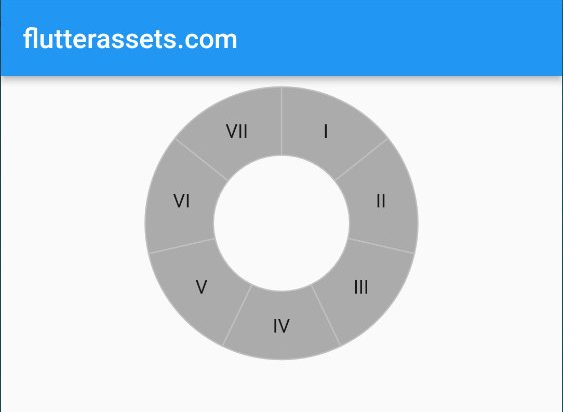
In the second example, we have the disabled ring with seven buttons, so no pressing is available. We also can change the button size and the number of buttons. The number of labels needs to be the same as the number of buttons. This example uses single selectable button RingButtonGroupType.SINGLE_SELECTABLE.
Padding(
  padding: const EdgeInsets.all(8.0),
  child: Center(
    child: SizedBox(
      width: 200,
      height: 200,
      child: RingButtonGroup(
        disabled: true,
        buttonNumber: 7,
        buttonSize: 50,
        labels: const [
          Text("I"),
          Text("II"),
          Text("III"),
          Text("IV"),
          Text("V"),
          Text("VI"),
          Text("VII"),
        ],
        type: RingButtonGroupType.SINGLE_SELECTABLE,
        pressedIndex: const {1},
        onPressed: (index, selected) {  },
      ),
    ),
  ),
),
Customize the RingButtonGroup
RingButtonGroup can be easly customised. Below you can see the orginal list of attributes from the project page. Also you can customize your text an icons.
More about icons in flutter you can find here.
More about text in flutter you can find here.
RingButtonGroup Attributes
| Attribute | Type | Default | Annotation |
|---|---|---|---|
| buttonNumber | int | total number of buttons in this group, must be greater than 1 | |
| pressedIndex | Set | {} | a list of indexes of button which should be pressed when rendering, index starts from 0 |
| onPressed | OnPressedFunction? | null | Function(int index, Set |
| disabled | bool | false | navigation buttons of BottomBarWithSheet |
| buttonSize | double | 40 | the size of button, it identifies the radius of the circle |
| toneColor | Color | Colors.blueAccent | main color of the button |
| tintColor | Color | Colors.blueGrey | button color while pressing down |
| activeColor | Color | Colors.lightBlueAccent | button color after pressed |
| borderColor | Color | Colors.lightBlueAccent | button border color |
| disableColor | Color | Colors.blueAccent | disabled main color, when color same with toneColor, auto transform to grayscale |
| disableBorderColor | Color | Colors.lightBlueAccent | disabled border color, when color same with borderColor, auto transform to grayscale |
| icons | List | null | button icons list, while set, the list length must be same with buttonNumber |
| labels | List | null | button label list, only works when icons is null, the list length must be same with buttonNumber |
| child | Widget? | null | a child of ring button, common case is put a circle in the center for display purpose |
| shadowEffect | bool | false | use a inner shadow effects in pressed/selected button |
RingButtonGroupType
| type | description |
|---|---|
| PRESS_ONLY | such type only allow press action, but will not stay in pressed/selected state |
| SINGLE_SELECTABLE | only allow one of buttons stay in pressed/selected state, like a radio box |
| MULTIPLE_SELECTABLE | allow multiple pressed like a checkbox |
RingButtonGroup with a text output
The example below shows all the ring buttons attributes with output text in the center of the ring.
Padding(
  padding: const EdgeInsets.all(8.0),
  child: Center(
    child: SizedBox(
      width: 200,
      height: 200,
      child: RingButtonGroup(
        disabled: false,
        buttonNumber: 6,
        buttonSize: 50,
        toneColor: Colors.deepOrange,
        borderColor: Colors.orange,
        activeColor: Colors.deepOrange.shade200,
        tintColor: Colors.deepOrange.shade400,
        disableColor: Colors.black54,
        disableBorderColor: Colors.red,
        shadowEffect: true,
        labels: const [
          Text("ONE", style: TextStyle(color: Colors.white),),
          Text("2", style: TextStyle(color: Colors.white),),
          Text("3", style: TextStyle(color: Colors.white),),
          Text("4", style: TextStyle(color: Colors.white),),
          Text("5", style: TextStyle(color: Colors.white),),
          Text("6", style: TextStyle(color: Colors.white),),
        ],
        type: RingButtonGroupType.SINGLE_SELECTABLE,
        // pressedIndex: {},
        onPressed: (index, selected) {
          setState(() {
            displayName = "Test $index";
          });
        },
        child: Center(
          child: Container(
              decoration: BoxDecoration(
                color: Colors.amber.shade100,
                border: Border.all(color: Colors.orange),
                borderRadius: BorderRadius.circular(50),
                boxShadow: const [BoxShadow(blurStyle: BlurStyle.outer, color: Colors.black12, blurRadius: 5)],
              ),
              width: 90,
              height: 90,
              child: Center(child: Text(displayName))
          ),
        ),
      ),
    ),
  ),
),
Ring buttons inside ring buttons
To achive a nice effect you can place a ring button group inside another ring button group using Stack widget. To place the widget inside anothe widget you need to maipulate the padding a little.
Stack(
  children: [
    Padding(
      padding: const EdgeInsets.all(10.0),
      child: Center(
        child: SizedBox(
          width: 250,
          height: 250,
          child: RingButtonGroup(
            buttonNumber: 5,
            // buttonSize: 50,
            icons: const [
              Icon(Icons.flag_circle_outlined, color: Colors.white,),
              Icon(Icons.gamepad_outlined, color: Colors.white,),
              Icon(Icons.cabin, color: Colors.white,),
              Icon(Icons.safety_check_outlined, color: Colors.white,),
              Icon(Icons.data_exploration_outlined, color: Colors.white,),
            ],
            type: RingButtonGroupType.MULTIPLE_SELECTABLE,
            pressedIndex: const {1},
            shadowEffect: true,
            onPressed: (index, selected) {  },
          ),
        ),
      ),
    ),
    Padding(
      padding: const EdgeInsets.all(60.0),
      child: Center(
        child: SizedBox(
          width: 150,
          height: 150,
          child: RingButtonGroup(
            buttonNumber: 5,
            buttonSize: 55,
            toneColor: Colors.deepOrange,
            borderColor: Colors.orange,
            activeColor: Colors.deepOrange.shade200,
            tintColor: Colors.deepOrange.shade400,
            icons: const [
              Icon(Icons.face_retouching_natural_outlined, color: Colors.white,),
              Icon(Icons.get_app_outlined, color: Colors.white,),
              Icon(Icons.handshake_outlined, color: Colors.white,),
              Icon(Icons.safety_divider, color: Colors.white,),
              Icon(Icons.dashboard, color: Colors.white,),
            ],
            type: RingButtonGroupType.MULTIPLE_SELECTABLE,
            pressedIndex: const {1},
            shadowEffect: true,
            onPressed: (index, selected) {  },
          ),
        ),
      ),
    ),
  ],
)
pub.dev
https://pub.dev/packages/ring_button_group


