What is the side slide menu in Flutter
A side slide menu, also known as a navigation drawer, is a common navigation pattern used in mobile apps to provide users with quick access to important features and actions. It typically appears as a panel that slides out from the side of the screen, revealing a list of options or links.
The side slide menu is typically invoked by tapping on a hamburger icon or by swiping from the left edge of the screen. The menu can be opened and closed by the user, allowing them to access the options or links at any time.
Some common features that can be included in a side slide menu include:
- Navigation links: Links that allow users to navigate between different sections of the app.
- Profile information: Information about the logged-in user, such as their name and profile picture.
- Settings: Options for adjusting app settings and preferences.
- Help and support: Links to help documentation or support resources.
- Logout: An option for logging out of the app.
The side slide menu is a convenient and efficient way to provide users with quick access to important features and actions, making it a popular navigation pattern in mobile apps. It can help to improve the overall user experience and make it more efficient for users to accomplish their tasks.
Slide menu in Flutter with AnimatedBuilder
Here I will try to explain how you can create a side sliding menu with AnimatedBuilder.
Flutter Slide menu _MyHomePageState class:
class _MyHomePageState extends State<MyHomePage> with SingleTickerProviderStateMixin{

  late AnimationController _controller;
  late Animation _animation;
  bool _isOpen = false;

  @override
  void initState() {
    super.initState();
    _controller = AnimationController(
      duration: Duration(seconds: 1),
      vsync: this,
    );
    _animation = Tween<double>(begin: 0, end: 200).animate(_controller);
  }

  @override
  void dispose() {
    _controller.dispose();
    super.dispose();
  }

  @override
  Widget build(BuildContext context) {
    return Scaffold(
      // ...
    );
  }
}
This class extends the State class and mixes in the SingleTickerProviderStateMixin. It has an AnimationController object and an Animation object. The AnimationController controls the animation, while the Animation object defines the animation. The class also has a boolean variable _isOpen which keeps track of whether the side menu is open or closed.
The initState method initializes the AnimationController and Animation objects. The build method returns a Scaffold widget which is a pre-built widget in Flutter that provides a default app structure. The Scaffold widget has an appBar with a title and an IconButton.
The IconButton, when pressed, triggers the animation by calling the forward or reverse method on the AnimationController object depending on the value of _isOpen. The Scaffold also has a body with a Stack widget that contains a Container which is the main body of the app and a Positioned widget which is the animated side menu.
The Positioned widget contains an AnimatedBuilder widget which takes the animation and the builder callback, it returns a Container widget with the animated width and a child Column with a list of MyListTile widgets. The MyListTile widgets are custom widgets that are used to display items in the side menu.
Flutter Slide menu MyListTile: (this class widget will be described also below)
MyListTile(
 icon: Icons.info_outlined,
 title: "Menu Item 1",
 onTap: (){
    setState(() {
        _isOpen = !_isOpen;
        _controller.reverse();
    });
 },
)
This class is a custom widget that is used to display items in the side menu. It takes in properties such as icon, title, and onTap. The onTap property is a callback function that sets the value of _isOpen to its opposite and calls the reverse method on the AnimationController when the list tile is tapped.
Here’s a more detailed breakdown of the elements in the Scaffold widget:
Flutter Slide menu AppBar with a title and an IconButton:
appBar: AppBar(
        title: Text('flutterassets.com'),
        actions: [
          IconButton(
            icon: Icon(Icons.menu),
            onPressed: () {
              setState(() {
                _isOpen = !_isOpen;
                if (_isOpen) {
                  _controller.forward();
                } else {
                  _controller.reverse();
                }
              });
            },
          ),
        ],
      ),
This code creates an AppBar and sets its title to “flutterassets.com”, it also has an IconButton with an icon of Icons.menu and an onPressed callback. The callback sets the value of _isOpen to its opposite and calls the forward or reverse method on the _controller AnimationController object depending on the value of _isOpen.
Flutter slide menu Body with a Stack widget that contains a Container and a Positioned widget:
body: Stack(
        children: <Widget>[
          Container(
            // the main body of the app
            height: MediaQuery.of(context).size.height,
            width: MediaQuery.of(context).size.width,
            color: Colors.grey.shade100,
            alignment: Alignment.topLeft,
            child: Image.asset('assets/logo.png'),
          ),
          Positioned(
            // the animated side menu
            right: 0,
            top: 0,
            // bottom: 0,
            child: AnimatedBuilder(
              animation: _animation,
              builder: (BuildContext context, Widget? child) {
                return Container(
                  width: _animation.value,
                  height: 300,
                  decoration: BoxDecoration(
                    color: Colors.grey.shade300,
                    borderRadius: const BorderRadius.only(
                      topLeft: Radius.circular(20),
                      bottomLeft: Radius.circular(20),
                      bottomRight: Radius.circular(20),
                    ),
                    border: Border.all(color: Colors.grey)
                  ),
                  child: Visibility(
                    visible: _animation.value == 200,
                    child: Column(
                      children: [
                        MyListTile(
                          icon: Icons.info_outlined,
                          title: "Menu Item 1",
                          onTap: (){
                            setState(() {
                              _isOpen = !_isOpen;
                              _controller.reverse();
                            });
                          },
                        ),
                        // ...
                      ],
                    ),
                  ),
                );
              },
            ),
          ),
        ],
      ),
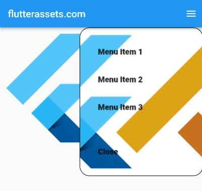
This code creates a Stack widget that contains a Container widget and a Positioned widget. The Container widget is the main body of the app, it has a height and width that match the screen size, a colour of Colors.grey.shade100, an alignment of Alignment.topLeft and an Image.asset(‘assets/logo.png’) as a child which is the logo of the app.
The Positioned widget is the animated side menu, it’s positioned at the top right corner of the screen, it has a child of an AnimatedBuilder widget. The AnimatedBuilder widget takes the _animation object and a builder callback. The builder callback returns a Container widget with an animated width of _animation.value and a fixed height of 300.
The Container also has a BoxDecoration with a background colour of Colors.grey.shade300, rounded corners and a border. It also has a child of Visibility widget, which only shows the child if the _animation.value is equal to 200. The child of the Visibility widget is a Column widget which contains a list of MyListTile widgets. Each MyListTile widget has an icon, a title, and an onTap callback.
The onTap callback sets the value of _isOpen to its opposite and calls the reverse method on the _controller AnimationController object to close the side menu.
The code in the body of the Scaffold is responsible for creating the main UI of the app, it displays the logo, the Appbar and the side menu with the list of menu items, and this menu items have the ability to open and close with an animation.
In summary, the Scaffold widget has an AppBar which contains the title and the button to open and close the menu, and the body which contains the main body of the app and the side menu, the side menu is built using the AnimatedBuilder widget which takes the _animation object as a parameter and rebuilds its child every time the animation ticks, and the child is a Container widget with an animated width and a fixed height, and it contains a Visibility widget to show the menu items only when the menu is open, and it contains a Column widget that contains a list of MyListTile widgets which are custom widgets to display the menu items.
Flutter slide menu MyListTile custom class
Here’s a breakdown of the code:
class MyListTile extends StatelessWidget {
  final String? title;
  final IconData? icon;
  final VoidCallback? onTap;

  MyListTile({this.title, this.icon, this.onTap});
The class starts by defining three properties: title, icon, and onTap. These properties are passed as named arguments to the constructor of the class. title is of type String, icon is of type IconData, and onTap is of type VoidCallback. All of these properties are nullable, meaning that they can be assigned a value of null.
  @override
  Widget build(BuildContext context) {
    return InkWell(
      onTap: onTap,
      child: Padding(
        padding: const EdgeInsets.all(10.0),
        child: Container(
          child: Row(
            children: <Widget>[
              Container(
                width: 30,
                height: 30,
                decoration: BoxDecoration(
                  shape: BoxShape.circle,
                  color: Colors.white,
                ),
                child: Icon(
                  icon,
                  color: Colors.black,
                  size: 28,
                ),
              ),
              SizedBox(
                width: 10,
              ),
              Text(title!, style: TextStyle(fontSize: 16),),
            ],
          ),
        ),
      ),
    );
  }
}
The build method returns a widget tree that describes the part of the user interface represented by this widget. The return value of this method is an InkWell widget which wraps a Padding widget that wraps a Container widget.
The InkWell widget is used to add a ripple effect when the widget is tapped. The onTap property is set to the onTap property passed to the constructor of the class.
The Padding widget adds some space around its child, in this case, it adds a space of 10.0 pixels all around the Container widget.
The Container widget is a convenience widget that can be used to align other widgets, it takes a child property, in this case, it takes a Row widget as a child.
The Row widget displays its children in a horizontal line, it takes a list of widgets as its children, in this case, it takes three children:
Containerwidget, this widget is used to create a circle shape with a white background colour and an Icon widget as a child, the Icon widget takes the icon property passed to the constructor of the class, and it’s displayed in black colour with a size of 28.SizedBoxwidget, this widget is used to add some space between theContainerand theTextwidget, it’s width is set to 10.Textwidget, this widget is used to display text, it takes thetitleproperty passed to the constructor of the class, and it’s displayed in font size of 16.
This class is a simple custom widget that takes properties such as a title, an icon, and a callback function on tap, it uses these properties to display a list item with an icon, a title, and a ripple effect when the item is tapped and calls the callback function passed to it when the item is tapped.
Apologies if I missed something, so to be sure, the fill code is attached below.
Full code of the custom side slide menu in Flutter

import 'package:flutter/material.dart';

void main() {
  runApp(MyApp());
}

class MyApp extends StatelessWidget {

  @override
  Widget build(BuildContext context) {
    return MaterialApp(
      debugShowCheckedModeBanner: false,
      title: 'Flutter Demo',
      theme: ThemeData(
        primarySwatch: Colors.blue,
      ),
      home: MyHomePage(),
    );
  }
}

class MyHomePage extends StatefulWidget {

  @override
  State<MyHomePage> createState() => _MyHomePageState();
}

class _MyHomePageState extends State<MyHomePage> with SingleTickerProviderStateMixin{

  late AnimationController _controller;
  late Animation _animation;
  bool _isOpen = false;

  @override
  void initState() {
    super.initState();
    _controller = AnimationController(
      duration: Duration(seconds: 1),
      vsync: this,
    );
    _animation = Tween<double>(begin: 0, end: 200).animate(_controller);
  }

  @override
  void dispose() {
    _controller.dispose();
    super.dispose();
  }

  @override
  Widget build(BuildContext context) {
    return Scaffold(
      appBar: AppBar(
        title: Text('flutterassets.com'),
        actions: [
          IconButton(
            icon: Icon(Icons.menu),
            onPressed: () {
              setState(() {
                _isOpen = !_isOpen;
                if (_isOpen) {
                  _controller.forward();
                } else {
                  _controller.reverse();
                }
              });
            },
          ),
        ],
      ),
      body:
      Stack(
        children: <Widget>[
          Container(
            // the main body of the app
            height: MediaQuery.of(context).size.height,
            width: MediaQuery.of(context).size.width,
            color: Colors.grey.shade100,
            alignment: Alignment.topLeft,
            child: Image.asset('assets/logo.png'),
          ),
          Positioned(
            // the animated side menu
            right: 0,
            top: 0,
            // bottom: 0,
            child: AnimatedBuilder(
              animation: _animation,
              builder: (BuildContext context, Widget? child) {
                return Container(
                  width: _animation.value,
                  height: 300,
                  decoration: BoxDecoration(
                    color: Colors.grey.shade300,
                    borderRadius: const BorderRadius.only(
                      topLeft: Radius.circular(20),
                      bottomLeft: Radius.circular(20),
                      bottomRight: Radius.circular(20),
                    ),
                    border: Border.all(color: Colors.grey)
                  ),
                  child: Visibility(
                    visible: _animation.value == 200,
                    child: Column(
                      children: [
                        MyListTile(
                          icon: Icons.info_outlined,
                          title: "Menu Item 1",
                          onTap: (){
                            setState(() {
                              _isOpen = !_isOpen;
                              _controller.reverse();
                            });
                          },
                        ),
                        MyListTile(
                          icon: Icons.info_outlined,
                          title: "Menu Item 2",
                          onTap: (){
                            setState(() {
                              _isOpen = !_isOpen;
                              _controller.reverse();
                            });
                          },
                        ),
                        MyListTile(
                          icon: Icons.info_outlined,
                          title: "Menu Item 3",
                          onTap: (){
                            setState(() {
                              _isOpen = !_isOpen;
                              _controller.reverse();
                            });
                          },
                        ),
                        Spacer(),
                        Padding(
                          padding: const EdgeInsets.all(8.0),
                          child: ElevatedButton(
                            child: Text("Close"),
                              onPressed: (){
                                setState(() {
                                  _isOpen = !_isOpen;
                                  _controller.reverse();
                                });
                              },
                          ),
                        )
                      ],
                    ),
                  ),
                );
              },
            ),
          ),
        ],
      )
    );
  }

}

class MyListTile extends StatelessWidget {
  final String? title;
  final IconData? icon;
  final VoidCallback? onTap;

  MyListTile({this.title, this.icon, this.onTap});

  @override
  Widget build(BuildContext context) {
    return InkWell(
      onTap: onTap,
      child: Padding(
        padding: const EdgeInsets.all(10.0),
        child: Container(
          child: Row(
            children: <Widget>[
              Container(
                width: 30,
                height: 30,
                decoration: BoxDecoration(
                  shape: BoxShape.circle,
                  color: Colors.white,
                ),
                child: Icon(
                  icon,
                  color: Colors.black,
                  size: 28,
                ),
              ),
              SizedBox(
                width: 10,
              ),
              Text(title!, style: TextStyle(fontSize: 16),),
            ],
          ),
        ),
      ),
    );
  }
}
How to customize the above Custom Slide Menu
You could customize it further in various ways, here are a few examples:
- You could customize the appearance of the side menu by changing the background colour, border colour, and the radius of the rounded corners.
- You could add more items to the side menu by adding more
MyListTilewidgets to theColumnwidget. - You could change the animation duration, you could also change the animation curve.
- You could add more functionality to the side menu, for example, you could add a search bar, or add a function that allows the user to log in or log out.
- You could add more pages to the app and navigate between them using the
Navigatorwidget. - You could add more styles to the text, the icon and the other elements in the menu, like changing the font size, font family, and more.
- You could also add more functionalities to the menu items like showing a dialog or a snackbar when an item is tapped.
These are just a few examples, but there are many other ways that you could customize the code to fit your needs.


