In this post, I would like to go through the 5 most popular and incredible progress bars widgets available for flutter. This list is based on a search on the pub.dev website and sorted by popularity. I guess, in time that list might change :).
Package installation process
The installation process for all the plugins is the same. I presume, everyone knows how to add the plugin to the dependencies. Just in case, I added all plugins into one code, just for simplicity. I also created a list of all the imports used in this post. You can copy any from it.
dependencies:
 percent_indicator: ^4.0.1
 step_progress_indicator: ^1.0.2
 sleek_circular_slider: ^2.0.1
 progress_indicators: ^1.0.0
 liquid_progress_indicator: ^0.4.0
import 'package:percent_indicator/percent_indicator.dart';
import 'package:step_progress_indicator/step_progress_indicator.dart';
import 'package:sleek_circular_slider/sleek_circular_slider.dart';
import 'package:progress_indicators/progress_indicators.dart';
import 'package:liquid_progress_indicator/liquid_progress_indicator.dart';Flutter countdown timer for all the tests
All the tests and examples on this page are based on this timer. In all the examples I used a simple countdown timer and an ElevatedButton to start the timer.
import 'dart:async';
import 'package:flutter/material.dart';
import 'package:percent_indicator/percent_indicator.dart';


void main() {
  runApp(const MyApp());
}

class MyApp extends StatelessWidget {
  const MyApp({super.key});

  @override
  Widget build(BuildContext context) {
    return MaterialApp(
      debugShowCheckedModeBanner: false,
      title: 'Flutter Demo',
      theme: ThemeData(
        primarySwatch: Colors.blue,
      ),
      home: const MyHomePage(title: 'flutterassets.com'),
    );
  }
}

class MyHomePage extends StatefulWidget {
  const MyHomePage({super.key, required this.title});

  final String title;

  @override
  State<MyHomePage> createState() => _MyHomePageState();
}

class _MyHomePageState extends State<MyHomePage> {

  late Timer _timer;
  int _count = 100;

  void startTimer() {
    const oneSec = const Duration(seconds: 1);
    _timer = Timer.periodic(
      oneSec,
          (Timer timer) {
        if (_count == 0) {
          setState(() {
            timer.cancel();
          });
        } else {
          setState(() {
            _count --;
          });
        }
      },
    );
  }

  @override
  Widget build(BuildContext context) {
    return Scaffold(
      appBar: AppBar(
        title: Text(widget.title),
      ),
      body: Center(
        child: Column(
          mainAxisAlignment: MainAxisAlignment.start,
          children: <Widget>[
            Padding(
              padding: const EdgeInsets.all(20.0),
              child: ElevatedButton(
                onPressed: () {
                  startTimer();
                },
                child: Text("start counter"),
              ),
            ),

            // PROGRESS BAR HERE


          ],
        ),
      ),
    );
  }
}
No. 1. percent_indicator
The Procent Indicator is number one on the list. At this moment it has 1679 likes and 100% popularity. The first version of this plugin was created on July 17, 2018. The package includes two indicators. We can use the Circle percent indicator and the Linear percent indicator. With the Circle percent indicator we have two styles: circle and arc.
- Project pub.dev page: https://pub.dev/packages/percent_indicator
- Project GitHub page: https://github.com/diegoveloper/flutter_percent_indicator
- The license is specified on the project page.
More example codes you can find on the project pages.
What is the Procent Indicator
The Procent Indicator is a plugin which allows you to show the progress in the circular or linear indicator. In this plugin, we use values from 0.0 to 1.0 which means the value of 0.01 is 1 procent, and 0.1 will be 10 percent.
The key features of percent indicator
- Circle percent indicator
- Linear percent indicator
- You can Toggle animation
- The duration of the animation can be customized
- Progress is measured by a percentage value
- Customize the colours of the progress bar and background
- Size can be customised too
- Left, right or centre child for Linear percent indicator
- Top, bottom or centre child for Circular percent indicator
- Gradient colour can be used in progress bar
The images below show both indicators in action.
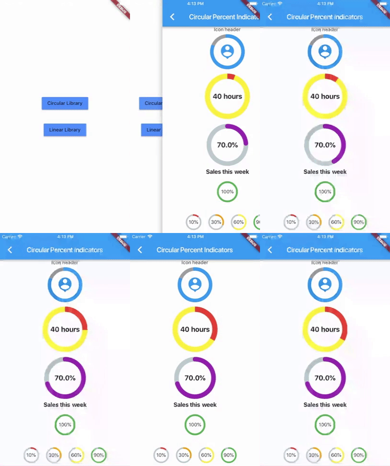
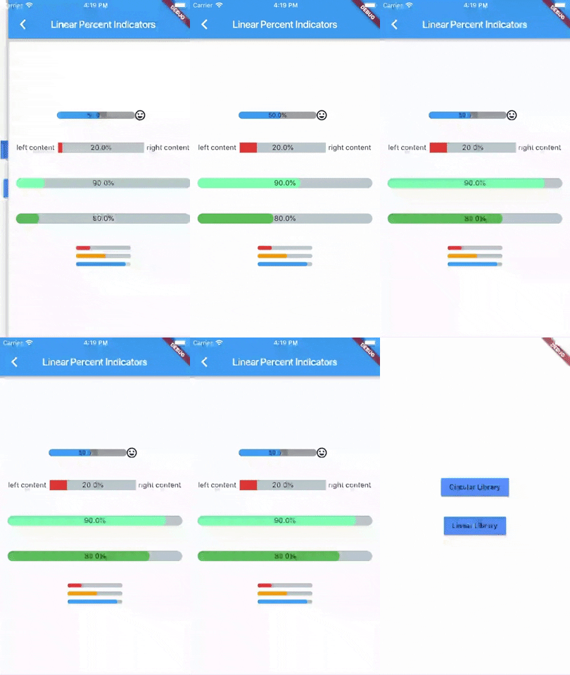
The base code for these two progress bars is below. As you can see, in the procent property, I used output from my Timer. The same Timer output is used in all center, header, footer, leading and trailing properties.
As a Widget inside center, header, footer, leading and trailing you can use Icons, Text or any visual widget. The animated GIF image above shows the Icon inside the CircularPercentIndicator. If you use a Text or Icon widget, you can use text style or Icon style properties too.
The widget is quite simple but has a lot of options for customisation.
Base code for the percent_indicator
CircularPercentIndicator(
  radius: 60.0,
  lineWidth: 5.0,
  percent: (_count.toDouble())/100,
  center: Text("${(_count.toDouble())/100}"),
  progressColor: Colors.green,
),
LinearPercentIndicator(
width: 260
lineHeight: 20.0,
percent: (_count.toDouble())/100,
backgroundColor: Colorsgreen.shade200,
progressColor: Colors.green,
),Percent_indicator properties for CircularPercentIndicator
If you need to customize your Circular Percent Indicator try to play with these properties. I am sure you can create something useful :).
- radius: – radius of the circular element
- lineWidth: – the width progress bar line
- percent: – Percent value between 0.0 and 1.0
- center: – widget inside the circle, in this case, it is a Text()
- progressColor: – the colour of the progress bar. If we use this parameter, the linearGradient must be disabled.
- backgroundWidth: – the background width of the progress bar
- backgroundColor: – Color of the background of the circle, default = transparent
- fillColor: – The first colour applied to the complete circle
- animation: – true or false, true if you want the circle to have animation
- animationDuration: – duration of the animation in milliseconds, It only applies if the animation attribute is true
- header: – widget at the top of the circle, in this case, it could be an icon, text, or anything
- footer: – widget at the bottom of the circle, in this case, it could be an icon, text, or anything
- linearGradient: – gradient colour of the progress bar line. If we use this parameter, the progressColor must be disabled
- circularStrokeCap: – The kind of finish to place on the end of lines drawn, values supported: butt, round, square
- CircularStrokeCap.round,
- CircularStrokeCap.butt,
- CircularStrokeCap.square,
- startAngle: – use double here from 0.0 to 360.0 degrees, the angle at which the circle will start the progress (in degrees, eg: 0.0, 45.0, 90.0)
- animateFromLastPercent: – use true or false, set true if you want to animate the linear from the last percent value you set
- addAutomaticKeepAlive: – use true or false, set false if you don’t want to preserve the state of the widget
- arcType: – set the arc type, we can use
- ArcType.FULL,
- ArcType.FULL_REVERSED,
- ArcType.HALF,
- arcBackgroundColor: – set circular background colour when using the arcType property
- reverse: – true or false, set true when you want to display the progress in reverse mode
- maskFilter: – creates a mask filter that takes the progress shape being drawn and blurs it.
- MaskFilter.blur(BlurStyle.normal, 5.0),
- MaskFilter.blur(BlurStyle.inner, 5.0),
- MaskFilter.blur(BlurStyle.outer, 5.0),
- MaskFilter.blur(BlurStyle.solid, 5.0),
- curve: – set a circular curve animation type, I think we have about 42 different styles i.e.
- Curves.linear,
- Curves.ease,
- …
- restart animation: – true or false, set true when you want to restart the animation, it restarts only when reaches 1.0 as a value, default to false
- onAnimationEnd: – Callback called when the animation ends (only if `animation` is true)
- widgetIndicator: – Display a widget indicator at the end of the progress. It only works when `animation` is true
- rotateLinearGradient: – Set to true if you want to rotate linear gradient in accordance with the [startAngle].
CircularPercentIndicator progress bar
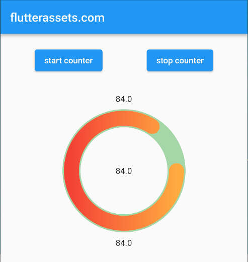
// PROGRESS BAR HERE
CircularPercentIndicator(
  radius: 100.0,
  lineWidth: 25.0,
  percent: (_count.toDouble())/100,
  center: Text("${(_count.toDouble())}"),
  // progressColor: Colors.green,
  backgroundWidth: 30,
  backgroundColor: Colors.green.shade200,
  // fillColor: Colors.red.shade200,
  animation: true,
  // animationDuration: ,
  header: Padding(
    padding: const EdgeInsets.all(12.0),
    child: Text("${(_count.toDouble())}"),
  ),
  footer: Padding(
    padding: const EdgeInsets.all(12.0),
    child: Text("${(_count.toDouble())}"),
  ),
  linearGradient: LinearGradient(colors: [ Colors.red, Colors.orangeAccent,], ),
  circularStrokeCap: CircularStrokeCap.round,
  startAngle: 90.0,
  // animateFromLastPercent: true,
  //   addAutomaticKeepAlive: true,
    // arcType: ArcType.HALF,
    // arcBackgroundColor: Colors.green.shade200,
    // reverse: true,
    // maskFilter: MaskFilter.blur(BlurStyle.normal, 5.0),
    // curve: Curves.linear,
    // restartAnimation: true,
    // onAnimationEnd: (){print('progress...');},
    // widgetIndicator: Text('V'),
    // rotateLinearGradient: true,
),
Percent_indicator properties for LinearPercentIndicator
- percent: – Percent value between 0.0 and 1.0
- width: – width of the progress bar
- lineHeight: – Height of the line
- fillColor: – Color of the background of the Line, default = transparent
- backgroundColor: – First colour applied to the complete line
- linearGradientBackgroundColor: – First colour applied to the complete line
- progressColor: – the colour of the progress bar. If we use this parameter, the linearGradient must be disabled.
- animation: – true if you want the Line to have animation
- animationDuration: – duration of the animation in milliseconds, It only applies if the animation attribute is true
- leading: – widget at the left of the Line
- trailing: – widget at the right of the Line
- center: – widget inside the Line
- linearStrokeCap: – This property is no longer used, use barRadius instead.
- barRadius: – The border-radius of the progress bar (Will replace linearStrokeCap)roundAll
- alignment: – alignment of the Row (leading-widget-center-trailing)
- padding: – padding to the LinearPercentIndicator
- animateFromLastPercent: – set true if you want to animate the linear from the last percent value you set
- linearGradient: – This will override [progressColor]. It is an error to provide both. If we use this parameter, the progressColor must be disabled
- addAutomaticKeepAlive: – set false if you don’t want to preserve the state of the widget
- isRTL: – true or false, set true if you want to animate the linear from the right to left (RTL)
- maskFilter: – Creates a mask filter that takes the progress shape being drawn and blurs it.
- MaskFilter.blur(BlurStyle.normal, 5.0),
- MaskFilter.blur(BlurStyle.inner, 5.0),
- MaskFilter.blur(BlurStyle.outer, 5.0),
- MaskFilter.blur(BlurStyle.solid, 5.0),
- clipLinearGradient: – Set true if you want to display only part of [linearGradient] based on percent value(ie. create ‘VU effect’). If no [linearGradient] is specified this option is ignored.
- curve: – set a linear curve animation type
- Curves.linear,
- Curves.ease,
- …
- restartAnimation: – set true when you want to restart the animation, it restarts only when reaches 1.0 as a value, default to false
- onAnimationEnd: – Callback called when the animation ends (only if `animation` is true)
- widgetIndicator: – Display a widget indicator at the end of the progress. It only works when `animation` is true
LinearPercentIndicator progress bar example

// PROGRESS BAR HERE
LinearPercentIndicator(
  width: 260,
  lineHeight: 20.0,
  percent: (_count.toDouble())/100,
  backgroundColor: Colors.green.shade200,
  // progressColor: Colors.green,
    // fillColor: Colors.red.shade200,
    animation: true,
    // animationDuration: ,
    leading: Text("${(_count.toDouble())}"),
    trailing: Text("${(_count.toDouble())}"),
    center: Text("${(_count.toDouble())}"),
    barRadius: Radius.circular(10),
  alignment: MainAxisAlignment.center,
  padding: EdgeInsets.symmetric(horizontal: 10),
  // animateFromLastPercent: true,
  linearGradient: LinearGradient(colors: [ Colors.red, Colors.orangeAccent,], ),
  // addAutomaticKeepAlive: true,
  // isRTL: true,
  // maskFilter: MaskFilter.blur(BlurStyle.normal, 5.0),
  // curve: Curves.linear,
  // clipLinearGradient: true,
  // restartAnimation: true,
  // onAnimationEnd: (){print('progress...');},
  // widgetIndicator: Icon(Icons.arrow_downward_outlined),
),
No. 2. step_progress_indicator
Number two on the list is Step Progress Indicator. At this moment it has 573 likes and 98% popularity. The first version of this plugin was created on January 23, 2020. This is an Open Source project created by Sandro Maglione.
- Project pub.dev page: https://pub.dev/packages/step_progress_indicator
- Project GitHub page: https://github.com/SandroMaglione/step-progress-indicator
- The license is specified on the project page.
- More code examples are on the project page.
What is the Step Progres Indicator
It is an indicator where the progress is presented with steps, a point in time or a process. In my examples, I used the timer to count the time. If you need an indicator which will count all the steps, this is a package for you.
The key features of the step_progress_indicator
- Horizontal Step Progress Indicator
- Vertical Step Progress Indicator
- Circular Step Progress Indicator
- Arc type of the indicator
- Customize steps count of the progress
- Custom steps with custom sizes
- onTap functionality
- Change the colours
- Use gradient colours
- Define progress direction
- Customize size and padding
- Alignments
- Rounder edges
- Height, width and padding
- Custom start angle
- And probably more…
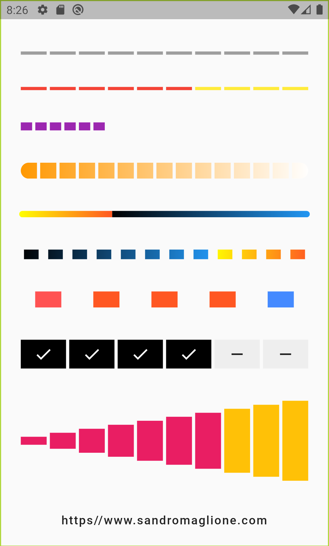
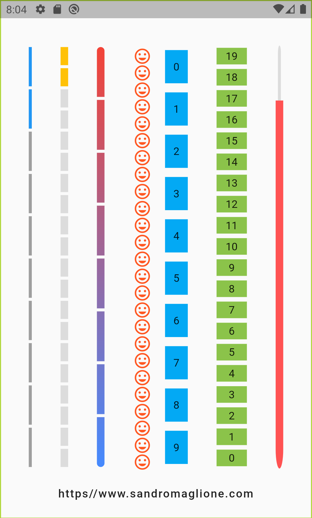
The first images show the horizontal and vertical indicators.
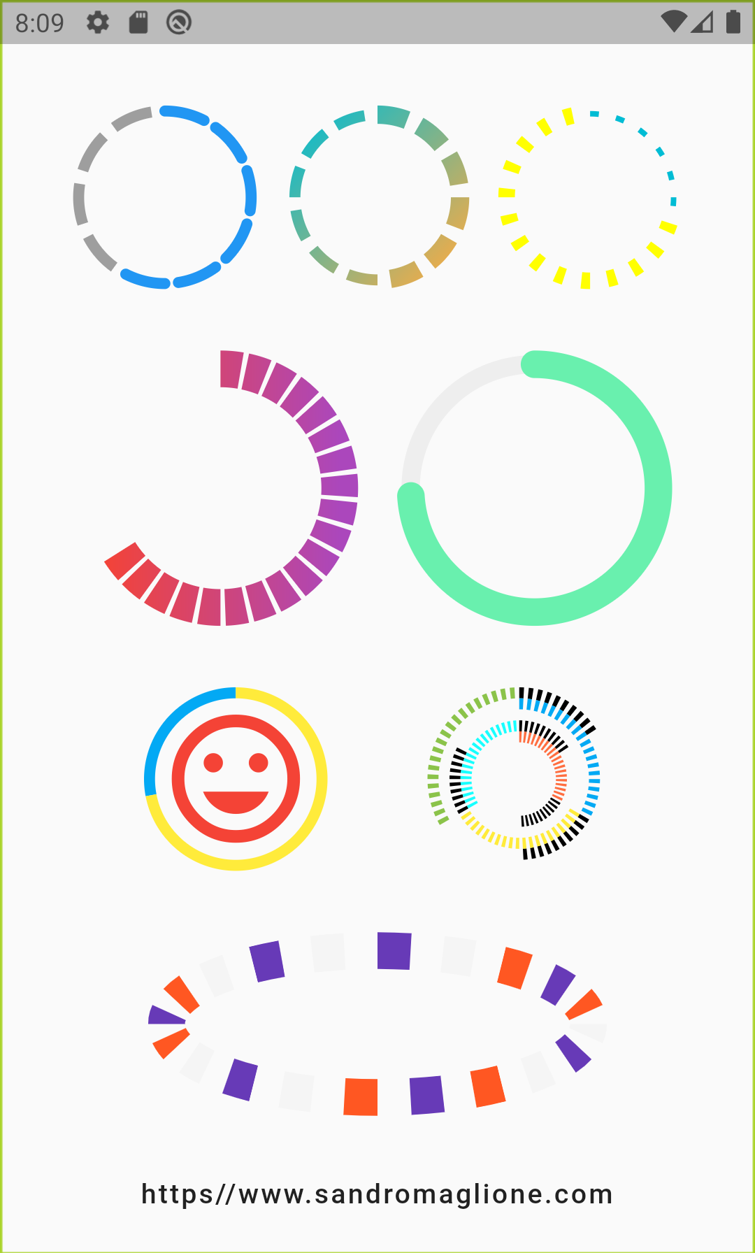
Here you can see the circular indicators.
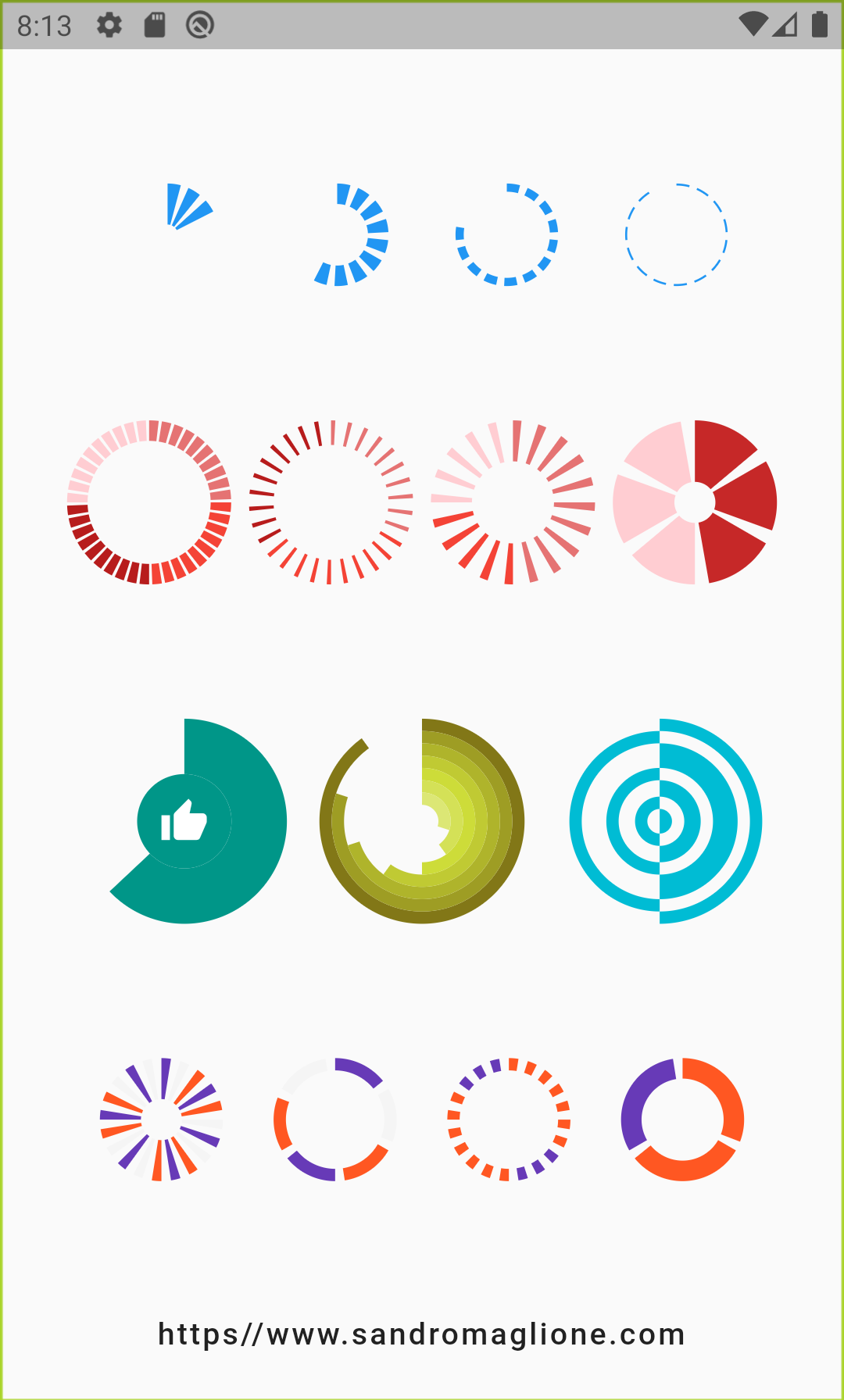
Base code for the step_progress_indicator
The basic code looks like this. In this state, you can see only the line of dashes.
StepProgressIndicator(
    totalSteps: 10,
)
CircularStepProgressIndicator(
totalSteps: 10,
),Tips
- If you need a line without the breaks, set the padding to 0.
- If you have an error: The argument type ‘double Function(int)’ can’t be assigned to the parameter type ‘double Function(int, bool)?’. customSize: (index) => (index + 1) * 10.0, it is mean you need to change a bit this line and add a dash ‘_’ like this: ustomSize: (index, _ ) => (index + 1) * 10.0
- If you use custom properties, disable standard properties.
- If you use CircularStepProgressIndicator with a totalSteps only the widget height might be default 100, but the width will be the width of the screen or the container.
- If you wrap the CircularStepProgressIndicator with SizedBox or Container with a fixed size the widget will fill the space.
- If we use an arcSize or startingAngle with math we need to import an additional package: import ‘dart:math’ as math;
Step Progress Indicator properties
- totalSteps: – uses int values, Total number of steps of the complete indicator and it is required
- currentStep: – uses int value, Number of steps to underline, all the steps with index <=
currentStepwill have a colour equal toselectedColor. Default to 0 - customStep: – use Widget here. Defines a custom Widget to display at each step, given the current step index, the Color, which could be defined with
selectedColorandunselectedColoror usingcustomColor, and its size, which could be defined usingsize,selectedSize,unselectedSize, orcustomSize - onTap: – callback function, Defines onTap function given index of the pressed step
- customColor: – Assign a custom Color for each step.
- customSize: – Assign a custom size for each step.
- selectedColor: – Color of the selected steps. Default to Colors.blue
- unselectedColor: – Color of the unselected steps. Default to Colors.grey
- gradientColor: – Apply gradient colour to the indicator.
- selectedGradientColor: – Apply gradient colour to the selected steps of the indicator.
- unselectedGradientColor: – Apply gradient colour to the unselected steps of the indicator.
- blendMode: – Apply
BlendModetoShaderMaskwhengradientColor,selectedGradientColor, orunselectedGradientColordefined. - direction: – Uses axis, defines if the indicator is horizontal or vertical, default to Axis.horizontal
- progressDirection: – Uses TextDirection. Defines if steps grow from left to right/top-to-bottom
TextDirection.ltror right-to-left / bottom-to-topTextDirection.rtl. Default to TextDirection.ltr. - size: – Uses double value. Size of the indicator (height if
directionisAxis.horizontal, width ifAxis.vertical). Default to 4.0. - padding: – uses double. Spacing, left-right if horizontal, top-bottom if vertical, of each step. default to 2.0.
- fallbackLength: – Uses double value. Length of the progress indicator in case the main axis (based on
directionattribute) has no size limit i.e.double.infinity. Default to 100.0 - selectedSize: – Double value. Specify a custom size for selected steps
- unselectedSize: – double value. Specify a custom size for unselected steps.
- roundedEdges: – Uses Radius value. Add rounded edge corners to the first and the last step.
- mainAxisAlignment: – Assign alignment
MainAxisAlignmentfor the indicator’s container. default to MainAxisAlignment.center. - crossAxisAlignment: – Assign alignment
CrossAxisAlignmentfor the indicator’s container. Default to CrossAxisAlignment.center. - stepMainAxisAlignment: – Assign alignment
MainAxisAlignmentfor a single step. Default to MainAxisAlignment.center. - stepCrossAxisAlignment: – Assign alignment
CrossAxisAlignmentfor a single step. Default to CrossAxisAlignment.center.
What is the Horizontal Step Progress Indicator
The horizontal Step Progress Indicator is the progress bar where we can present the time or progress steps in the horizontal indicator, from left to right. In my examples here I used the timer to count the time.

StepProgressIndicator(
  totalSteps: 10,
  currentStep: _count,
  // size: 20,
  customSize: (index, _ ) => (index + 10) * 2.0,
  padding: 1,
  // selectedColor: Colors.green.shade200,
  // unselectedColor: Colors.green,
  roundedEdges: Radius.circular(10),
  // selectedSize: 30,
  selectedGradientColor: const LinearGradient(
    begin: Alignment.topLeft,
    end: Alignment.bottomRight,
    colors: [Colors.yellowAccent, Colors.deepOrange],
  ),
  unselectedGradientColor: const LinearGradient(
    begin: Alignment.topLeft,
    end: Alignment.bottomRight,
    colors: [Colors.black, Colors.blue],
  ),
)
What is the Vertical Step Progress Indicator
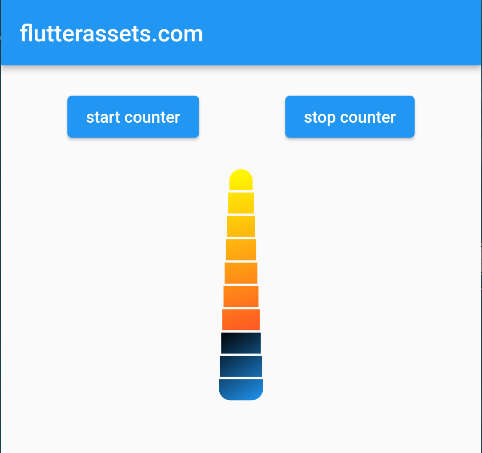
The vertical Step Progress Indicator is the progress bar where we can present the time or progress steps in the Vertical indicator, from top to bottom. In my examples here I used the timer to count the time.
The default height of the Vertical Step Progress Indicator is, I think, about 100.0. To change that, you can wrap the indicator with a SizedBox or Container with a fixed height. See the example code below.
SizedBox(
  height: 200,
  child: StepProgressIndicator(
    totalSteps: 10,
    currentStep: _count,
    direction: Axis.vertical,
    // size: 20,
    customSize: (index, _ ) => (index + 10) * 2.0,
    padding: 1,
    roundedEdges: Radius.circular(10),
    // selectedSize: 30,
    selectedGradientColor: const LinearGradient(
      begin: Alignment.topLeft,
      end: Alignment.bottomRight,
      colors: [Colors.yellowAccent, Colors.deepOrange],
    ),
    unselectedGradientColor: const LinearGradient(
      begin: Alignment.topLeft,
      end: Alignment.bottomRight,
      colors: [Colors.black, Colors.blue],
    ),
  ),
)
Circular Step Progress Indicator properties
- totalSteps: – Use int value. The total number of steps of the complete indicator. This is required.
- currentStep: – Int. Number of steps to underline, all the steps with index <=
currentStepwill have Color equal toselectedColor, Default to 0. - child: – Widget. Widget child contained inside the indicator.
- selectedColor: – Color of the selected steps. Default to Colors.blue.
- unselectedColor: – Color of the unselected steps. Default to Colors.grey.
- customColor: – Custom Color for each step.
- gradientColor: – Gradient colour to the indicator
- customStepSize: – Custom size for each step
- selectedStepSize: – Custom size for selected steps
- unselectedStepSize: – Custom size for unselected steps
- circularDirection: – Defines if steps grow clockwise (
CircularDirection.clockwise) or counterclockwise (CircularDirection.counterclockwise). Default to CircularDirection.clockwise. - stepSize: – Size of each step of the indicator. Default to 6.0.
- height: – Height of the indicator’s container.
- width: – Width of the indicator’s container.
- padding: – Spacing between each step.
- startingAngle: – Double. Angle in which is placed the starting point of the indicator. Default to 0.
- roundedCap: – Boolean. Adds rounded edges at the beginning and at the end of the circular indicator given
intindex of each step and abooltelling if the step is selected. Default to (_, __) => false - removeRoundedCapExtraAngle: – Boolean. Removes extra angle caused by
StrokeCap.buttwhenroundedCapis applied. - arcSize: – Angle in radiants which represents the size of the arc used to display the indicator. Default to math.pi * 2
- fallbackHeight: – Height of the indicator’s container in case the parent height has no size limit i.e.
double.infinity. Default to 100.0. - fallbackWidth: – Width of the indicator’s container in case the parent width has no size limit i.e.
double.infinity. Default to 100.0.

// PROGRESS BAR HERE
CircularStepProgressIndicator(
  totalSteps: 10,
  stepSize: 20,
  selectedStepSize: 30,
  currentStep: _count,
  width: 200,
  height: 200,
  padding: 0,
  circularDirection: CircularDirection.counterclockwise,
  selectedColor: Colors.green,
  unselectedColor: Colors.red,
  roundedCap: (_, __) => true,
  arcSize: math.pi * 2/1.5,
  startingAngle: -math.pi * 2/3,
  // removeRoundedCapExtraAngle: true,
  // gradientColor: const LinearGradient(
  //   begin: Alignment.topLeft,
  //   end: Alignment.bottomRight,
  //   colors: [Colors.yellowAccent, Colors.deepOrange],
  // ),
),
How to add Text to Circular Step Progress Indicator
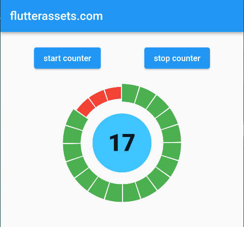
To add Text to the Circular Step Progress Indicator we can wrap it with the Stack widget. As a second child, we will add our Text with a suitable style. Now we add the alignment to the stack widget and set it to Alignment.center. That will position our text right in the centre.
While I was working on this post I missed one parameter in this progress indicator. There is a child parameter where you can add another widget, like a Text. But I couldn’t resize the container inside the indicator. That might be fixed in the future or at a time while you read this post.
The Stock Version of the CircularStepProgressIndicator with Text
Stack(
  alignment: Alignment.center,
  children: [
    Container(
      width: 100,
      height: 100,
      alignment: Alignment.center,
      decoration: BoxDecoration(
        color: Colors.lightBlueAccent,
        borderRadius: BorderRadius.circular(50)
      ),
      child: Text('$_count',
          style: const TextStyle(
              fontSize: 40,
              fontWeight: FontWeight.w900),
        ),
    ),
    CircularStepProgressIndicator(
      totalSteps: 20,
      stepSize: 20,
      selectedStepSize: 30,
      currentStep: _count,
      width: 200,
      height: 200,
      padding: 0.02,
      selectedColor: Colors.green,
      unselectedColor: Colors.red,
    ),
  ],
),
The Child Version of the CircularStepProgressIndicator with Text

CircularStepProgressIndicator(
  totalSteps: 20,
  stepSize: 20,
  selectedStepSize: 10,
  currentStep: _count,
  width: 200,
  height: 200,
  padding: 0.02,
  selectedColor: Colors.lightBlue,
  unselectedColor: Colors.red,
  child: Container(
    height: 50,
    width: 50,
    decoration: BoxDecoration(
      color: Colors.lightBlueAccent,
      borderRadius: BorderRadius.circular(100)
    ),
    alignment: Alignment.center,
    child: Text('$_count',
        style: const TextStyle(
            fontSize: 40,
            fontWeight: FontWeight.w900),
      ),
  ),
),
How to add an Icon to Circular Step Progress Indicator
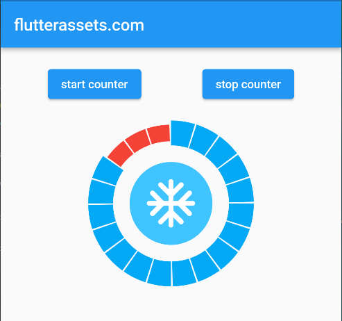
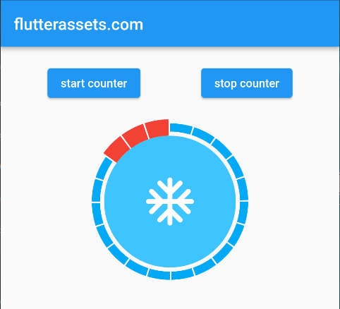
To add an Icon to the Circular Step Progress Indicator we do exactly what we did with a text widget. We can wrap it with a Stack widget. As a second child, we will add our Icon with the size and colour we want. As an option, I wrapped the Icon with a Container with the background colour. Now we add the alignment to the stack widget and set it to Alignment.center. That will position our Icon right in the centre.
While I was working on this post I missed one parameter in this progress indicator. There is a child parameter where you can add another widget, like an Icon. But I couldn’t resize the container inside the indicator. That might be fixed in the future or at a time while you read this post.
The Stock Version of the CircularStepProgressIndicator with Icon
Stack(
  alignment: Alignment.center,
  children: [
    Container(
      width: 100,
      height: 100,
      decoration: BoxDecoration(
        color: Colors.lightBlueAccent,
        borderRadius: BorderRadius.circular(50)
      ),
      child: Icon(Icons.ac_unit_rounded,
      size: 70,
        color: Colors.white,
      ),
    ),
    CircularStepProgressIndicator(
      totalSteps: 20,
      stepSize: 20,
      selectedStepSize: 30,
      currentStep: _count,
      width: 200,
      height: 200,
      padding: 0.02,
      selectedColor: Colors.lightBlue,
      unselectedColor: Colors.red,
    ),
  ],
),
The child version of the CircularStepProgressIndicator with Icon
CircularStepProgressIndicator(
  totalSteps: 20,
  stepSize: 20,
  selectedStepSize: 10,
  currentStep: _count,
  width: 200,
  height: 200,
  padding: 0.02,
  selectedColor: Colors.lightBlue,
  unselectedColor: Colors.red,
  child: Container(
    width: 50,
    height: 50,
    decoration: BoxDecoration(
        color: Colors.lightBlueAccent,
        borderRadius: BorderRadius.circular(100)
    ),
    child: const Icon(Icons.ac_unit_rounded,
      size: 70,
      color: Colors.white,
    ),
  ),
),
No.3. sleek_circular_slider
Number three on the list is the Sleek circular slider. At this moment it has 933 likes and 97% popularity. The first version of this plugin was created on October 8, 2019. This is an Open Source project created by Mat Nuckowski
- Project pub.dev page: https://pub.dev/packages/sleek_circular_slider
- Project GitHub page: https://github.com/matthewfx/sleek_circular_slider
- The license is specified on the project page.
- More code examples are on the project page.
I must add a few animated images from the project page, they look great. If the images are not visible it is mean something might be wrong with the project page.


What is the Sleek circular slider?
The Sleek circular slider is a highly customizable circular slider/progress bar & spinner for Flutter.
The key features of the sleek_circular_slider
- circular slider
- progress bar
- spinner
- Customization of the appearance
- Customize a sizes
- Use custom colours
- It has the info properties
The base code for sleek_circular_slider example
SleekCircularSlider(
    appearance: CircularSliderAppearance(),
),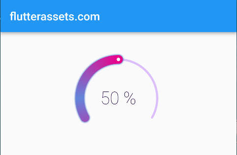
As you can see in the image, without any set up the widget looks amazing. This is the output from the code I presented above. It already has set up the default size, colours, label and some values.
SleekCircularSlider parameters
- appearance CircularSliderAppearance: – A collection of elements that describe the appearance and feel of the slider.
- min double: – The smallest value that the user can pick. The value must be less than or equal to max.
- max double: – The maximum value that the user can choose. min must be greater than or equal to
- initialValue double: – This slider’s starting value.
- onChange OnChange(double value): – this method is called when the user drags to choose a new value for the slider,
- onChangeStart OnChange(double value): – When the user starts to pick a new value for the slider, this method is called.
- onChangeEnd OnChange(double value): – When the user starts to pick a new value for the slider, this method is called.
- innerWidget Widget InnerWidget(double value): – A custom widget that can collect a slider value from the callback to replace the built-in text labels.
SleekCircularSlider in Action with example
In this example, you can grab the slider point and drag it. The changed values will be displayed in the code editor console. I also changed the inside widget. Simple row with an Icon and text.

SleekCircularSlider(
  min: 0,
    max: 100,
    appearance: CircularSliderAppearance(),
  initialValue: 25,
  onChange: (double value){
      print(value);
      },
  onChangeStart: (double value){
      print('Start $value');
      },
  onChangeEnd: (double value){
      print('End $value');
      },
  innerWidget: (double value) => Container(
    alignment: Alignment.center,
      child: Row(
        mainAxisAlignment: MainAxisAlignment.center,
        children: [
          Icon(Icons.ac_unit_outlined),
          Text('% ${value.roundToDouble()}'),
        ],
      )
  ),
),
CircularSliderAppearance parameters
- size double: – The width and height of the slider.
- startAngle double: – The slider’s starting angle (in degrees).
- angleRange double: – The angle range (in degrees) reached by the slider when the maximum value is selected.
- counterClockwise bool: – The widget’s direction is indicated by this option.
- customWidths CustomSliderWidths: – The object with a set of widths for the track, bar, shadow etc.
- customColors CustomSliderColors: – The object with a set of colours for the track, bar, shadow etc.
- infoProperties InfoProperties: – The object with a set of properties for internal labels displaying a current slider value.
- animationEnabled bool: – The setting indicating whether external changes of a slider value should be animated.
- spinnerMode bool: – The option that turns the widget into a spinner.
- spinnerDuration int: – The duration of the spinner animation in milliseconds.
- animDurationMultiplier double: – The time multiplier for the animation when the value is changed.
CircularSliderAppearance example
In this example, I used the above properties. The initial input is from the timer I presented at the beginning of this post. The buttons are to start and stop the timer while testing.

SleekCircularSlider(
    appearance: CircularSliderAppearance(
      size: 200,
      startAngle: 180,
      angleRange: 180,
      // counterClockwise: true,
        customWidths: CustomSliderWidths(progressBarWidth: 30),
      customColors: CustomSliderColors(
        dotColor: Colors.red,
        progressBarColor: Colors.green,
        shadowColor: Colors.greenAccent,
        trackColor: Colors.lightGreenAccent
    ),
      infoProperties: InfoProperties(
          mainLabelStyle: TextStyle(
            color: Colors.red,
            fontSize: 35,
          )
      ),
      spinnerDuration: 10,
      animDurationMultiplier: 10,
      animationEnabled: true,
    ),
  initialValue: _count.toDouble(),
),
CustomSliderWidths parameters
- trackWidth double: – The width of the slider’s track. Default progressBarWidth / 4
- progressBarWidth double: – The width of the slider’s progress bar. Default slider’s size / 10
- shadowWidth double: – The width of the slider’s shadow. Default progressBarWidth * 1.4
- handlerSize double: – The width of the slide Default progressBarWidth / 5
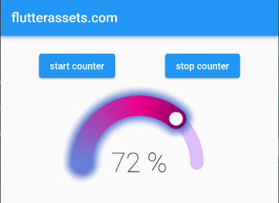
CustomSliderWidths example
SleekCircularSlider(
    appearance: CircularSliderAppearance(
      size: 200,
      startAngle: 180,
      angleRange: 180,
      // counterClockwise: true,
        customWidths: CustomSliderWidths(
            progressBarWidth: 30,
          trackWidth: 20,
          shadowWidth: 60,
          handlerSize: 10,
        ),
    ),
  initialValue: _count.toDouble(),
),
CustomSliderColors parameters
- trackColor Color: – The track colour of the slider. Default #DCBEFB
- trackColors List: – The colour palette for the gradient of the track.
- trackGradientStartAngle double: – The start angle for the track’s gradient.
- trackGradientEndAngle double: – The end angle for the track’s gradient.
- progressBarColor Color: – The colour of the progress bar on the slider. Will not be utilized if the slider uses gradient progressBarColors != null
- progressBarColors List: – The colour palette for the gradient of the progress bar. Default [#1E003B, #EC008A, #6285DA]
- gradientStartAngle double: – The start angle for the progress bar’s gradient.
- gradientEndAngle double: – The start angle for the progress bar’s gradient.
- dynamicGradient bool: – The gradient angles will change dynamically with value changing. If true it will ignore both the grandientStartAngle and gradientEndAngle
- dotColor Color: – The handle colour of the
- hideShadow bool: – The setting that controls whether or not the shadow is displayed.
- shadowColor Color: – The colour of the shadow.
- shadowMaxOpacity double: – The opacity of the shadow in its darker part.
- shadowStep double: – The shadow is painted with a number of steps. This value determines how big is the width of each step. The more steps are painted the softer the shadow is. For a flat shadow use a difference between the shadowWidth and the progressWidth for the shadowStep.
CustomSliderColors example
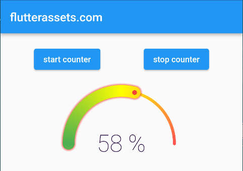
In the example below I used only a few parameters from the above list, but you could customise it much more than I did.
SleekCircularSlider(
    appearance: CircularSliderAppearance(
      size: 200,
      startAngle: 180,
      angleRange: 180,
      customColors: CustomSliderColors(
        // trackColor: Colors.red,
          trackColors: [Colors.redAccent, Colors.yellowAccent, Colors.green],
          progressBarColors: [Colors.redAccent, Colors.yellowAccent, Colors.green],
          dotColor: Colors.red,
          progressBarColor: Colors.lightBlueAccent,
          shadowColor: Colors.red,
      ),
    ),
  initialValue: _count.toDouble(),
),
InfoProperties parameters
- mainLabelStyle TextStyle: – The text style of the main text widget displaying a slider’s current value.
- topLabelStyle TextStyle: – The text style of the top text widget.
- bottomLabelStyle TextStyle: – The text style of the bottom text widget.
- topLabelText String: – The text style of the bottom text widget.
- bottomLabelText String: – The text for the bottom text widget.
- modifier String PercentageModifier(double percentage): – The closure allows modification of how the current value of the slider is displayed. Closure adding the % character
InfoProperties example
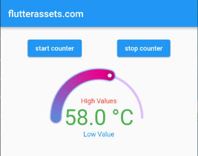
The code below shows how to modify the info properties. For me, the trickiest part was to find how to change a % sign with another. I didn’t figure this out by myself, I had to search for a minute on google.
How to change modifier in SleekCircularSlider
modifier: (double value) {
  final roundedValue = value
      .toStringAsFixed(1);
  return '$roundedValue °C';
},
SleekCircularSlider(
    appearance: CircularSliderAppearance(
      size: 200,
      startAngle: 180,
      angleRange: 180,
      infoProperties: InfoProperties(
          mainLabelStyle: const TextStyle(
            color: Colors.green,
            fontSize: 45,
          ),
          topLabelText: 'High Values',
          topLabelStyle: TextStyle(color: Colors.red),
          bottomLabelText: 'Low Value',
        bottomLabelStyle: TextStyle(color: Colors.blue),
        modifier: (double value) {
          final roundedValue = value
              .toStringAsFixed(1);
          return '$roundedValue °C';
        },
      ),
    ),
  initialValue: _count.toDouble(),
),
How to set the SpinnerMode in SleekCircularSlider
This is an example code for the spinner mode. It just spins around 🙂

SleekCircularSlider(
  appearance: CircularSliderAppearance(
    spinnerMode: true,
    spinnerDuration: 10000,
    animDurationMultiplier: 2
  )
)
No.4. progress_indicators
Number four on the list is Flutter progress indicators. At this moment it has 171 likes and 97% popularity. The first version of this plugin was created on August 19, 2018. This is an Open Source project. Also, this package is smaller than the others I already mentioned.
- Project pub.dev page: https://pub.dev/packages/progress_indicators
- Project GitHub page: https://github.com/wal33d006/progress_indicators
- The license is specified on the project page.
What are the Flutter progress indicators?
The Flutter progress indicators provide some interesting, animated progress indications to Flutter developers. The usage is very simple, you can yus add one line of code in your Dart code and it works. Here we do not have the option to use any input, like I did before, from the timer.
The image below shows the indicator in action. This animated image is from the project page.

The key features of the progress indicators
FadingTextJumpingTextScalingTextJumpingDotsHeartbeatProgressIndicatorGlowingProgressIndicatorCollectionSlideTranstionCollectionScaleTransition
Fading Text indicator example
This indicator shows a fading text. You can customise it the same way as you do with the Text widget. So, change the colour, the fontSize and fontWeight, if you using a custom font it can be used here too.
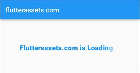
FadingText('Flutterassets.com is Loading...',
  style: const TextStyle(
      fontSize: 20,
    fontWeight: FontWeight.w900,
    color: Colors.blue
  ),
),
Jumping Text indicator example
The Jumping Text indicator animates the text, the letters will jump a bit throughout the entire text. Just for curiosity, I tried to break the text into the next line with “\n” but it doesn’t work. same as above, the text style works as in a normal Text Widget.

JumpingText('Flutterassets.com is Loading...',
  style: const TextStyle(
      fontSize: 20,
    fontWeight: FontWeight.w900,
    color: Colors.blue,
  ),
),
Scaling Text indicator example
The Scaling Text indicator animates the text and scales the individual letters throughout the entire length of the text. The styling works the same as in a normal text widget.

ScalingText('Flutterassets.com is Loading...',
  style: const TextStyle(
      fontSize: 20,
    fontWeight: FontWeight.w900,
    color: Colors.blue,
  ),
),
Jumping Dots indicator example
The Jumping Dots indicator is what it says it is. A three jumping dots. I placed a 3 JumpingDotsProgressIndicator in a Row so that is why this is a bit more than three dots.

JumpingDotsProgressIndicator(
  fontSize: 40.0,
  color: Colors.red,
),
Row(
mainAxisAlignment: MainAxisAlignment.center,
children: [
JumpingDotsProgressIndicator(
fontSize: 40.0,
color: Colors.red,
),
JumpingDotsProgressIndicator(
fontSize: 40.0,
color: Colors.red,
),
JumpingDotsProgressIndicator(
fontSize: 40.0,
color: Colors.red,
),
],
)Heartbeat Progress Indicator example
The Heartbeat Progress Indicator is a beating heart in my example. Basically, you can choose an Icon you want to use and that’s it. Imy example I wrapped the icon with a Contained, added colour. The icon itself can be scaled and the colour can be changed too. See the example below.

HeartbeatProgressIndicator(
  child: Icon(Icons.favorite_outline_outlined),
),
HeartbeatProgressIndicator(
child: Icon(Icons.favorite_outline_outlined),
),
HeartbeatProgressIndicator(
child: Container(
padding: EdgeInsets.all(8),
decoration: BoxDecoration(
color: Colors.blue,
borderRadius: BorderRadius.circular(30)
),
child: Icon(
Icons.favorite_outline_outlined,
color: Colors.red,
size: 46,
)
),
),Glowing Progress Indicator example
The Glowing Progress Indicator is a fade-in / fade-out animation effect. Inside the widget, you can use any visual widget you want. In my example, I added a Row with Text and an Icon with the container background colour.

GlowingProgressIndicator(
  child: Column(
    children: [
      Text('Crisis Alert', style: TextStyle(fontSize: 24),),
      Container(
        padding: EdgeInsets.all(8),
        decoration: BoxDecoration(
          color: Colors.blue,
          borderRadius: BorderRadius.circular(60)
        ),
          child: Icon(
              Icons.crisis_alert,
            color: Colors.red,
            size: 60,
          )
      ),
    ],
  ),
),
Collection Slide Transition example
The Collection Slide Transition works similarly to the above jumping text. I used 5 icons with blue backgrounds. To wrap each icon with Container I used a please of code under the CollectionSlideTransition.
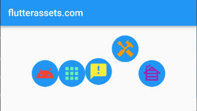
SizedBox(height: 32.0),
CollectionSlideTransition(
  children: <Widget>[
    Icon(Icons.android, color: Colors.red,size: 40,),
    Icon(Icons.apps, color: Colors.greenAccent,size: 40,),
    Icon(Icons.announcement, color: Colors.yellow,size: 40,),
    Icon(Icons.handyman, color: Colors.orange,size: 40,),
    Icon(Icons.cabin, color: Colors.purple,size: 40,),
  ].map((widget) => Container(
      decoration: BoxDecoration(
        color: Colors.blue,
        borderRadius: BorderRadius.circular(30)
      ),
    padding: const EdgeInsets.all(8),
    child: widget,
  )).toList(),
),
.map((widget) => Container(
decoration: BoxDecoration(
color: Colors.blue,
borderRadius: BorderRadius.circular(30)
),
padding: const EdgeInsets.all(8),
child: widget,
)).toList(),Collection Scale Transition example
The Collection Scale Transition has similar animation as scaling text which was also presented above. In this case, it scales the icons with a nice animation. The same as above I wrapped all icons with a container. To do that I use the code which was presented above.
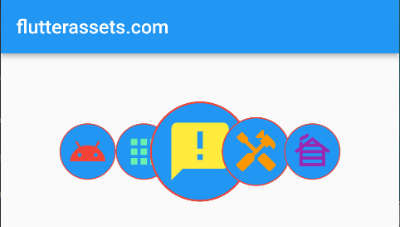
SizedBox(height: 32.0),
CollectionScaleTransition(
  children: <Widget>[
    Icon(Icons.android, color: Colors.red,size: 40,),
    Icon(Icons.apps, color: Colors.greenAccent,size: 40,),
    Icon(Icons.announcement, color: Colors.yellow,size: 40,),
    Icon(Icons.handyman, color: Colors.orange,size: 40,),
    Icon(Icons.cabin, color: Colors.purple,size: 40,),
  ].map((widget) => Container(
    decoration: BoxDecoration(
        color: Colors.blue,
        borderRadius: BorderRadius.circular(30),
      border: Border.all(
        color: Colors.red,
        width: 1.0,
      ),
    ),
    padding: const EdgeInsets.all(8),
    child: widget,
  )).toList(),
),
No.5. liquid_progress_indicator
Number five on the list is Flutter liquid_progress_indicator. At this moment it has 608 likes and 96% popularity. The first version of this plugin was created on May 30, 2019. This is an Open Source project.
- Project pub.dev page: https://pub.dev/packages/liquid_progress_indicator
- Project GitHub page: https://github.com/JordanADavies/liquid_progress_indicator
- The license is specified on the project page.
What is the liquid progress indicator?
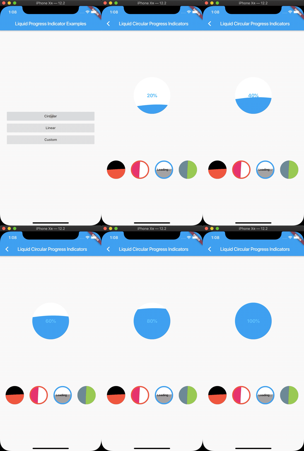
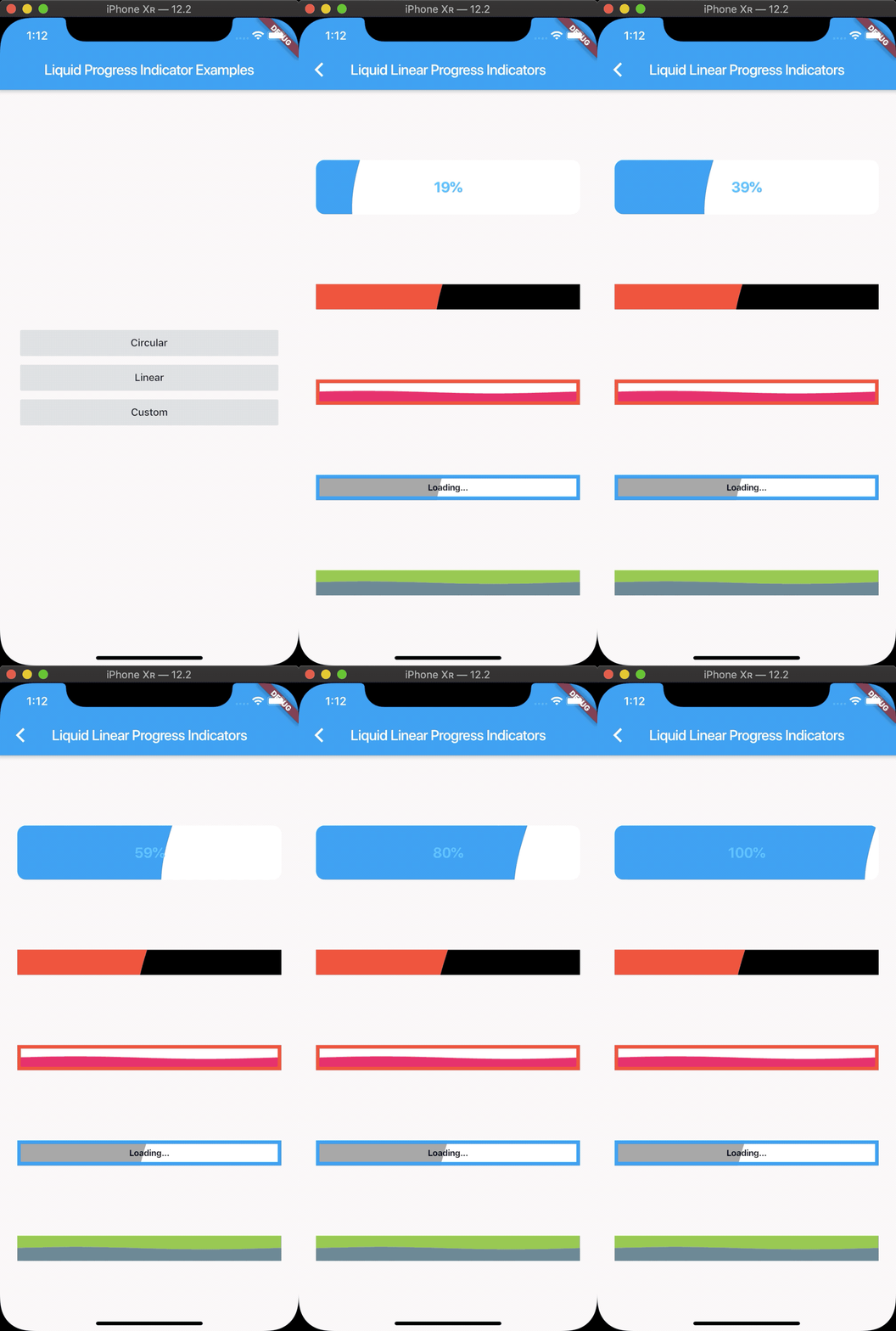
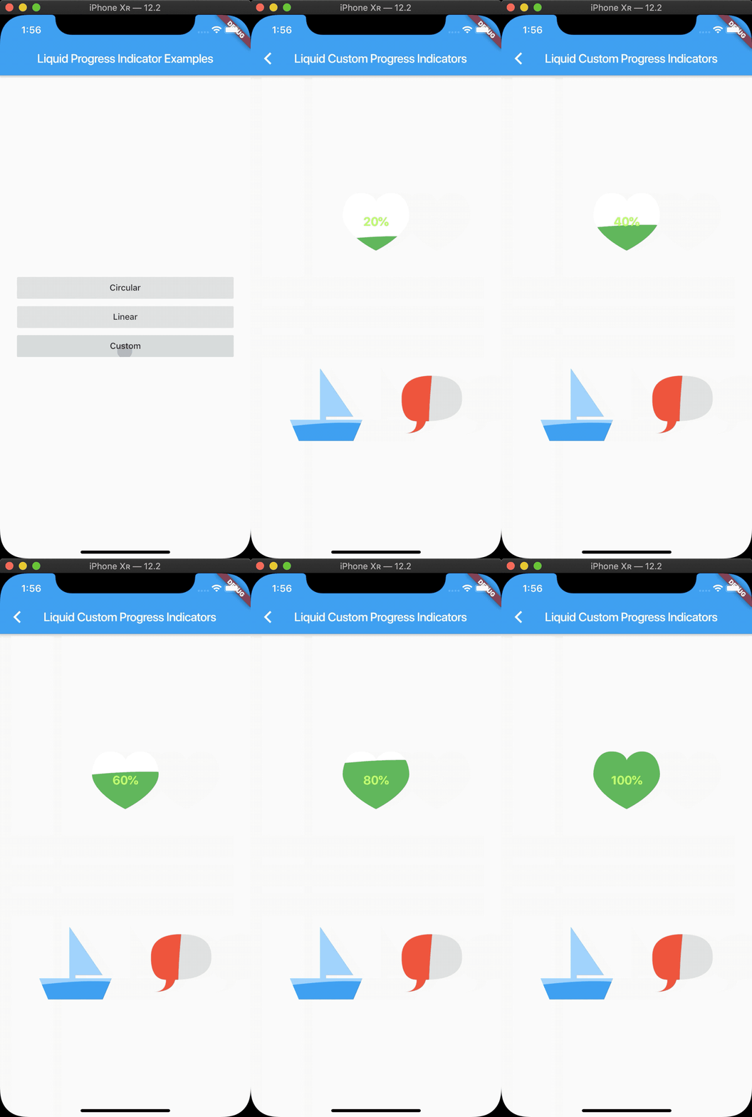
The liquid progress indicator is a package with cool progress animations. As its own name suggests it has a nice wavy progress animation.
The images right below are from the project page.
Key features of the liquid progress indicator
- Liquid circular progress indicator.
- Liquid linear progress indicator.
- Liquid custom progress indicator.
- Works similarly to Flutter’s own ProgressIndicator.
- Customise colours, borders, directions, etc.
liquid progress indicator properties
- value: – the value of the indicator. Defaults to 0.5.
- valueColor: – the colour of the value part of the indicator. Defaults to the current Theme’s accentColor.
- backgroundColor: – as above, the background colour of the indicator. Defaults to the current Theme’s backgroundColor.
- borderColor: – the colour of the border.
- borderWidth: – the width of the border
- direction: – the direction the liquid moves (Axis.vertical = bottom to top, Axis.horizontal = left to right). Defaults to Axis.vertical.
- center: – The central widget, could be text, row, column or something.
- shapePath: – The custom shape path
LiquidCircularProgressIndicator example
As the name suggests, it is a circular indicator. The flow of the waves can be vertical or horizontal. To change the size of the indicator wrap it with a Container or a SizedBox and set the width and height. It also has a central widget where you can present text or any parameter.
In the example below I used the output from the timer I presented at the beginning of the post.


Container(
  width: 200,
  height: 200,
  child: LiquidCircularProgressIndicator(
    value: (_count.toDouble())/10,
    valueColor: AlwaysStoppedAnimation(Colors.blue),
    backgroundColor: Colors.lightGreenAccent.shade200,
    borderColor: Colors.red,
    borderWidth: 5.0,
    direction: Axis.vertical,
    //direction: Axis.vertical,
    center: Text("Level: $_count", style: TextStyle(fontSize: 30),),
  ),
),
LiquidLinearProgressIndicator example
The Liquid Linear Progress Indicator can be presented as a box or a narrow rectangle. The size can be determined the same way as I mentioned above with the circular indicator. Wrap it with Container or SizedBox with some size.


Container(
  height: 100,
  width: 300,
  child: LiquidLinearProgressIndicator(
    value: (_count.toDouble())/10,
    valueColor: AlwaysStoppedAnimation(Colors.lightBlueAccent),
    backgroundColor: Colors.white,
    borderColor: Colors.red,
    borderWidth: 5.0,
    borderRadius: 12.0,
    direction: Axis.vertical,
    //direction: Axis.horizontal,
    center: Text("Level: $_count", style: TextStyle(fontSize: 30),),
  ),
),
LiquidCustomProgressIndicator example
This indicator uses a custom shape as an indicator shape. It has all the parameters as the above example plus the custom shape input.
The Liquid Custom Progress Indicator was a bit tricky for me. I wanted to know how to create shapes. I was looking at the tutorials about this plugin but everyone was presenting the shapes from the project page.
As you can see below I used my own custom paths.
How to create a custom path for LiquidCustomProgressIndicator?
The first option is to create a path yourself with the point coordinates like this. The 3 code snippets are from the GitHub project page. You could manipulate the points and create something awesome. But, I will the truth I cannot see the shape here.
Path _buildHeartPath() {
    return Path()
      ..moveTo(55, 15)
      ..cubicTo(55, 12, 50, 0, 30, 0)
      ..cubicTo(0, 0, 0, 37.5, 0, 37.5)
      ..cubicTo(0, 55, 20, 77, 55, 95)
      ..cubicTo(90, 77, 110, 55, 110, 37.5)
      ..cubicTo(110, 37.5, 110, 0, 80, 0)
      ..cubicTo(65, 0, 55, 12, 55, 15)
      ..close();
  }
Path _buildBoatPath() {
return Path()
..moveTo(15, 120)
..lineTo(0, 85)
..lineTo(50, 85)
..lineTo(50, 0)
..lineTo(105, 80)
..lineTo(60, 80)
..lineTo(60, 85)
..lineTo(120, 85)
..lineTo(105, 120)
..close();
}Path _buildSpeechBubblePath() {
return Path()
..moveTo(50, 0)
..quadraticBezierTo(0, 0, 0, 37.5)
..quadraticBezierTo(0, 75, 25, 75)
..quadraticBezierTo(25, 95, 5, 95)
..quadraticBezierTo(35, 95, 40, 75)
..quadraticBezierTo(100, 75, 100, 37.5)
..quadraticBezierTo(100, 0, 50, 0)
..close();
}The second option is to use an SVG file and convert it to Path.
- What you might need here is your own custom SVG file. I am sure you can find online how to create one.
- Now you can open tour SVG with notepad++. There you will see some code, you can copy all.
- Next, go to https://fluttershapemaker.com/ and paste the code in the dedicated field. You can also upload your custom SVG file here too.
- Below the input field are some buttons, use Responsive Code and Get Code.
- The generated code will appear.
- Copy the part of the code between path_0.moveTo(size.width*……… and the last path_0.close();
- Paste this code to a new Notepad++ file. You should have something like you see below.

- Pres Ctrl+F to search. In the search window can choose ‘replace‘ and replace ‘path_0’ with a dot ‘.’
- Next, replace ‘size.’ with nothing (empty field), do the same with the semicolon ‘ ; ‘ and replace with nothing. You can keep the last semicolon.

The part of the Path code looks like this. With width and height, you can control the size of your custom shape indicator. You can paste your custom path somewhere at the beginning of your project file, it could be somewhere, in my example from above, below Timer.
At this point, I just hope that my explanation was good enough end you can create your own path.
Path _buildSunPath() {
  int width = 200;
  int height = 200;
  return Path()
    ..moveTo(width*0.4919896,height*0.9716581)
    ..cubicTo(width*0.4856161,height*0.9680030,width*0.4798204,height*0.9608225,width*0.4750599,height*0.9506836)
    ..cubicTo(width*0.4657580,height*0.9308726,width*0.4671224,height*0.9180372,width*0.4824304,height*0.8813477)
    ..cubicTo(width*0.4953372,height*0.8504133,width*0.4967703,height*0.8405925,width*0.4918518,height*0.8167830)
    ..cubicTo(width*0.4901749,height*0.8086650,width*0.4888124,height*0.7998760,width*0.4888242,height*0.7972518)
    ..cubicTo(width*0.4888774,height*0.7854356,width*0.4993091,height*0.7753338,width*0.5113770,height*0.7754121)
    ..cubicTo(width*0.5252559,height*0.7755020,width*0.5365251,height*0.7932024,width*0.5396846,height*0.8198741)
    ..cubicTo(width*0.5405458,height*0.8271448,width*0.5404495,height*0.8303480,width*0.5391412,height*0.8379288)
    ..cubicTo(width*0.5370025,height*0.8503219,width*0.5331951,height*0.8593449,width*0.5208199,height*0.8813477)
    ..cubicTo(width*0.5089104,height*0.9025224,width*0.5047850,height*0.9121317,width*0.5028083,height*0.9233018)
    ..cubicTo(width*0.5012554,height*0.9320769,width*0.5014997,height*0.9353542,width*0.5050592,height*0.9534963)
    ..cubicTo(width*0.5065522,height*0.9611055,width*0.5072841,height*0.9673700,width*0.5069120,height*0.9693536)
    ..cubicTo(width*0.5057852,height*0.9753602,width*0.5000021,height*0.9762533,width*0.4919896,height*0.9716581)
    ..close();
}
LiquidCustomProgressIndicator example code itself

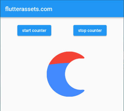
LiquidCustomProgressIndicator(
  value: (_count.toDouble())/10,
  valueColor: AlwaysStoppedAnimation(Colors.blueAccent),
  backgroundColor: Colors.red,
  direction: Axis.vertical,
  shapePath: _buildMoonPath(),
),
LiquidCustomProgressIndicator(
value: (_count.toDouble())/10,
valueColor: AlwaysStoppedAnimation(Colors.blueAccent),
backgroundColor: Colors.red,
direction: Axis.vertical,
shapePath: _buildSunPath(),
center: Text(
"${_count.toStringAsFixed(0)}0",
style: const TextStyle(
color: Colors.yellowAccent,
fontSize: 15.0,
fontWeight: FontWeight.bold,
),
),
),I am adding the link to the original project examples on GitHub:
https://github.com/JordanADavies/liquid_progress_indicator/tree/master/example/lib


