What is Flutter Slider and how to use it
Flutter Slider is a widget that allows users to select a single value from a continuous range of values. It provides a visual representation of the range that the user can select and is commonly used in applications that require users to input a single value. The Slider widget is a useful tool for adjusting volume levels, selecting a specific value within a range, and more.
double _value = 50.0;

@override
Widget build(BuildContext context) {

  return Scaffold(
    appBar: AppBar(
      title: Text('flutterassets.com'),
    ),
    body:  Container(
      alignment: Alignment.topCenter,
      padding: EdgeInsets.all(20),
      child: Column(
        children: [
          Slider(
            value: _value,
            min: 0,
            max: 100,
            divisions: 10,
            label: '$_value',
            onChanged: (double value) {
              setState(() {
                _value = value;
              });
            },
          )
        ],
      ),
    ),
  );
}
In this example, the Slider widget is created with a minimum value of 0 and a maximum value of 100. The starting value is set to 50, using the _value variable. The divisions parameter specifies the number of labels or tick marks on the slider, and the label parameter displays the current value of the slider as a text label. When the user interacts with the slider, the onChanged function is called with the new value, and the setState function is used to update the state of the slider with the new value.
The Flutter Slider is a useful tool for selecting a single value from a continuous range of values. By using this widget, you can provide a visual representation of the selected value, which can improve the user experience of your application.
Flutter Slider properties
Here’s an example of the Slider constructor in Flutter with all parameters:
  double _sliderValue = 50.0;
  double _secondarySliderValue = 80.0;
  double _minValue = 0.0;
  double _maxValue = 100.0;

Slider(
  key: UniqueKey(),
  value: _sliderValue,
  secondaryTrackValue: _secondarySliderValue,
  onChanged: (double value) {
    setState(() {
      _sliderValue = value;
    });
  },
  onChangeStart: (double value) {
    print('Started sliding');
  },
  onChangeEnd: (double value) {
    print('Finished sliding');
  },
  min: _minValue,
  max: _maxValue,
  divisions: 5,
  label: '${_sliderValue.round()}',
  activeColor: Colors.blue,
  inactiveColor: Colors.grey,
  secondaryActiveColor: Colors.lightBlue,
  thumbColor: Colors.white,
  overlayColor: MaterialStateProperty.all<Color?>(Colors.blue.withOpacity(0.2)),
  mouseCursor: SystemMouseCursors.grab,
  semanticFormatterCallback: (double value) => '${value.round()}',
  focusNode: FocusNode(),
  autofocus: true,
),
In this example, the Slider widget has all the optional properties set.
The key parameter is set to a UniqueKey to ensure that the widget is unique and identifiable.
The secondaryTrackValue parameter is set to _secondarySliderValue, a variable that holds the current value of the slider’s secondary track.
The onChanged callback function is called whenever the user slides the thumb along the track.
The onChangeStart and onChangeEnd callback functions are called when the user starts and finishes sliding the thumb, respectively.
The min and max properties are set to 0 and 100, respectively, to specify the range of values for the slider. The divisions property is set to 5 to divide the slider into 5 parts.
The label property is set to display the current value of the slider, rounded to the nearest integer.
The activeColor, inactiveColor, secondaryActiveColor, and thumbColor properties are set to change the colours of the slider’s track, thumb, and secondary track.
The overlayColor property is set to change the colour of the slider’s overlay.
The mouseCursor property is set to change the cursor when the user hovers over the slider.
The semanticFormatterCallback property is set to provide a description of the slider’s value for screen readers.
The focusNode and autofocus properties are set to manage the focus of the slider.
What is Flutter Range Slider and how to use it
Flutter Range Slider is a widget that allows users to select a range of values within a specified range. It is used to visually represent the range of values that can be selected and is commonly used in applications that require users to input a range of values. The Range Slider is particularly useful for setting up filters, adjusting audio levels, selecting price ranges, and more.
Here is an example code snippet:
double _startValue = 15.0;
double _endValue = 55.0;

@override
Widget build(BuildContext context) {

  return Scaffold(
    appBar: AppBar(
      title: Text('flutterassets.com'),
    ),
    body:  Container(
      alignment: Alignment.topCenter,
      padding: EdgeInsets.all(20),
      child: Column(
        children: [
          RangeSlider(
            min: 0,
            max: 100,
            values: RangeValues(_startValue, _endValue),
            onChanged: (RangeValues value) {
              setState(() {
                _startValue = value.start;
                _endValue = value.end;
              });
            },
          )
        ],
      ),
    ),
  );
}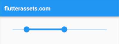
In this example, the RangeSlider widget is created with a minimum value of 0 and a maximum value of 100. The starting and ending values are set to 15 and 55, respectively, using the RangeValues class. When the user interacts with the slider, the onChanged function is called with a RangeValues object containing the new start and end values. The setState function is then used to update the state of the slider with the new values.
The Flutter Range Slider is a useful tool for selecting a range of values within a specified range. By using this widget, you can provide a visual representation of the selected range, which can improve the user experience of your application.
Flutter Range Slider properties
Here’s an example of the RangeSlider constructor in Flutter with all parameters:
  RangeValues _rangeValues = RangeValues(25, 75);
  double _minValue = 0.0;
  double _maxValue = 100.0;

RangeSlider(
  key: UniqueKey(),
  values: _rangeValues,
  onChanged: (RangeValues values) {
    setState(() {
      _rangeValues = values;
    });
  },
  onChangeStart: (RangeValues values) {
    print('Started sliding');
  },
  onChangeEnd: (RangeValues values) {
    print('Finished sliding');
  },
  min: _minValue,
  max: _maxValue,
  divisions: 5,
  labels: RangeLabels('${_rangeValues.start.round()}', '${_rangeValues.end.round()}'),
  activeColor: Colors.blue,
  inactiveColor: Colors.grey,
  semanticFormatterCallback: (double value) => '${value.round()}',
),
In this example, the RangeSlider widget has all the optional properties set.
The key parameter is set to a UniqueKey to ensure that the widget is unique and identifiable.
The values parameter is set to _rangeValues, a variable that holds the current values of the slider’s range.
The onChanged callback function is called whenever the user slides the thumbs along the track.
The onChangeStart and onChangeEnd callback functions are called when the user starts and finishes sliding the thumbs, respectively.
The min and max properties are set to 0 and 100, respectively, to specify the range of values for the slider. The divisions property is set to 5 to divide the slider into 5 parts.
The labels property is set to display the current values of the slider’s range, rounded to the nearest integer.
The activeColor and inactiveColor properties are set to change the colours of the slider’s track.
The semanticFormatterCallback property is set to provide a description of the slider’s range values for screen readers.
How to control the Flutter Slider widget with buttons
To control the Flutter Slider widget with buttons, you can add two buttons, one for incrementing the value and another for decrementing it. This is useful in situations where the user may want to adjust the value using buttons rather than the slider itself.
To implement this functionality, you can create two buttons and add an onPressed function to each one. The function will increase or decrease the value of the slider by a certain amount. You can adjust the amount based on how much you want the value to increase or decrease with each button press.
Here is an example code snippet:
double _value = 50.0;
double _incrementValue = 10.0;

void _incrementValueByAmount() {
  setState(() {
    _value += _incrementValue;
  });
}

void _decrementValueByAmount() {
  setState(() {
    _value -= _incrementValue;
  });
}

@override
Widget build(BuildContext context) {

  return Scaffold(
    appBar: AppBar(
      title: Text('flutterassets.com'),
    ),
    body:  Container(
      alignment: Alignment.topCenter,
      padding: EdgeInsets.all(20),
      child: Column(
        mainAxisAlignment: MainAxisAlignment.start,
        children: [
          Row(
            mainAxisAlignment: MainAxisAlignment.center,
            children: [
              ElevatedButton(
                onPressed: _decrementValueByAmount,
                child: Text('-'),
              ),
              SizedBox(width: 16.0),
              ElevatedButton(
                onPressed: _incrementValueByAmount,
                child: Text('+'),
              ),
            ],
          ),
          SizedBox(height: 16.0),
          Slider(
            value: _value,
            min: 0,
            max: 100,
            divisions: 10,
            label: '$_value',
            onChanged: (double value) {
              setState(() {
                _value = value;
              });
            },
          ),
        ],
      ),
    ),
  );
}
In this example, we have added two buttons to the user interface, one for incrementing the value and another for decrementing it. The onPressed function for each button calls a separate function that increases or decreases the value of the slider by a specified amount. In this case, the increment value is set to 10.
The Slider widget remains the same as in the previous example. The only difference is that it is now wrapped inside a Column widget along with the buttons. This ensures that the buttons and the slider are displayed vertically.
Flutter Slider in a Row with IconButtons
To place a Flutter Slider in a Row with two IconButtons, you can wrap the Slider widget inside an Expanded widget to take up the remaining space in the Row. The two IconButtons can be placed on either side of the Slider.
Here’s an example of how you can create a Row with a Slider widget and two IconButtons using the Icons.add_circle and Icons.remove_circle icons:
double _sliderValue = 50.0;

Row(
  mainAxisAlignment: MainAxisAlignment.spaceBetween,
  children: [
    IconButton(
      icon: Icon(Icons.remove_circle),
      onPressed: () {
        // Decrease the slider value
      },
    ),
    Expanded(
      child: Slider(
        value: _sliderValue,
        onChanged: (newValue) {
          setState(() {
            _sliderValue = newValue;
          });
        },
        min: 0,
        max: 100,
      ),
    ),
    IconButton(
      icon: Icon(Icons.add_circle),
      onPressed: () {
        // Increase the slider value
      },
    ),
  ],
)
In this example, the Row widget is used to display the Slider widget along with two IconButtons. The MainAxisAlignment.spaceBetween property is used to distribute the three widgets evenly across the row.
The first IconButton displays the Icons.remove_circle icon and is used to decrease the slider value. The second IconButton displays the Icons.add_circle icon and is used to increase the slider value.
The Slider widget is wrapped inside an Expanded widget to take up the remaining space in the row. The value property of the Slider widget is set to the _sliderValue variable, which represents the current value of the slider. The onChanged property is used to update the _sliderValue variable when the user drags the slider thumb. The min and max properties are set to 0 and 100, respectively, to define the range of the slider.
Flutter Slider out-of-range errors
These errors occur because the value of the slider is set outside the minimum and maximum range. To prevent these errors, you need to ensure that the value of the slider is always within the minimum and maximum range.
One way to prevent these errors is to set the value of the slider to the minimum or maximum value if it is outside the range. Here is an example code snippet to do this:
double _value = 50.0;
double _minValue = 0.0;
double _maxValue = 100.0;
double _incrementValue = 10.0;

void _incrementValueByAmount() {
  setState(() {
    _value += _incrementValue;
    if (_value > _maxValue){
      _value = _maxValue;
    }
  });
}

void _decrementValueByAmount() {
  setState(() {
    _value -= _incrementValue;
    if (_value < _minValue){
      _value = _minValue;
    }
  });
}

@override
Widget build(BuildContext context) {

  return Scaffold(
    appBar: AppBar(
      title: Text('flutterassets.com'),
    ),
    body:  Container(
      alignment: Alignment.topCenter,
      padding: EdgeInsets.all(20),
      child: Column(
        mainAxisAlignment: MainAxisAlignment.start,
        children: [
          Row(
            mainAxisAlignment: MainAxisAlignment.center,
            children: [
              ElevatedButton(
                onPressed: _decrementValueByAmount,
                child: Text('-'),
              ),
              SizedBox(width: 16.0),
              ElevatedButton(
                onPressed: _incrementValueByAmount,
                child: Text('+'),
              ),
            ],
          ),
          SizedBox(height: 16.0),
          Slider(
            value: _value.clamp(_minValue, _maxValue),
            min: _minValue,
            max: _maxValue,
            divisions: 10,
            label: '$_value',
            onChanged: (double value) {
              setState(() {
                _value = value.clamp(_minValue, _maxValue);
                print(_value);
              });
            },
          ),
          SizedBox(height: 16.0),
          Text(
            'Slider value: $_value',
            style: TextStyle(fontSize: 20.0),
          ),
        ],
      ),
    ),
  );
}
In this example, _currentValue is the current value of the slider, _minValue and _maxValue are the minimum and maximum values of the slider respectively. The value parameter of the slider is set using the clamp method, which ensures that the value is always within the range. The onChanged callback function also ensures that the value is within the range by using the clamp method to set the new value.
By using the clamp method, you ensure that the value of the slider is always within the minimum and maximum range, and prevent these errors from occurring.
When you use the clamp method the error will not appear but the values still can go outside of the min and max range. To prevent that you can use the if statement when using the buttons.
Actually, when you clip the value with the if statement you do not have to use the clamp method.
void _incrementValueByAmount() {
  setState(() {
    _value += _incrementValue;
    if (_value > _maxValue){
      _value = _maxValue;
    }
  });
}

void _decrementValueByAmount() {
  setState(() {
    _value -= _incrementValue;
    if (_value < _minValue){
      _value = _minValue;
    }
  });
}
Display Flutter Slider value in a Text widget
To display the value from the Flutter Slider widget in a Text widget, you can make use of the onChanged callback of the Slider widget to update a variable with the current slider value, and then use that variable to display the value in the Text widget.
Here is an example code snippet:
double _value = 50.0;

@override
Widget build(BuildContext context) {

  return Scaffold(
    appBar: AppBar(
      title: Text('flutterassets.com'),
    ),
    body:  Container(
      alignment: Alignment.topCenter,
      padding: EdgeInsets.all(20),
      child: Column(
        mainAxisAlignment: MainAxisAlignment.start,
        children: [
          Slider(
            value: _value,
            min: 0,
            max: 100,
            divisions: 10,
            onChanged: (double value) {
              setState(() {
                _value = value;
              });
            },
          ),
          SizedBox(height: 16.0),
          Text(
            'Slider value: $_value',
            style: TextStyle(fontSize: 20.0),
          ),
        ],
      ),
    ),
  );
}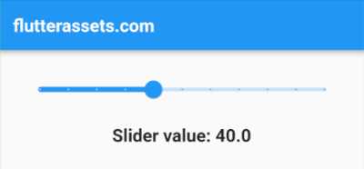
In this example, we have added a Text widget below the Slider widget that displays the current value of the slider. We have also updated the _value variable in the onChanged callback of the Slider widget whenever the slider is moved.
When the user moves the slider, the _value variable will be updated, and the Text widget will display the updated value. Since we have wrapped the Text widget in a setState call, the widget tree will be rebuilt, and the updated value will be displayed on the screen.
How to control the Flutter Range Slider widget with buttons
To control the Flutter Range Slider widget with buttons, you can make use of buttons to increment or decrement the lower and upper values of the Range Slider. Here is an example code snippet:
double _startValue = 10.0;
double _endValue = 50.0;

void _incrementStartValue() {
  setState(() {
    _startValue += 5.0;
    if (_startValue > _endValue) {
      _startValue = _endValue;
    }
  });
}

void _decrementStartValue() {
  setState(() {
    _startValue -= 5.0;
    if (_startValue < 0) {
      _startValue = 0;
    }
  });
}

void _incrementEndValue() {
  setState(() {
    _endValue += 5.0;
    if (_endValue > 100) {
      _endValue = 100;
    }
  });
}

void _decrementEndValue() {
  setState(() {
    _endValue -= 5.0;
    if (_endValue < _startValue) {
      _endValue = _startValue;
    }
  });
}

@override
Widget build(BuildContext context) {

  return Scaffold(
    appBar: AppBar(
      title: Text('flutterassets.com'),
    ),
    body:  Container(
      alignment: Alignment.topCenter,
      padding: EdgeInsets.all(20),
      child: Column(
        mainAxisAlignment: MainAxisAlignment.start,
        children: [
          Row(
            mainAxisAlignment: MainAxisAlignment.spaceAround,
            children: [
              ElevatedButton(
                onPressed: _decrementStartValue,
                child: Icon(Icons.remove),
              ),
              ElevatedButton(
                onPressed: _incrementStartValue,
                child: Icon(Icons.add),
              ),
              ElevatedButton(
                onPressed: _decrementEndValue,
                child: Icon(Icons.remove),
              ),
              ElevatedButton(
                onPressed: _incrementEndValue,
                child: Icon(Icons.add),
              ),
            ],
          ),
          SizedBox(height: 16.0),
          RangeSlider(
            min: 0,
            max: 100,
            values: RangeValues(_startValue, _endValue),
            onChanged: (RangeValues value) {
              setState(() {
                _startValue = value.start;
                _endValue = value.end;
              });
            },
          ),
          SizedBox(height: 16.0),
          Text(
            'Start value: $_startValue',
            style: TextStyle(fontSize: 20.0),
          ),
          SizedBox(height: 16.0),
          Text(
            'End value: $_endValue',
            style: TextStyle(fontSize: 20.0),
          ),
        ],
      )
    ),
  );
}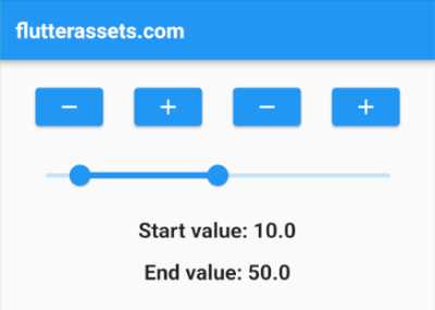
In this example, we have added four buttons: two for controlling the start value of the range slider and two for controlling the end value. When the user taps one of the increment or decrement buttons, the corresponding value will be updated and the widget tree will be rebuilt, which will update the Range Slider widget accordingly.
To update the start or end values, we have implemented four methods _incrementStartValue, _decrementStartValue, _incrementEndValue, and _decrementEndValue. Each method uses the setState method to update the corresponding value and handle any boundary conditions to ensure that the value does not go out of range.
How to create a vertical slider in Flutter
To create a vertical slider in Flutter, you can use the RotatedBox widget to rotate the Slider widget by 90 degrees.
Here’s an example of how you can create a vertical slider in Flutter:
RotatedBox(
  quarterTurns: 3,
  child: Slider(
    value: _sliderValue,
    onChanged: (newValue) {
      setState(() {
        _sliderValue = newValue;
      });
    },
    min: 0,
    max: 100,
    divisions: 10,
    label: '$_sliderValue',
  ),
)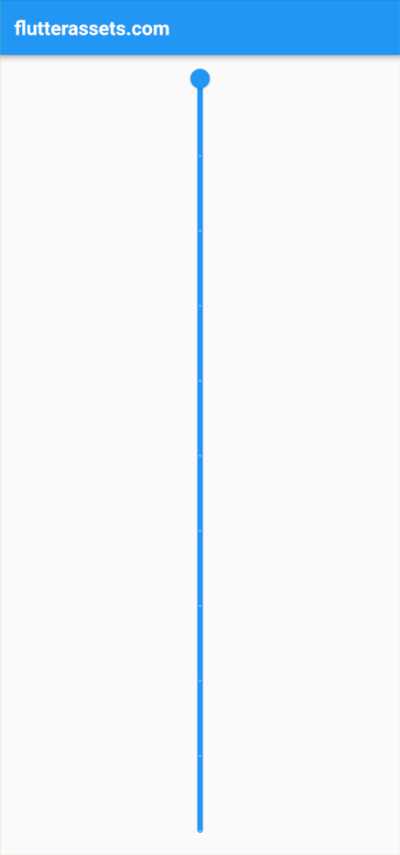
In this example, the RotatedBox widget is used to rotate the Slider widget by 90 degrees. The quarterTurns property is set to 3 to rotate the Slider widget by 270 degrees (90 degrees clockwise).
The Slider widget is similar to the one used in the previous examples, with a few additional properties. The divisions property is used to divide the slider into 10 equal parts, and the label property is used to display the current value of the slider above the thumb.
By wrapping the Slider widget in a RotatedBox widget and setting the quarterTurns property, you can easily create a vertical slider in Flutter.
Control the vertical Slider in Flutter with buttons
To control a vertical Flutter Slider in a column with two IconButtons, you can use the RotatedBox widget to rotate the Slider vertically. Here’s an example:
Column(
  mainAxisAlignment: MainAxisAlignment.center,
  children: <Widget>[
    IconButton(
      onPressed: () {
        setState(() {
          _sliderValue += 10;
        });
      },
      icon: Icon(Icons.add_circle),
    ),
    RotatedBox(
      quarterTurns: 3,
      child: Slider(
        value: _sliderValue,
        onChanged: (newValue) {
          setState(() {
            _sliderValue = newValue;
          });
        },
        min: 0,
        max: 100,
        divisions: 10,
        label: '$_sliderValue',
      ),
    ),
    IconButton(
      onPressed: () {
        setState(() {
          _sliderValue -= 10;
        });
      },
      icon: Icon(Icons.remove_circle),
    ),
  ],
)
In this example, the Column widget is used to display the IconButton widgets and the rotated Slider widget in a vertical layout. The mainAxisAlignment property is set to MainAxisAlignment.center to center the widgets vertically.
The IconButton widgets are used to increase or decrease the slider value by 10 units when pressed. When the user presses the “remove circle” icon button, the _sliderValue variable is decreased by 10 and the setState() method is called to update the UI. Similarly, when the user presses the “add circle” icon button, the _sliderValue variable is increased by 10 and the setState() method is called.
The RotatedBox widget is used to rotate the Slider widget 270 degrees (3 quarter turns) to make it vertical. The Slider widget works the same way as in the previous example, with the exception that it’s rotated vertically.
Flutter Vertical Slider with buttons and full-screen height
To make the Vertical Slider with button fill the whole height of the screen, we can wrap the RotatedBox widget with an Expanded widget. The Expanded widget tells the Column to give the RotatedBox as much available space as possible, which in this case will be the full height of the screen.
Here’s an updated example code with the Expanded widget:
Column(
  mainAxisAlignment: MainAxisAlignment.center,
  children: <Widget>[
    IconButton(
      onPressed: () {
        setState(() {
          _sliderValue += 10;
        });
      },
      icon: Icon(Icons.add_circle),
    ),
    Expanded(
      child: RotatedBox(
        quarterTurns: 3,
        child: Slider(
          value: _sliderValue,
          onChanged: (newValue) {
            setState(() {
              _sliderValue = newValue;
            });
          },
          min: 0,
          max: 100,
          divisions: 10,
          label: '$_sliderValue',
        ),
      ),
    ),
    IconButton(
      onPressed: () {
        setState(() {
          _sliderValue -= 10;
        });
      },
      icon: Icon(Icons.remove_circle),
    ),
  ],
)
In this updated code, we wrap the RotatedBox widget with an Expanded widget. The Expanded widget tells the Column to give as much available space as possible to its child, which in this case is the RotatedBox. The RotatedBox widget will rotate the Slider by -90 degrees, which will make it vertical. The Slider will then take up the full height of the screen because it’s wrapped with the Expanded widget.


