A star or point rating is a form of classification scale that uses a star glyph or a similar typographic icon. The Flutter star rating widgets can be used to rank items like movies, TV series, restaurants, hotels, apps, games and many more. A system of one to five stars is widely used with five stars being the highest rating.
I didn’t go through all packages on the pub.dev page. This is a list of star-rating packages sorted by the newest first ( at the time of writing). I used only a few, but definitely, there is much more to explore.
How to calculate Average Rating
Example:
- 5 stars – 5 votes
- 4 stars – 4 votes
- 3 stars – 2 votes
- 2 stars – 1 vote
- 1 star – 1 vote
In order to calculate the average rating we need to do some simple math. In my example, we have a 5-star rating system. In this case, we multiply 5 stars by 5 votes, 4 stars by 4 votes, 3 stars by 2 votes, 2 stars by 1 vote, and 1 star by 1 vote and add it all together. Now we need to count the votes too.
Star points: 5*5 + 4*4 + 3*2 + 2*1 + 1*1 = 25 + 16 + 6 + 2 + 1 = 50
Votes: 5 + 4 + 2 + 1 +1 = 13
Now you can divide our sum of the star points with counted votes.
50 / 13 = 3.846153846153846
So, our Average Rating is 3.8 and some change.
Flutter Average Rating example code
Here is a simple example of how the calculation can be done in Flutter. Here, I did exactly as in my calculation example above.
- First I counted the number of votes, used int counter
- Then I counted points for each star
- in int allStarPoints I added all the points from all the stars
- double average is the result of allStarPoints divided by a counter
I hope my calculations make sense.
int counterFiveStars = 5;
int counterFourStars = 4;
int counterThreeStars = 2;
int counterTwoStars = 1;
int counterOneStars = 1;

int counter = 0;
late double average;

@override
void initState() {
  counter = counterFiveStars + counterFourStars + counterThreeStars + counterTwoStars + counterOneStars;

  int sumFiveStars = 5 * counterFiveStars;
  int sumFourStars = 4 * counterFourStars;
  int sumThreeStars = 3 * counterThreeStars;
  int sumTwoStars = 2 * counterTwoStars;
  int sumOneStars = 1 * counterOneStars;

  int allStarPoints = sumFiveStars + sumFourStars + sumThreeStars + sumTwoStars + sumOneStars;

  average = allStarPoints / counter;
  print('Average: $average');
}
No.1. Flutter flutter_rating_native package
Info from the project page: A Flutter package to show ratings in a beautiful way. It is highly customizable and easy to use. It is inspired by the Flutter Rating package as this is now not null-safety enable & the maintainer is not updating the package.
Note: This plugin is still under development, if anyone wants to contribute to this project is most welcome. If you have any ideas or suggestions, please feel free to contact the developer.
Even if the developer said it is still under development, it is fully functional.
pub.dev: https://pub.dev/packages/flutter_rating_native

Features of Flutter Ratings Native package
- Null-safety enable
- Easy to use
- Highly customizable
- Supports both Android and iOS
- Supports both horizontal and vertical directions
- Supports both full and half ratings
How to use the Flutter flutter_rating_native widget
Install by adding it to your project dependencies in pubspec.yaml file.
dependencies:
  flutter_rating_native: ^0.0.2
Add it to your Dart code.
import 'package:flutter_rating_native/flutter_rating_native.dart';The base example code is below.
FlutterRating(
  rating: 3.5,
)
Flutter Ratings Native parameters
- starCount: – the number of stars to display
- rating: – the current rating
- onRatingChanged: – the callback when the user selects a new rating
- color: – the colour of the filled stars
- borderColor: – the colour of the border of the stars
- size: – the size of the stars
- allowHalfRating: – is a boolean value that determines if the rating can be a half value
- mainAxisAlignment: – the alignment of the stars
Flutter flutter_rating_native example code

If you want to use this widget only to display ratings you can skip onRatingChanged.
double rating = 4.5;FlutterRating(
rating: rating,
starCount: 10,
borderColor: Colors.blue,
color: Colors.red,
allowHalfRating: true,
size: 30,
mainAxisAlignment: MainAxisAlignment.start,
onRatingChanged: (value) {
setState((){
print(value);
rating = value;
});
},
)No.2. Flutter rating_summary package
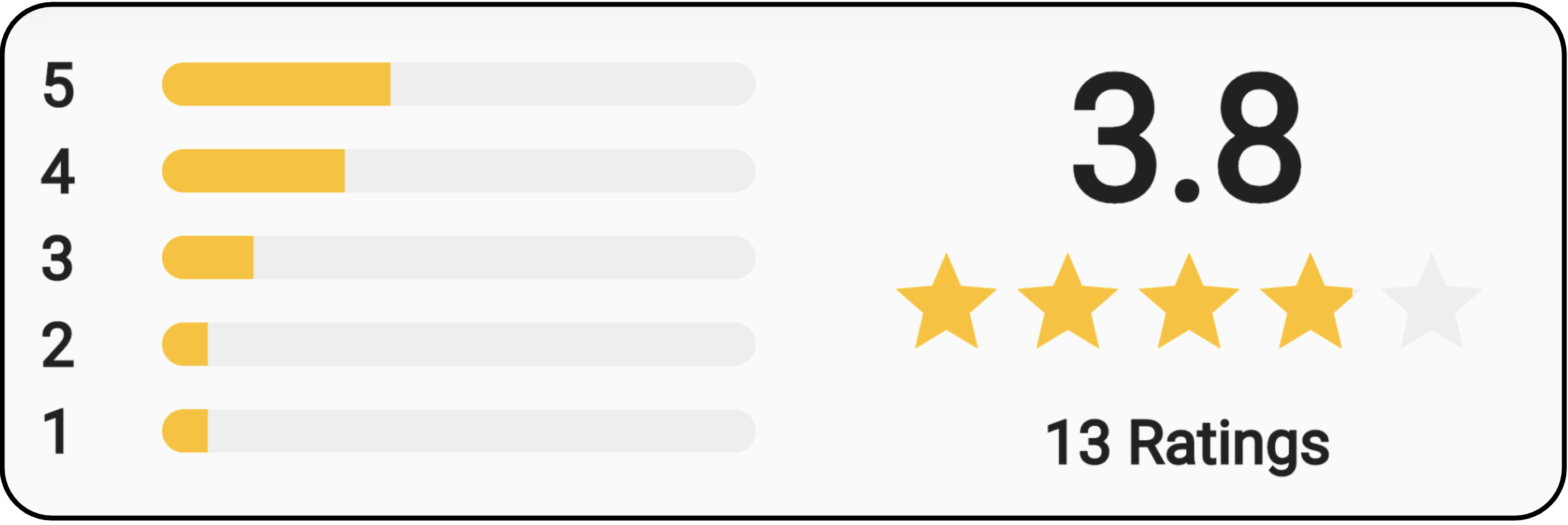
The rating_summary is based on the 5-star rating system. It creates a summary statistic Widget to display the rating and average rating of a product or service. It shows the results but cannot add a vote. The two example images are from the project page and show the two available outputs of this widget.
pub.dev: https://pub.dev/packages/rating_summary

How to use the Flutter rating summary widget
Install by adding it to your project dependencies in pubspec.yaml file.
dependencies:
  rating_summary: ^1.0.1+1
Add it to your Dart code.
import 'package:rating_summary/rating_summary.dart';An example of the base code is shown below.
RatingSummary(
  counter: 13,
  average: 3.846,
  showAverage: true,
  counterFiveStars: 5,
  counterFourStars: 4,
  counterThreeStars: 2,
  counterTwoStars: 1,
  counterOneStars: 1,
)
Flutter rating_summary parameters
- average: – the average rating that will be displayed when showAverage is true. This value will NOT be calculated from the given parameters. The default value is 0.0.
- showAverage: – If true, the average rating will be displayed. If not specified, the default value is true.
- averageStyle: – You can use this to customize the average look.
- counterFiveStars: – The number of ratings with 5 stars that will be displayed
- counterFourStars: – The number of ratings with 4 stars that will be displayed
- counterThreeStars: – The number of ratings with 3 stars that will be displayed
- counterTwoStars: – The number of ratings with 2 stars that will be displayed
- counterOneStars: – The number of ratings with 1 star that will be displayed
- label: – It will be displayed below the average counter with stars. It only appears when showAverage is true.
- labelStyle: – You can use this to customize the label look.
- color: – The colour of the stars and the horizontal bar
- backgroundColor: – The colour of the unused stars and the background of the horizontal bar
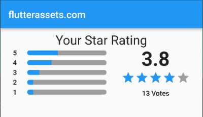
Here is an example code with the average rating counter system I presented at the beginning of the post.
RatingSummary(
  label: 'Votes',
  color: Colors.blue,
  backgroundColor: Colors.grey,
  counter: counter,
  average: average,
  showAverage: true,
  counterFiveStars: counterFiveStars,
  counterFourStars: counterFourStars,
  counterThreeStars: counterThreeStars,
  counterTwoStars: counterTwoStars,
  counterOneStars: counterOneStars,
)
Flutter rating_summary example full code
import 'package:flutter/material.dart';
import 'package:rating_summary/rating_summary.dart';

void main() {
  runApp(const MyApp());
}

class MyApp extends StatelessWidget {
  const MyApp({super.key});

  @override
  Widget build(BuildContext context) {
    return MaterialApp(
      debugShowCheckedModeBanner: false,
      title: 'Flutter Demo',
      theme: ThemeData(
        primarySwatch: Colors.blue,
      ),
      home: MyHomePage(title: 'flutterassets.com'),
    );
  }
}

class MyHomePage extends StatefulWidget {
  MyHomePage({super.key, required this.title});

  final String title;

  @override
  State<MyHomePage> createState() => _MyHomePageState();
}

class _MyHomePageState extends State<MyHomePage> {

  int counterFiveStars = 5;
  int counterFourStars = 4;
  int counterThreeStars = 2;
  int counterTwoStars = 1;
  int counterOneStars = 1;

  int counter = 0;
  late double average;

  @override
  void initState() {

    counter = counterFiveStars + counterFourStars + counterThreeStars + counterTwoStars + counterOneStars;

    int sumFiveStars = 5 * counterFiveStars;
    int sumFourStars = 4 * counterFourStars;
    int sumThreeStars = 3 * counterThreeStars;
    int sumTwoStars = 2 * counterTwoStars;
    int sumOneStars = 1 * counterOneStars;

    int allStarPoints = sumFiveStars + sumFourStars + sumThreeStars + sumTwoStars + sumOneStars;

    average = allStarPoints / counter;
    print('Average: $average');
  }

  @override
  Widget build(BuildContext context) {
    return Scaffold(
      appBar: AppBar(
        title: Text(widget.title),
      ),
      body: Center(
        child: Column(
          mainAxisAlignment: MainAxisAlignment.start,
          children: <Widget>[
            SizedBox(height: 10,),
            Text('Your Star Rating', style: TextStyle(fontSize: 26),),
            RatingSummary(
              label: 'Votes',
              color: Colors.blue,
              backgroundColor: Colors.grey,
              counter: counter,
              average: average,
              showAverage: true,
              counterFiveStars: counterFiveStars,
              counterFourStars: counterFourStars,
              counterThreeStars: counterThreeStars,
              counterTwoStars: counterTwoStars,
              counterOneStars: counterOneStars,
            )
          ],
        ),
      ),
    );
  }
}
No.3. Flutter awesome_rating package
Flutter awesome_rating package provides a widget which can display the rating and have the ability to make a rating/voting possible. You can also set the number of stars in your system.
pub.dev: https://pub.dev/packages/awesome_rating

How to use the Flutter awesome rating widget
Install by adding it to your project dependencies in pubspec.yaml file.
dependencies:
  awesome_rating: ^0.0.4
Add it to your Dart code.
import 'package:awesome_rating/awesome_rating.dart';An example of the base code is shown below.
AwesomeStarRating(
  rating: 3.4,
),
Flutter awesome_rating parameters
- starCount: – the number of stars in your system
- rating: – your ratings go here
- onRatingChanged: – it allows performing voting or rating
- color: – the colour of the full icons
- borderColor: – the colour of the empty icons
- size: – the size of the icons
- allowHalfRating: -it allows showing the half ratings
- customRatingWidget: – custom widgets
- filledIconData: – the filled / full icon widget
- halfFilledIconData: – the half-filled / half-full icon widget
- defaultIconData: – the empty / line icon widget
- spacing: – spacing between the icons
Flutter awesome_rating example code
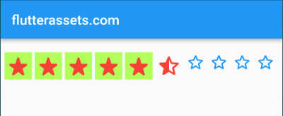
The example below shows the full customized code. I commented out the customRatingWidget because three more parameters with icon data, which also displays custom icons too.
The onRatingChanged properties allow performing rating. If you do need this functionality, simply remove it from the code.
late double rating;AwesomeStarRating(
starCount: 10,
rating: rating,
color: Colors.green,
borderColor: Colors.grey,
size: 30,
allowHalfRating: true,
spacing: 10,
// customRatingWidget: RatingWidget(
// full: Icon(Icons.star_rate_rounded, size: 34, color: Colors.red,),
// half: Icon(Icons.star_half_rounded, size: 34, color: Colors.red,),
// empty: Icon(Icons.star_border_rounded, size: 34, color: Colors.blue,),
// ),
filledIconData: Icons.radar_outlined,
halfFilledIconData: Icons.radio_button_checked_outlined,
defaultIconData: Icons.radio_button_off_outlined,
onRatingChanged: (double value){
setState((){
print(value);
rating = value;
});
},
),
Here you can have a bit more flexibility with the customization. The customRatingWidget allows using a custom widget for each icon. In my example below I wrapped the icon with a Container.
customRatingWidget: RatingWidget(
    full: Container(
        color: Colors.lightGreenAccent,
      child: Icon(Icons.star_rate_rounded, size: 40, color: Colors.red,)),
    half: Icon(Icons.star_half_rounded, size: 40, color: Colors.red,),
    empty: Icon(Icons.star_border_rounded, size: 30, color: Colors.blue,),
),
No.4. Flutter duo_rating_dialog package
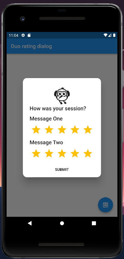
Flutter duo rating dialog package allows you to ask your app users for two ratings in one dialog box. The dialog box elements can be customized a bit too. The image below shows the dialog with default values.
pub.dev: https://pub.dev/packages/duo_rating_dialog
How to use the Flutter duo_rating_dialog widget
Install by adding it to your project dependencies in pubspec.yaml file.
dependencies:
  duo_rating_dialog: ^0.0.4
Add it to your Dart code.
import 'package:duo_rating_dialog/duo_rating_dialog.dart';An example of the code from the project page is shown below.
DuoRatingDialog(
    title: const Text('How was your session?'),
    submitButtonText: 'SUBMIT',
    submitButtonTextStyle: const TextStyle(color: Colors.black),
    onSubmitted: (value) {
      // Passing data to a new page as an example

      Map<String, dynamic> ratingsOneMap = {
        "rating": value.ratingOne,
        "status": value.getRatingOneStatus
      };
      Map<String, dynamic> ratingsTwoMap = {
        "rating": value.ratingTwo,
        "status": value.getRatingTwoStatus
      };
      List<Map<String, dynamic>> ratingsData = [
        ratingsOneMap,
        ratingsTwoMap
      ];

      Navigator.push(
          context,
          MaterialPageRoute(
              builder: ((context) =>
                  ResultsPage(ratingsData: ratingsData))));
    }
)
Flutter duo rating dialog parameters
- title: – The dialog’s title
- ratingicon: – To add any Specific Logo/Icon
- messageOne: – The dialog’s first message/description text
- messageTwo: – The dialog’s second message/description text
- starColor: – The rating bar (star icon & glow) color
- starSize: – The size of the star
- force: – Disables the cancel button and forces the user to leave a rating
- showCloseButton: – Show or hide the close button
- initialRatingOne: – The initial first rating of the rating bar
- initialRatingTwo: – The initial second rating of the rating bar
- submitButtonText: – The submit button’s label/text
- submitButtonTextStyle: – The submit button’s label/text
- onSubmitted: – Returns a RatingDialogResponse with the user’s rating and comment values
- onCancelled: – Called when the user cancels/closes the dialog
Flutter duo rating dialog example code
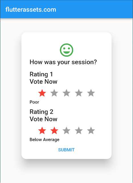
The example below shows the code with slight customization.
DuoRatingDialog(
    title: const Text('How was your session?'),
    submitButtonText: 'SUBMIT',
    submitButtonTextStyle: const TextStyle(color: Colors.blue),
    messageOne: Text('Rating 1\nVote Now'),
    messageTwo: Text('Rating 2\nVote Now'),
    starColor: Colors.red,
    starSize: 30,
    ratingicon: Icon(Icons.mood,size: 50,color: Colors.green,),
    showCloseButton: true,
    initialRatingOne: 0,
    initialRatingTwo: 0,
    force: true,
    onCancelled: (){print('Voting Canceled');},
    onSubmitted: (value) {
      // Passing data to a new page as an example

      Map<String, dynamic> ratingsOneMap = {
        "rating": value.ratingOne,
        "status": value.getRatingOneStatus
      };
      Map<String, dynamic> ratingsTwoMap = {
        "rating": value.ratingTwo,
        "status": value.getRatingTwoStatus
      };
      List<Map<String, dynamic>> ratingsData = [
        ratingsOneMap,
        ratingsTwoMap
      ];

      print('Your Rating 1: ${value.ratingOne}');
      print('Your Rating 2: ${value.ratingTwo}');

      // Navigator.push(
      //     context,
      //     MaterialPageRoute(
      //         builder: ((context) =>
      //             ResultsPage(ratingsData: ratingsData))));
    }
),
No.5. Flutter rate package
The Flutter rate package is quite simple and of course one with the shortest name. The Rate widget allows you to display the rating and to vote. Also, it allows to display and vote with half points. The image below is from the project page and shows the widget with default and customized forms.
pub.dev: https://pub.dev/packages/rate

How to use the Flutter rate widget
Install by adding it to your project dependencies in pubspec.yaml file.
dependencies:
  rate: ^0.0.2
Add it to your Dart code.
import 'package:rate/rate.dart';An example of the base code is shown below.
Rate(),
Of course, to display the values it needs a few more parameters, or at least one :).
Flutter rate parameters
- initialValue: – Initial value, defaults to `0`
- color: – Color of the icon
- iconSize: – Size of the icon
- allowHalf: – Allows half a start to be selectable, like 2.5 stars. Defaults to `false`
- allowClear: – Allows clearing if clicked in the same points. Defaults to `true`
- readOnly: – If read-only, click is blocked
- onChange: – Function called whenever the rating changes
- iconBuilder: – Custom icon builder, in case you need something more customizable
Flutter rate example code
This example shows the other parameters available for this widget.

Text(
  'Custom size and color',
  style: TextStyle(fontSize: 20),
),
Rate(
  iconSize: 50,
  color: Colors.blue,
  allowHalf: true,
  allowClear: true,
  initialValue: 4.5,
  readOnly: false,
  onChange: (value) => print(value),
),
The example below shows the Rate widget with a custom icon builder. If you use the icon builder the colour and icon size will be defined inside the builder.

Text('Custom Icons', style: TextStyle(fontSize: 20)),
Rate(
    initialValue: 3.5,
    readOnly: false,
    allowHalf: false,
    onChange: (value) => print(value),
    iconBuilder: _customIconBuilder
),
The custom icon builder can be placed at the bottom of the code. The code below does not allow to display of half points.
Icon _customIconBuilder(double value, int index) {
  var icon =
  value > index.toDouble() ? Icons.favorite : Icons.favorite_border;
  return Icon(icon, color: Colors.red, size: 50,);
}
No.6. Flutter flutter_rating_stars package
Flutter flutter_rating_stars package can display a rating and be used to get the rating. It display a star rating and also can display numeric value. The accuracy of the displayed rating is 0.1 points.
pub.dev: https://pub.dev/packages/flutter_rating_stars

How to use the Flutter flutter_rating_stars widget
Install by adding it to your project dependencies in pubspec.yaml file.
dependencies:
  flutter_rating_stars: ^1.0.3+4
Add it to your Dart code.
import 'package:flutter_rating_stars/flutter_rating_stars.dart';The base code example will show default star rating look with your initial value.
RatingStars(
  value: 3.4,
)
Flutter flutter_rating_stars parameters
- maxValue: – maximum value of the rating
- value: – value rating go here
- starCount: – number of stars
- starSize: – the size of the star widget
- valueLabelColor: – the colour background of the label widget
- valueLabelTextStyle: – the TextStyle of the text widget inside the label.
- valueLabelRadius: – the border radius of the label
- starSpacing: – the spacing between the star icons
- maxValueVisibility: – show/hide the max value in the value label on the left side (true or false)
- valueLabelVisibility: – show/hide value label at the left side (true or false)
- valueLabelPadding: – the padding of the label widget
- valueLabelMargin: – the margin of the label widget
- starOffColor: – is the colour of the star widget that [value] doesn’t reach yet
- starColor: – is the colour of the star widget that [value] reaches
- onValueChanged: – if it is not null RatingStars is able to click to change the value, and it is calculated by rounded star count only. Ex: [maxValue] is 12, [starCount] is 5, clicked on 3th star, [onValueChanged] is called with [value] is 3*12/5=7.2
- starBuilder: – use to build your own star widget
- animationDuration: – animated when the [value] is changed
Flutter flutter_rating_stars example code
The code below shows all the parameters you can use with this widget.

double rating = 5.5;RatingStars(
value: rating,
maxValue: 6,
starCount: 6,
maxValueVisibility: true,
starSize: 40,
starSpacing: 2,
starColor: Colors.red,
starOffColor: Colors.blue,
valueLabelColor: Colors.green,
valueLabelTextStyle: TextStyle(
color: Colors.white,
fontWeight: FontWeight.w400,
fontStyle: FontStyle.normal,
fontSize: 20.0),
valueLabelMargin: EdgeInsets.only(right: 20),
valueLabelPadding: EdgeInsets.all(10),
valueLabelRadius: 30,
valueLabelVisibility: true,
animationDuration: Duration(milliseconds: 1000),
onValueChanged: (value) {
//
setState(() {
print('Raiting: $value');
rating = value;
});
},
starBuilder: (index, color) => Icon(
Icons.stars,
color: color,
size: 40,
),
)WARNING
If you use a starBuilder, the size of the new icon and the starSize need to be the same. If the icon size will be bigger than the starSize the rating colour might not cover the whole icon, and the spacing between icons will be wrong.

RatingStars(
  value: rating,
  maxValue: 6,
  starCount: 6,
  starSize: 24,
  starColor: Colors.red,
  starBuilder: (index, color) => Icon(
    Icons.stars,
    color: color,
    size: 40,
  ),
)
No.7. Flutter smooth_star_rating_nsafe package
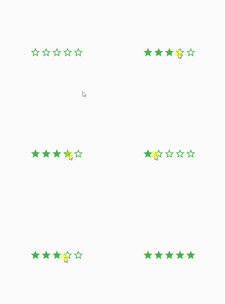
Most or all of the rating systems have the same or similar options while customizing the widget. This widget is similar to the above. The smooth_star_rating_nsafe widget has the option to use full and half ratings. It also supports touch and swipe rate.
Here is a description from the project page:
A Star rating with touch and swipe rate enabled
- Supports replacing default star icons with desired IconData
- Supports half rate and full rate (1.0 or 0.5)
- Swipe for incrementing/decrementing rate amount
- Change star body and boundary colours independently
- Control the size of the star rating
- Set your desired total Star count
- Supports click-to-rate
- Spacing between stars
pub.dev: https://pub.dev/packages/smooth_star_rating_nsafe
How to use the Flutter smooth_star_rating_nsafe widget
Install by adding it to your project dependencies in pubspec.yaml file.
dependencies:
  smooth_star_rating_nsafe: ^1.0.0+1
Add it to your Dart code.
import 'package:smooth_star_rating_nsafe/smooth_star_rating.dart';The base example code is below.
double rating = 3.5;SmoothStarRating(
rating: rating,
)
Flutter smooth_star_rating_nsafe parameters
- allowHalfRating: – Whether to use the whole numbers for rating(1.0 or 0.5)
- onRatingChanged(int rating): – Rating changed callback
- starCount: – The maximum amount of stars
- rating: – The current value of the rating
- size: – The size of a single star
- color: – The body colour of the star
- borderColor: – The border colour of the star
- spacing: – Spacing between stars(default is 0.0)
- filledIconData: – Full Rated Icon
- halfFilledIconData: – Half Rated Icon
- defaultIconData: – Default Rated Icon
Flutter smooth_star_rating_nsafe example code
Below you can see the code with all the available parameters. As you can see it is pretty simple. The onRatingChanged is responsible for getting ratings from the system.
double rating = 4.4;SmoothStarRating(
starCount: 6,
rating: rating,
size: 40.0,
filledIconData: Icons.stars,
halfFilledIconData: Icons.mode_night,
defaultIconData: Icons.stars_outlined,
color: Colors.green,
borderColor: Colors.red,
spacing:6.0,
allowHalfRating: true,
onRatingChanged: (value) {
rating = value;
setState(() {});
},
)


