In this post, I would like to show you a list of Beautiful and awesome animated backgrounds in Flutter. I will provide a link to the pub.dev and GitHub for each project.
All the packages will be presented with code examples.
- weather_animation
- animated_background
- lit_starfield
- colorful_background
- create_atom
- starsview
- particles_flutter
- parallax_rain
- flutter_weather_bg_null_safety
- floating_bubbles
- metaballs
No.1. Flutter weather_animation
The Flutter weather animation package contains really stylish weather animations. The package also has ready-made weather scenes in the WeatherScene. The widget can be well customized too if you need it. The image below is from the project page and shows some of the cool results.

How to use Flutter weather animation
In your pubspec.yaml:
dependencies:
  weather_animation: ^0.0.1
In your Dart file:
import 'package:weather_animation/weather_animation.dart';The code snippet below shows the WrapperScene with available weather widgets within the children element. You can use one, two, all or none. Each widget has a list of properties that can be customised. If you want to use it as a background for your app you can wrap it with a Stack widget.
body: SizedBox(
  width: MediaQuery.of(context).size.width,
  height: MediaQuery.of(context).size.height,
  child:
  const WrapperScene(
    colors: [
      Color(0xff283593),
      Color(0xffff8a65),
    ],
    children: [
      SunWidget(),
      CloudWidget(),
      WindWidget(),
      RainWidget(),
      SnowWidget(),
      ThunderWidget(),
    ],
  ),
)
Flutter weather animation SunWidget configuration example
Each of the weather widgets has the same or similar config options.
SunWidget(
  sunConfig: SunConfig(
    width: 262.0,
    blurSigma: 10.0,
    blurStyle: BlurStyle.solid,
    isLeftLocation: true,
    coreColor: Color(0xffffa726),
    midColor: Color(0xd6ffee58),
    outColor: Color(0xffff9800),
    animMidMill: 2000,
    animOutMill: 1800,
  ),
),
Flutter weather animation presets

Flutter weather animation WeatherScene frosty example code
body: SizedBox(
  width: MediaQuery.of(context).size.width,
  height: MediaQuery.of(context).size.height,
  child: WeatherScene.frosty.getWeather()
)
Flutter weather animation WeatherScene rainyOvercast example code
body: SizedBox(
  width: MediaQuery.of(context).size.width,
  height: MediaQuery.of(context).size.height,
  child: WeatherScene.rainyOvercast.getWeather()
)
Flutter weather animation WeatherScene scorchingSun example code
body: SizedBox(
  width: MediaQuery.of(context).size.width,
  height: MediaQuery.of(context).size.height,
  child: WeatherScene.scorchingSun.getWeather()
)
Flutter weather animation WeatherScene showerSleet example code
body: SizedBox(
  width: MediaQuery.of(context).size.width,
  height: MediaQuery.of(context).size.height,
  child: WeatherScene.showerSleet.getWeather()
)
Flutter weather animation WeatherScene snowfall example code
body: SizedBox(
  width: MediaQuery.of(context).size.width,
  height: MediaQuery.of(context).size.height,
  child: WeatherScene.snowfall.getWeather()
)
Flutter weather animation WeatherScene stormy example code
body: SizedBox(
  width: MediaQuery.of(context).size.width,
  height: MediaQuery.of(context).size.height,
  child: WeatherScene.stormy.getWeather()
)
Flutter weather animation WeatherScene sunset example code
body: SizedBox(
  width: MediaQuery.of(context).size.width,
  height: MediaQuery.of(context).size.height,
  child: WeatherScene.sunset.getWeather()
)
Flutter weather animation WeatherScene weatherEvery example code
body: SizedBox(
  width: MediaQuery.of(context).size.width,
  height: MediaQuery.of(context).size.height,
  child: WeatherScene.weatherEvery.getWeather()
)
More information about this package can be found on the project page, see the links below.
pub.dev: https://pub.dev/packages/weather_animation
GitHub: https://github.com/PackRuble/weather_animation
No.2. Flutter animated_background
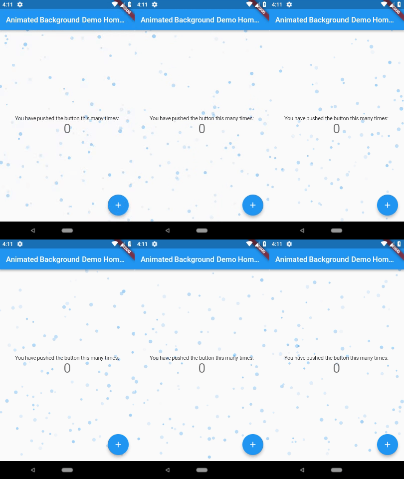
As the author of this plugin described it, Animated Backgrounds for Flutter. Easily extended to paint whatever you want on the canvas. It has a quite few options to customize. I recommend checking examples on the project page and playing with them.
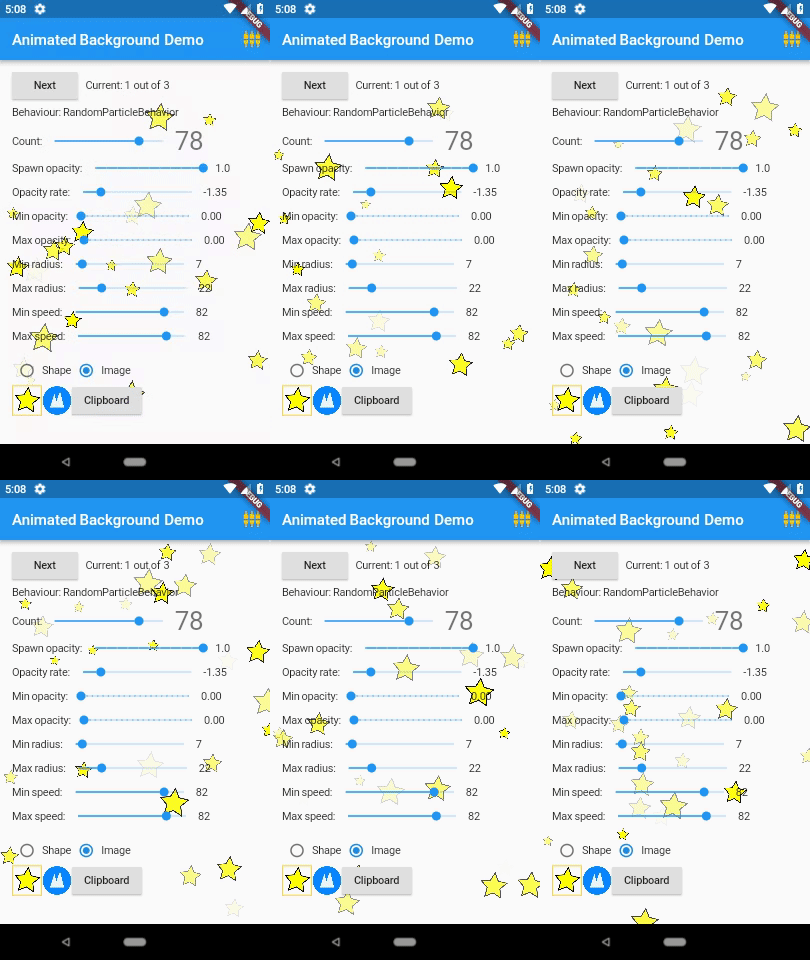
How to use Flutter animated_background
In your pubspec.yaml:
dependencies:
  animated_background: ^2.0.0
In your Dart file:
import 'package:animated_background/animated_background.dart';Warning 🙂
You have to use it in a Stateful Widget with mixin TickerProviderStateMixin or pass a ticker provider in vsync. Without this, you can see the error.
class _MyHomePageState extends State<MyHomePage> with TickerProviderStateMixinThe snippet below shows a basic code, and the second one shows the animated background widget with some options to play with. I really recommend going to the project page example code and checking all the options.
body: AnimatedBackground(
  behaviour: RandomParticleBehaviour(),
  vsync: this,
  child: Center(
      child: Text('Hello', style: TextStyle(fontSize: 40),)
  ),
),
Flutter animated_background example code
I want to mention this just in case, all the page elements like Texts, Rows, Columns etc. go to the AnimatedBackground child element.
body: AnimatedBackground(
  behaviour: RandomParticleBehaviour(
    options: ParticleOptions(
      baseColor: Colors.blue,
      spawnOpacity: 0.0,
      opacityChangeRate: 0.25,
      minOpacity: 0.1,
      maxOpacity: 0.4,
      spawnMinSpeed: 30.0,
      spawnMaxSpeed: 70.0,
      spawnMinRadius: 7.0,
      spawnMaxRadius: 55.0,
      particleCount: 40,
    ),
  ),
  vsync: this,
  child: Center(
      child: Text('Hello', style: TextStyle(fontSize: 40),)
  ),
),
More information about this package can be found on the project page, links below.
pub.dev: https://pub.dev/packages/animated_background
GitHub: https://github.com/AndreBaltazar8/flutter_animated_background
No. 3. Flutter lit_starfield
This Flutter plugin renders an animated starfield on your screen.

How to use Flutter lit_starfield
In your pubspec.yaml:
dependencies:
  lit_starfield: ^0.1.1
In your Dart file:
import 'package:lit_starfield/lit_starfield.dart';
To test this widget simply add the LitStarfieldContainer to the body and you will see the result immediately. But If you want to use this as your app background you can wrap it with a Stack widget.
body: LitStarfieldContainer(),
Flutter lit_starfield example code
Here is the example with the Stack widget. As you can see below, I used a few properties to change the lit_starfield background a little. You can also create a separate widget at the bottom of the code and use only your new widget in your page body.
body: Stack(
  children: [
    LitStarfieldContainer(
      animated: true,
      number: 500,
      velocity: 0.85,
      depth: 0.9,
      scale: 4,
      starColor: Colors.amber,
      backgroundDecoration: BoxDecoration(
        gradient: LinearGradient(
          colors: [
            Color(0xFF031936),
            Color(0xFF791818),
            Color(0xFF284059),
          ],
          begin: Alignment.topRight,
          end: Alignment.bottomLeft,
        ),
      ),
    ),
    Center(
        child: Text('Hello', style: TextStyle(fontSize: 40, color: Colors.white))
    )
  ],
)
Please create a new class on the bottom of the page code with the name you want to use, I used LitStarfield. Then add your LitStarfieldContainer with your custom settings. When this is done use your new widget in Stack in your page body.
class LitStarfield extends StatelessWidget {
  const LitStarfield({Key? key}) : super(key: key);

  @override
  Widget build(BuildContext context) {
    return LitStarfieldContainer(
      animated: true,
      number: 500,
      velocity: 0.85,
      depth: 0.9,
      scale: 4,
      starColor: Colors.amber,
      backgroundDecoration: BoxDecoration(
        gradient: LinearGradient(
          colors: [
            Color(0xFF031936),
            Color(0xFF791818),
            Color(0xFF05294B),
          ],
          begin: Alignment.topRight,
          end: Alignment.bottomLeft,
        ),
      ),
    );
  }
}
body: Stack(
children: [
LitStarfield(),
Center(
child: Text('Hello', style: TextStyle(fontSize: 40, color: Colors.white))
)
],
)More information about this package can be found on the project page, links below.
pub.dev: https://pub.dev/packages/lit_starfield
GitHub: https://github.com/litlifesoftware/lit_starfield
No. 4. Flutter colorful_background
The Flutter colorful_background is a package that allows you to animate the background with the gradient colours from your colour list.

How to use Flutter colorful_background
In your pubspec.yaml:
dependencies:
  colorful_background: ^0.0.4
In your Dart file:
import 'package:colorful_background/colorful_background.dart';
Flutter colorful_background example code
Below you can see a basic code. To make this work you need to specify at least two colours and add set-up duration for the animation. The decoratorsList is not required but can be a nice addon to the animated gradient colours. Inside the decoratorsList, you can add a Container with background colours and position them on your screen.
body: ColorfulBackground(
  duration: Duration(milliseconds: 1000),
  backgroundColors: [
    const Color(0xFFFF5ACD),
    const Color(0xFFFBDA61),
    const Color(0xFF00AB79),
    const Color(0xFFF7CE68),
    const Color(0xFFFF007D),
  ],

 decoratorsList: [

  ]
  child: Center(
      child: Text('Hello',
          style: TextStyle(
              fontSize: 40,
              color: Colors.white)
      )
  )
),
Here you can find the example for colorful_background as a separate widget which can be placed below your page code. I also added some Positioned Containers to the decoratorsList.
body: AnimatedBackground(
    child: Center(
        child: Text('Hello',
            style: TextStyle(fontSize: 40, color: Colors.white))),
),
class AnimatedBackground extends StatelessWidget {
AnimatedBackground({Key? key, this.child,}) : super(key: key);
Widget? child;
@override
Widget build(BuildContext context) {
return ColorfulBackground(
duration: Duration(milliseconds: 1000),
backgroundColors: [
const Color(0xFFFF5ACD),
const Color(0xFFFBDA61),
const Color(0xFF00AB79),
const Color(0xFFF7CE68),
const Color(0xFFFF007D),
],
decoratorsList: [
Positioned(
top: MediaQuery.of(context).size.height / 2,
right: MediaQuery.of(context).size.width / 2.5,
child: Container(
height: 200,
width: 200,
decoration: BoxDecoration(
color: Colors.blue.withOpacity(0.3),
shape: BoxShape.circle,
),
),
) ,
Positioned(
top: 40,
right: 20,
child: Container(
height: 40,
width: 40,
decoration: BoxDecoration(
color: Colors.yellow.withOpacity(0.3),
shape: BoxShape.circle,
),
),
),
Positioned(
top: 200,
right: 90,
child: Container(
height: 120,
width: 120,
decoration: BoxDecoration(
color: Colors.red.withOpacity(0.3),
shape: BoxShape.circle,
),
),
),
Positioned(
top: MediaQuery.of(context).size.height / 2,
right: 90,
child: Container(
height: 80,
width: 80,
decoration: BoxDecoration(
color: Colors.purple.withOpacity(0.3),
shape: BoxShape.circle,
),
),
),
Positioned(
top: MediaQuery.of(context).size.height / 1.45,
right: 90,
child: Container(
height: 120,
width: 120,
decoration: BoxDecoration(
color: Colors.white.withOpacity(0.3),
shape: BoxShape.circle,
),
),
),
],
child: child,
);
}
}More information about this package can be found on the project page, links below.
pub.dev: https://pub.dev/packages/colorful_background
GitHub: https://github.com/x-abgth/colorful_background
No. 5. Flutter create_atom
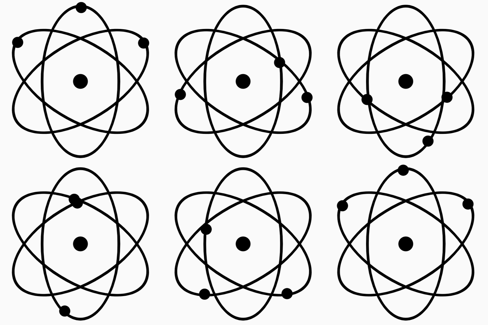
The Flutter create_atom is not technically a background widget but it could be adapted. If you place it in the Stack widget it can be a nice background. This widget can also work as an animated element, for example as the first element in a Row. I will show an example below. You can find more image examples on the project pages (see links below).
How to use Flutter create_atom
This project wasn’t maintained for a while but it has the null safety version and it is still working now. Make sure you have the null safety version installed.
In your pubspec.yaml:
dependencies:
  create_atom: ^2.1.0-nullsafety
In your Dart file:
import 'package:create_atom/create_atom.dart';You need to install the math package too.
import 'dart:math' as math;Flutter create_atom example code
This is the base code for this package. The only required value is size. You can also customize it a bit, sees the second code snipped.
Atom(
  size: 200.0,
),
Container(
width: 210.0,
height: 210.0,
color: Color(0xFF000000),
child: Atom(
size: 200.0,
nucleusRadiusFactor: 3.5,
orbitsWidthFactor: 3.0,
orbit1Angle: math.pi / 2,
orbit2Angle: math.pi / 6,
orbit3Angle: - math.pi / 6,
orbitsColor: Color(0xFF00D8FF),
electronsColor: Color(0xFFFF0000),
nucleusColor: Color(0xFF00D8FF),
animDuration1: Duration(seconds: 4),
animDuration2: Duration(seconds: 2),
animDuration3: Duration(seconds: 1),
centerWidget: Icon(Icons.electric_bolt, size: 60, color: Colors.red,),
),
),
Now you can place it inside the Stack widget. Also, it would be a good idea to create a separate widget at the bottom of the page.
return Scaffold(
  backgroundColor: Colors.black,
  appBar: AppBar(
    title: Text(widget.title),
  ),
  body: Stack(
    children: [
      AtomBackground(),
      Center(
        child: Container(
          width: 300,
          height: 50,
          child: Card(
            child: Center(
              child: Text('Hello',
                  style: TextStyle(fontSize: 30, color: Colors.black)),
            )
          ),
        ),
      )
    ],

  ),
);
The code below shows your new widget. Inside our build, I added an Opacity widget in order to fade a bit the atom visibility.
class AtomBackground extends StatelessWidget {
  AtomBackground({Key? key}) : super(key: key);

  @override
  Widget build(BuildContext context) {
    return Opacity(
      opacity: 0.4,
      child: Container(
        child: Center(
          child: Column(
            mainAxisAlignment: MainAxisAlignment.center,
            children: [
              Atom(
                size: MediaQuery.of(context).size.width - 20,
                nucleusRadiusFactor: 3.5,
                orbitsWidthFactor: 1.0,

                orbit1Angle: math.pi / 2,
                orbit2Angle: math.pi / 6,
                orbit3Angle: - math.pi / 6,

                orbitsColor: Color(0xFF00D8FF),
                electronsColor: Color(0xFFFF0000),
                nucleusColor: Color(0xFF00D8FF),

                animDuration1: Duration(seconds: 4),
                animDuration2: Duration(seconds: 2),
                animDuration3: Duration(seconds: 1),

                centerWidget: Icon(Icons.electric_bolt, size: 60, color: Colors.red,),
              ),
            ],
          ),
        ),
      ),
    );
  }
}
Use Flutter create_atom like an Icon (kind of)
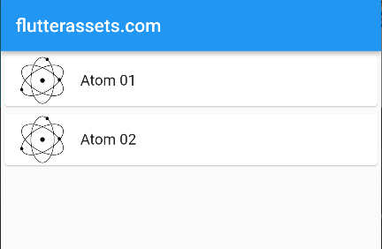
In the code below I used the Atom widget as a leading element in ListTile but you can also use it inside Row or any place like a normal widget.
Column(
  children: [
    Card(
      child: ListTile(
        leading: Atom(size: 50,),
        title: Text('Atom 01'),
      ),
    ),
    Card(
      child: ListTile(
        leading: Atom(size: 50,),
        title: Text('Atom 02'),
      ),
    ),
  ],
),
If you need more info, please look into the project pages, see the links below.
pub.dev: https://pub.dev/packages/create_atom
GitHub: https://github.com/Abhi011999/create_atom_flutter
No. 6. Flutter starsview
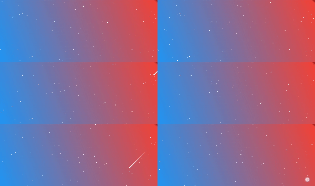
Flutter’s AnimatedStarsView. The widget displays a view with an animated night sky effect.
How to use Flutter starsview
As always installation first.
In your pubspec.yaml:
dependencies:
  starsview: ^0.0.2
In your Dart file:
import 'package:starsview/starsview.dart';The StarsView has only one parameter to set up. It is fps for the animation. This widget also requires a background with a colour or a gradient colour and needs to be placed in the Stack widget. As a background colour, I used a Container with gradient colours.
StarsView(
  fps: 60,
)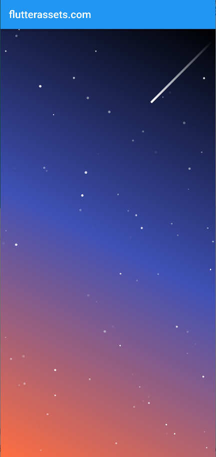
Flutter starsview example code
Stack(
  children: <Widget>[
    Container(
        decoration: const BoxDecoration(
            gradient: LinearGradient(
              begin: Alignment.topRight,
              end: Alignment.bottomLeft,
              colors: <Color>[
                Colors.black,
                Colors.indigo,
                Colors.deepOrangeAccent,
              ],
            )
        )
    ),
    const StarsView(
      fps: 60,
    )
  ],
),
To make your main build cleaner, you can make an external widget with the StarViewBackground widget.
body: Stack(
  children: [
    StarsViewBackground(),
    Center(
        child: Text('Hello',
          style: TextStyle(fontSize: 40, color: Colors.white),
        )
    )
  ],
),
class StarsViewBackground extends StatelessWidget {
StarsViewBackground({Key? key}) : super(key: key);
@override
Widget build(BuildContext context) {
return Stack(
children: <Widget>[
Container(
decoration: const BoxDecoration(
gradient: LinearGradient(
begin: Alignment.topRight,
end: Alignment.bottomLeft,
colors: <Color>[
Colors.black,
Colors.indigo,
Colors.deepOrangeAccent,
],
)
)
),
const StarsView(
fps: 60,
)
],
);
}
}More information about this package can be found on the project page, links below.
pub.dev: https://pub.dev/packages/starsview
GitHub: https://github.com/flyingV805/AnimatedStarsFlutter
No. 7. particles_flutter
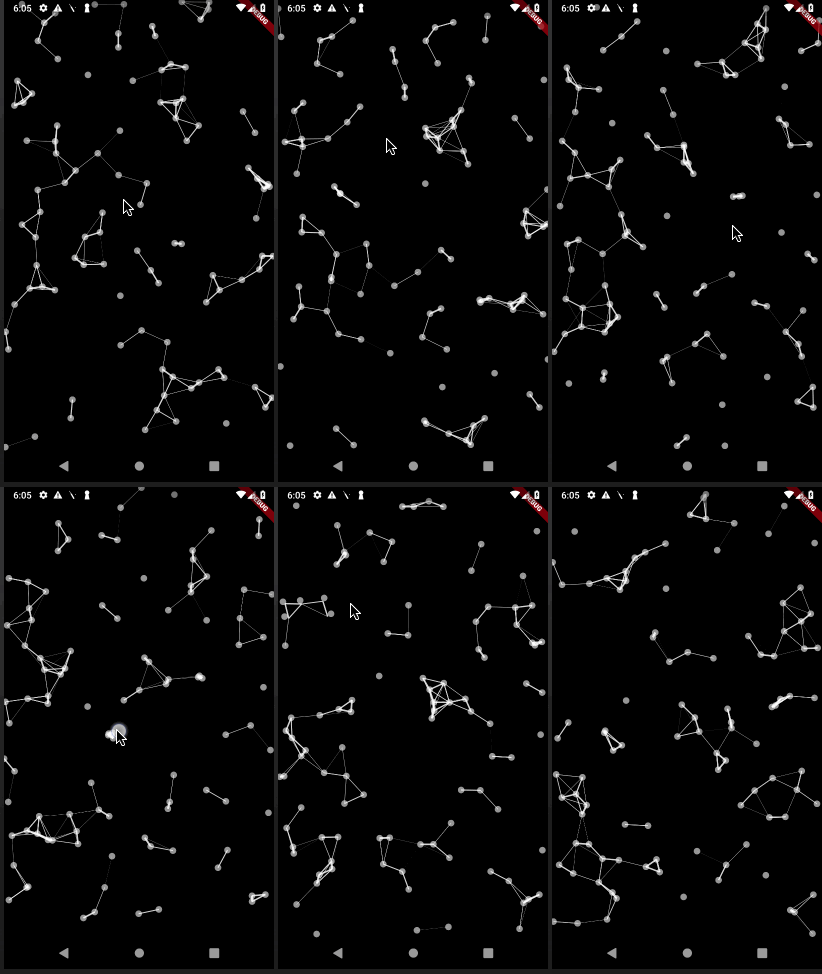
The Flutter Particles is as the name suggests, a particle animation widget. You can control the speed of the animation, the number of particles displayed on the screen, and size and shape via connecting particles with lines.

How to use particles_flutter
In your pubspec.yaml:
dependencies:
  particles_flutter: ^0.1.4
In your Dart file:
import 'package:particles_flutter/particles_flutter.dart';The base code requires only 3 parameters, but it all looks better when you customize all.
CircularParticle(
   height: MediaQuery.of(context).size.height,
   width: MediaQuery.of(context).size.width,
   isRandomColor: false,
),
particles_flutter example code
I should also mention about the background colour. It was set to black in the Scaffold element.
backgroundColor: Colors.black,CircularParticle(
key: UniqueKey(),
awayRadius: 80,
numberOfParticles: 200,
speedOfParticles: 1,
height: MediaQuery.of(context).size.height,
width: MediaQuery.of(context).size.width,
onTapAnimation: false,
particleColor: Colors.white.withAlpha(150),
awayAnimationDuration: Duration(milliseconds: 600),
maxParticleSize: 12,
isRandSize: true,
isRandomColor: true,
randColorList: [
Colors.red.withAlpha(210),
Colors.white.withAlpha(210),
// Colors.yellow.withAlpha(210),
// Colors.green.withAlpha(210)
],
awayAnimationCurve: Curves.easeInOutBack,
enableHover: false,
hoverColor: Colors.white,
hoverRadius: 90,
connectDots: true, //not recommended
),Now you can create a new widget class on the bottom for your new background.
Stack(
  children: [
    ParticleBackground(),
    Center(
        child: Container(
          padding: EdgeInsets.all(10),
          height: 100,
          width: 300,
          color: Color(0xdaffffff),
          child: const Text('Hello',
              style: TextStyle(fontSize: 30, color: Colors.black)
          ),
      )
    )
  ],
),
class ParticleBackground extends StatelessWidget {
ParticleBackground({Key? key}) : super(key: key);
@override
Widget build(BuildContext context) {
return CircularParticle(
key: UniqueKey(),
awayRadius: 80,
numberOfParticles: 200,
speedOfParticles: 1,
height: MediaQuery.of(context).size.height,
width: MediaQuery.of(context).size.width,
onTapAnimation: false,
particleColor: Colors.white.withAlpha(150),
awayAnimationDuration: Duration(milliseconds: 600),
maxParticleSize: 12,
isRandSize: true,
isRandomColor: true,
randColorList: [
Colors.red.withAlpha(210),
Colors.white.withAlpha(210),
// Colors.yellow.withAlpha(210),
// Colors.green.withAlpha(210)
],
awayAnimationCurve: Curves.easeInOutBack,
enableHover: false,
hoverColor: Colors.white,
hoverRadius: 90,
connectDots: true, //not recommended
);
}
}
How to add a Gradient colour to Scaffold in Flutter
I will show you two ways to do that. First, to add a gradient colour to the scaffold you can wrap it with a container and add the gradient with the BoxDecoration. Also, you need to set the scaffold background colour to transparent.
@override
Widget build(BuildContext context) {

  return Container(
    decoration: const BoxDecoration(
        gradient: LinearGradient(
          begin: Alignment.topCenter,
          end: Alignment.bottomCenter,
          colors: [
            Color.fromARGB(255, 14, 93, 119),
            Color.fromARGB(255, 21,236,229)
          ],
        )),
    child: Scaffold(
      backgroundColor: Colors.transparent,
      appBar: AppBar(
        title: Text(widget.title),
      ),
      body: Stack(
        children: [
          ParticleBackground(),
          Center(
              child: Container(
                padding: EdgeInsets.all(10),
                height: 100,
                width: 300,
                color: Color(0xdaffffff),
                child: const Text('Hello',
                    style: TextStyle(fontSize: 30, color: Colors.black)
                ),
            )
          )
        ],
      )
    ),
  );
}
The second way will be to wrap all of the body elements in a Container with a gradient colour with the BoxDecoration.
return Scaffold(
  appBar: AppBar(
    title: Text(widget.title),
  ),
  body: Container(
    decoration: const BoxDecoration(
        gradient: LinearGradient(
          begin: Alignment.topCenter,
          end: Alignment.bottomCenter,
          colors: [
            Color.fromARGB(255, 14, 93, 119),
            Color.fromARGB(255, 21,236,229)
          ],
        )),
    child: Stack(
      children: [
        ParticleBackground(),
        Center(
            child: Container(
              padding: EdgeInsets.all(10),
              height: 100,
              width: 300,
              color: Color(0xdaffffff),
              child: const Text('Hello',
                  style: TextStyle(fontSize: 30, color: Colors.black)
              ),
          )
        )
      ],
    ),
  )
);
More information about this package can be found on the project page, links below.
pub.dev: https://pub.dev/packages/particles_flutter
GitHub: https://github.com/rajajain08/particles_flutter/tree/master/particles_flutter
No. 8. Flutter parallax_rain
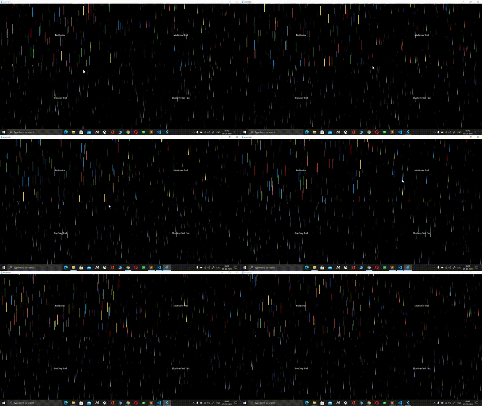
With this package, you can create a really nice 3D rain effect on your background. You can change colours, speed, and probably a little more. The example is from the project page and shows the effect on the computer screen, but the effect on mobile will be the same.
How to use Flutter Parallax Rain
In your pubspec.yaml:
dependencies:
  parallax_rain: ^1.1.0
In your Dart file:
import 'package:parallax_rain/parallax_rain.dart';Now you can add the ParallaxRain widget to your body element. You do not need to use Stack here, this widget has already the child element. In my example, I used the same gradient background as I used in the previous package.

Flutter parallax_rain example code
body: Container(
  decoration: const BoxDecoration(
      gradient: LinearGradient(
        begin: Alignment.topCenter,
        end: Alignment.bottomCenter,
        colors: [
          Color.fromARGB(255, 8, 51, 63),
          Color.fromARGB(255, 21,236,229)
        ],
      )),
  child: Container(
    width: MediaQuery.of(context).size.width,
    height: MediaQuery.of(context).size.height,
    child: ParallaxRain(
      dropColors: [
        Colors.red,
        Colors.green,
        Colors.blue,
        Colors.yellow,
        Colors.brown,
        Colors.blueGrey
      ],
      child: Center(
          child: Container(
            padding: EdgeInsets.all(10),
            height: 100,
            width: 300,
            color: Color(0xdaffffff),
            child: const Text('Hello',
                style: TextStyle(fontSize: 30, color: Colors.black)
            ),
          )
      )
    ),
  ),
)
Below you can find more options to customize the widget.
ParallaxRain(
  trail: true,
    trailStartFraction: 0.1,
    key: GlobalKey(),
    dropFallSpeed: 2,
  numberOfDrops: 300,
  numberOfLayers: 5,
  dropHeight: 10,
  dropWidth: 1,
  distanceBetweenLayers: 0.5,
  rainIsInBackground: false,
  dropColors: [
    Colors.red,
    Colors.green,
    Colors.blue,
    Colors.yellow,
    Colors.brown,
    Colors.blueGrey
  ],
  child: Center(
      child: Container(
        padding: EdgeInsets.all(10),
        height: 100,
        width: 300,
        color: Color(0xdaffffff),
        child: const Text('Hello',
            style: TextStyle(fontSize: 30, color: Colors.black)
        ),
      )
  )
),
With this widget, you can create your own rain widget, at the bottom of the code, the same way we did with described above the colorful_background package.
More information about this package can be found on the project page, links below.
pub.dev: https://pub.dev/packages/parallax_rain
GitHub: https://github.com/Zachariah-Abraham/parallax_rain
No. 9. flutter_weather_bg_null_safety
This is another cool plugin, but this time it allows you to have the weather background in your app. It supports 15 different types of weather. You can use this plugin as a background for your whole app or inside another element like Container. The image is from the project page, there you can find more example codes and images (link at the bottom of this section).
How to use flutter weather background
In your pubspec.yaml:
dependencies:
  flutter_weather_bg_null_safety: ^1.0.0
In your Dart file:
import 'package:flutter_weather_bg_null_safety/bg/weather_bg.dart';
import 'package:flutter_weather_bg_null_safety/bg/weather_cloud_bg.dart';
import 'package:flutter_weather_bg_null_safety/bg/weather_color_bg.dart';
import 'package:flutter_weather_bg_null_safety/bg/weather_night_star_bg.dart';
import 'package:flutter_weather_bg_null_safety/bg/weather_rain_snow_bg.dart';
import 'package:flutter_weather_bg_null_safety/bg/weather_thunder_bg.dart';
import 'package:flutter_weather_bg_null_safety/flutter_weather_bg.dart';
import 'package:flutter_weather_bg_null_safety/utils/image_utils.dart';
import 'package:flutter_weather_bg_null_safety/utils/print_utils.dart';
import 'package:flutter_weather_bg_null_safety/utils/weather_type.dart';
Flutter weather backround example code
The base code of the widget is quite simple. You can use width and height and the weather type. The second code snippet shows the weather background in the Stack widget.
WeatherBg(
  weatherType: WeatherType.thunder,
    width: MediaQuery.of(context).size.width,
    height: MediaQuery.of(context).size.height
),
Stack(
  children: [
    WeatherBg(
      weatherType: WeatherType.thunder,
        width: MediaQuery.of(context).size.width,
        height: MediaQuery.of(context).size.height
    ),
    Center(
      child: Container(
        padding: EdgeInsets.all(10),
        height: 100,
        width: 300,
        color: Color(0xc0ffffff),
        child: const Text('Hello',
            style: TextStyle(fontSize: 30, color: Colors.black)
        ),
      )
    )
  ],
)
Flutter weather background WeatherType’s
- WeatherType.sunny
- WeatherType.sunnyNight
- WeatherType.cloudy
- WeatherType.cloudyNight
- WeatherType.overcast
- WeatherType.lightRainy
- WeatherType.middleRainy
- WeatherType.heavyRainy
- WeatherType.thunder
- WeatherType.hazy
- WeatherType.foggy
- WeatherType.lightSnow
- WeatherType.middleSnow
- WeatherType.heavySnow
- WeatherType.dusty
More information about this package can be found on the project page, links below.
pub.dev: https://pub.dev/packages/flutter_weather_bg_null_safety
GitHub: https://github.com/lianyagang/flutter_weather_bg_null_safety
No. 10. Flutter floating_bubbles
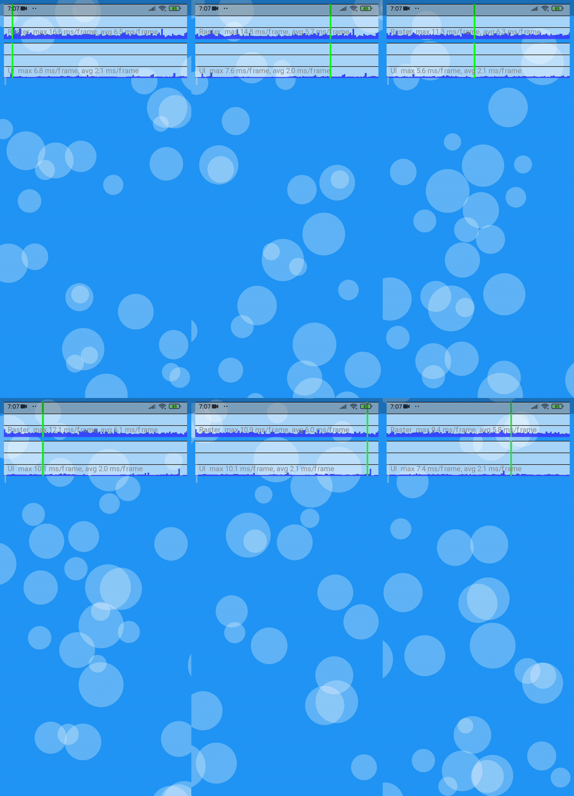
Floating Bubbles is the package that allows you to add floating bubbles in the foreground and the background to your main page widget.
How to use Flutter floating bubbles
In your pubspec.yaml:
dependencies:
  floating_bubbles: ^2.4.0
In your Dart file:
import 'package:floating_bubbles/floating_bubbles.dart';The base code for this widget is a bit similar to the others presented above. You need to use a stack widget to see the best results. The base code for the FloatingBuubles only is below. The first image below shows the gradient background colours which I will add to the next example code.
FloatingBubbles.alwaysRepeating(
      noOfBubbles: 25,
      strokeWidth: 8,
      colorsOfBubbles: [
        Colors.red,
      ],
)
By the way, FloatingBubbles.alwaysRepeating allows the bubbles to float and never stop. If You do not use the alwaysRepeating you will need to specify the duration of the bubbles flow, see the example below.

Flutter floating bubbles example code
In this example, I used the gradient background colours in a Container decoration but you can use a single colour too. Right now the flow of the bubbles is in the foreground. You can change it by commenting out the first Container child and uncommenting the part at the end of the code.
body: Stack(
  children: [
    Positioned.fill(
      child: Container(
        // color: Colors.deepPurple,
          decoration: const BoxDecoration(
            gradient: LinearGradient(
              begin: Alignment.topCenter,
              end: Alignment.bottomCenter,
              colors: [
                Color.fromARGB(255, 5, 54, 101),
                Color.fromARGB(255, 239, 96, 227)
              ],
            )
          ),
        child: Center(
            child: Container(
              padding: EdgeInsets.all(10),
              height: 200,
              width: 300,
              color: Color(0xc0ffffff),
              child: const Text('Hello',
                  style: TextStyle(fontSize: 30, color: Colors.black)
              ),
            )
        ),
      ),
    ),
    Positioned.fill(
        child: FloatingBubbles.alwaysRepeating(
          noOfBubbles: 25,
          sizeFactor: 0.16,
          // seconds, required if use without alwaysRepeating
          // duration: 120,
          opacity: 70,
          paintingStyle: PaintingStyle.fill, //PaintingStyle.stroke
          strokeWidth: 2, // works with stroke
          shape: BubbleShape.circle, // circle is the default. No need to explicitly mention if its a circle.
          speed: BubbleSpeed.slow, //slow, normal, fast
          colorsOfBubbles: [
            Colors.green.withAlpha(30),
            Colors.red,
          ],
    )
    ),
    // Center(
    //   child: Container(
    //     padding: EdgeInsets.all(10),
    //     height: 200,
    //     width: 300,
    //     color: Color(0xc0ffffff),
    //     child: const Text('Hello',
    //         style: TextStyle(fontSize: 30, color: Colors.black)
    //     ),
    //   )
    // )
  ],
)
There is much more to read on the project pages, see the links below.
pub.dev: https://pub.dev/packages/floating_bubbles
GitHub: https://github.com/Poujhit/floating_bubbles
No. 11. Flutter metaballs
In this place, I think I will use the original project description.
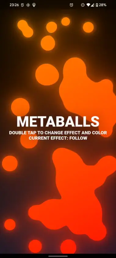
“This library makes it easy to add well-performing, highly configurable metaballs to your flutter project. The metaballs automatically scale to any screen size so you don’t have to manually adjust the parameters for different devices. The metaballs have been implemented in shaders for the best performance across all devices. All available effects have been optimized for both mouse and touch input and should not interfere with any gesture detectors.”
How to use Flutter metaballs
In your pubspec.yaml:
dependencies:
  metaballs: ^1.4.2
In your Dart file:
import 'package:metaballs/metaballs.dart';It is time for a base core, which is really short. The first image below shows the effect of the base code. Please note you can or should set a background colour for your page separately, for example you can wrap theMetaballs with the Container with a colour assigned to it. I added the background colour to the next example.
body: Metaballs(),
Flutter Metaballs example code

The code below shows the code with its optimization options. As I mentioned earlier I added the background colour with the container, and in this case I added the gradient colours. The MetaBalls also has the child element, so the other widgets can go there.
body: Container(
  // color: const Color.fromARGB(255, 9, 34, 70),
  decoration: const BoxDecoration(
      gradient: LinearGradient(
        begin: Alignment.topCenter,
        end: Alignment.bottomCenter,
        colors: [
          Color.fromARGB(255, 5, 37, 47),
          Color.fromARGB(255, 21,236,229)
        ],
      )),
  child: Metaballs(
      color: const Color.fromARGB(255, 66, 133, 244),
      effect: MetaballsEffect.follow(
        growthFactor: 1,
        smoothing: 1,
        radius: 0.5,
      ),
      gradient: const LinearGradient(
          colors: [
            Color.fromARGB(255, 152, 51, 9),
            Color.fromARGB(255, 255, 167, 72),
          ],
          begin: Alignment.bottomRight,
          end: Alignment.topLeft
      ),
      metaballs: 30,
      animationDuration: const Duration(milliseconds: 200),
      speedMultiplier: 1,
      bounceStiffness: 3,
      minBallRadius: 15,
      maxBallRadius: 40,
      glowRadius: 0.7,
      glowIntensity: 0.6,
      child: Center(
        child: Container(
          padding: EdgeInsets.all(10),
          height: 200,
          width: 300,
          color: Color(0xc0ffffff),
          child: const Text('Hello',
              style: TextStyle(fontSize: 30, color: Colors.black)
          ),
        )
      )
  ),
),
There is much more about customization on the project pages, see the links below.
pub.dev: https://pub.dev/packages/metaballs

