Do you want to build a simple calculator app or maybe you want to add a calculator to your existing project? Below I will show you a few simple calculator widgets that can be easily used.
The list below doesn’t have any specific hierarchy but all packages are presented as they appeared on pub.dev.
No.1 flutter_simple_calculator
The package was created by zuvola. This project can be found on pub.dev and GitHub.
This project is quite simple to implement and use. You could implement it using only one line of code. But first, you add the package to your dependencies and import it into your Dart code.
dependencies:
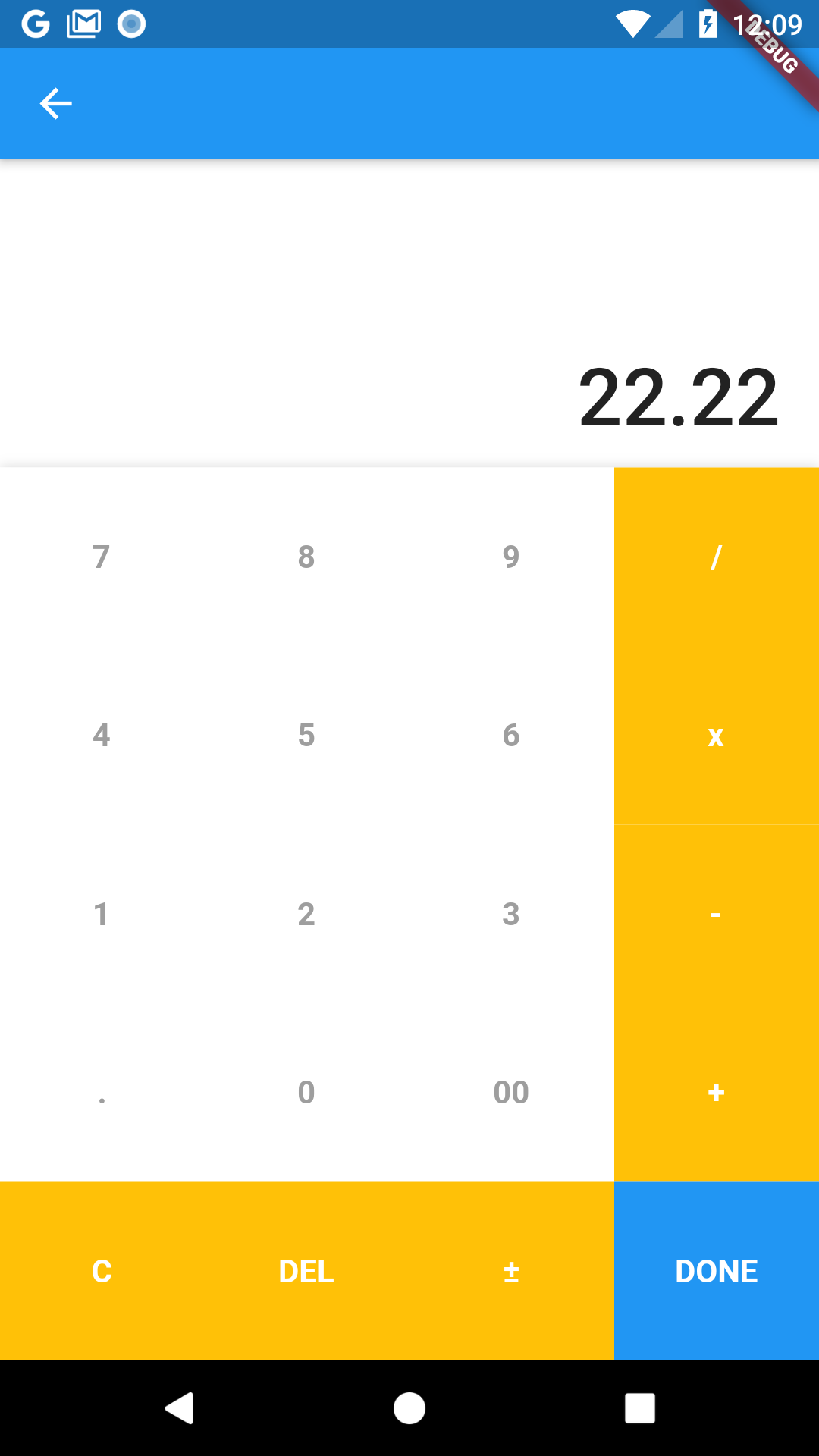
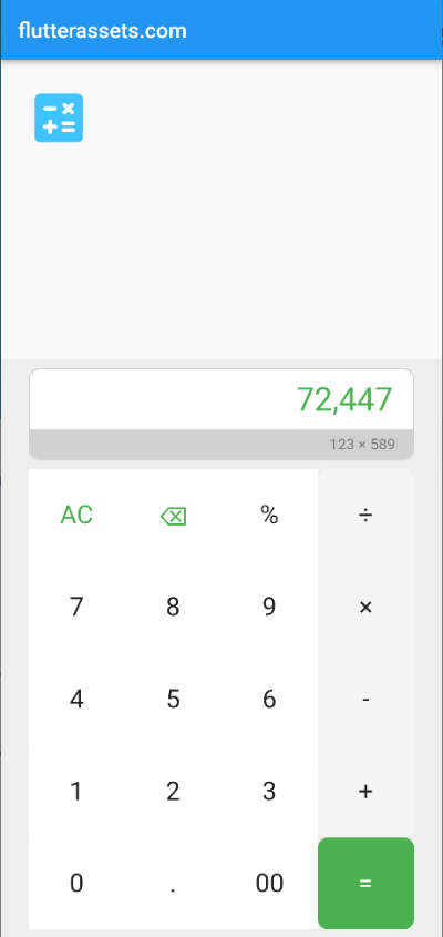
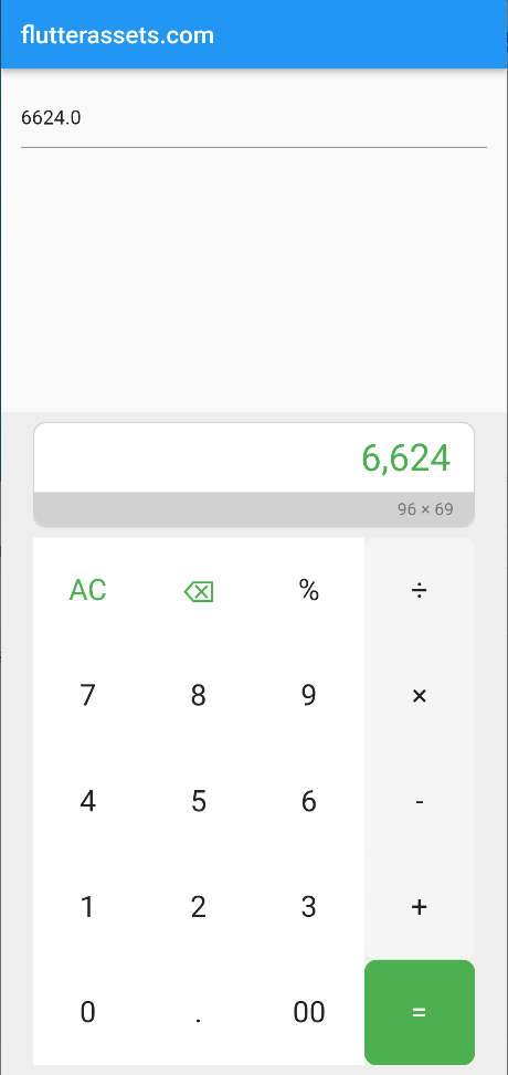
flutter_simple_calculator: ^2.2.2import 'package:flutter_simple_calculator/flutter_simple_calculator.dart';flutter_simple_calculator images from the project page
How to use flutter_simple_calculator
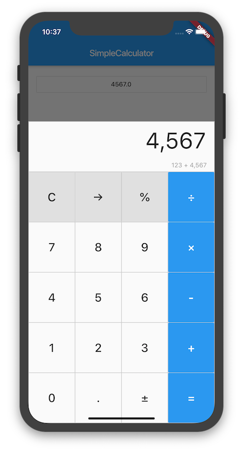
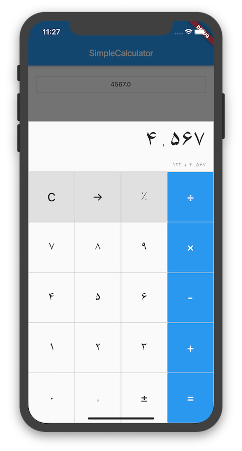
When the package is installed you can SimpleCalculator widget to the body element in your code. This code also will work without a Theme in it but looks better with it.
body: SimpleCalculator(
)
body: SimpleCalculator(
theme: CalculatorThemeData(
),
)flutter_simple_calculator parameters
- hideExpression: – true or false, Whether to show expression area.
- value: – The value currently displayed on this calculator.
- onChanged: – Called when the button is tapped or the value is changed.
- onTappedDisplay: – Called when the display area is tapped.
- numberFormat: – The [NumberFormat] used for display
- maximumDigits: – Maximum number of digits on display.
- hideSurroundingBorder: – true or false, Whether to show surrounding borders.
- autofocus: – True if this widget will be selected as the initial focus when no other node in its scope is currently focused.
- focusNode: – An optional focus node to use as the focus node for this widget.
- theme: – Visual properties for this widget.
- borderWidth: – Width of the divider border, which is usually 1.0.
- displayColor: – The colour of the display panel background.
- expressionColor: – The background colour of the expression area.
- borderColor: – The colour to use when painting the line.
- operatorColor: – The background colour of operator buttons.
- commandColor: – The background colour of command buttons.
- numColor: – The background colour of number buttons.
- displayStyle: – The text style to use for the display panel.
- expressionStyle: – The text style to use for the expression area.
- operatorStyle: – The text style to use for operator buttons.
- commandStyle: – The text style to use for command buttons.
- numStyle: – The text style to use for number buttons.
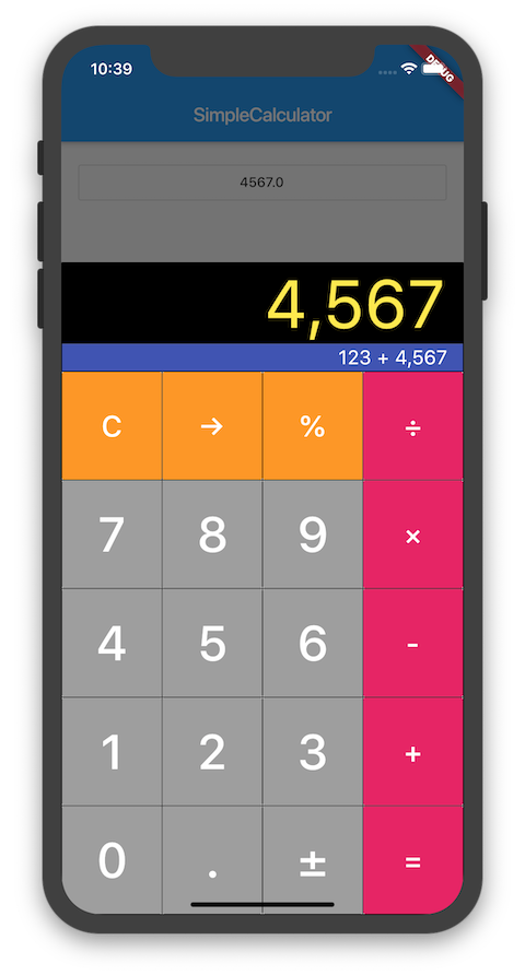
The code below shows the use of some of the parameters. I hope you do not mind the colours I used 🙂 because it is only a demonstration of use.
body:SimpleCalculator(
  value: 0,
  maximumDigits: 10,
  autofocus: true,
  hideExpression: false,
  hideSurroundingBorder: true,
  onChanged: (key, value, expression) {
    print(key);
    print(value);
    print(expression);
  },
  theme: CalculatorThemeData(
    displayColor: Colors.black87,
    expressionColor: Colors.grey,
    borderColor: Colors.purple,
    operatorColor: Colors.lightGreenAccent,
    commandColor: Colors.lime,
    numColor: Colors.pink.shade100,
    borderWidth: 10,
    displayStyle: const TextStyle(fontSize: 60, color: Colors.orange),
    expressionStyle: const TextStyle(fontSize: 20, color: Colors.black87),
    operatorStyle: const TextStyle(fontSize: 60, color: Colors.red),
    commandStyle: const TextStyle(fontSize: 40, color: Colors.red),
    numStyle: const TextStyle(fontSize: 60, color: Colors.cyanAccent, fontWeight: FontWeight.w900),
  ),
)
flutter_simple_calculator full code example
import 'package:flutter/material.dart';
import 'package:flutter_simple_calculator/flutter_simple_calculator.dart';

void main() {
  runApp(const MyApp());
}

class MyApp extends StatelessWidget {
  const MyApp({super.key});

  @override
  Widget build(BuildContext context) {
    return MaterialApp(
      title: 'Flutter Calculator',
      theme: ThemeData(
        primarySwatch: Colors.blue,
      ),
      home: const MyHomePage(title: 'flutterassets.com'),
    );
  }
}

class MyHomePage extends StatefulWidget {
  const MyHomePage({super.key, required this.title});

  final String title;

  @override
  State<MyHomePage> createState() => _MyHomePageState();
}

class _MyHomePageState extends State<MyHomePage> {


  @override
  Widget build(BuildContext context) {
    return Scaffold(
      appBar: AppBar(
        title: Text(widget.title),
      ),
      body:SimpleCalculator(
        value: 0,
        maximumDigits: 10,
        autofocus: true,
        hideExpression: false,
        hideSurroundingBorder: true,
        onChanged: (key, value, expression) {
          print(key);
          print(value);
          print(expression);
        },
        theme: CalculatorThemeData(
          displayColor: Colors.black87,
          expressionColor: Colors.grey,
          borderColor: Colors.purple,
          operatorColor: Colors.lightGreenAccent,
          commandColor: Colors.lime,
          numColor: Colors.pink.shade100,
          borderWidth: 10,
          displayStyle: const TextStyle(fontSize: 60, color: Colors.orange),
          expressionStyle: const TextStyle(fontSize: 20, color: Colors.black87),
          operatorStyle: const TextStyle(fontSize: 60, color: Colors.red),
          commandStyle: const TextStyle(fontSize: 40, color: Colors.red),
          numStyle: const TextStyle(fontSize: 60, color: Colors.cyanAccent, fontWeight: FontWeight.w900),
        ),
      )
    );
  }
}
No.2 input_calculator for Flutter
The Flutter input calculator is as simple to use as the one above but has a bit different functionality. It is s textField calculator. As default, you will see only the textField input and the calculator will appear when you click the field. You can add multiple CalculatorTextField or CalculatorTextFormField widgets in a Column.
The person responsible for this project is Gabriel Perez, and here you can find the pub.dev and GitHub project page.
input_calculator images from the project page
The images below show two available themes, curved and flat.
How to use flutter input_calculator
First, you need to install and import your new package.
dependencies:
  input_calculator: ^2.0.0
import 'package:input_calculator/input_calculator.dart';This input calculator can also be implemented with only one line of code. And that’s it, we are done here. Maybe not. We can still explore a few properties which can be used.
CalculatorTextField(),CalculatorTextFormField(),body: Column(
children: [
CalculatorTextField(),
CalculatorTextFormField(),
],
)input_calculator properties
input_calculator Calculator properties
- title: title to show on appbar.
- appBarBackgroundColor: appbar colour.
- theme: allows two themes [CalculatorThemes.curve | CalculatorThemes.flat] (default: curve).
- operatorButtonColor: colour operator button.
- operatorTextButtonColor: colour text of operator button.
- normalButtonColor: color normal button.
- normalTextButtonColor: colour text of the normal button.
- doneButtonColor: colour done button.
- doneTextButtonColor: colour text of the done button.
- allowNegativeResult: allow negative result (default: true).
input_calculator TextField properties
- initialValue: initial value to show.
- inputDecoration: decoration of textField.
- valueFormat: format value of textField.
- onSubmitted: It calls when the value is submitted.
- validator: can validate the value, works with CalculatorTextFormField.
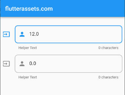
CalculatorTextField example
This is the example code for CalculatorTextField with its properties.
Padding(
  padding: const EdgeInsets.all(8.0),
  child: CalculatorTextField(
    initialValue: 12,
      onSubmitted: (value){
      print(value);
      },
      inputDecoration: InputDecoration(
        icon: Icon(Icons.input_outlined),
        hintText: 'Hint Text',
        helperText: 'Helper Text',
        counterText: '0 characters',
          prefixIcon: Icon(Icons.person),
        border: OutlineInputBorder(
          borderRadius: BorderRadius.circular(10)
        ),
      ),
    title: 'Your value calculator',
    appBarBackgroundColor: Colors.greenAccent,
    theme: CalculatorThemes.curve,
    operatorButtonColor: Colors.lightGreenAccent,
    operatorTextButtonColor: Colors.black,
      normalButtonColor: Colors.grey.shade100,
      normalTextButtonColor: Colors.black87,
      doneButtonColor: Colors.green,
      doneTextButtonColor: Colors.white,
      allowNegativeResult: true
  ),
),
CalculatorTextFormField example
This is the example code for CalculatorTextFormField with its properties.
Padding(
  padding: const EdgeInsets.all(8.0),
  child: CalculatorTextFormField(
    initialValue: _value,
      onSubmitted: (value){
        _value = value!;
        print('value: $_value');
      },
      validator: (value) {
        if (value!.isEmpty) {
          return 'Madatory field';
        }
        return null;
      },
      inputDecoration: InputDecoration(
        icon: Icon(Icons.input_outlined),
        hintText: 'Hint Text',
        helperText: 'Helper Text',
        counterText: '0 characters',
          prefixIcon: Icon(Icons.person),
        border: OutlineInputBorder(
          borderRadius: BorderRadius.circular(10)
        ),
      ),
    title: 'Your value calculator',
    appBarBackgroundColor: Colors.greenAccent,
    theme: CalculatorThemes.curve,
    operatorButtonColor: Colors.lightGreenAccent,
    operatorTextButtonColor: Colors.black,
      normalButtonColor: Colors.grey.shade100,
      normalTextButtonColor: Colors.black87,
      doneButtonColor: Colors.green,
      doneTextButtonColor: Colors.white,
      allowNegativeResult: true
  ),
),
No.3 flutter_dynamic_calculator
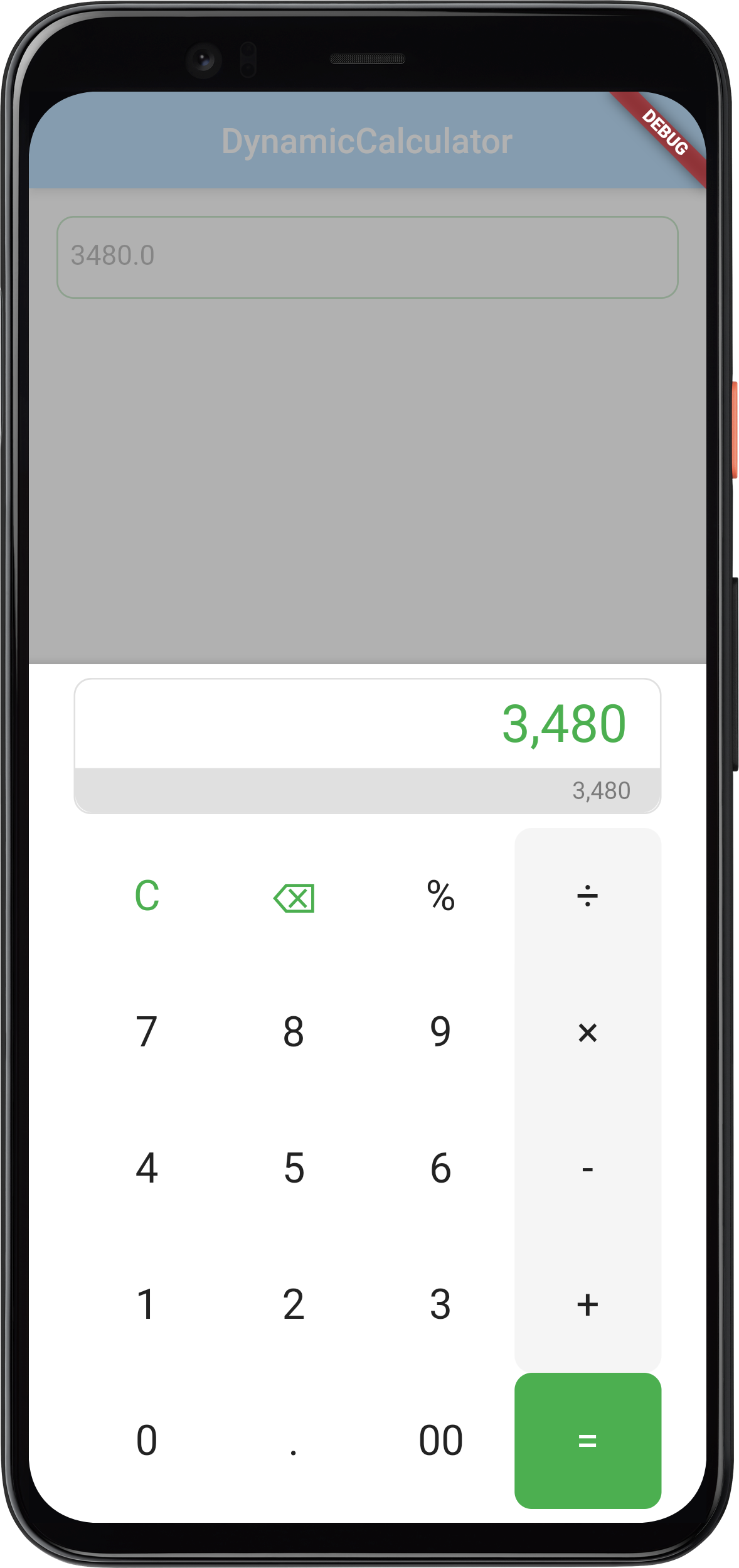
The flutter_dynamic_calculator can be opened as a stand-alone calculator or in a showModalBottomSheet. It also can be used similar way as the calculator presented above. You can also customize a lot of parameters here too.
The project was created by Sudipta Karmakar and here you have a link to the calculator pub.dev and GitHub pages.
flutter_dynamic_calculator images from the project page
Both image examples show the calculator connected to the TextField and displayed in showModalBottomSheet.

How to use flutter_dynamic_calculator
To install this package add it to the dependencies in pubspec.yaml and import it into your Dart code.
dependencies:
  flutter_dynamic_calculator: ^1.0.0
import 'package:flutter_dynamic_calculator/flutter_dynamic_calculator.dart';Below you can see the basic code for the stand-alone calculator. The size of the widget is controlled by SizedBox
SizedBox(
    height: MediaQuery.of(context).size.height * 0.8,
    child: Padding(
        padding: const EdgeInsets.all(8),
        child: DynamicCalculator(
          value: _currentValue!,
          showCalculatorDisplay: true,
          onChanged: (key, value, expression) {
            setState(() {
              _currentValue = value ?? 0;
            });
          },
          theme: const CalculatorTheme(),
        )
    )
),
flutter_dynamic_calculator properties
- hideExpression: – Whether to show expression area.
- showCalculatorDisplay: – Whether to show calculator display.
- value: – The value currently displayed on this calculator.
- onChanged: – Called when the button is tapped or the value is changed.
- onTappedDisplay: – Called when the display area is tapped.
- numberFormat: – The [NumberFormat] used for display
- maximumDigits: – Maximum number of digits on display.
- hideSurroundingBorder: – Whether to show surrounding borders.
- autofocus: – True if this widget will be selected as the initial focus when no other node in its scope is currently focused.
- focusNode: – An optional focus node to use as the focus node for this widget.
- theme: – Visual properties for this widget.
- displayBackgroundColor: – The colour of the display panel background.
- borderWidth: – Width of the divider border, which is usually 1.0.
- displayCalculatorRadius: – Width of the divider border, which is usually 1.0.
- expressionBackgroundColor: – The background colour of the expression area.
- borderColor: – The colour to use when painting the line.
- operatorColor: – The background colour of operator buttons.
- commandColor: – The background colour of command buttons.
- numColor: – The background colour of number buttons.
- displayStyle: – The text style to use for the display panel.
- expressionStyle: – The text style to use for the expression area.
- operatorStyle: – The text style to use for operator buttons.
- commandStyle: – The text style to use for command buttons.
- numStyle: – The text style to use for number buttons.
This example shows some of the properties applied
SizedBox(
    height: MediaQuery.of(context).size.height * 0.8,
    child: Padding(
        padding: const EdgeInsets.all(8),
        child: DynamicCalculator(
          value: _currentValue!,
          hideExpression: false,
          hideSurroundingBorder: true,
          showCalculatorDisplay: true,
          autofocus: true,
          onChanged: (key, value, expression) {
            setState(() {
              _currentValue = value ?? 0;
            });
          },
          theme: const CalculatorTheme(
            borderColor: Colors.transparent,
            borderWidth: 0.0,
            displayCalculatorRadius: 10.0,
            displayBackgroundColor: Colors.white,
            displayStyle: TextStyle(fontSize: 30, color: Colors.green),
            expressionBackgroundColor: Colors.black12,
            expressionStyle: TextStyle(fontSize: 14, color: Colors.black45),
            operatorColor: Colors.green,
            operatorStyle: TextStyle(fontSize: 24, color: Colors.white),
            commandColor: Colors.white,
            commandStyle: TextStyle(fontSize: 24, color: Colors.green),
            numColor: Colors.white,
            numStyle: TextStyle(fontSize: 24, color: Colors.black87),
          ),
        )
    )
),
Open flutter_dynamic_calculator in a modal
First, you can create a button. In my example used an IconButton.
IconButton(
  icon: Icon(Icons.calculate_rounded, size: 60, color: Colors.lightBlueAccent,),
  onPressed: () {  },
),
Next, add into onPressed the showModalBottomSheet widget, see the example below.
IconButton(
  icon: Icon(Icons.calculate_rounded, size: 60, color: Colors.lightBlueAccent,),
  onPressed: () {
    showModalBottomSheet(
      isScrollControlled: true,
      backgroundColor: Colors.transparent,
      barrierColor: Colors.transparent,
      context: context,
      builder: (BuildContext context) {
        return Container(
          child: Text('Calculator'),
        );
      }
    );
  },
),
Now you can add the calculator inside the Container (replace the text widget). The working code is presented below.
IconButton(
  icon: Icon(Icons.calculate_rounded, size: 60, color: Colors.lightBlueAccent,),
    onPressed: (){
      showModalBottomSheet(
          isScrollControlled: true,
          backgroundColor: Colors.transparent,
          barrierColor: Colors.transparent,
          context: context,
          builder: (BuildContext context) {
            return Container(
              decoration: BoxDecoration(
                color: Colors.grey.shade200,
              ),
              child: SizedBox(
                  height: MediaQuery.of(context).size.height * 0.6,
                  child: Padding(
                      padding: const EdgeInsets.only(
                          top: 8.0, bottom: 8.0, left: 26.0, right: 26.0),
                      child: DynamicCalculator(
                        value: 0,
                        hideExpression: false,
                        hideSurroundingBorder: true,
                        showCalculatorDisplay: true,
                        autofocus: true,
                        onChanged: (key, value, expression) {
                          setState(() {
                            print('$value');
                          });
                        },
                        theme: const CalculatorTheme(
                          borderColor: Colors.transparent,
                          borderWidth: 0.0,
                          displayCalculatorRadius: 10.0,
                          displayBackgroundColor: Colors.white,
                          displayStyle: TextStyle(fontSize: 30, color: Colors.green),
                          expressionBackgroundColor: Colors.black12,
                          expressionStyle: TextStyle(fontSize: 14, color: Colors.black45),
                          operatorColor: Colors.green,
                          operatorStyle: TextStyle(fontSize: 24, color: Colors.white),
                          commandColor: Colors.white,
                          commandStyle: TextStyle(fontSize: 24, color: Colors.green),
                          numColor: Colors.white,
                          numStyle: TextStyle(fontSize: 24, color: Colors.black87),
                        ),
                      )
                  )),
            );
          });
    },
)
Add the flutter_dynamic_calculator to a TextField or TextFormField
In this case, instead of the button, you can use the TextField onTap element, and provide the same way as with the button. Also, you can pass the calculator value to the TextFiels. But first, initialize a _currentValue variable and then you can try the code below. Now the calculator value should be automatically displayed in the TextField.
double? _currentValue = 0;TextField(
controller: TextEditingController(text: _currentValue.toString()),
enableInteractiveSelection: false,
showCursor: false,
readOnly: true,
onTap: (){
showModalBottomSheet(
isScrollControlled: true,
backgroundColor: Colors.transparent,
barrierColor: Colors.transparent,
context: context,
builder: (BuildContext context) {
return Container(
decoration: BoxDecoration(
color: Colors.grey.shade200,
),
child: SizedBox(
height: MediaQuery.of(context).size.height * 0.6,
child: Padding(
padding: const EdgeInsets.only(
top: 8.0, bottom: 8.0, left: 26.0, right: 26.0),
child: DynamicCalculator(
value: _currentValue!,
hideExpression: false,
hideSurroundingBorder: true,
showCalculatorDisplay: true,
autofocus: true,
onChanged: (key, value, expression) {
setState(() {
_currentValue = value ?? 0;
print('$value');
});
},
theme: const CalculatorTheme(
borderColor: Colors.transparent,
borderWidth: 0.0,
displayCalculatorRadius: 10.0,
displayBackgroundColor: Colors.white,
displayStyle: TextStyle(fontSize: 30, color: Colors.green),
expressionBackgroundColor: Colors.black12,
expressionStyle: TextStyle(fontSize: 14, color: Colors.black45),
operatorColor: Colors.green,
operatorStyle: TextStyle(fontSize: 24, color: Colors.white),
commandColor: Colors.white,
commandStyle: TextStyle(fontSize: 24, color: Colors.green),
numColor: Colors.white,
numStyle: TextStyle(fontSize: 24, color: Colors.black87),
),
)
)),
);
});
},
),No.4 flutter_awesome_calculator
This calculator is quite simple too. It doesn’t have too many properties to customize but it is enough to make it nice. The image below shows the calculator. The image is from the project Page.
This project belongs to Muhammad Musa and the calculator project pages can be found on pub.dev and GitHub.
How to use the flutter_awesome_calculator
The process of installation is always the same. Add the package to dependencies in pubspec.yaml file and import it to your Dart code.
dependencies:
  flutter_awesome_calculator: ^1.0.0+1
import 'package:flutter_awesome_calculator/flutter_awesome_calculator.dart';The basic usage of the code is below.
body: FlutterAwesomeCalculator(
      context: context,
      showAnswerField:true,
    )
flutter_awesome_calculator properties
- height: – Height of the calculator
- clearButtonColor: – Colour for the “C” button of the calculator
- operatorsButtonColor: – Colour for all the arithmetic buttons of the calculator
- digitsButtonColor: – Colour for all the digits button of the calculator
- expressionAnswerColor: – Colour for calculator input expression
- buttonRadius: – Radius of calculator buttons
- backgroundColor: – Background colour of the calculator
- fractionDigits: – Number of digits allowed after the decimal point, if fractionDigits:2, then the answer will be rounded to 1.00
- showAnswerField: – Bool value for showing the answer field of the calculator, if false then the only calculator will be displayed
- onChanged: – onChange callback

The working code of flutter_awesome_calculator with the available parameters is presented below.
Also, I should mention, at the moment of writing this post, this widget doesn’t have a text size or colour to customize or I do not know how to find it and change it :).
FlutterAwesomeCalculator(
  height: 300,
  context: context,
  showAnswerField:true,
  clearButtonColor: Colors.red.shade400,
  operatorsButtonColor: Colors.cyanAccent,
  digitsButtonColor: Colors.grey.shade300,
  backgroundColor: Colors.grey.shade100,
  expressionAnswerColor: Colors.black,
  buttonRadius: 20,
  fractionDigits: 6,
  onChanged: (answer,expression){

  },
)
If you want to make the calculator smaller, you can wrap it with the Sized box and there specify the width and height.
SizedBox(
  width: 300,
  height: 400,
  child: FlutterAwesomeCalculator(
    // height: 300,
    context: context,
    showAnswerField:true,
    clearButtonColor: Colors.red.shade400,
    operatorsButtonColor: Colors.cyanAccent,
    digitsButtonColor: Colors.grey.shade300,
    backgroundColor: Colors.grey.shade100,
    expressionAnswerColor: Colors.black,
    buttonRadius: 20,
    fractionDigits: 6,
    onChanged: (answer,expression){

    },
  ),
)
No.5 flutter_ios_calculator
The flutter_ios_calculator is as the name suggests the iOS-style calculator. I think in the whole widget you can change only one parameter. You can choose ios10 or ios12.
The project was created by David Richboy Echomgbe. Here are the pub.dev and the GitHub pages of the project.


How to use flutter_ios_calculator
As you know you need to install this plugin. Add it to the dependencies and then import it to your Dart code.
dependencies:
  flutter_ios_calculator: ^0.1.0
import 'package:flutter_ios_calculator/flutter_ios_calculator.dart';Now the most important and the simplest part of this widget. Add it to your code.
body: Calculator()body: Calculator(
//optional property
calculatorType: CalculatorType.ios10, //Defaults to CalculatorType.ios12
)This is all you can do to set it up 🙂
No.6 Flutter simple_custom_calculator
Number six on my list is simple_custom_calculator. Again, this is one of the simplest to set up and use. It doesn’t have a ton of parameters so it might be really friendly to you too :).
This calculator belongs to Yohan Sun. The project can be found on pub.dev and GitHub pages.
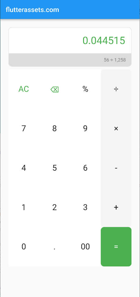
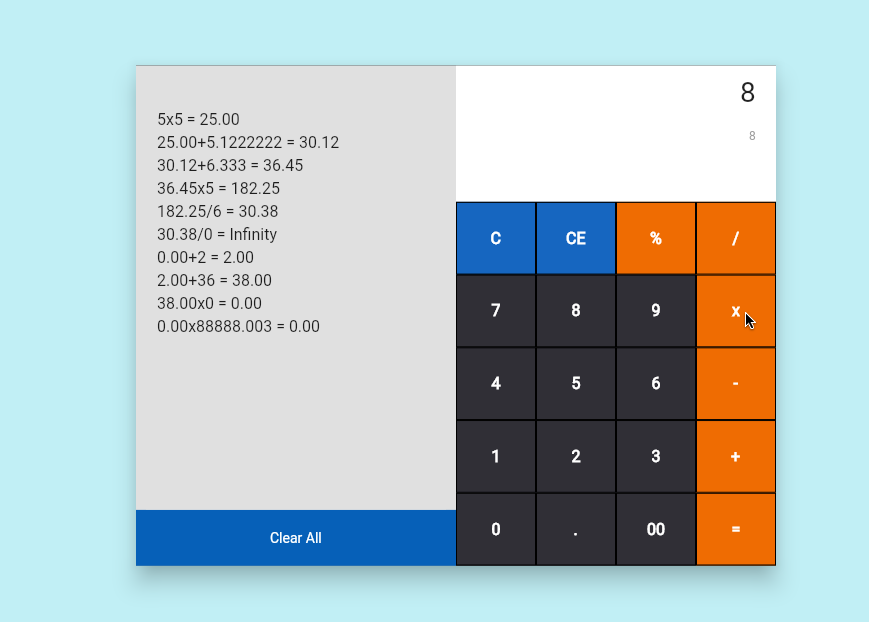
simple_custom_calculator images from the project page


How to use simple_custom_calculator
As always, the plugin installation goes first. Add the package to your dependencies in pubspec.yaml file, and Import into your Dart code.
dependencies:
  simple_custom_calculator: ^0.0.2
import 'package:simple_custom_calculator/simple_custom_calculator.dart';This calculator required the width and height. You can of course use size as you wish or you can use screen size width and height. The first snittpet below what values I used. You can see here that I subtracted some heights from the full screen height.
double screenWidth = MediaQuery.of(context).size.width;
double screenHeight = MediaQuery.of(context).size.height -
    AppBar().preferredSize.height -
    MediaQuery.of(context).padding.top -
    MediaQuery.of(context).padding.bottom;
The basic code required only two parameters as you can see below.
body: SimpleCustomCalculator(
  width: screenWidth,
  height: screenHeight,
)
The code below shows the SimpleCustomCalculator with all the parameters. Be aware, if you decide to use small values as width and height, the icon or numbers might not fit into small buttons. If you really want scale the calculator you can use Transform.scale(), see second code snipped.
body: SimpleCustomCalculator(
  width: screenWidth,
  // width: 300,
  height: screenHeight,
  // height: 400,
  backgroundColor: Colors.black.withOpacity(0.8),
  buttonColor: Colors.blueGrey,
  buttonIsRectangle: false,
  buttonPadding: 1,
  numberSize: 39,
)
body: Transform.scale(
scale: 0.5,
alignment: Alignment.topLeft,
child: SimpleCustomCalculator(
width: screenWidth,
// width: 300,
height: screenHeight,
// height: 400,
backgroundColor: Colors.black.withOpacity(0.8),
buttonColor: Colors.blueGrey,
buttonIsRectangle: false,
buttonPadding: 1,
numberSize: 39,
),
)No.7 Flutter versatile_calculator
This is another really simple calculator with the calculation history. That might be useful to you someday. The versatile_calculator doesn’t have any parameters to use. To tell the truth, I wish I could at least scale it a bit or move the history panel to a different place. At this point, it is what it is.
The project was created by Souvik. Here are the pub.dev and GitHub pages for your review if you want to.
The installation process is always the same, add it to project dependencies in pubspec.yaml and import it to Dart code.
dependencies:
  versatile_calculator: ^0.0.3
import 'package:versatile_calculator/versatile_calculator.dart';
How to use versatile_calculator
Simply add the VersatileCalculator() into your code and that is.
VersatileCalculator(),body: VersatileCalculator(),You can also open it in the in a Dialod window
body:IconButton(
  icon: Icon(Icons.calculate_rounded, size: 60, color: Colors.lightBlueAccent,),
    onPressed: (){
      showDialog(
          barrierColor: Colors.white.withOpacity(0.2),
          barrierDismissible: true,
          context: context,
          builder: (context) {
            return VersatileCalculator();
          });
    }
),