What are the Flutter Divider and VerticalDivider?
The Divider and VerticalDivider widgets in Flutter are used to create visual separators between different elements in a user interface. A Divider creates a horizontal line that can be used to separate text, images, or other widgets. The VerticalDivider, on the other hand, creates a vertical line that can be used to divide the screen space into distinct sections.
Both the Divider and VerticalDivider widgets are simple to use and can be easily customized to fit the specific design requirements of your app. With the ability to adjust the width, thickness, and colour, these widgets provide a versatile solution for enhancing the organization and clarity of your user interface. Whether you’re separating text, images, or other widgets, the Divider and VerticalDivider offer a simple yet powerful way to enhance the overall look and feel of your app.
How to use Flutter Divider
The Flutter Divider widget is a simple and straightforward way to add a horizontal line to your app’s user interface. The Divider widget acts as a visual separator between two widgets, providing a clear boundary between different sections of the interface.
Add the Divider widget to your widget tree: To add the Divider widget to your user interface, simply include it as a child of the parent widget. For example:
Container(
  child: Column(
    children: [
      Text("Hello World"),
      Divider(),
      Text("This is a Divider"),
    ],
  ),
),
How to customize Flutter Divider
The Divider widget in Flutter can be easily customized to fit the specific design requirements of your app. There are several parameters that can be adjusted to change the appearance of your Divider, including thickness, colour, height, and width.
Here’s an example of how you can customize the Divider widget in Flutter:
Divider(
  height: 30.0,
  thickness: 2.0,
  color: Colors.black,
  indent: 20.0,
  endIndent: 20.0,
),
heightis a double that determines the height of the line. In this example, the line has a height of 30.0.thicknessis a double that determines the thickness of the line. In this example, the line has a thickness of 2.0.coloris a Color that determines the colour of the line. In this example, the line is black.indentis a double that determines the amount of space to the left of the line. In this example, the line is indented 20.0.endIndentis a double that determines the amount of space to the right of the line. In this example, the line is indented 20.0 on the right as well.
How to use Flutter VerticalDivider
The Flutter VerticalDivider widget is a versatile tool for creating a clear visual separator between two elements in your user interface. It’s a simple and straightforward way to divide your screen space into distinct sections and help organize the layout of your app.
Add the VerticalDivider widget to your widget tree: To add the VerticalDivider to your interface, simply include it as a child of the parent widget. For example:
Container(
  height: 50,
  child: Row(
    mainAxisAlignment: MainAxisAlignment.center,
    children: [
      Text("Hello World"),
      VerticalDivider(),
      Text("This is a Vertical Divider"),
    ],
  ),
),
How to customize Flutter VerticalDivider
The VerticalDivider widget in Flutter can be easily customized to fit the specific design requirements of your app. There are several parameters that can be adjusted to change the appearance of your VerticalDivider, including width, thickness, colour, indent, and endIndent.
Here’s an example of how you can customize the VerticalDivider widget in Flutter:
VerticalDivider(
  width: 30.0,
  thickness: 2.0,
  color: Colors.black,
  indent: 20.0,
  endIndent: 20.0,
),
widthis a double that determines the width of the line. In this example, the line has a width of 30.0.thicknessis a double that determines the thickness of the line. In this example, the line has a thickness of 2.0.coloris a Color that determines the colour of the line. In this example, the line is black.indentis a double that determines the amount of space above the line. In this example, the line is indented 20.0.endIndentis a double that determines the amount of space below the line. In this example, the line is indented 20.0 below as well.
How to control the height of the VerticalDivider in Flutter
The height of the VerticalDivider in Flutter can be controlled by adjusting the height of its parent widget, such as a Container or a Row.
Here’s an example of how to control the height of a VerticalDivider using a Container widget:
Container(
  height: 50,
  child: Row(
    mainAxisAlignment: MainAxisAlignment.center,
    children: [
      Text("Hello World"),
      VerticalDivider(),
      Text("This is a Vertical Divider"),
    ],
  ),
),
In this example, the Container widget has a height of 50. Since the VerticalDivider is a child of the Row widget, which is in turn a child of the Container, the height of the Container will set the height of the entire Row, including the VerticalDivider. Therefore, by setting the height of the Container to 50, the height of the VerticalDivider will also be set to 50.
By using this approach, you can control the height of the VerticalDivider according to your needs, simply by adjusting the height of its parent widget.
You can also control the height of the VerticalDivider widget by adjusting the height of its parent widget.
For example, you could wrap the VerticalDivider widget inside a Container widget, and then set the height of the Container to control the height of the VerticalDivider. Here’s an example:
Container(
  height: 100.0,
  child: VerticalDivider(
    width: 2.0,
    thickness: 2.0,
    color: Colors.black,
  ),
),
In this example, the height of the Container is set to 100.0 pixels, so the height of the VerticalDivider will also be 100.0 pixels (assuming no other widgets are added to the Container). By adjusting the height of the Container, you can control the height of the VerticalDivider.
Cannot see your VerticalDivider in Flutter?
The reason why the VerticalDivider is not visible in the attached code is likely due to the fact that the height of the parent Container widget is not specified. By default, the height of a Container widget is set to “constrain” its child widgets, but this behaviour can lead to the VerticalDivider being hidden if the height of the Container is not set to an explicit value.
Column(
  children: [
    SizedBox(height: 20,),
    Container(
      color: Colors.grey.shade200,
      // height: 100, // the height of the container is not defined
      child: Row(
        mainAxisAlignment: MainAxisAlignment.center,
        children: [
          Text("Hello World"),
          VerticalDivider(
            width: 30.0,
            thickness: 10.0,
            color: Colors.red,
            indent: 20.0,
            endIndent: 20.0,
          ),
          Text("This is a Vertical Divider"),
        ],
      ),
    ),
  ],
),
To resolve this issue, you can add a “height” property to the Container widget and set it to an explicit value, such as 100.0. For example:
Column(
  children: [
    SizedBox(height: 20,),
    Container(
      color: Colors.grey.shade200,
      height: 100, // the height of the container should be defined
      child: Row(
        mainAxisAlignment: MainAxisAlignment.center,
        children: [
          Text("Hello World"),
          VerticalDivider(
            width: 30.0,
            thickness: 10.0,
            color: Colors.red,
            indent: 20.0,
            endIndent: 20.0,
          ),
          Text("This is a Vertical Divider"),
        ],
      ),
    ),
  ],
),
By setting the height of the Container, you ensure that there is enough space for the VerticalDivider to be displayed and its properties.
How to create a custom divider with a container in Flutter
In Flutter, you can create a custom divider using a Container widget. The Container widget provides you with the flexibility to specify the height, width, background colour, and margin of your divider.
Here’s an example of how you can create a custom divider using a Container widget:
Container(
  height: 1,
  width: double.infinity,
  margin: EdgeInsets.symmetric(horizontal: 20, vertical: 20),
  color: Colors.grey.shade200,
)
In this example, the height of the Container is set to 1, and the width is set to double.infinity, which means it will take up the entire width of its parent widget. The margin is set to EdgeInsets.symmetric(horizontal: 20, vertical:20), which means that there will be a margin of 20 on the left and right side, and top and bottom of the divider. The colour of the Container is set to Colors.grey.shade200, which is a light grey colour.
You can use this custom divider anywhere in your Flutter app by adding the Container widget to the desired location in your widget tree.
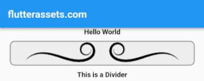
Flutter Custom Image Divider
A Custom Image Divider can be created in Flutter using a StatelessWidget. This custom widget can be used to add a divider with an image between different widgets in your app. To create the custom widget you can use the Container widget with the Decoration property set to a DecorationImage widget. This allows you to specify an image as the background of the container and set its appearance according to your needs.
Here is an example of what the custom widget might look like:
import 'package:flutter/material.dart';

void main() {
  runApp(MyApp());
}

class MyApp extends StatelessWidget {

  @override
  Widget build(BuildContext context) {
    return MaterialApp(
      debugShowCheckedModeBanner: false,
      title: 'Flutter Demo',
      theme: ThemeData(
        primarySwatch: Colors.blue,
      ),
      home: MyHomePage(),
    );
  }
}

class MyHomePage extends StatefulWidget {

  @override
  State<MyHomePage> createState() => _MyHomePageState();
}

class _MyHomePageState extends State<MyHomePage> {

  @override
  Widget build(BuildContext context) {
    return Scaffold(
        appBar: AppBar(
          title: Text('flutterassets.com'),
        ),
        body: Container(
          width: double.infinity,
          child: Column(
            children: [
              Text("Hello World"),
              CustomImageDivider(),
              Text("This is a Divider"),
            ],
          ),
        )
    );
  }
}

const AssetImage _dividerAssetImage = AssetImage('assets/divider_curved.png');
const Image _dividerImage = Image(
  image: _dividerAssetImage,
);

class CustomImageDivider extends StatelessWidget {
  final double? height;
  final double? width;
  final double? marginLeft;
  final double? marginRight;
  final double? marginTop;
  final double? marginBottom;
  final double? borderRadius;
  final double? borderWidth;
  final Color? borderColor;
  final Image image;
  final BoxFit? boxFit;
  final Color? backgroundColor;

  const CustomImageDivider({
    this.height = 20,
    this.width = double.infinity,
    this.marginLeft = 0,
    this.marginRight = 0,
    this.marginTop = 4,
    this.marginBottom = 4,
    this.borderRadius = 5,
    this.borderWidth = 1,
    this.borderColor = Colors.transparent,
    this.image = _dividerImage,
    this.boxFit = BoxFit.contain,
    this.backgroundColor = Colors.transparent,
  });

  @override
  Widget build(BuildContext context) {
    return Container(
      height: height!,
      width: width!,
      margin: EdgeInsets.only(
        left: marginLeft!,
        right: marginRight!,
        top: marginTop!,
        bottom: marginBottom!,
      ),
      decoration: BoxDecoration(
        color: backgroundColor!,
        borderRadius: BorderRadius.circular(borderRadius!),
        border: Border.all(
          color: borderColor!,
          width: borderWidth!,
        ),
        image: DecorationImage(
          image: image!.image,
          fit: boxFit!,
        ),
      ),
    );
  }
}
In the above code, we define a CustomImageDivider class that extends the StatelessWidget class. The custom image divider takes in several parameters that allow you to customize the appearance of the divider, such as its height, width, margins, border, background colour, and more. These parameters are defined with default values, but can be changed by passing in different values when creating an instance of the CustomImageDivider class.
The build method of the CustomImageDivider class returns a Container widget with the specified parameters. The Decoration property of the Container is set to a BoxDecoration widget that specifies the background colour, border radius, border colour and width, and an image to use as the background.
The image used as the background is specified as an instance of the Image class, with the image property set to a constant AssetImage named _dividerAssetImage. This asset image is set to the path of the image file in the assets directory.
In the MyHomePage class, an instance of the CustomImageDivider class is added as a child of a Column widget, which is the body of the Scaffold widget in the build method. When the app runs, the custom image divider will be displayed as a dividing line between the two texts “Hello World” and “This is a Divider”.
Please note: The above code can be simplified, you can remove most of its elements and keep, for example, only the image and height.
Here is a customized version of the above code:
CustomImageDivider(
  height: 50,
  width: double.infinity,
  marginLeft: 20,
  marginRight: 20,
  marginTop: 10,
  marginBottom: 10,
  borderRadius: 10,
  borderWidth: 2,
  borderColor: Colors.grey,
  image: Image.asset('assets/divider_curved.png'),
  boxFit: BoxFit.cover,
  backgroundColor: Colors.grey.shade200,
),
Container(
width: double.infinity,
child: Column(
children: [
Text("Hello World"),
CustomImageDivider(
height: 50,
width: double.infinity,
marginLeft: 20,
marginRight: 20,
marginTop: 10,
marginBottom: 10,
borderRadius: 10,
borderWidth: 2,
borderColor: Colors.grey,
image: Image.asset('assets/divider_curved.png'),
boxFit: BoxFit.cover,
backgroundColor: Colors.grey.shade200,
),
Text("This is a Divider"),
],
),
)
Now, you should rebuild the code to match your own requirements.
Flutter Custom Icon Divider
Here is how you can create a custom Icon divider using a stateless widget class in Flutter:
class CustomIconDivider extends StatelessWidget {
  final IconData? icon;
  final double? iconSize;
  final Color? iconColor;

  CustomIconDivider({
    this.icon = Icons.ac_unit,
    this.iconSize = 30,
    this.iconColor = Colors.red,
  });

  @override
  Widget build(BuildContext context) {
    return Container(
      height: 50,
      width: 50,
      decoration: BoxDecoration(
        color: Colors.transparent,
      ),
      child: Icon(
        icon,
        size: iconSize,
        color: iconColor,
      ),
    );
  }
}
The code is a Flutter widget class called “CustomIconDivider”. The class takes three optional parameters when it is instantiated: “icon”, “iconSize”, and “iconColor”. The default values for these parameters are “Icons.ac_unit”, 30, and “Colors.red” respectively.
The “build” method returns a “Container” widget, which is a box that can contain other widgets and can be given a height, width, colour, etc. In this case, the height and width of the container are set to 50, making it fill the available space. The background colour of the container is set to “Colors.transparent”.
The child of the container is an “Icon” widget, which displays an icon. The icon, size, and colour are specified by the parameters that were passed to the CustomIconDivider class when it was instantiated.
Here’s how you can use the CustomIconDivider class in your code:
Example 1: Using Row widget:
Container(
  width: double.infinity,
  child: Row(
    mainAxisAlignment: MainAxisAlignment.center,
    children: [
      Text("Hello World"),
      CustomIconDivider(),
      Text("This is a Divider"),
    ],
  ),
)
In this example, we start by creating a Container widget with a width set to double.infinity. Inside the container, we use the Row widget to display text widgets and a divider. The Row widget allows us to display widgets horizontally, and in this case, we have two text widgets and a CustomIconDivider widget in between. The text widgets display the text “Hello World” and “This is a Divider”.
Example 2: Using Column widget:
Container(
  width: double.infinity,
  child: Column(
    children: [
      Text("Hello World"),
      CustomIconDivider(),
      Text("This is a Divider"),
    ],
  ),
)
In this example, we start by creating a Container widget with a width set to double.infinity. Inside the container, we use the Column widget to display text widgets and a divider. The Column widget allows us to display widgets vertically, and in this case, we have two text widgets and a CustomIconDivider widget in between. The text widgets display the text “Hello World” and “This is a Divider”.
You can also use custom values :
CustomIconDivider(
  icon: Icons.add,
  iconColor: Colors.green,
  iconSize: 40,
),
