What is a Flutter ChoiceChip Widget
The Flutter ChoiceChip widget is a type of interactive element that allows users to choose from a set of options. It is typically used in situations where you want the user to make a single selection from a group of options, such as choosing a category or a filter.
A ChoiceChip looks like a small button, and it can have a label, an icon, or both. When the user taps on a ChoiceChip, it becomes “selected,” meaning it appears visually different to show that it has been chosen. If another ChoiceChip was previously selected, it becomes “deselected,” which means it returns to its unselected appearance.
One of the great things about ChoiceChips is that they can be used in a horizontal row, making them a space-efficient way to present several options. Additionally, you can customize the appearance of ChoiceChips by setting properties such as the background colour, text colour, and padding.
What is the difference between Chip and ChoiceChip widget
Flutter provides two widgets for displaying a small, interactive element that represents a piece of information or action: the Chip widget and the ChoiceChip widget. While both widgets look similar and share some common properties, there are some differences between them.
The Chip widget is designed to display information or data that is not necessarily interactive. It is often used to represent a single entity or a short piece of text. The Chip widget can be created with various shapes, including rounded rectangles, circles, and more. It can also display an avatar or an icon to help identify the entity it represents.
On the other hand, the ChoiceChip widget is designed to allow users to make a selection from a set of choices. It is interactive and can be toggled on and off. The ChoiceChip widget is typically used in a group, where each choice represents a different option. When a user selects a ChoiceChip, the previously selected ChoiceChip is deselected automatically.
In summary, the main difference between the Chip widget and the ChoiceChip widget is that the Chip widget is used to display information, while the ChoiceChip widget is used to allow users to make a selection from a set of choices.
Where to use the ChoiceChip widget in Flutter
Here are a few common usages of the Flutter ChoiceChip widget:
- Categories: You can use ChoiceChips to display categories of items within your app. For example, you could use chips to display different types of products in a shopping app.
- User selection: You can use ChoiceChips to allow users to select one option from a list of choices. For example, you could use chips to allow users to select their preferred language.
- Filtering content: ChoiceChips are often used to filter content in a list or grid. For example, if you have a list of products, you could use ChoiceChips to allow the user to filter by category, brand, or price range.
- Sorting content: ChoiceChips can also be used to sort content. For example, if you have a list of articles, you could use ChoiceChips to allow the user to sort by date, popularity, or relevance.
- Selecting an option: ChoiceChips can be used to allow the user to select an option from a set of choices. For example, if you have a survey app, you could use ChoiceChips to allow the user to select their answer from a list of options.
- Navigation: ChoiceChips can be used as a form of navigation in your app. For example, if you have a menu, you could use ChoiceChips to allow the user to navigate between different sections of the app.
- Custom controls: ChoiceChips can be customized to provide a unique user experience. For example, you could use ChoiceChips to create a custom slider, or to allow the user to adjust a value within a specific range.
ChoiceChip widget as a Button in Flutter
Here is a simple code example of using the Flutter ChoiceChip widget as a button:
ChoiceChip(
  selected: true,
  label: Text('My Choice Chip'),
  onSelected: (bool selected){
    print('Choice Chip Pressed');
  },
)
int _selectedIndex = 0;

@override
Widget build(BuildContext context) {

  return Scaffold(
    appBar: AppBar(
      title: Text('flutterassets.com'),
    ),
    body: Container(
      alignment: Alignment.topCenter,
      padding: const EdgeInsets.all(8.0),
      child: ChoiceChip(
        label: Text('Click me!'),
        selected: _selectedIndex == 0,
        onSelected: (bool selected) {
          setState(() {
            _selectedIndex = selected ? 0 : -1;
          });
        },
        backgroundColor: Colors.blue,
        selectedColor: Colors.green,
        labelStyle: TextStyle(color: Colors.white),
      ),
    ),
  );
}
In this example, we create a simple ChoiceChip with a label “Click me!”. We use the selected property to determine whether the chip is currently selected or not, and use the onSelected callback to update the selectedIndex state variable when the user clicks on the chip.
We also customize the background colour of the chip using the backgroundColor property, the selected colour using the selectedColor property, and the label colour using the labelStyle property.
When the user clicks on the chip, the _selectedIndex state variable is updated, which can be used to trigger some action in your app.
How to disable the ChoiceChip widget after pressed
To disable a Flutter ChoiceChip Widget after it has been pressed, you can use a StatefulWidget and a boolean variable to store the state of the ChoiceChip. You can use the onSelected callback function to handle the ChoiceChip selection event and update the state of the boolean variable to disable the ChoiceChip.
First, you can create a boolean variable to store the state of the ChoiceChip, and set it to false initially.
Then, you can use the ChoiceChip Widget with its selected property set to the boolean variable you created, so that the ChoiceChip will reflect the current state.
You can use the onSelected callback function to handle the ChoiceChip selection event. Within the onSelected event handler, you can use the setState() method to update the state of the boolean variable to false, which will disable the ChoiceChip.
Here’s an example code snippet:
bool _isSelected = true;

@override
Widget build(BuildContext context) {
  return Scaffold(
    appBar: AppBar(
      title: Text('flutterassets.com'),
    ),
    body: Container(
      alignment: Alignment.topCenter,
      padding: EdgeInsets.all(16),
      child: ChoiceChip(
        selected: _isSelected,
        label: Text('My Choice Chip'),
        onSelected: _isSelected ? (bool selected) {
          setState(() {
            _isSelected = false;
          });
        } : null,
      )
    ),
  );
}
In this example, the ChoiceChip will be disabled initially with the label “My Choice Chip”. When the ChoiceChip is selected, the onSelected event handler will be triggered, and the _isSelected boolean variable will be set to false using setState(), which will disable the ChoiceChip.
Use the Flutter ChoiceChip widget as Categories
Here’s an example of how to use the Flutter Chip widget to display categories:
import 'package:flutter/material.dart';

void main() {
  runApp(MyApp());
}

class MyApp extends StatelessWidget {

  @override
  Widget build(BuildContext context) {
    return MaterialApp(
      debugShowCheckedModeBanner: false,
      title: 'Flutter Demo',
      theme: ThemeData(
        primarySwatch: Colors.blue,
      ),
      home: MyHomePage(),
    );
  }
}

class MyHomePage extends StatefulWidget {

  @override
  State<MyHomePage> createState() => _MyHomePageState();
}

class _MyHomePageState extends State<MyHomePage>{

  int _selectedCategoryIndex = 0;
  final List<String> _categories = [    'Electronics',    'Clothing',    'Home & Garden',    'Toys & Games',    'Beauty',    'Sports & Outdoors',  ];


  @override
  Widget build(BuildContext context) {

    return Scaffold(
      appBar: AppBar(
        title: Text('flutterassets.com'),
      ),
      body: Column(
        children: [
          Padding(
            padding: const EdgeInsets.all(16.0),
            child: Wrap(
              spacing: 8.0,
              runSpacing: 8.0,
              children: _buildCategoryChips(),
            ),
          ),
          Expanded(
            child: Center(
              child: Text(
                'Selected Category: ${_categories[_selectedCategoryIndex]}',
                style: TextStyle(fontSize: 24.0),
              ),
            ),
          ),
        ],
      ),
    );
  }

  List<Widget> _buildCategoryChips() {
    return List<Widget>.generate(
      _categories.length,
          (index) => ChoiceChip(
        label: Text(_categories[index]),
        selected: _selectedCategoryIndex == index,
        onSelected: (selected) {
          setState(() {
            _selectedCategoryIndex = selected ? index : 0;
          });
        },
      ),
    ).toList();
  }
}
In this example, we have a list of categories stored in _categories. We use the _buildCategoryChips() method to generate a list of ChoiceChip widgets, each representing one category. The ChoiceChip widget is a type of Chip widget that allows for a selected state.
We set the selected property of the ChoiceChip to _selectedCategoryIndex == index to ensure that the correct chip is selected when the widget is built. We also provide an onSelected callback function that updates the state of the widget when a chip is selected.
In the Scaffold widget’s body, we use a Column widget to display the list of category chips and the selected category text. The Wrap widget is used to wrap the category chips and ensure that they are displayed on multiple lines if necessary. The Expanded widget is used to ensure that the selected category text is centred vertically within the widget.
Use the Flutter ChoiceChip widget as a User language selection
Here’s an example of how you can use the Flutter Chip widget for user selection:
String? _selectedLanguage;

  final List<String> _languages = ['English', 'Spanish', 'French', 'German'];

  void _selectLanguage(String language) {
    setState(() {
      _selectedLanguage = language;
    });
  }

  @override
  Widget build(BuildContext context) {

    return Scaffold(
      appBar: AppBar(
        title: Text('flutterassets.com'),
      ),
      body: Container(
        alignment: Alignment.center,
        padding: EdgeInsets.all(20),
        child: Column(
          children: [
            Wrap(
              spacing: 8.0,
              children: _languages
                  .map((language) => ChoiceChip(
                label: Text(language),
                selected: _selectedLanguage == language,
                onSelected: (selected) {
                  if (selected) {
                    _selectLanguage(language);
                  }
                },
              ))
                  .toList(),
            ),
            ElevatedButton.icon(
                onPressed: () {
                  // do something with selected language
                  print(_selectedLanguage);
                },
                icon: Icon(Icons.check),
                label: Text('Select Language'))
          ],
        ),
      ),
    );
  }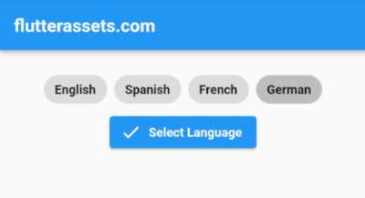
In this example, we have a list of languages stored in the _languages variable. We use the Wrap widget to wrap the ChoiceChip widgets, which display each language option. The selected property of the ChoiceChip is set to true if the current language matches the _selectedLanguage variable, which is initially null.
When a user selects a language by tapping on a chip, the _selectLanguage function updates the _selectedLanguage variable to the selected language, which causes the ChoiceChip widget to change its appearance to indicate that it has been selected. Finally, the “Check” ElevatedButton can be used to perform some action based on the selected language, such as saving it to a user profile.
Use the Flutter ChoiceChip widget as a Filtering content
Suppose we have a list of products that we want to filter by category using the Flutter ChoiceChip widget. We’ll start by creating a new Flutter project and adding a list of products to the main.dart file:
import 'package:flutter/material.dart';

void main() {
  runApp(MyApp());
}

class MyApp extends StatelessWidget {

  @override
  Widget build(BuildContext context) {
    return MaterialApp(
      debugShowCheckedModeBanner: false,
      title: 'Flutter Demo',
      theme: ThemeData(
        primarySwatch: Colors.blue,
      ),
      home: MyHomePage(),
    );
  }
}

class MyHomePage extends StatefulWidget {

  @override
  State<MyHomePage> createState() => _MyHomePageState();
}
class _MyHomePageState extends State<MyHomePage>{

  final List<Product> products = [
    Product(name: 'iPhone 13', category: 'Electronics', price: 999),
    Product(name: 'MacBook Pro', category: 'Electronics', price: 1499),
    Product(name: 'T-shirt', category: 'Clothing', price: 19),
    Product(name: 'Jeans', category: 'Clothing', price: 49),
    Product(name: 'Sofa', category: 'Home Goods', price: 799),
    Product(name: 'Coffee Table', category: 'Home Goods', price: 149),
  ];

  @override
  Widget build(BuildContext context) {

    return Scaffold(
      appBar: AppBar(
        title: Text('flutterassets.com'),
      ),
      body: Padding(
        padding: const EdgeInsets.all(8.0),
        child: ProductList(products: products),
      ),
    );
  }
}

class Product {
  final String name;
  final String category;
  final int price;

  Product({required this.name, required this.category, required this.price});
}
Now that we have a list of products, we’ll create a new widget called ProductList that displays the products and allows the user to filter by category using ChoiceChips.
class ProductList extends StatefulWidget {
  final List<Product> products;

  const ProductList({required this.products});

  @override
  _ProductListState createState() => _ProductListState();
}

class _ProductListState extends State<ProductList> {
  List<String> categories = ['Electronics', 'Clothing', 'Home Goods'];
  String selectedCategory = '';

  @override
  Widget build(BuildContext context) {
    List<Product> filteredProducts =
    widget.products.where((product) => product.category == selectedCategory).toList();

    return Column(
      children: [
        Row(
          children: categories
              .map((category) => ChoiceChip(
            label: Text(category),
            selected: selectedCategory == category,
            onSelected: (isSelected) {
              setState(() {
                if (isSelected) {
                  selectedCategory = category;
                } else {
                  selectedCategory = '';
                }
              });
            },
          ))
              .toList(),
        ),
        Expanded(
          child: ListView.builder(
            itemCount: filteredProducts.length,
            itemBuilder: (context, index) {
              Product product = filteredProducts[index];
              return ListTile(
                title: Text(product.name),
                subtitle: Text('${product.category} - \$${product.price}'),
              );
            },
          ),
        ),
      ],
    );
  }
}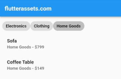
The ProductList widget has a categories list and a selectedCategory variable that keep track of the selected category. We create a row of ChoiceChips that display the categories, and when the user taps a ChoiceChip, we update the value of selectedCategory and filter the list of products accordingly.
We use the where method to create a new list of products that match the selected category, and we display the filtered list using a ListView.builder.
you can place the ProductList widget directly in the main.dart file. In fact, in many small or simple Flutter projects, it’s common to define all of the widgets in the same file, including the MyApp widget and any other widgets that are used in the app.
However, as your project grows and becomes more complex, it’s a good idea to organize your widgets into separate files to make your code more modular and easier to maintain. This also makes it easier to reuse widgets across different parts of your app.
So, the ProductList widget can be placed in a separate file from the main MyApp widget, typically in a file named product_list.dart or something similar. This is because it’s good practice to keep your widgets organized into separate files to make your code easier to read, maintain, and scale.
When creating a new file for the ProductList widget, you’ll need to make sure to import any necessary dependencies and classes that you’ll be using in your widget, such as Material and Product.
Once you have your ProductList widget defined in its own file, you can import it into your main MyApp widget file and use it as a child widget in the Scaffold‘s body property. This allows you to keep your code organized and maintainable, making it easier to add new features and functionality as your app grows.
Use the Flutter ChoiceChip widget Selecting an option
Here’s an example of how to use the ChoiceChip widget in Flutter to allow the user to select an option from a set of choices:
int _selectedOption = 0; // Keeps track of the currently selected option

List<String> _options = [
  'Option A',
  'Option B',
  'Option C',
  'Option D',
];


@override
Widget build(BuildContext context) {

  return Scaffold(
    appBar: AppBar(
      title: Text('flutterassets.com'),
    ),
    body: Padding(
      padding: const EdgeInsets.all(8.0),
      child: Column(
        children: [
          SizedBox(height: 16),
          Text(
            'What is your favorite color?',
            style: TextStyle(fontSize: 18, fontWeight: FontWeight.bold),
          ),
          SizedBox(height: 16),
          Row(
            mainAxisAlignment: MainAxisAlignment.center,
            children: _options.map((option) {
              final index = _options.indexOf(option);
              return Padding(
                padding: EdgeInsets.symmetric(horizontal: 8),
                child: ChoiceChip(
                  label: Text(option),
                  selected: _selectedOption == index,
                  onSelected: (selected) {
                    setState(() {
                      _selectedOption = (selected ? index : null)!;
                    });
                  },
                ),
              );
            }).toList(),
          ),
          SizedBox(height: 16),
          ElevatedButton(
            onPressed: _selectedOption == null ? null : () {
              // Do something with the selected option
              print('Selected option: ${_options[_selectedOption]}');
            },
            child: Text('Submit'),
          ),
        ],
      ),
    ),
  );
}
In this example, we have a SurveyApp widget that displays a question with a set of answer options as ChoiceChip widgets. The _options list contains the answer options, and _selectedOption is used to keep track of the currently selected option.
In the build method, we create a Column widget with a Text widget to display the question, and a Row widget to display the ChoiceChip options. We use the map method to create a ChoiceChip widget for each option in the _options list. The selected property of each ChoiceChip widget is set to true if the index of the option matches the _selectedOption variable, and the onSelected callback is used to update the _selectedOption variable when the user selects an option.
Finally, we have an ElevatedButton widget that is disabled if no option is selected, and enabled if an option is selected. When the button is pressed, we can do something with the selected option, such as sending it to a server or storing it locally.
Use the Flutter ChoiceChip widget as a Navigation
Here’s an example of how to use the ChoiceChip widget in Flutter as a form of navigation:
import 'package:flutter/material.dart';

void main() {
  runApp(MyApp());
}

class MyApp extends StatelessWidget {

  @override
  Widget build(BuildContext context) {
    return MaterialApp(
      debugShowCheckedModeBanner: false,
      title: 'Flutter Demo',
      theme: ThemeData(
        primarySwatch: Colors.blue,
      ),
      home: MyHomePage(),
    );
  }
}

class MyHomePage extends StatefulWidget {

  @override
  State<MyHomePage> createState() => _MyHomePageState();
}
class _MyHomePageState extends State<MyHomePage>{

  int _selectedSection = 0; // Keeps track of the currently selected section

  List<String> _sections = [
    'Home',
    'About',
    'Contact',
  ];

  @override
  Widget build(BuildContext context) {

    return Scaffold(
      appBar: AppBar(
        title: Text('flutterassets.com'),
      ),
      body: Padding(
        padding: const EdgeInsets.all(8.0),
        child: _buildPageForSection(_selectedSection),
        // bottomNavigationBar:
      ),
      bottomNavigationBar: BottomAppBar(
        child: Padding(
          padding: EdgeInsets.all(16),
          child: Row(
            mainAxisAlignment: MainAxisAlignment.spaceEvenly,
            children: _sections.map((section) {
              final index = _sections.indexOf(section);
              return ChoiceChip(
                label: Text(section),
                selected: _selectedSection == index,
                onSelected: (selected) {
                  setState(() {
                    _selectedSection = (selected ? index : null)!;
                  });
                },
              );
            }).toList(),
          ),
        ),
      ),
    );
  }
}

Widget _buildPageForSection(int sectionIndex) {
  switch (sectionIndex) {
    case 0:
      return Center(
        child: Text('Home Page'),
      );
    case 1:
      return Center(
        child: Text('About Page'),
      );
    case 2:
      return Center(
        child: Text('Contact Page'),
      );
    default:
      return Center(
        child: Text('Unknown Page'),
      );
  }
}

In this example, we have a MenuApp widget that displays different sections of the app as ChoiceChip widgets in the bottom navigation bar. The _sections list contains the names of the sections, and _selectedSection is used to keep track of the currently selected section.
In the build method, we create a Scaffold widget with a BottomAppBar widget that contains a row of ChoiceChip widgets. The selected property of each ChoiceChip widget is set to true if the index of the section matches the _selectedSection variable, and the onSelected callback is used to update the _selectedSection variable when the user selects a section.
We also have a _buildPageForSection method that returns a different page depending on the selected section. In this example, we just return a Center widget with some text for each page, but you could replace this with any widget that represents the contents of the section.
Use the Flutter ChoiceChip widget as a Custom controls
Here’s an example of how to use the ChoiceChip widget in Flutter as a custom control to allow the user to adjust a value within a specific range:
double minValue = 0.0;
double maxValue = 100.0;
late double _currentValue;

@override
void initState() {
  super.initState();
  _currentValue = (minValue + maxValue) / 2.0;
}

@override
Widget build(BuildContext context) {

  return Scaffold(
    appBar: AppBar(
      title: Text('flutterassets.com'),
    ),
    body: Container(
      height: 100,
      alignment: Alignment.topCenter,
      padding: const EdgeInsets.all(8.0),
      child:  Row(
        children: [
          Text('Min'),
          SizedBox(width: 8),
          ChoiceChip(
            label: Text('${minValue.round()}'),
            selected: _currentValue == minValue,
            onSelected: (selected) {
              setState(() {
                _currentValue = minValue;
              });
            },
          ),
          SizedBox(width: 8),
          Expanded(
            child: Slider(
              value: _currentValue,
              min: minValue,
              max: maxValue,
              onChanged: (newValue) {
                setState(() {
                  _currentValue = newValue;
                });
              },
            ),
          ),
          SizedBox(width: 8),
          ChoiceChip(
            label: Text('${maxValue.round()}'),
            selected: _currentValue == maxValue,
            onSelected: (selected) {
              setState(() {
                _currentValue = maxValue;
              });
            },
          ),
          SizedBox(width: 8),
          Text('Max'),
        ],
      )
      // bottomNavigationBar:
    ),
  );
}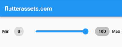
In this example, we have a RangeSlider widget that displays a Slider widget with ChoiceChip widgets on either side to allow the user to adjust the value within a specific range. The minValue and maxValue parameters are used to specify the range of the slider, and the _currentValue variable is used to keep track of the current value.
In the build method, we create a Row widget with a Text widget and a ChoiceChip widget for the minimum value, a Slider widget for the current value, and another Text widget and ChoiceChip widget for the maximum value. The selected property of each ChoiceChip widget is set to true if the current value matches the corresponding value (widget.minValue or widget.maxValue), and the onSelected callback is used to update the _currentValue variable when the user selects a value.
You can customize this example to fit your specific use case by changing the range of the slider or the appearance of the ChoiceChip widgets. This is just one example of how you can use the ChoiceChip widget in Flutter as a custom control.