What is the Flutter RawChip Widget
Flutter RawChip Widget is a UI component that represents a small, clickable element used for displaying a short piece of information, such as a category, tag, or label. The RawChip is part of the Material Design library in Flutter, and it is customizable and easy to use.
The RawChip is often used to represent filters or categories in an app. For example, in a recipe app, you could use RawChips to represent categories such as vegetarian, vegan, gluten-free, or dairy-free. When a user clicks on a RawChip, it can trigger an action or filter results based on the selected category.
The RawChip has several properties that can be customized, such as the label, icon, background colour, and border. You can also specify the padding and shape of the RawChip, and adjust the font size and colour of the label. Additionally, RawChips can be grouped together using a Wrap widget, which allows for a flexible layout of the chips.
What is the difference between Chip and RawChip widget
In Flutter, both Chip and RawChip widgets are used for displaying small, clickable elements that represent a piece of information, such as a category, tag, or label. However, there are some key differences between the two widgets.
The Chip widget is a higher-level widget that provides a predefined design and behaviour for the chip element. It has a Material Design style by default, which includes a rounded shape, a background colour, and an icon or label. The Chip widget also provides built-in functionality for deleting the chip or toggling its selection state.
On the other hand, the RawChip widget is a lower-level widget that gives you more control over the design and behaviour of the chip element. It doesn’t have any predefined styles, so you need to specify the shape, background colour, icon, and label yourself. The RawChip widget also doesn’t provide built-in functionality for deleting or toggling the selection state of the chip.
While the Chip widget is easier to use and provides a consistent Material Design look and feel, the RawChip widget is more flexible and customizable. You can use the RawChip widget to create a completely custom design for your chips or to match a specific design style for your app.
In summary, the main difference between the Chip and RawChip widgets is the level of customization and control they provide. The Chip widget is easier to use and provides a consistent design, while the RawChip widget is more flexible and customizable.
Where the Flutter RawChip widget can be used
Here are a few examples of where the RawChip widget may be used:
- Tagging System: RawChip is perfect for creating a tagging system in your app. You can use it to display tags associated with a post or item, allowing users to filter content by tag. RawChip widgets can be customized to match the design of your app and are easily clickable, making them a great choice for tagging systems.
- Filter System: RawChip is also useful for creating filter systems in your app. You can use it to allow users to filter content by category, price range, or other attributes. The RawChip widget can be customized to display the filter option, and you can use
onPressedproperty to handle the filter logic. - Selection System: If you want to create a system where users can select items,
RawChipwidget can be a good choice. You can use RawChip to display a list of items and let users select one or multiple options. The selected RawChip widgets can be styled differently to indicate their selected state. - User Profile: RawChip can be used to display a user profile picture or avatar. You can customize the RawChip widget to include the user’s name, profile picture, and other information. By using the
onPressedproperty, you can create interactivity, such as allowing users to edit their profiles or view their followers. - Action Buttons: RawChip can be used as a replacement for standard buttons in some use cases. For example, you can use RawChip to display social media icons, allowing users to share content or follow your social media pages.
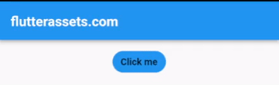
How to use the RawChip widget as a Button in Flutter
In Flutter, you can use the RawChip widget as a button by adding an onTap or onPressed callback to it. When the user clicks on the RawChip, the callback function will be triggered, allowing you to perform an action.
Here’s an example of how to use the RawChip widget as a button:
RawChip(
  label: Text('Click me'),
  onPressed: () {
    // Perform an action when the RawChip is clicked
  },
),
In this example, we’ve created a RawChip with a label that says “Click me”. We’ve also added an onPressed callback to the RawChip. When the user clicks on the RawChip, the callback function will be triggered, allowing us to perform an action.
How to disable the Flutter RawChip Widget after pressed
Disable RawChip with isEnabled property
In Flutter, you can disable the RawChip widget after it has been clicked by using the “isEnabled” property of the RawChip. By default, the RawChip is enabled, but you can set the isEnabled property to false to disable the RawChip.
Here’s an example of how to disable the RawChip after it has been clicked:
bool isChipEnabled = true;

RawChip(
  label: Text('Click me'),
  isEnabled: isChipEnabled,
  onPressed: () {
    setState(() {
      isChipEnabled = false;
    });
    // Perform an action when the RawChip is clicked
    print('Chip Disabled');
  },
),
In this example, we’ve created a RawChip with a label that says “Click me”. We’ve also added an onPressed callback to the RawChip. When the user clicks on the RawChip, the callback function will be triggered, and we’ve used setState to update the value of the “isChipEnabled” variable to false.
We’ve also set the “isEnabled” property of the RawChip to the value of “isChipEnabled”. This means that when the RawChip is clicked and “isChipEnabled” is set to false, the RawChip will be disabled and will no longer be clickable.
Disable RawChip with onPressed property to null
Yes, you can disable the Flutter RawChip by setting the onPressed property to null. When the onPressed property is null, the RawChip is effectively disabled and will not respond to user clicks.
Here’s an example of how to disable the RawChip by setting the onPressed property to null:
bool isChipEnabled = true;

RawChip(
  label: Text('Click me'),
  backgroundColor: isChipEnabled ? Colors.blue : Colors.grey,
  onPressed: isChipEnabled ? () {
    print('Chip Disabled');
    // Perform an action when the RawChip is clicked
    setState(() {
      isChipEnabled = false;
    });
  } : null,
),
In this example, we’ve created a RawChip with a label that says “Click me”. We’ve also added an onPressed callback to the RawChip, but we’ve wrapped it in a conditional expression that checks the value of a boolean variable called “isChipEnabled”. If “isChipEnabled” is true, the onPressed callback will be triggered when the RawChip is clicked. If “isChipEnabled” is false, the onPressed property will be set to null, and the RawChip will be disabled.
The isChipEnabled also change the backgroundColor when RawChip is disabled.
You can update the value of “isChipEnabled” to enable or disable the RawChip dynamically based on your application logic.
Use the Flutter RawChip widget in a tagging system
Here’s an example of how you can use the RawChip widget in a tagging system to filter content by tags.
Let’s say you have a list of items and each item is associated with one or more tags. You want to display the tags associated with each item and allow users to filter the items by clicking on a tag.
First, you’ll need to create a list of tags to work with. For this example, we’ll use the following list:
List<String> tags = [
  'Tech',
  'Food',
  'Travel',
  'Art',
  'Music',
];
Next, you’ll need to create a list of items. For this example, we’ll use a list of maps where each map represents an item and contains a name and a list of tags associated with that item.
List<Map<String, dynamic>> items = [
  {
    'name': 'iPhone',
    'tags': ['Tech'],
  },
  {
    'name': 'Barcelona',
    'tags': ['Travel', 'Art'],
  },
  {
    'name': 'Pizza',
    'tags': ['Food'],
  },
  {
    'name': 'Paris',
    'tags': ['Travel', 'Art'],
  },
  {
    'name': 'Mona Lisa',
    'tags': ['Art', 'Travel'],
  },
  {
    'name': 'Jazz',
    'tags': ['Music'],
  },
  {
    'name': 'Soul',
    'tags': ['Music', 'Travel'],
  },
  {
    'name': 'Samsung',
    'tags': ['Tech'],
  },
];
Now that we have our list of tags and items, we can display the tags associated with each item using RawChip widgets. We can also use RawChip widgets to allow users to filter the items by clicking on a tag.
Here’s an example code that displays the tags associated with each item and allows users to filter the items by tag:
List<String> tags = [
  'Tech',
  'Food',
  'Travel',
  'Art',
  'Music',
];

List<Map<String, dynamic>> items = [
  {
    'name': 'iPhone',
    'tags': ['Tech'],
  },
  {
    'name': 'Barcelona',
    'tags': ['Travel', 'Art'],
  },
  {
    'name': 'Pizza',
    'tags': ['Food'],
  },
  {
    'name': 'Paris',
    'tags': ['Travel', 'Art'],
  },
  {
    'name': 'Mona Lisa',
    'tags': ['Art', 'Travel'],
  },
  {
    'name': 'Jazz',
    'tags': ['Music'],
  },
  {
    'name': 'Soul',
    'tags': ['Music', 'Travel'],
  },
  {
    'name': 'Samsung',
    'tags': ['Tech'],
  },
];

List<String> selectedTags = [];

@override
Widget build(BuildContext context) {
  return Scaffold(
    appBar: AppBar(
      title: Text('flutterassets.com'),
    ),
    body: Container(
        alignment: Alignment.topCenter,
        padding: const EdgeInsets.all(8.0),
        child: Column(
          children: [
            Wrap(
              spacing: 8.0,
              children: tags.map((tag) {
                bool isSelected = selectedTags.contains(tag);
                return RawChip(
                  label: Text(tag),
                  selected: isSelected,
                  onSelected: (isSelected) {
                    setState(() {
                      if (isSelected) {
                        selectedTags.add(tag);
                      } else {
                        selectedTags.remove(tag);
                      }
                    });
                  },
                );
              }).toList(),
            ),
            Expanded(
              child: ListView(
                children: items.where((item) {
                  return selectedTags.every((tag) => item['tags'].contains(tag));
                }).map((item) {
                  return ListTile(
                    title: Text(item['name']),
                    subtitle: Text(item['tags'].join(', ')),
                  );
                }).toList(),
              ),
            ),
          ],
        )
    ),
  );
}
In this example, we’re using a selectedTags list to keep track of which tags are currently selected by the user. We’re displaying the tags using a Wrap widget and creating a RawChip for each tag. We’re setting the selected property of each RawChip based on whether the tag is currently selected or not, and we’re updating the selectedTags list when the user selects or deselects a tag.
We’re using the where method on the items list to filter the items based on the selected tags. We’re using the every method on the selectedTags list to check if every selected tag is present in the tags associated with the item. Finally, we’re displaying the filtered items using a ListView widget.
Use the Flutter RawChip widget in a filtering system
here is the full code example for a filter system using RawChip widget in Flutter:
import 'package:flutter/material.dart';
import 'package:share_plus/share_plus.dart';
import 'package:url_launcher/url_launcher.dart';

void main() {
  runApp(MyApp());
}

class MyApp extends StatelessWidget {

  @override
  Widget build(BuildContext context) {
    return MaterialApp(
      debugShowCheckedModeBanner: false,
      title: 'Flutter Demo',
      theme: ThemeData(
        primarySwatch: Colors.blue,
      ),
      home: MyHomePage(),
    );
  }
}

class MyHomePage extends StatefulWidget {

  @override
  State<MyHomePage> createState() => _MyHomePageState();
}
class _MyHomePageState extends State<MyHomePage>{

  List<Item> _items = [
    Item(name: "Product A", price: 10.0, categories: ["Category 1", "Category 2"]),
    Item(name: "Product B", price: 20.0, categories: ["Category 2"]),
    Item(name: "Product C", price: 30.0, categories: ["Category 3"]),
    Item(name: "Product D", price: 40.0, categories: ["Category 1", "Category 3"]),
    Item(name: "Product E", price: 50.0, categories: ["Category 2", "Category 3"]),
  ];

  List<String> _selectedCategories = [];

  void _handleCategorySelection(String category) {
    setState(() {
      if (_selectedCategories.contains(category)) {
        _selectedCategories.remove(category);
      } else {
        _selectedCategories.add(category);
      }
    });
  }

  List<Item> getFilteredItems() {
    if (_selectedCategories.isEmpty) {
      return _items;
    } else {
      return _items.where((item) => item.categories.any((category) => _selectedCategories.contains(category))).toList();
    }
  }

  @override
  Widget build(BuildContext context) {
    return Scaffold(
      appBar: AppBar(
        title: Text('flutterassets.com'),
      ),
      body: Container(
          alignment: Alignment.topCenter,
          padding: const EdgeInsets.all(8.0),
          child: Column(
            children: [
              Wrap(
                spacing: 8.0,
                children: [
                  for (var category in ["Category 1", "Category 2", "Category 3"])
                    RawChip(
                      label: Text(category),
                      labelStyle: TextStyle(color: Colors.white),
                      backgroundColor: _selectedCategories.contains(category) ? Colors.blue : Colors.grey,
                      onPressed: () => _handleCategorySelection(category),
                    )
                ],
              ),
              Expanded(
                child: ListView.builder(
                  itemCount: getFilteredItems().length,
                  itemBuilder: (context, index) {
                    final item = getFilteredItems()[index];
                    return ListTile(
                      title: Text(item.name),
                      subtitle: Text("\$${item.price.toStringAsFixed(2)}"),
                    );
                  },
                ),
              ),
            ],
          ),
      ),
    );
  }
}

class Item {
  final String name;
  final double price;
  final List<String> categories;

  Item({required this.name, required this.price, required this.categories});
}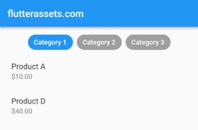
This code creates a filter system that allows users to filter items by category. The _items list contains a few Item objects, each with a name, price, and categories list. The _selectedCategories list keeps track of which categories are currently selected.
In the build method, a Column widget is used to display the filter chips and the list of items. The filter chips are created using a Wrap widget and a for loop that loops over each category. For each category, a RawChip widget is created with the category name as the label, a white label text colour, and a background colour that is blue if the category is selected and grey otherwise. The onPressed property is set to _handleCategorySelection method, which adds or removes the category from the _selectedCategories list.
The getFilteredItems method returns a filtered list of items based on the currently selected categories. If no categories are selected, it returns the original list of items.
Use the Flutter RawChip widget in a simple selection system
To use RawChip for selection, you can create a list of items and wrap each item in a RawChip widget. Set the selected property to true or false based on whether the item is currently selected or not. When the user clicks on a RawChip widget, you can toggle the selected property and update the state of your app accordingly.
Here’s an example code snippet that demonstrates how to use RawChip for selection:
List<String> items = ['Item 1', 'Item 2', 'Item 3', 'Item 4'];
List<bool> isSelected = [false, false, false, false];

@override
Widget build(BuildContext context) {
  return Scaffold(
    appBar: AppBar(
      title: Text('flutterassets.com'),
    ),
    body: Container(
        alignment: Alignment.topCenter,
        padding: const EdgeInsets.all(8.0),
        child: Wrap(
          spacing: 8.0,
          runSpacing: 4.0,
          children: List<Widget>.generate(items.length, (int index) {
            return RawChip(
              label: Text(items[index]),
              selected: isSelected[index],
              onSelected: (bool selected) {
                setState(() {
                  isSelected[index] = selected;
                });
              },
            );
          }),
        ),
    ),
  );
}
In this example, we have a list of four items and a list of four boolean values indicating whether each item is selected or not. In the build method, we use a Wrap widget to display the RawChip widgets in a row. We generate the RawChip widgets dynamically based on the items list, setting the label property to display the name of each item, and the selected property to indicate whether it is currently selected or not.
When the user clicks on a RawChip widget, we update the isSelected list using setState, which triggers a rebuild of the UI. The selected property of the RawChip widget is set to the new value of isSelected[index], which updates the styling of the RawChip to indicate its selected state.
With this approach, you can easily create a selection system that allows users to select one or multiple items, and customize the styling of the RawChip widgets to match your app’s design.
Use the Flutter RawChip widget in a user profile button
To use RawChip in a user profile button, you can create a container with a RawChip inside it. The RawChip can contain the user’s profile picture and name, and you can customize it with different shapes, colours, and other properties to match your app’s design. You can also add onPressed property to the RawChip to handle user interaction.
Here is an example code:
Container(
  padding: EdgeInsets.all(10),
  child: RawChip(
    avatar: CircleAvatar(
      backgroundImage: AssetImage('assets/logo.png'),
    ),
    label: Text('Flutterassets.com'),
    onPressed: () {
      // Handle user interaction, such as editing profile or viewing followers.
    },
  ),
)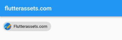
In this example, the RawChip contains the user’s profile picture as the avatar and the user’s name as the label. When the user taps on the RawChip, the onPressed property is called, which can be used to handle user interaction, such as opening a new screen to allow the user to edit their profile or view their followers.
You can also display a user’s profile picture, name, email, phone number, location, and other information.
To create a user profile using the RawChip widget, you can start by defining the user’s information as variables. For example, you could have:
String name = "Your Name";
String email = "john.doe@email.com";
String phone = "+1 (555) 123-4567";
String location = "City, Country";
String profilePicture = "assets/logo.png";
Then, you can create a RawChip widget that displays the user’s information. The onPressed property can be used to handle button presses, such as allowing the user to edit their profile or view their followers.
RawChip(
  avatar: CircleAvatar(backgroundImage: AssetImage(profilePicture),),
  label: Column(
    mainAxisSize: MainAxisSize.min,
    children: [
      Text(name),
      Text(email),
      Text(phone),
      Text(location),
    ],
  ),
  onPressed: () {
    // code to handle button press, such as allowing user to edit profile
  },
),
In the above code, the label property contains a Column widget with multiple Text widgets that display the user’s information. By using the Column widget, the Text widgets are displayed one below the other, making it easy to read the user’s information.
Use the Flutter RawChip widget in an action buttons
Here’s an example code snippet that shows how you could use RawChip to display social media names and share icons:
Row(
    children: [
      RawChip(
        label: Text('Facebook'),
        avatar: Icon(Icons.share),
        onPressed: () {
          // code to share content on Facebook
        },
      ),
      RawChip(
        label: Text('Twitter'),
        avatar: Icon(Icons.share),
        onPressed: () {
          // code to share content on Twitter
        },
      ),
      RawChip(
        label: Text('Instagram'),
        avatar: Icon(Icons.share),
        onPressed: () {
          // code to share content on Instagram
        },
      ),
    ],
  )
)
In this example, we create three RawChip widgets, each representing a different social media platform. The label property is set to display the name of the social media platform, and the avatar property is set to display the share icon.
We also set the onPressed property to specify what should happen when the user taps the RawChip. In this case, we would need to provide the code to share content on each platform.
You can also use the RawChip like this:
import 'package:flutter/material.dart';

void main() {
  runApp(MyApp());
}

class MyApp extends StatelessWidget {

  @override
  Widget build(BuildContext context) {
    return MaterialApp(
      debugShowCheckedModeBanner: false,
      title: 'Flutter Demo',
      theme: ThemeData(
        primarySwatch: Colors.blue,
      ),
      home: MyHomePage(),
    );
  }
}

class MyHomePage extends StatefulWidget {

  @override
  State<MyHomePage> createState() => _MyHomePageState();
}
class _MyHomePageState extends State<MyHomePage>{

  List<SocialMediaItem> _socialMediaItems = [
    SocialMediaItem(name: "facebook", url: 'https://facebook.com/....'),
    SocialMediaItem(name: "twitter", url: 'https://twitter.com/....'),
    SocialMediaItem(name: "instagram", url: 'https://instagram.com/....'),
    SocialMediaItem(name: "linkedin", url: 'https://linkedin.com/....'),
  ];

  @override
  Widget build(BuildContext context) {
    return Scaffold(
      appBar: AppBar(
        title: Text('flutterassets.com'),
      ),
      body: Container(
        padding: EdgeInsets.all(10),
        child: Wrap(
          children: _socialMediaItems.map((label) {
            return Padding(
              padding: const EdgeInsets.symmetric(horizontal: 8.0),
              child: RawChip(
                avatar: Icon(Icons.share_outlined),
                label: Text(label.name),
                onPressed: () {
                  // handle the logic for each button here
                  print('Go to ${label.url}');
                },
              ),
            );
          }).toList(),
        ),
      )
    );
  }
}

class SocialMediaItem {
  final String name;
  final String url;

  SocialMediaItem({required this.name, required this.url});
}
The above code is a Flutter app that displays a list of social media names as RawChip buttons, and when the user presses each button, it prints a message with the corresponding social media URL.
In the code, we have defined a list of SocialMediaItem objects that contains the social media names and their URLs. This list is mapped over to create a list of RawChip buttons using the Wrap and map methods. The RawChip widget is customized by providing an icon as the avatar and the social media name as the label.
The onPressed property of each RawChip button is used to handle the button’s logic. In this case, it simply prints a message with the corresponding social media URL. However, we can modify this logic to perform other actions, such as launching a web page with the corresponding social media URL or sharing content on the social media platform.