What can be customized in the Flutter RawChip widget
In the Flutter RawChip widget, there are many properties that you can use to customize its appearance and behaviour.
Some of the properties that can be customized include the label text and style, background colour, shadow colour, selected colour, delete icon colour, checkmark colour, disabled colour, selected shadow colour, shape, and border.
You can also define whether the chip is selected or enabled, and add callbacks for when the chip is selected, deleted, or pressed.
Here are the RawChip properties:
RawChip RawChip({
  Key? key,
  ChipThemeData? defaultProperties,
  Widget? avatar,
  required Widget label,
  TextStyle? labelStyle,
  EdgeInsetsGeometry? padding,
  VisualDensity? visualDensity,
  EdgeInsetsGeometry? labelPadding,
  Widget? deleteIcon,
  void Function()? onDeleted,
  Color? deleteIconColor,
  String? deleteButtonTooltipMessage,
  void Function()? onPressed,
  void Function(bool)? onSelected,
  double? pressElevation,
  bool tapEnabled = true,
  bool selected = false,
  bool isEnabled = true,
  Color? disabledColor,
  Color? selectedColor,
  String? tooltip,
  BorderSide? side,
  OutlinedBorder? shape,
  Clip clipBehavior = Clip.none,
  FocusNode? focusNode,
  bool autofocus = false,
  Color? backgroundColor,
  MaterialTapTargetSize? materialTapTargetSize,
  double? elevation,
  Color? shadowColor,
  Color? surfaceTintColor,
  IconThemeData? iconTheme,
  Color? selectedShadowColor,
  bool? showCheckmark = true,
  Color? checkmarkColor,
  ShapeBorder avatarBorder = const CircleBorder(),
  bool useDeleteButtonTooltip = true,
})
How to use an avatar in Flutter RawChip
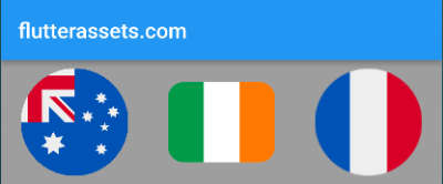
In Flutter, the RawChip widget allows you to add an avatar image to the chip using the avatar property. The avatar image is typically used to display a profile picture or icon, providing a visual cue to the user about the context of the chip.
To use the avatar property, you can set its value to a widget that represents the avatar image. This can be done using the CircleAvatar widget, which creates a circular avatar with an image or icon inside.
Here is an example of how to use the avatar property in a RawChip widget:
RawChip(
  label: Text('Raw Chip'),
  avatar: CircleAvatar(
    backgroundImage: NetworkImage('https://picsum.photos/250?image=9'),
  ),
  onSelected: (bool selected) {},
),
In this example, the RawChip widget has a label ‘Raw Chip’ and an avatar image, which is created using the CircleAvatar widget. The backgroundImage property of the CircleAvatar widget is set to a network image URL. This will create a circular avatar with the image at the given URL. Finally, the onSelected property is set to an empty function, which will be called when the chip is selected.
By using the avatar property, you can add an avatar image to the RawChip widget, providing a more visually engaging user experience.
Flutter RawChip widget avatar with Image
To use an asset image as the avatar of the RawChip, you can pass the AssetImage widget as the “avatar” property of the RawChip. The AssetImage widget takes the path to the asset image as a parameter and loads the image at runtime.
Here’s an example of how to use an asset image as the avatar of the RawChip:
RawChip(
  label: Text('Click me'),
  avatar: CircleAvatar(
    backgroundImage: AssetImage('assets/logo.png'),
  ),
  onPressed: (){
    // Perform an action when the RawChip is clicked
  },
),
In this example, we’ve created a RawChip with an avatar that shows the profile picture of a user. We’ve used the CircleAvatar widget to create a circular avatar, and we’ve passed the AssetImage widget to the “backgroundImage” property to load the image from the “assets/logo.png” file.
Flutter RawChip widget avatar with Icon
To use an Icon as the avatar of the RawChip, you can pass the Icon widget as the “avatar” property of the RawChip. The Icon widget takes the name of the icon as a parameter and displays the corresponding icon.
Here’s an example of how to use an Icon as the avatar of the RawChip:
RawChip(
  label: Text('Click me'),
  avatar: Icon(Icons.person),
  onPressed: (){
    // Perform an action when the RawChip is clicked
  },
),
RawChip(
label: Text('Click me'),
avatar: CircleAvatar(
child: Icon(Icons.person)),
onPressed: (){
// Perform an action when the RawChip is clicked
},
),
In this example, we’ve created a RawChip with an avatar that shows the person icon from the material icons library. We’ve used the Icon widget to display the icon, and we’ve passed the “Icons.person” value as the parameter to the Icon widget.
How to customize the colours of the RawChip in Flutter
To customize the Flutter RawChip widget colours, you can use the following properties:
deleteIconColor: sets the colour of the delete icon when a chip is deletable.disabledColor: sets the colour of the chip when it is disabled.selectedColor: sets the colour of the chip when it is selected.backgroundColor: sets the background colour of the chip.shadowColor: sets the colour of the chip’s shadow.surfaceTintColor: sets the colour of the chip’s surface.selectedShadowColor: sets the colour of the chip’s shadow when it is selected.checkmarkColor: sets the colour of the checkmark when a chip is checkable.
Here’s an example code that shows how to use these properties:
RawChip(
  label: Text('Customize me!'),
  labelStyle: TextStyle(color: Colors.white),
  backgroundColor: Colors.blue,
  shadowColor: Colors.black,
  selectedColor: Colors.green,
  deleteIconColor: Colors.white,
  checkmarkColor: Colors.red,
  disabledColor: Colors.grey,
  selectedShadowColor: Colors.purple,
)
The code creates a RawChip widget with the label ‘Customize me!’ and white text colour. The background colour of the chip is set to blue, and the shadow colour to black. When the chip is selected, it changes its colour to green, and a checkmark appears with red colour. The delete icon has a white colour and the chip appears greyed out when disabled. Finally, the selected shadow colour is set to purple. By using these properties, the appearance of the RawChip widget is fully customized and can be adapted to match the visual design of the application.
How to use onSelected in Flutter RawChip
In Flutter, the RawChip widget provides an onSelected property that allows you to define a callback function that is called when the user selects or deselects the chip.
To use the onSelected property, you can set its value to a function that takes a boolean parameter. This parameter will indicate whether the chip is selected or deselected.
Here is an example of how to use the onSelected property in a RawChip widget:
bool _isSelected = false;

RawChip(
  label: Text('Click me!'),
  onSelected: (bool isSelected) {
    setState(() {
      _isSelected = isSelected;
    });
  },
  selected: _isSelected,
),
In this example, the RawChip widget has a label ‘Click me!’ and an onSelected property that is set to a function that updates the _isSelected boolean value. The _isSelected value is used to track whether the chip is selected or not, and it is initially set to false. The selected property is also set to the _isSelected value, which determines whether the chip is visually selected or not.
When the user clicks on the chip, the onSelected function is called with the boolean parameter indicating whether the chip is selected or not. In this case, the _isSelected value is updated to match the new selected state, and setState is called to update the widget’s state. As a result, the selected property is also updated to reflect the new selected state.
How to use onDeleted in Flutter RawChip
In Flutter, the RawChip widget provides an onDeleted property that allows you to define a callback function that is called when the user deletes the chip.
To use the onDeleted property, you can set its value to a function that is called when the user deletes the chip. Typically, you would use this property to remove the chip from the screen or update the app’s state.
Here is an example of how to use the onDeleted property in a RawChip widget:
RawChip(
  label: Text('Delete me!'),
  onDeleted: () {
    // Implement delete functionality
  },
),
In this example, the RawChip widget has a label ‘Delete me!’ and an onDeleted property that is set to a function. When the user clicks on the delete icon, the function is called. In this case, the function is not implemented, but you can replace the comment with code that removes the chip from the screen or updates the app’s state.
By using the onDeleted property, you can define a callback function that is called when the user deletes the chip, and use this function to update the app’s state or remove the chip from the screen.
How to use onPressed in Flutter RawChip
In Flutter, the RawChip widget provides an onPressed property that allows you to define a callback function that is called when the user taps on the chip.
To use the onPressed property, you can set its value to a function that is called when the user taps on the chip. Typically, you would use this property to perform some action when the user interacts with the chip.
Here is an example of how to use the onPressed property in a RawChip widget:
RawChip(
  label: Text('Tap me!'),
  onPressed: () {
    // Implement tap functionality
  },
)
In this example, the RawChip widget has a label ‘Tap me!’ and an onPressed property that is set to a function. When the user taps on the chip, the function is called. In this case, the function is not implemented, but you can replace the comment with code that performs some action when the user interacts with the chip.
By using the onPressed property, you can define a callback function that is called when the user taps on the chip, and use this function to perform some action or update the app’s state.
How to customize the Label in the Flutter RawChip widget
In Flutter, the RawChip widget provides several properties that allow you to customize the label appearance. Here are a few customization options along with code examples:
Changing the RawChip label text colour:
RawChip(
  label: Text('Customize me!'),
  labelStyle: TextStyle(color: Colors.red),
),
In this example, the labelStyle property is used to change the label text colour to red.
Changing the RawChip label font size:
RawChip(
  label: Text('Customize me!'),
  labelStyle: TextStyle(fontSize: 18),
)
In this example, the labelStyle property is used to change the label font size to 18.
Changing the RawChip label padding:
RawChip(
  label: Text('Customize me!'),
  labelStyle: TextStyle(color: Colors.white),
  padding: EdgeInsets.symmetric(horizontal: 20, vertical: 5),
)
In this example, the padding property is used to change the label padding to 20 pixels horizontally and 5 pixels vertically.
Adding an icon to the label in RawChip:
RawChip(
  label: Row(
    children: [
      Icon(Icons.star, size: 18),
      SizedBox(width: 5),
      Text('Customize me!'),
    ],
  ),
)
In this example, an Icon widget is added to the label by wrapping the label text with a Row widget and adding the icon before the label text.
Changing the RawChip label background colour:
RawChip(
  label: Text('Customize me!'),
  labelStyle: TextStyle(color: Colors.white),
  backgroundColor: Colors.blue,
)
In this example, the backgroundColor property is used to change the label background colour to blue.
How to use tapEnabled in the Flutter RawChip
The tapEnabled property is used in the RawChip widget to enable or disable the chip’s tap handling. When tapEnabled is set to true, the RawChip is tappable, and when it is set to false, the RawChip is not tappable.
Here’s an example of how to use the tapEnabled property:
bool _isTappable = false;

RawChip(
  label: Text('Customize me!'),
  labelStyle: TextStyle(color: Colors.white),
  backgroundColor: Colors.blue,
  tapEnabled: _isTappable,
  onPressed: () {
    // Do something when chip is pressed
  },
  onDeleted: () {
    // Do something when chip is deleted
    print('Delete Pressed');
  },
)
In this example, the _isTappable boolean variable is used to toggle the tapEnabled property. When _isTappable is true, the RawChip is tappable, and when it is false, the RawChip is not tappable. You can set the value of _isTappable based on certain conditions in your app to enable or disable the tap handling of the RawChip.
Note that you can still use the onDeleted callback function to perform an action when the RawChip is deleted regardless of the tapEnabled property.
How to use selected in the Flutter RawChip
The selected property in the RawChip widget is used to indicate whether the chip is currently selected or not. When selected is set to true, the RawChip is visually highlighted to indicate that it is selected, and when it is set to false, the RawChip is not visually highlighted.
Here’s an example of how to use the selected property:
bool _isSelected = false;

RawChip(
  label: Text('Customize me!'),
  labelStyle: TextStyle(color: Colors.white),
  backgroundColor: Colors.blue,
  selected: _isSelected,
  onSelected: (isSelected) {
    setState(() {
      _isSelected = isSelected;
    });
  },
  onDeleted: () {
    // Do something when chip is deleted
    print('Delete Pressed');
  },
)

In this example, the _isSelected boolean variable is used to toggle the selected property. When _isSelected is true, the RawChip is visually highlighted to indicate that it is selected, and when it is false, the RawChip is not visually highlighted. The onSelected callback function is called whenever the selected property is changed, and in this case, it updates the _isSelected variable to reflect the new selection state.
How to use isEnabled in the Flutter RawChip
The isEnabled property in the RawChip widget is used to indicate whether the chip is enabled or disabled. When isEnabled is set to true, the RawChip is enabled and can be interacted with, and when it is set to false, the RawChip is disabled and cannot be interacted with.
Here’s an example of how to use the isEnabled property:
bool _isEnabled = false;

RawChip(
  label: Text('Customize me!'),
  labelStyle: TextStyle(color: Colors.white),
  backgroundColor: Colors.blue,
  disabledColor: Colors.green.shade200,
  isEnabled: _isEnabled,
  onPressed: () {
    // Do something when chip is pressed
  },
  onDeleted: () {
    // Do something when chip is deleted
  },
)
In this example, the _isEnabled boolean variable is used to toggle the isEnabled property. When _isEnabled is true, the RawChip is enabled and can be interacted with, and when it is false, the RawChip is disabled and cannot be interacted with.
Note that when the isEnabled property is set to false, the RawChip will use the disabledColor property to indicate that it is disabled. If you want to customize the disabled colour, you can set the disabledColor property to a different colour.
How to change the shape of the Flutter RawChip
The RawChip widget in Flutter has a shape property that allows you to customize the shape of the chip. By default, the shape is a rounded rectangle, but you can change it to a different shape, such as a circle or a stadium shape.
Here’s an example of how to change the shape of a RawChip:
RawChip(
  label: Text('Customize me!'),
  labelStyle: TextStyle(color: Colors.white),
  backgroundColor: Colors.blue,
  shape: RoundedRectangleBorder(
    borderRadius: BorderRadius.circular(5),
  ),
)
In this example, the shape property is set to a RoundedRectangleBorder with a circular border-radius of 5. This gives the RawChip a rounded rectangle shape with rounded corners.
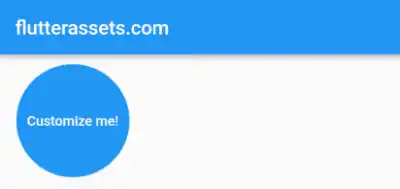
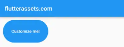
You can also set the shape property to a CircleBorder to make the chip circular, or a StadiumBorder to give it a stadium shape with rounded ends.
RawChip(
  label: Text('Customize me!'),
  labelStyle: TextStyle(color: Colors.white),
  backgroundColor: Colors.blue,
  padding: EdgeInsets.symmetric(horizontal: 10, vertical: 50),
  shape: CircleBorder(),
)
RawChip(
  label: Text('Customize me!'),
  labelStyle: TextStyle(color: Colors.white),
  backgroundColor: Colors.blue,
  padding: EdgeInsets.symmetric(horizontal: 20, vertical: 30),
  shape: StadiumBorder(),
)
How to add a border to the Flutter RawChip
To add a black border to the Flutter RawChip, you can use the shape property to define the shape of the chip and the border property to define the colour and width of the border.
Here’s an example of how to add a black border to a RawChip widget:
RawChip(
  label: Text('Customize me!'),
  labelStyle: TextStyle(color: Colors.white),
  backgroundColor: Colors.blue,
  shape: RoundedRectangleBorder(
    borderRadius: BorderRadius.circular(10.0),
    side: BorderSide(color: Colors.black, width: 2.0),
  ),
)
In this example, we set the borderRadius property to create rounded corners on the chip and used side property to set the colour and width of the border. The color is set to black and the width is set to 2.0. You can adjust these values as needed to achieve the desired border style.


