What is Flutter AlertDialog
Flutter AlertDialog is a box that appears on top of your app’s content. It can show information or ask the user to make a decision. To use an AlertDialog in Flutter, you can use the showDialog function.
The showDialog function takes two arguments: a BuildContext and a builder function. The BuildContext is usually the context of the current widget. It’s used to find the nearest ancestor Scaffold, which is needed to display the AlertDialog. The builder function is a callback that returns a Dialog widget. You can use the AlertDialog widget as the return value of the builder function to create an AlertDialog.
You can customize the AlertDialog by setting its optional properties. For example, you can use the title property to set a title for the AlertDialog, and the content property to set the main content of the AlertDialog. You can also use the actions property to specify a list of buttons that the user can press.
The AlertDialog widget has a few other optional properties that you can use to customize it. For example, you can use the backgroundColor property to set the background colour of the AlertDialog, and the elevation property to set the shadow intensity.
How to use AlertDialog in Flutter
To use an AlertDialog in Flutter, you can use the showDialog function. This function takes in two required arguments: a BuildContext and a builder function.
The BuildContext is usually the context of the current widget. It’s used to locate the nearest ancestor Scaffold, which is needed to display the AlertDialog.
The builder function is a callback that returns a Dialog widget. You can use the AlertDialog widget as the return value of the builder function to create an AlertDialog.
Here’s an example of how you can use the showDialog function to display an AlertDialog:
  @override
  Widget build(BuildContext context) {
    return Scaffold(
      body: Center(
        child: ElevatedButton(
          child: Text("Open AlertDialog"),
          onPressed: () {
            showDialog(
              context: context,
              builder: (BuildContext context) {
                return AlertDialog(
                  title: Text("AlertDialog Title"),
                  content: Text("This is the content of the AlertDialog"),
                  actions: [
                    TextButton(
                      child: Text("OK"),
                      onPressed: () {
                        Navigator.of(context).pop();
                      },
                    ),
                  ],
                );
              },
            );
          },
        ),
      ),
    );
  }
This code will create a button that, when pressed, opens an AlertDialog with a title and content. The AlertDialog has a single button that dismisses the dialogue when pressed.
You can customize the AlertDialog by setting its optional properties, such as the title, content, and actions. You can also use the builder function to create a custom Dialog widget instead of using the AlertDialog widget.

Flutter AlertDialog separated void function
Yes, you can use the showDialog function outside of the build method in a separate void function. However, you will need to pass a BuildContext to the function as an argument. You can use the context of the current widget or the context of a descendant widget as the BuildContext argument.
Here’s an example of how you can use the showDialog function in a separate void function:
import 'package:flutter/material.dart';

void main() {
  runApp(MyApp());
}

class MyApp extends StatelessWidget {
  @override
  Widget build(BuildContext context) {
    return MaterialApp(
      debugShowCheckedModeBanner: false,
      home: MyHomePage(),
    );
  }
}

class MyHomePage extends StatelessWidget {
  @override
  Widget build(BuildContext context) {
    return Scaffold(
      appBar: AppBar(
        title: Text('flutterassets.com'),
      ),
      body: Center(
        child: ElevatedButton(
          child: Text("Open AlertDialog"),
          onPressed: () {
            _showAlertDialog(context);
          },
        ),
      ),
    );
  }

  void _showAlertDialog(BuildContext context) {
    showDialog(
      context: context,
      builder: (BuildContext context) {
        return AlertDialog(
          title: Text("AlertDialog Title"),
          content: Text("This is the content of the AlertDialog"),
          actions: [
            TextButton(
              child: Text("OK"),
              onPressed: () {
                Navigator.of(context).pop();
              },
            ),
          ],
        );
      },
    );
  }
}
This code will create a button that, when pressed, calls the _showAlertDialog function, which displays an AlertDialog with the title “AlertDialog Title” and the content “This is the content of the AlertDialog”. The AlertDialog has a single button with the label “OK”, which dismisses the dialogue when pressed.

Note: All the examples in this post are with the AlertDialog inside the ElevatedButton. If you need a separate void function do as in the example above.
Flutter AlertDialog properties
The AlertDialog widget in Flutter has several optional properties that you can use to customize it. Here is a list of the main properties of an AlertDialog:
title: The title of the AlertDialog, displayed at the top of the dialogue.titleTextStyle: The style for the title text.titlePadding: The padding around the title.content: The main content of the AlertDialog, displayed in the centre of the dialogue.contentTextStyle: The style for the content text.contentPadding: The padding around the content.actions: The buttons displayed at the bottom of the AlertDialog.actionsAlignment: The alignment of the buttons in the AlertDialog.actionsOverflowAlignment: The alignment of the overflow button in the AlertDialog.actionsOverflowButtonSpacing: The spacing between the overflow button and the other buttons in the AlertDialog.actionsOverflowDirection: The direction in which the overflow button is placed in the AlertDialog.actionsPadding: The padding around the buttons in the AlertDialog.buttonPadding: The padding around each button in the AlertDialog.semanticLabel: A semantic label for the AlertDialog, used for accessibility.backgroundColor: The background colour of the AlertDialog.elevation: The shadow intensity of the AlertDialog.shape: The shape of the AlertDialog’s border.clipBehavior: The clip behaviour of the AlertDialog.insetPadding: The padding around the content of the AlertDialog.scrollable: Whether the content of the AlertDialog should be scrollable.icon: The icon displayed in the AlertDialog.iconPadding: The padding around the icon.- iconColor: The colour of the icon.
alignment: The screen alignment of the AlertDialog
Flutter AlertDialog customize Title
To customize the title of an AlertDialog with an icon and custom size and colours in Flutter, you can use a Row widget as the title and include the desired icon and text widgets as children.
Here is an example of how you can customize the title of an AlertDialog with an icon and custom size and colours:
ElevatedButton(
  child: Text("Open AlertDialog"),
  onPressed: () {
    showDialog(
      context: context,
      builder: (BuildContext context) {
        return AlertDialog(
          title: Container(
            width: 250,
            height: 50,
            padding: EdgeInsets.all(5),
            decoration: BoxDecoration(
              borderRadius: BorderRadius.circular(25),
              color: Colors.greenAccent
            ),
            // color: Colors.yellow,
            child: Row(
              children: [
                Icon(Icons.info, size: 40, color: Colors.red),
                SizedBox(width: 8),
                Text(
                  'Alert Dialog Title',
                  style: TextStyle(fontSize: 18, color: Colors.red),
                ),
              ],
            ),
          ),
          content: Text('This is the content of the alert dialog'),
          actions: [
            TextButton(
              child: Text('Ok'),
              onPressed: () {
                // Handle Ok press
              },
            ),
          ],
        );
      },
    );
  },
),
You can customize the size and colour of the icon and text by using the appropriate properties, such as size, color, and style.
You can also customize the size and colour of the overall title container by using the width, height, and color properties of the Container widget.

Flutter AlertDialog customize Icon
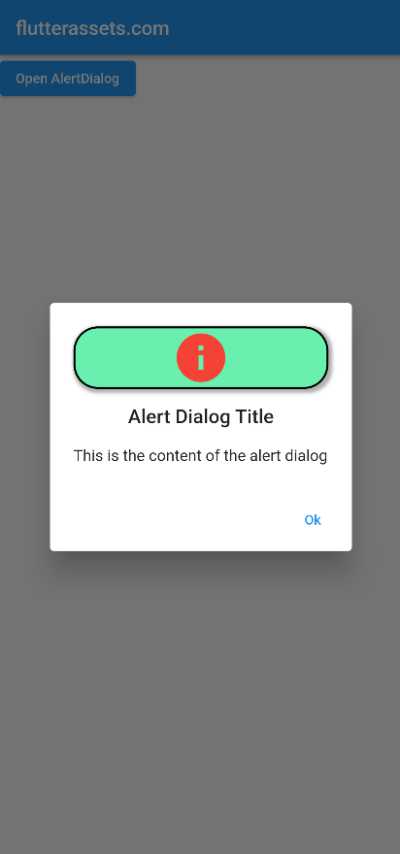
To customize the icon of an AlertDialog in Flutter and wrap it in a container with a border, rounded corners, and a box shadow, you can use a Container widget as the icon and set the desired properties on the container.
Here is an example of how you can customize the icon of an AlertDialog with a container, border, rounded corners, and a box shadow:
ElevatedButton(
  child: Text("Open AlertDialog"),
  onPressed: () {
    showDialog(
      context: context,
      builder: (BuildContext context) {
        return AlertDialog(
          icon: Container(
              child: Icon(Icons.info, size: 60, color: Colors.red),
            decoration: BoxDecoration(
                borderRadius: BorderRadius.circular(25),
                border: Border.all(color: Colors.black, width: 2),
                color: Colors.greenAccent,
              boxShadow: [
                BoxShadow(
                  color: Colors.grey.withOpacity(0.8),
                  spreadRadius: 2,
                  blurRadius: 2,
                  offset: Offset(2, 2), // changes position of shadow
                ),
              ],
            ),
          ),
          title: Text('Alert Dialog Title'),
          content: Text('This is the content of the alert dialog'),
          actions: [
            TextButton(
              child: Text('Ok'),
              onPressed: () {
                // Handle Ok press
              },
            ),
          ],
        );
      },
    );
  },
),
You can customize the appearance of the icon by using the size and color properties of the Icon widget.
You can customize the appearance of the container by using the decoration, borderRadius, border, color, and boxShadow properties of the Container widget.
Flutter AlertDialog Icon shadow
To add a shadow to the icon in an AlertDialog in Flutter, you can wrap the Icon widget in a Container widget and set the desired box shadow using the boxShadow property of the Container‘s decoration.
Here is an example of how you can add a shadow to the icon in an AlertDialog:
ElevatedButton(
  child: Text("Open AlertDialog"),
  onPressed: () {
    showDialog(
      context: context,
      builder: (BuildContext context) {
        return AlertDialog(
          icon: Container(
              decoration: BoxDecoration(
                  shape: BoxShape.circle,
                  boxShadow: [
                    BoxShadow(
                      color: Colors.grey.shade400,
                      blurRadius: 3.0,
                      offset: Offset(3, 3), // changes position of shadow
                    ),
                  ]
              ),
              child: Icon(Icons.info, size: 60, color: Colors.red),
          ),
          title: Text('Alert Dialog Title'),
          content: Text('This is the content of the alert dialog'),
          actions: [
            TextButton(
              child: Text('Ok'),
              onPressed: () {
                // Handle Ok press
              },
            ),
          ],
        );
      },
    );
  },
),
You can customize the appearance of the shadow by using the color, spreadRadius, blurRadius, and offset properties of the BoxShadow widget.

You can also use a Stack widget to display another icon as a shadow for the icon in an AlertDialog in Flutter.
To do this, you can place the shadow icon behind the main icon using the Positioned widget, and set the desired offset using the top and left properties.
Here is an example of how you can use a Stack widget to display another icon as a shadow for the icon in an AlertDialog:
ElevatedButton(
  child: Text("Open AlertDialog"),
  onPressed: () {
    showDialog(
      context: context,
      builder: (BuildContext context) {
        return AlertDialog(
          icon: Container(
            alignment: Alignment.center,
            child: Stack(
              children: [
                Positioned(
                  top: 3,
                  left: 3,
                  child: Icon(Icons.info, size: 60, color: Colors.grey),
                ),
                Icon(Icons.info, size: 60, color: Colors.red),
              ],
            ),
          ),
          title: Text('Alert Dialog Title'),
          content: Text('This is the content of the alert dialog'),
          actions: [
            TextButton(
              child: Text('Ok'),
              onPressed: () {
                // Handle Ok press
              },
            ),
          ],
        );
      },
    );
  },
),
You can customize the appearance of the shadow icon by using the size and color properties of the Icon widget.
You can also customize the offset of the shadow icon by using the top and left properties of the Positioned widget.

Flutter AlertDialog background colour
You can change the background colour of an AlertDialog in Flutter using the backgroundColor property.
Here is an example of how you can use the backgroundColor property to change the background colour of an AlertDialog:
ElevatedButton(
  child: Text("Open AlertDialog"),
  onPressed: () {
    showDialog(
      context: context,
      builder: (BuildContext context) {
        return AlertDialog(
          backgroundColor: Colors.yellow.shade100,
          title: Text('Alert Dialog Title'),
          content: Text('This is the content of the alert dialog'),
          actions: [
            TextButton(
              child: Text('Ok'),
              onPressed: () {
                // Handle Ok press
              },
            ),
          ],
        );
      },
    );
  },
),
You can customize the appearance of the AlertDialog by using other styling properties, such as elevation and shape
Flutter AlertDialog Background Image
You can use an image as the background of an AlertDialog in Flutter using the Stack widget.
Here is an example of how you can use the Stack widget to use an image as the background in an AlertDialog:
ElevatedButton(
  child: Text("Open AlertDialog"),
  onPressed: () {
    showDialog(
      context: context,
      builder: (context) {
        return AlertDialog(
          backgroundColor: Colors.red,
          content: Stack(
            children: [
              Positioned(
                left: 0,
                right: 0,
                top: 0,
                bottom: 0,
                child: Image.network(
                  "https://picsum.photos/250?image=9",
                  fit: BoxFit.cover,
                ),
              ),
              Padding(
                padding: EdgeInsets.all(24),
                child: Container(
                  padding: EdgeInsets.all(8),
                  height: 200,
                  // width: 240,
                  color: Colors.white.withOpacity(.8),
                  child: Column(
                    mainAxisAlignment: MainAxisAlignment.spaceBetween,
                    children: [
                      Text('AlertDialog Title',
                        style: TextStyle(fontSize: 30, fontWeight: FontWeight.bold),
                      ),
                      Divider(),
                      Spacer(),
                      Text('"This is the content of the AlertDialog'),
                      Spacer(),
                      Divider(),
                      Row(
                        mainAxisAlignment: MainAxisAlignment.spaceBetween,
                        children: [
                          TextButton(onPressed: (){}, child: Text('Cancel')),
                          TextButton(onPressed: (){}, child: Text('OK')),
                        ],
                      )
                    ],
                  ),
                ),
              )
            ],
          ),
          contentPadding: EdgeInsets.zero,
          clipBehavior: Clip.antiAlias,
          shape: RoundedRectangleBorder(borderRadius: BorderRadius.circular(5)),
        );
      },
    );
  },
),
The background image is set using the Image.network widget, which displays an image from a URL. The image is placed in a Positioned widget with the left, right, top, and bottom properties set to 0, which covers the entire AlertDialog.
The title and content of the AlertDialog are displayed in a Column widget within a Container widget with a white background and some padding. The Column widget has a mainAxisAlignment property set to spaceBetween, which evenly distributes the space between the widgets within the column.
The two buttons at the bottom of the AlertDialog are TextButton widgets, which are buttons with text only. When tapped, the buttons call an empty function. The buttons are placed in a Row widget with the mainAxisAlignment property set to spaceBetween, which evenly distributes the space between the buttons.
The AlertDialog has the contentPadding property set to EdgeInsets.zero, which removes the default padding around the content. The clipBehavior property is set to Clip.antiAlias, which smooths the edges of the AlertDialog. The shape property is set to a RoundedRectangleBorder with a borderRadius of 5, which gives the AlertDialog rounded corners.
Flutter Alert Dialog rounded corners
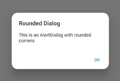
To create an AlertDialog with rounded corners in Flutter, you can use the shape property of the AlertDialog widget and specify a RoundedRectangleBorder as the shape.
Flutter Alert Dialog RoundedRectangleBorder
The RoundedRectangleBorder class in Flutter is a subclass of ShapeBorder that defines a rectangle with rounded corners as the custom shape.
Here’s an example of how you might do this:
ElevatedButton(
  child: Text("Open AlertDialog"),
  onPressed: () {
    showDialog(
      context: context,
      builder: (context) {
        return AlertDialog(
          shape: RoundedRectangleBorder(
            borderRadius: BorderRadius.all(
              Radius.circular(20.0),
            ),
          ),
          title: Text('Rounded Dialog'),
          content: Text('This is an AlertDialog with rounded corners'),
          actions: [
            TextButton(
              onPressed: () {
                Navigator.of(context).pop();
              },
              child: Text('OK'),
            ),
          ],
        );
      },
    );
  },
),
You can adjust the value of the borderRadius to change the roundness of the corners. You can also use the shape property to specify a custom shape for the AlertDialog using a ShapeBorder object.
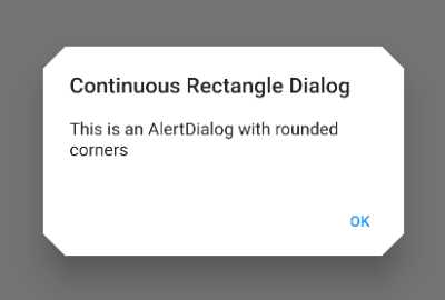
Flutter Alert Dialog ContinuousRectangleBorder
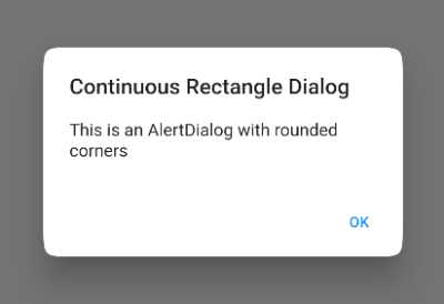
To use a ContinuousRectangleBorder as the shape of an AlertDialog, you can use the shape property and pass in an instance of ContinuousRectangleBorder.
Here’s an example of how you might do this:
ElevatedButton(
  child: Text("Open AlertDialog"),
  onPressed: () {
    showDialog(
      context: context,
      builder: (context) {
        return AlertDialog(
          shape: ContinuousRectangleBorder(
            borderRadius: BorderRadius.circular(28.0),
        ),
          title: Text('Continuous Rectangle Dialog'),
          content: Text('This is an AlertDialog with rounded corners'),
          actions: [
            TextButton(
              onPressed: () {
                Navigator.of(context).pop();
              },
              child: Text('OK'),
            ),
          ],
        );
      },
    );
  },
),
Flutter Alert Dialog BeveledRectangleBorder
The BeveledRectangleBorder class in Flutter is a subclass of ShapeBorder that defines a rectangle with bevelled corners as the custom shape.
Here’s an example of how you might do this:
ElevatedButton(
  child: Text("Open AlertDialog"),
  onPressed: () {
    showDialog(
      context: context,
      builder: (context) {
        return AlertDialog(
          shape: BeveledRectangleBorder(
            borderRadius: BorderRadius.all(
              Radius.circular(20.0),
            ),
          ),
          title: Text('Beveled Rectangle Dialog'),
          content: Text('This is an AlertDialog with rounded corners'),
          actions: [
            TextButton(
              onPressed: () {
                Navigator.of(context).pop();
              },
              child: Text('OK'),
            ),
          ],
        );
      },
    );
  },
),
Flutter Alert Dialog CircleBorder
The CircleBorder class in Flutter is a subclass of ShapeBorder that defines a circle as a custom shape.
Here’s an example of how you might do this:
ElevatedButton(
  child: Text("Open AlertDialog"),
  onPressed: () {
    showDialog(
      context: context,
      builder: (context) {
        return AlertDialog(
          contentPadding: EdgeInsets.all(50),
          shape: CircleBorder(),
          title: Center(child: Text('Circle Dialog')),
          content: Text('This is an AlertDialog with CircleBorder'),
          actions: [
            Center(
              child: TextButton(
                onPressed: () {
                  Navigator.of(context).pop();
                },
                child: Text('OK'),
              ),
            ),
          ],
        );
      },
    );
  },
),
Flutter Alert Dialog StadiumBorder
The StadiumBorder class in Flutter is a subclass of ShapeBorder that defines a rectangle with semi-circular ends as the custom shape.
Here’s an example of how you might do this:
ElevatedButton(
  child: Text("Open AlertDialog"),
  onPressed: () {
    showDialog(
      context: context,
      builder: (context) {
        return AlertDialog(
          shape:  StadiumBorder(),
          title: Container(
            alignment: Alignment.center,
              child: Text('Stadium Dialog')
          ),
          content: Text('This is an AlertDialog with Stadium Border'),
          actions: [
            Row(
              mainAxisAlignment: MainAxisAlignment.center,
              children: [
                TextButton(
                  onPressed: () {
                    Navigator.of(context).pop();
                  },
                  child: Text('Cancel'),
                ),
                TextButton(
                  onPressed: () {
                    Navigator.of(context).pop();
                  },
                  child: Text('OK'),
                ),
              ],
            ),
          ],
        );
      },
    );
  },
),
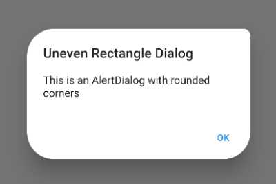
Flutter AlertDialog uneven rounded corners
To create an AlertDialog with uneven rounded corners in Flutter, you can use the shape property of the AlertDialog widget and specify a RoundedRectangleBorder as the shape. You can then use the borderRadius property of the RoundedRectangleBorder to specify a different radius for each corner.
Here’s an example of how you might do this:
ElevatedButton(
  child: Text("Open AlertDialog"),
  onPressed: () {
    showDialog(
      context: context,
      builder: (context) {
        return AlertDialog(
          shape:  RoundedRectangleBorder(
            borderRadius: BorderRadius.only(
              topLeft: Radius.circular(40.0),
              topRight: Radius.circular(10.0),
              bottomLeft: Radius.circular(40.0),
              bottomRight: Radius.circular(40.0),
            ),
          ),
          title: Text('Uneven Rectangle Dialog'),
          content: Text('This is an AlertDialog with rounded corners'),
          actions: [
            TextButton(
              onPressed: () {
                Navigator.of(context).pop();
              },
              child: Text('OK'),
            ),
          ],
        );
      },
    );
  },
),
In this example, the AlertDialog will have uneven rounded corners, because the borderRadius property is used to specify a different radius for each corner.
How to customize Flutter AlertDialog buttons
To customize the buttons on a Flutter AlertDialog, you can use the actions parameter of the AlertDialog constructor to specify a list of TextButton widgets. For example:
AlertDialog(
  title: Text('AlertDialog Title'),
  content: Text('This is the content of the AlertDialog'),
  actions: <Widget>[
    TextButton(
      child: Text('CANCEL'),
      onPressed: () {
        // Perform some action
      },
    ),
    TextButton(
      child: Text('OK'),
      onPressed: () {
        // Perform some action
      },
    ),
  ],
)
This will create an AlertDialog with two buttons, “CANCEL” and “OK”. You can customize the text and behaviour of each button by setting the child and onPressed parameters of the FlatButton widgets.
You can also customize the style of the buttons by passing a TextStyle object to the style parameter of the FlatButton constructor. For example:
TextButton(
  child: Text('OK'),
  onPressed: () {
    // Perform some action
  },
  style: TextStyle(fontSize: 24, color: Colors.green),
)
This will create a button with green, 24pt text. You can use any of the style properties available in the TextStyle class to customize the appearance of the buttons.
You can also wrap the TextButton widgets with the Row widget and use spaceBetween, spaceAround or spaceEvenly. Here is another example:
ElevatedButton(
  child: Text("Open AlertDialog"),
  onPressed: () {
    showDialog(
      context: context,
      builder: (context) {
        return AlertDialog(
          title: Text('AlertDialog Title'),
          content: Text('This is the content of the AlertDialog'),
          actions: <Widget>[
            Row(
              mainAxisAlignment: MainAxisAlignment.spaceBetween,
              children: [
                TextButton(
                  child: Text('CANCEL',
                    style: TextStyle(fontSize: 24, color: Colors.red),
                  ),
                  onPressed: () {
                    // Perform some action
                  },
                ),
                TextButton(
                  child: Text('OK',
                    style: TextStyle(fontSize: 24, color: Colors.green),
                  ),
                  onPressed: () {
                    // Perform some action
                  },
                ),
              ],
            )

          ],
        );
      },
    );
  },
),
Flutter AlertDialog custom ElevatedButton
You can also use elevated buttons in a Flutter AlertDialog by using the RaisedButton widget instead of the TextButton widget. The ElevatedButton widget is a button with a shadow effect that makes it appear elevated from the surface of the screen.
Here’s an example of how you can use a ElevatedButton in an AlertDialog:
ElevatedButton(
  child: Text("Open AlertDialog"),
  onPressed: () {
    showDialog(
      context: context,
      builder: (context) {
        return AlertDialog(
          title: Text('AlertDialog Title'),
          content: Text('This is the content of the AlertDialog'),
          actions: <Widget>[
            ElevatedButton(
              child: Text('CANCEL'),
              onPressed: () {
                // Perform some action
              },
            ),
            ElevatedButton(
              child: Text('OK'),
              onPressed: () {
                // Perform some action
              },
            ),
          ],
        );
      },
    );
  },
),
You can customize the appearance of the raised buttons by using the various constructor parameters available in the ElevatedButton class. For example, you can use the backgroundColor parameter to change the background colour of the button, and the foregroundColor parameter to change the colour of the button’s text.
You can read more about ElevatedButton widget in this post: https://flutterassets.com/quick-tip-flutter-elevatedbutton-with-rounded-border/
ElevatedButton(
  child: Text('OK'),
  style: ElevatedButton.styleFrom(
    backgroundColor: Colors.green,
      foregroundColor: Colors.white,
      shape: RoundedRectangleBorder(
          borderRadius: BorderRadius.circular(25.0),
          side: BorderSide(color: Colors.red)
      )
  ),
  onPressed: () {
    // Perform some action
  },
),
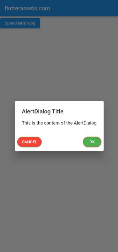
Here is another example with two ElevatedButton widgets inside the Row widget:
ElevatedButton(
  child: Text("Open AlertDialog"),
  onPressed: () {
    showDialog(
      context: context,
      builder: (context) {
        return AlertDialog(
          title: Text('AlertDialog Title'),
          content: Text('This is the content of the AlertDialog'),
          actions: <Widget>[
            Row(
              mainAxisAlignment: MainAxisAlignment.spaceBetween,
              children: [
                ElevatedButton(
                  child: Text('CANCEL'),
                  style: ElevatedButton.styleFrom(
                    backgroundColor: Colors.red,
                    foregroundColor: Colors.white,
                    shape: RoundedRectangleBorder(
                        borderRadius: BorderRadius.circular(25.0),
                        side: BorderSide(color: Colors.green)
                    )
                  ),
                  onPressed: () {
                    // Perform some action
                  },
                ),
                ElevatedButton(
                  child: Text('OK'),
                  style: ElevatedButton.styleFrom(
                    backgroundColor: Colors.green,
                    foregroundColor: Colors.white,
                      shape: RoundedRectangleBorder(
                          borderRadius: BorderRadius.circular(25.0),
                          side: BorderSide(color: Colors.red)
                      )
                  ),
                  onPressed: () {
                    // Perform some action
                  },
                ),
              ],
            ),

          ],
        );
      },
    );
  },
),