What are the colour swatches?
Colour swatches are collections of standardized colours that are used in design and printing to make sure that the colours being used are consistent and accurate. Colour swatches usually consist of small rectangles, squares or circles that display a specific colour. The most commonly used system for colour swatches is the Pantone Matching System (PMS), which assigns a unique code to each colour to ensure that it is reproduced consistently across different media.
In mobile apps, colour swatches are used to give users a selection of predefined colours that they can choose from when creating content or customizing the app’s appearance. These colour swatches are often presented in a grid or palette format and are grouped together by category or theme. For example, there may be a set of swatches for blues or greens or a set of swatches for a specific holiday or occasion. Some mobile apps also allow users to create their own custom colour swatches by selecting and saving their preferred colours.
Colour swatches in mobile apps can be used for a range of purposes, such as selecting the background colour of a screen or choosing a font colour for text. They can also be used to create custom graphics and designs. Colour swatches make it easier for users to create a cohesive and consistent look for their content, and they help ensure that colours are reproduced accurately across different devices and platforms.
Where to use colour swatches in Flutter apps
In Flutter, colour swatches are an important part of designing a user interface. They provide a set of predefined colours that can be used consistently across the app. Here are some of the most common use cases for colour swatches in Flutter:
- Defining a primary colour scheme: Colour swatches can be used to define a primary colour scheme for the app. This is typically used for things like the app bar, buttons, and other key interface elements.
- Creating a secondary colour palette: A secondary colour palette can be used to provide additional colours for the app’s design. This can be used for things like backgrounds, borders, and other interface elements.
- Theming the app: Color swatches can be used to define a theme for the app. This can include the colour scheme, typography, and other design elements. Theming the app with colour swatches ensures a consistent look and feel across the app.
- Defining product colours: Color swatches can be used in mobile shops to define the colours of products. This makes it easy for users to see the available colour options for each product.
- Setting text colour: Color swatches can be used to define the text colour for different parts of the app, such as headings, body text, and links. This ensures a consistent look and feel for the app’s typography.
- Creating custom graphics: Color swatches can be used to create custom graphics and icons that match the app’s colour scheme. This makes it easy to create a cohesive and consistent look for the app.
List of the Flutter Chip widgets
Chip: The basicChipwidget represents a simple piece of information, such as a tag or a label. It can display text, an icon, or both.ActionChip: AnActionChipis a clickableChipthat triggers an action when pressed. It is often used for actions like filtering, sorting, or initiating an operation.ChoiceChip:ChoiceChiprepresents a single choice from a set of options. It is typically used in scenarios where the user can select one option from a group, such as selecting a colour or category.FilterChip: AFilterChipis used to represent a filtering criterion or a selected filter. It is commonly used in filter options where users can toggle filters on and off.InputChip: AnInputChipallows users to enter or select information. It is often used for things like entering tags, selecting people, or choosing from a list of options.RawChip:RawChipprovides more control over the visual appearance and behaviour of a chip. It can be customized to suit specific design requirements.
Can I use a Chip widget to build a Row of colour swatches and How to use a Flutter Chip as a Row of colour swatches
Yes, you can use a Chip widget to build a row of colour swatches. Each Chip widget can be wrapped with an InkWell widget to make it clickable, and you can use a Stack widget to overlay the icon on the selected Chip.
Here’s an example of how you can use the Chip widget as a row of colour swatches:
late Color selectedColor = Colors.red;

Container(
  height: 100,
  padding: EdgeInsets.all(10),
  child: Row(
    mainAxisAlignment: MainAxisAlignment.start,
    mainAxisSize: MainAxisSize.min,
    crossAxisAlignment: CrossAxisAlignment.center,
    children: [
      InkWell(
        onTap: () {
          setState(() {
            selectedColor = Colors.red;
          });
        },
        child: Stack(
          children: [
            Chip(
              backgroundColor: Colors.red,
              label: Container(width: 20,),
            ),
            if (selectedColor == Colors.red)
              const Positioned(
                top: 5,
                left: 5,
                child: Icon(Icons.check, color: Colors.white),
              ),
          ],
        ),
      ),
      InkWell(
        onTap: () {
          setState(() {
            selectedColor = Colors.blue;
          });
        },
        child: Stack(
          children: [
            Chip(
              backgroundColor: Colors.blue,
              label: Container(width: 20,),
            ),
            if (selectedColor == Colors.blue)
              const Positioned(
                top: 5,
                left: 5,
                child: Icon(Icons.check, color: Colors.white),
              ),
          ],
        ),
      ),
      InkWell(
        onTap: () {
          setState(() {
            selectedColor = Colors.green;
          });
        },
        child: Stack(
          children: [
            Chip(
              backgroundColor: Colors.green,
              label: Container(width: 20,),
            ),
            if (selectedColor == Colors.green)
              const Positioned(
                top: 5,
                left: 5,
                child: Icon(Icons.check, color: Colors.white),
              ),
          ],
        ),
      ),
    ],
  ),
),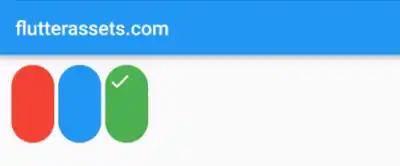
In this code example, we create a Container with a specified height and padding to hold the row of colour swatches. Inside the Row, each colour swatch is represented by a Chip widget wrapped with an InkWell widget for click functionality.
The Stack widget is used to overlay the Icon on the selected Chip. We check if the selectedColor matches the colour of the Chip and conditionally render the Icon inside a Positioned widget.
When a colour swatch is tapped, the onTap callback is triggered, updating the selectedColor value and causing the UI to refresh. The Chip associated with the selected colour will display the checkmark Icon over it.
Feel free to customize the code and adjust the styling or behaviour to meet your specific requirements.
Flutter Chip widgets as Colour swatches from a List of colours
To create a row of colour swatches using the Flutter Chip widget, you can follow these steps. First, define a list of colours that you want to display as swatches. Next, create a variable to keep track of the selected colour. This variable will be initially set to null or set it to one colour.
To build the row of colour swatches, wrap the Row widget with a Container or another parent widget of your choice for styling purposes. Inside the Row, use the map method to iterate over the list of colours and create Chip widgets for each colour. Each Chip widget should be wrapped with an InkWell widget to make it clickable.
Within the InkWell widget, define an onTap callback function that updates the selectedColor variable with the tapped colour. To indicate the selected colour, use a Stack widget. Place the Chip widget as the base layer and conditionally render an “check” Icon on top of it if the current colour matches the selected colour.
// Color? selectedColor;
          // or
  late Color selectedColor = Colors.green;

Container(
  height: 100,
  padding: EdgeInsets.all(10),
  child: Row(
    mainAxisAlignment: MainAxisAlignment.start,
    mainAxisSize: MainAxisSize.min,
    crossAxisAlignment: CrossAxisAlignment.center,
    children: colorList.map((color) {
      return InkWell(
        onTap: () {
          setState(() {
            selectedColor = color;
          });
        },
        child: Stack(
          children: [
            Chip(
              backgroundColor: color,
              label: Container(width: 20,),
            ),
            if (selectedColor == color)
              Positioned(
                top: 5,
                left: 5,
                child: Icon(Icons.check, color: Colors.white),
              ),
          ],
        ),
      );
    }).toList(),
  ),
),
How to use a Flutter ActionChip as a Row of colour swatches
To use a Flutter ActionChip widget as a row of colour swatches, we can create an ActionChip for each colour and place them in a Row widget. Each ActionChip will have a CircleBorder shape and a background colour corresponding to the colour it represents. We can add a black border to the ActionChips by setting the side property of the shape to a BorderSide with a black colour and a width of 1.0. As an addition, you can also add some padding around the ActionChips to create some space between them using the EdgeInsets.all() method.
Here’s an example code snippet:
Row(
  children: <Widget>[
    ActionChip(
      backgroundColor: Colors.red,
      shape: CircleBorder(
        side: BorderSide(
          color: Colors.black,
          width: 1.0,
        ),
      ),
      onPressed: () {
        // Do something when red swatch is selected
      },
      label: SizedBox(width: 40, height: 40),
    ),
    // SizedBox(width: 10,),
    ActionChip(
      backgroundColor: Colors.blue,
      shape: CircleBorder(
        side: BorderSide(
          color: Colors.black,
          width: 1.0,
        ),
      ),
      onPressed: () {
        // Do something when blue swatch is selected
      },
      label: SizedBox(width: 40, height: 40),
    ),
    // SizedBox(width: 10,),
    ActionChip(
      backgroundColor: Colors.green,
      shape: CircleBorder(
        side: BorderSide(
          color: Colors.black,
          width: 1.0,
        ),
      ),
      onPressed: () {
        // Do something when green swatch is selected
      },
      label: SizedBox(width: 40, height: 40),
    ),
  ],
)
In this example, we create a Row widget and add three ActionChips to it, each with a CircleBorder shape and a different background colour. We set the onPressed property for each ActionChip to handle what happens when the swatch is selected. The label property of the ActionChip is set to a SizedBox with a fixed width and height to create a circular swatch. We also set the shape property of the ActionChip to a CircleBorder with a black border and a width of 1.0 to create a border around the swatch.
ActionChip as Colour swatches from a List of colours
Here is an example code snippet that displays a row of colour swatches generated from a list of colours and updates a text widget with the selected colour:
import 'package:flutter/material.dart';

void main() {
  runApp(MyApp());
}

class MyApp extends StatelessWidget {

  @override
  Widget build(BuildContext context) {
    return MaterialApp(
      debugShowCheckedModeBanner: false,
      title: 'Flutter Demo',
      theme: ThemeData(
        primarySwatch: Colors.blue,
      ),
      home: MyHomePage(),
    );
  }
}

class MyHomePage extends StatefulWidget {

  @override
  State<MyHomePage> createState() => _MyHomePageState();
}
class _MyHomePageState extends State<MyHomePage>{

  ColorItem? _selectedColor;

  final List<ColorItem> _colors = [
    ColorItem(name: "Red", color: Colors.red),
    ColorItem(name: "Blue", color: Colors.blue),
    ColorItem(name: "Green", color: Colors.green),
    ColorItem(name: "Yellow", color: Colors.yellow),
  ];

  @override
  Widget build(BuildContext context) {
    return Scaffold(
      appBar: AppBar(
        title: Text('flutterassets.com'),
      ),
      body: Container(
        alignment: Alignment.topCenter,
        padding: EdgeInsets.all(10),
        child: Column(
          crossAxisAlignment: CrossAxisAlignment.start,
          children: [
            Row(
              children: _colors.map((colorItem) {
                return Padding(
                  padding: const EdgeInsets.all(15),
                  child: ActionChip(
                    backgroundColor: colorItem.color,
                    shape: CircleBorder(
                      side: BorderSide(
                        color: _selectedColor == colorItem ? Colors.black : Colors.transparent,
                        width: 2.0,
                      ),
                    ),
                    onPressed: () {
                      setState(() {
                        _selectedColor = colorItem;
                      });
                    },
                    label: Text(colorItem.name),
                    labelPadding: EdgeInsets.all(10),
                  ),
                );
              }).toList(),
            ),
            SizedBox(height: 10),
            Text("Selected color: ${_selectedColor?.name ?? "None"}", style: TextStyle(fontSize: 20)),
          ],
        ),
      ),
    );
  }
}

class ColorItem {
  final String name;
  final Color color;

  ColorItem({required this.name, required this.color});
}
In this code, we create an app that displays a row of colour swatches with their names using the ActionChip widget. We define a ColorItem class that contains a name string and a colour value and use it to create a list of _colours with different colour items.
Inside the app’s state, we create a variable _selectedColor to keep track of the currently selected colour item. We then build a column that contains a row of colour swatches and a text widget to display the selected colour name.
Inside the row, we map over the list of _colors and create an ActionChip for each ColorItem. The backgroundColor property of the ActionChip is set to the colour item’s colour, and the shape property is set to a CircleBorder with a black border of width 2.0 if the colour item is selected, or transparent otherwise.
When an ActionChip is pressed, its onPressed function is called, which sets the _selectedColor variable to the selected colour item and triggers a rebuild of the widget. The text widget below the row displays the currently selected colour name.
How to use a Flutter ChoiceChip as a Row of colour swatches
Here’s an example of how you can use a Flutter ChoiceChip as a row of selectable circular colour swatches with only the selected swatch having a black border:
Color? selectedColor;

Container(
  height: 100,
  padding: EdgeInsets.all(10),
  child: Row(
    mainAxisAlignment: MainAxisAlignment.start,
    mainAxisSize: MainAxisSize.min,
    crossAxisAlignment: CrossAxisAlignment.center,
    children: [
      ChoiceChip(
        label: Container(
          width: 40,
          height: 40,
          decoration: BoxDecoration(
            shape: BoxShape.circle,
            color: Colors.red,
            border: selectedColor == Colors.red
                ? Border.all(color: Colors.black, width: 2)
                : null,
          ),
        ),
        shape: CircleBorder(),
        selected: selectedColor == Colors.red,
        onSelected: (selected) {
          setState(() {
            selectedColor = selected ? Colors.red : null;
          });
        },
      ),
      ChoiceChip(
        label: Container(
          width: 40,
          height: 40,
          decoration: BoxDecoration(
            shape: BoxShape.circle,
            color: Colors.blue,
            border: selectedColor == Colors.blue
                ? Border.all(color: Colors.black, width: 2)
                : null,
          ),
        ),
        shape: CircleBorder(),
        selected: selectedColor == Colors.blue,
        onSelected: (selected) {
          setState(() {
            selectedColor = selected ? Colors.blue : null;
          });
        },
      ),
      ChoiceChip(
        label: Container(
          width: 40,
          height: 40,
          decoration: BoxDecoration(
            shape: BoxShape.circle,
            color: Colors.green,
            border: selectedColor == Colors.green
                ? Border.all(color: Colors.black, width: 2)
                : null,
          ),
        ),
        shape: CircleBorder(),
        selected: selectedColor == Colors.green,
        onSelected: (selected) {
          setState(() {
            selectedColor = selected ? Colors.green : null;
          });
        },
      ),
    ],
  ),
)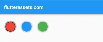
In the above code, we have a selectedColor variable that stores the currently selected colour. By default, it is initialized to null.
The ChoiceChip widgets are placed within a Row widget to display them horizontally. Each ChoiceChip represents a colour swatch.
For each ChoiceChip, the label property is set to a Container widget with a circular shape. The color property defines the background colour of the swatch.
To provide a black border around the selected swatch, the border property of the Container widget is conditionally set using a ternary operator. If the selectedColor matches the colour of the current swatch, a black border is applied; otherwise, no border is set.
The selected property of each ChoiceChip is set by comparing the selectedColor with the desired colour.
To handle the selection of a colour swatch, the onSelected property of each ChoiceChip is set to a callback function. When a ChoiceChip is selected or unselected, the callback function is triggered. In the callback, we update the selectedColor variable based on the selection status. If the ChoiceChip is selected, we assign the corresponding colour to the selectedColor variable; otherwise, we set it back to null.
ChoiceChip as Colour swatches from a List of colours
Here’s a slightly modified code from above that creates a row of swatches populated from a list of colours:
List<Color> colors = [Colors.red, Colors.blue, Colors.green];

Color? selectedColor;

Container(
  height: 100,
  padding: EdgeInsets.all(10),
  child: Row(
    mainAxisAlignment: MainAxisAlignment.start,
    mainAxisSize: MainAxisSize.min,
    crossAxisAlignment: CrossAxisAlignment.center,
    children: List.generate(
      colors.length,
          (index) => ChoiceChip(
        label: Container(
          width: 40,
          height: 40,
          decoration: BoxDecoration(
            shape: BoxShape.circle,
            color: colors[index],
            border: selectedColor == colors[index]
                ? Border.all(color: Colors.black, width: 2)
                : null,
          ),
        ),
            shape: CircleBorder(),
        selected: selectedColor == colors[index],
        onSelected: (selected) {
          setState(() {
            selectedColor = selected ? colors[index] : null;
          });
        },
      ),
    ),
  ),
)
In this updated example, we have a colors list that contains the desired colours for the swatches. Each colour in the list is used to create a ChoiceChip widget.
The ChoiceChip widgets are generated dynamically using the List.generate method. It iterates over the colors list and creates a ChoiceChip for each colour.
For each ChoiceChip, the label property is set to a Container widget with a circular shape. The color property of the Container defines the background colour of the swatch.
The border property of the Container widget is conditionally set using a ternary operator. If the selectedColor matches the colour of the current swatch, a black border is applied; otherwise, no border is set.
The selected property of each ChoiceChip is set by comparing the selectedColor with the corresponding colour from the colors list.
To handle the selection of a colour swatch, the onSelected property of each ChoiceChip is set to a callback function. When a ChoiceChip is selected or unselected, the callback function is triggered. In the callback, we update the selectedColor variable based on the selection status. If the ChoiceChip is selected, we assign the corresponding colour from the colors list to the selectedColor variable; otherwise, we set it back to null.
How to use a Flutter FilterChip as a Row of colour swatches
Here’s an example of how you can use a Flutter FilterChip as a row of selectable colour swatches, where each swatch is represented by a CircleAvatar with a label showing the colour name
Color? selectedColor;

Container(
  height: 100,
  padding: EdgeInsets.all(10),
  child: Row(
    mainAxisAlignment: MainAxisAlignment.start,
    mainAxisSize: MainAxisSize.min,
    crossAxisAlignment: CrossAxisAlignment.center,
    children: [
      FilterChip(
        label: Column(
          mainAxisSize: MainAxisSize.min,
          children: [
            CircleAvatar(
              radius: 20,
              backgroundColor: Colors.red,
            ),
            Text('Red', style: TextStyle(fontSize: 12)),
          ],
        ),
        selected: selectedColor == Colors.red,
        onSelected: (selected) {
          setState(() {
            selectedColor = selected ? Colors.red : null;
          });
        },
      ),
      FilterChip(
        label: Column(
          mainAxisSize: MainAxisSize.min,
          children: [
            CircleAvatar(
              radius: 20,
              backgroundColor: Colors.blue,
            ),
            Text('Blue', style: TextStyle(fontSize: 12)),
          ],
        ),
        selected: selectedColor == Colors.blue,
        onSelected: (selected) {
          setState(() {
            selectedColor = selected ? Colors.blue : null;
          });
        },
      ),
      FilterChip(
        label: Column(
          mainAxisSize: MainAxisSize.min,
          children: [
            CircleAvatar(
              radius: 20,
              backgroundColor: Colors.green,
            ),
            Text('Green', style: TextStyle(fontSize: 12)),
          ],
        ),
        selected: selectedColor == Colors.green,
        onSelected: (selected) {
          setState(() {
            selectedColor = selected ? Colors.green : null;
          });
        },
      ),
    ],
  ),
)
In this example, we use FilterChip widgets to create a row of selectable colour swatches. Each swatch is represented by a CircleAvatar with a label showing the colour name.
For each FilterChip, we define the label property as a Column widget. Inside the column, we have a CircleAvatar representing the colour swatch.
To highlight the selected swatch, we use the selected property of each FilterChip. If the selected colour matches the current swatch colour, we set selected to true; otherwise, we set it to false.
To handle swatch selection, we set the onSelected property of each FilterChip to a callback function. When a swatch is selected or unselected, the callback function is triggered. In the callback, we update the selectedColor variable based on the selection status. If the swatch is selected, we assign the corresponding colour to the selectedColor variable; otherwise, we set it back to null.
Flutter FilterChip avatar as a Row of colour swatches
Here’s an amended code example that uses the avatar property with a CircleAvatar to show the colour swatch:
Color? selectedColor;

Container(
  height: 100,
  padding: EdgeInsets.all(10),
  child: Row(
    mainAxisAlignment: MainAxisAlignment.start,
    mainAxisSize: MainAxisSize.min,
    crossAxisAlignment: CrossAxisAlignment.center,
    children: [
      FilterChip(
        avatar: CircleAvatar(backgroundColor: Colors.red),
        label: Text('Red'),
        selected: selectedColor == Colors.red,
        onSelected: (selected) {
          setState(() {
            selectedColor = selected ? Colors.red : null;
          });
        },
        selectedColor: Colors.red,
      ),
      FilterChip(
        avatar: CircleAvatar(backgroundColor: Colors.blue),
        label: Text('Blue'),
        selected: selectedColor == Colors.blue,
        onSelected: (selected) {
          setState(() {
            selectedColor = selected ? Colors.blue : null;
          });
        },
        selectedColor: Colors.blue,
      ),
      FilterChip(
        avatar: CircleAvatar(backgroundColor: Colors.green),
        label: Text('Green'),
        selected: selectedColor == Colors.green,
        onSelected: (selected) {
          setState(() {
            selectedColor = selected ? Colors.green : null;
          });
        },
        selectedColor: Colors.green,
      ),
    ],
  ),
)
In this code example, we use the avatar property of the FilterChip widget to display a colour swatch using a CircleAvatar. Each CircleAvatar has its backgroundColor set to the desired colour.
The label property is used to display the name of the colour below the swatch.
To handle the selection of colour swatches, we use the selected property of each FilterChip. When a swatch is selected or unselected, the onSelected callback function is called. Inside this function, we update the selectedColor variable based on the selected state of the swatch.
Additionally, we set the selectedColor property of each FilterChip.
FilterChip as Colour swatches from a List of colours
Here’s an example that creates a row of selectable colour swatches populated from a list of colours, where each swatch includes a colour name as the label:
import 'package:flutter/material.dart';

void main() {
  runApp(MyApp());
}

class MyApp extends StatelessWidget {

  @override
  Widget build(BuildContext context) {
    return MaterialApp(
      debugShowCheckedModeBanner: false,
      title: 'Flutter Demo',
      theme: ThemeData(
        primarySwatch: Colors.blue,
      ),
      home: MyHomePage(),
    );
  }
}

class MyHomePage extends StatefulWidget {

  @override
  State<MyHomePage> createState() => _MyHomePageState();
}
class _MyHomePageState extends State<MyHomePage>{

  List<ColorSwatch> colorSwatches = [
  ColorSwatch(Colors.red, 'Red'),
  ColorSwatch(Colors.blue, 'Blue'),
  ColorSwatch(Colors.green, 'Green'),
  ];

  Color? selectedColor;

  @override
  Widget build(BuildContext context) {
    return Scaffold(
      appBar: AppBar(
        title: Text('flutterassets.com'),
      ),
      body: Container(
        height: 100,
        padding: EdgeInsets.all(10),
        child: Row(
          mainAxisAlignment: MainAxisAlignment.start,
          mainAxisSize: MainAxisSize.min,
          crossAxisAlignment: CrossAxisAlignment.center,
          children: colorSwatches.map((colorSwatch) {
            return FilterChip(
              avatar: CircleAvatar(backgroundColor: colorSwatch.color),
              label: Text(colorSwatch.name),
              selected: selectedColor == colorSwatch.color,
              onSelected: (selected) {
                setState(() {
                  selectedColor = selected ? colorSwatch.color : null;
                });
              },
              selectedColor: colorSwatch.color,
            );
          }).toList(),
        ),
      )
    );
  }
}

class ColorSwatch {
  final Color color;
  final String name;

  ColorSwatch(this.color, this.name);
}
In this example, we define a ColorSwatch class that holds both the colour and its corresponding name. The colorSwatches list is populated with instances of ColorSwatch, each representing a colour swatch along with its name.
The code then iterates over the colorSwatches list using the map method to create a FilterChip for each colour swatch. The CircleAvatar inside the avatar property is set with the respective colour from colorSwatch.color, and the label is set to colorSwatch.name.
The selected property is used to track the selection state and the onSelected callback function updates the selectedColor variable based on the selected state of the swatch.
The selectedColor property of each FilterChip is set to the respective colour from the colorSwatch.color.
How to use a Flutter InputChip avatar as a Row of colour swatches
Here’s an example of how to use a Flutter InputChip as a row of selectable colour swatches, where each swatch includes a circular avatar representing the colour and a label showing its colour name.
Color? selectedColor;

Container(
  height: 100,
  padding: EdgeInsets.all(10),
  child: Row(
    mainAxisAlignment: MainAxisAlignment.start,
    mainAxisSize: MainAxisSize.min,
    crossAxisAlignment: CrossAxisAlignment.center,
    children: [
      InputChip(
        avatar: CircleAvatar(backgroundColor: Colors.red),
        label: Text('Red'),
        selected: selectedColor == Colors.red,
        onSelected: (selected) {
          setState(() {
            selectedColor = selected ? Colors.red : null;
          });
        },
        selectedColor: Colors.red,
      ),
      SizedBox(width: 10),
      InputChip(
        avatar: CircleAvatar(backgroundColor: Colors.blue),
        label: Text('Blue'),
        selected: selectedColor == Colors.blue,
        onSelected: (selected) {
          setState(() {
            selectedColor = selected ? Colors.blue : null;
          });
        },
        selectedColor: Colors.blue,
      ),
      SizedBox(width: 10),
      InputChip(
        avatar: CircleAvatar(backgroundColor: Colors.green),
        label: Text('Green'),
        selected: selectedColor == Colors.green,
        onSelected: (selected) {
          setState(() {
            selectedColor = selected ? Colors.green : null;
          });
        },
        selectedColor: Colors.green,
      ),
    ],
  ),
)
In this example, we use the InputChip widget to represent each colour swatch. Each InputChip includes a circular avatar created using CircleAvatar with the desired colour as the background. The colour name is set as the label text using the Text widget.
To handle the selection, we use the selected property of each InputChip to determine if it is currently selected. The onSelected callback function is triggered when a swatch is selected or unselected. Inside this callback, we update the selectedColor variable to match the selected colour if it is selected, or set it to null if the swatch is unselected.
The selectedColor property of each InputChip is set to the .selectedColor
How to use a Flutter InputChip as a Row of colour swatches
Here’s an example of how to use a Flutter InputChip as a row of selectable colour swatches, where each swatch includes a circular avatar representing the colour in the label property.
Color? selectedColor;

Container(
  height: 100,
  padding: EdgeInsets.all(10),
  child: Row(
    mainAxisAlignment: MainAxisAlignment.start,
    mainAxisSize: MainAxisSize.min,
    crossAxisAlignment: CrossAxisAlignment.center,
    children: [
      InputChip(
        labelPadding: EdgeInsets.zero,
        label: CircleAvatar(backgroundColor: Colors.red),
        selected: selectedColor == Colors.red,
        backgroundColor: Colors.transparent,
        onSelected: (selected) {
          setState(() {
            selectedColor = selected ? Colors.red : null;
          });
        },
        // shape: CircleBorder(),
        selectedColor: Colors.red.shade300,
      ),
      SizedBox(width: 10),
      InputChip(
        labelPadding: EdgeInsets.zero,
        label: CircleAvatar(backgroundColor: Colors.blue),
        selected: selectedColor == Colors.blue,
        backgroundColor: Colors.transparent,
        onSelected: (selected) {
          setState(() {
            selectedColor = selected ? Colors.blue : null;
          });
        },
        // shape: CircleBorder(),
        selectedColor: Colors.blue.shade300,
      ),
      SizedBox(width: 10),
      InputChip(
        labelPadding: EdgeInsets.zero,
        label: CircleAvatar(backgroundColor: Colors.green),
        selected: selectedColor == Colors.green,
        backgroundColor: Colors.transparent,
        onSelected: (selected) {
          setState(() {
            selectedColor = selected ? Colors.green : null;
          });
        },
        // shape: CircleBorder(),
        selectedColor: Colors.green.shade300,
      ),
    ],
  ),
)
In this code example, we use the InputChip widget to represent each colour swatch. The labelPadding property is set to EdgeInsets.zero to remove any padding around the label.
Each swatch is represented by a CircleAvatar widget within the InputChip label property. The backgroundColor of the CircleAvatar is set to the desired colour.
To handle the selection, we use the selected property of each InputChip to determine if it is currently selected. The onSelected callback function is triggered when a swatch is selected or unselected. Inside this callback, we update the selectedColor variable to match the selected colour if it is selected, or set it to null if the swatch is unselected.
The backgroundColor property of each InputChip is set to Colors.transparent to remove the background colour of the chip. This allows the circular avatar to be fully visible.
The selectedColor property of each InputChip is set to a shade of the respective colour (Colors.red.shade300, Colors.blue.shade300, Colors.green.shade300).
InputChip as Colour swatches from a List of colours
Here’s an example of how to use a Flutter InputChip as a row of selectable colour swatches, where the swatches are populated from a list of colours.
List<Color> colorSwatches = [
    Colors.red,
    Colors.blue,
    Colors.green,
    // Add more colors as needed
];

Color? selectedColor;

Container(
  height: 100,
  padding: EdgeInsets.all(10),
  child: Row(
    mainAxisAlignment: MainAxisAlignment.start,
    mainAxisSize: MainAxisSize.min,
    crossAxisAlignment: CrossAxisAlignment.center,
    children: colorSwatches.map((color) {
      return InputChip(
        labelPadding: EdgeInsets.zero,
        label: CircleAvatar(
          backgroundColor: color,
        ),
        selected: selectedColor == color,
        onSelected: (selected) {
          setState(() {
            selectedColor = selected ? color : null;
          });
        },
        selectedColor: color,
      );
    }).toList(),
  ),
)
In this code example, we have a list called colorSwatches that contains the colours you want to display as swatches. Each colour is represented by a CircleAvatar widget within the InputChip label property.
The InputChip widget is created for each colour in the colorSwatches list using the map function. The map function iterates over each colour in the list and returns an InputChip widget with the corresponding colour.
The labelPadding property is set to EdgeInsets.zero to remove any padding around the label.
To handle the selection, we use the selected property of each InputChip to determine if it is currently selected. The onSelected callback function is triggered when a swatch is selected or unselected. Inside this callback, we update the selectedColor variable to match the selected colour if it is selected or set it to null if the swatch is unselected.
The selectedColor property of each InputChip is set to the corresponding colour from the colorSwatches list.
How to use a Flutter RawChip as a Row of colour swatches
To use a Flutter RawChip as a row of selectable colour swatches, where each swatch is represented by a CircleAvatar in the label property, you can follow the code example and description provided below:
Color? selectedColor;

Container(
  height: 100,
  padding: EdgeInsets.all(10),
  child: Row(
    mainAxisAlignment: MainAxisAlignment.start,
    mainAxisSize: MainAxisSize.min,
    crossAxisAlignment: CrossAxisAlignment.center,
    children: [
      RawChip(
        labelPadding: EdgeInsets.zero,
        label: CircleAvatar(
          backgroundColor: Colors.red,
          radius: 20,
        ),
        selected: selectedColor == Colors.red,
        onSelected: (selected) {
          setState(() {
            selectedColor = selected ? Colors.red : null;
          });
        },
      ),
      SizedBox(width: 10),
      RawChip(
        labelPadding: EdgeInsets.zero,
        label: CircleAvatar(
          backgroundColor: Colors.blue,
          radius: 20,
        ),
        selected: selectedColor == Colors.blue,
        onSelected: (selected) {
          setState(() {
            selectedColor = selected ? Colors.blue : null;
          });
        },
      ),
      SizedBox(width: 10),
      RawChip(
        labelPadding: EdgeInsets.zero,
        label: CircleAvatar(
          backgroundColor: Colors.green,
          radius: 20,
        ),
        selected: selectedColor == Colors.green,
        onSelected: (selected) {
          setState(() {
            selectedColor = selected ? Colors.green : null;
          });
        },
      ),
    ],
  ),
)
In this code example, we have a row of selectable colour swatches represented by RawChip widgets. Each RawChip contains a CircleAvatar in the label property to display the colour swatch. We set the backgroundColor of the CircleAvatar to the desired colour, such as red, blue, or green, and adjust the radius to control the size of the swatch.
To handle the selection, we use the selected property of each RawChip. When a swatch is selected or unselected, the onSelected callback function is triggered. Inside this function, we update the selectedColor variable to match the selected colour if it is selected or set it to null if the swatch is unselected.
RawChip as Colour swatches from a List of colours
To create a row of selectable colour swatches populated from a list of colours, you can modify the above code example as follows:
List<Color> colorSwatches = [
    Colors.red,
    Colors.blue,
    Colors.green,
    // Add more colors as needed
  ];

  Color? selectedColor;

Container(
  height: 100,
  padding: EdgeInsets.all(10),
  child: Row(
    mainAxisAlignment: MainAxisAlignment.start,
    mainAxisSize: MainAxisSize.min,
    crossAxisAlignment: CrossAxisAlignment.center,
    children: colorSwatches.map((color) {
      return RawChip(
        labelPadding: EdgeInsets.zero,
        label: CircleAvatar(
          backgroundColor: color,
          radius: 20,
        ),
        selected: selectedColor == color,
        onSelected: (selected) {
          setState(() {
            selectedColor = selected ? color : null;
          });
        },
      );
    }).toList(),
  ),
)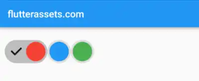
In this modified code example, we have a colorSwatches which is a list of Color objects representing the available colours for the swatches. Each colour is mapped to a RawChip widget in the row using the map function. Inside the map function, we create a RawChip with a CircleAvatar label that uses the corresponding colour from the list.
By populating the row with chips based on the colours in the colorSwatches, you can dynamically generate the colour swatches. The selection and deselection logic remains the same, updating the selectedColor variable accordingly.


