Types of Button press animations
In Flutter, you can apply various visual effects to buttons to make them more engaging and interactive for users. Here are some of the most common types of button press animations or visual effects:
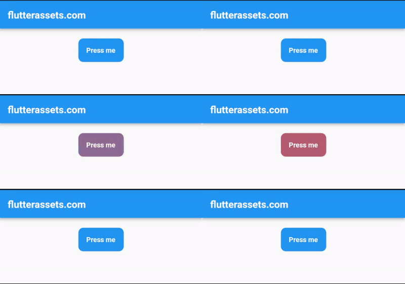
- Ripple effect: When a button is pressed, a ripple effect is displayed on the button’s surface. This creates the impression that the button is being physically pushed, which is an effective way of communicating to users that the button has been pressed.
- Scale effect: A scale effect is an animation that is applied to a button when it is pressed. The button can either grow in size or shrink in size, depending on the effect that you want to achieve. This effect helps to create a sense of feedback for the user, letting them know that their action has been registered.
- Colour change: You can also change the colour of a button when it is pressed. This can help to draw attention to the button and make it more visually appealing. You can either change the colour of the entire button or just a specific part of the button, such as the text or the icon.
- Bounce effect: A bounce effect is an animation that makes a button bounce or spring back when it is pressed. This effect can make the button feel more responsive and engaging, as it gives the user a sense of physical interaction with the button.
- Shrink effect: A shrink effect is an animation that makes a button shrink in size when it is pressed. This effect can create the impression that the button is being pushed down, which can be a very effective way of communicating to users that the button has been activated.
- Pulse effect: A pulse effect is an animation that makes a button pulse or throb when it is pressed. This effect can be used to create a sense of excitement or urgency, as it creates a visual rhythm that draws the user’s attention.
- …
Flutter Button Ripple Effect Animation
Creating a Ripple effect animation on a Flutter button is a straightforward process that involves adding a Material widget to your button and configuring it with a Ripple effect. Here’s an example code snippet that shows you how to do it:
ElevatedButton(
  onPressed: () {},
  child: Text('Press me'),
  style: ButtonStyle(
    overlayColor: MaterialStateProperty.resolveWith<Color>(
          (Set<MaterialState> states) {
        if (states.contains(MaterialState.pressed)) {
          return Colors.red.withOpacity(0.8);
        }
        return Colors.transparent;
      },
    ),
  ),
),
In this code snippet, we use an ElevatedButton widget, which is a Material Design button that has a shadow to give it a sense of elevation. To create a Ripple effect on this button, we add a ButtonStyle to the style property of the button. Within the ButtonStyle, we use the overlayColor property to set the colour of the Ripple effect when the button is pressed.
The overlayColor property takes a MaterialStateProperty, which is a function that returns a colour based on the button’s current state. In this example, we use the resolveWith method to return a colour only when the button is in the pressed state. We set the colour to Colors.grey.withOpacity(0.5), which is a semi-transparent grey colour that will be displayed as a Ripple effect when the button is pressed.
That’s it! With this code, you’ve successfully added a Ripple effect animation to your Flutter button. When the button is pressed, the Ripple effect will be displayed on the button’s surface, indicating to the user that the button has been activated.
Flutter Button Shrink Effect Animation
To create a shrink effect animation on a Flutter button using onTap, we can use a GestureDetector widget and its onTap property to detect when the user taps the button. Here’s an example code snippet that demonstrates this:
late AnimationController _controller;

@override
void initState() {
  super.initState();
  _controller = AnimationController(
    duration: Duration(milliseconds: 150),
    vsync: this,
  );
}

@override
void dispose() {
  _controller.dispose();
  super.dispose();
}

@override
Widget build(BuildContext context) {

  return Scaffold(
    appBar: AppBar(
      title: Text('flutterassets.com'),
    ),
    body:  Container(
      alignment: Alignment.topCenter,
      padding: EdgeInsets.all(20),
      child: GestureDetector(
        onTap: () {
          _controller.forward();
          Future.delayed(Duration(milliseconds: 200), () {
            _controller.reverse();
          });
          print('Shrink');
        },
        child: ScaleTransition(
          scale: Tween<double>(
            begin: 1.0,
            end: 0.7,
          ).animate(_controller),
          child: ElevatedButton(
            onPressed: null,
            child: Text('Press me'),
            style: ElevatedButton.styleFrom(
              disabledBackgroundColor: Colors.blue,
              disabledForegroundColor: Colors.white,
              shape: RoundedRectangleBorder(
                borderRadius: BorderRadius.circular(10),
              ),
              padding: EdgeInsets.all(16),
            ),
          ),
        ),
      )
    ),
  );
}
In the above code, we use a GestureDetector widget to detect when the user taps the button. We also use an AnimationController to animate the button’s scale when it is tapped.
The ScaleTransition widget is used to animate the button’s scale, with the scale property being controlled by the _controller. When the user taps the button (onTap), we call _controller.forward() to animate the button’s scale to the shrinkScale value. We then use the Future.delayed method to wait for 200 milliseconds before calling _controller.reverse() to animate the button’s scale back to its original size. Finally, we call the onPressed callback to trigger the desired action when the button is tapped.
Note that we set the onPressed property of the ElevatedButton widget to null to prevent the button from being tapped directly.
Flutter Button Shrink custom widget
Also, you can make a custom widget from the above code. Create a new Dart file and name it, for example, “ShrinkButton.dart”, and modify the code a bit by adding a few parameters, here is the full code:
import 'package:flutter/material.dart';

class ShrinkButton extends StatefulWidget {
  final Widget child;
  final Function onPressed;
  final double shrinkScale;

  ShrinkButton({
    required this.child,
    required this.onPressed,
    this.shrinkScale = 0.9,
  });

  @override
  _ShrinkButtonState createState() => _ShrinkButtonState();
}

class _ShrinkButtonState extends State<ShrinkButton>
    with SingleTickerProviderStateMixin {
  late AnimationController _controller;

  @override
  void initState() {
    super.initState();
    _controller = AnimationController(
      duration: Duration(milliseconds: 150),
      vsync: this,
    );
  }

  @override
  Widget build(BuildContext context) {
    return GestureDetector(
      onTap: () {
        _controller.forward();
        Future.delayed(Duration(milliseconds: 200), () {
          _controller.reverse();
        });
        widget.onPressed();
      },
      child: ScaleTransition(
        scale: Tween<double>(
          begin: 1.0,
          end: widget.shrinkScale,
        ).animate(_controller),
        child: ElevatedButton(
          onPressed: null,
          child: widget.child,
          style: ElevatedButton.styleFrom(
            disabledBackgroundColor: Colors.blue,
            disabledForegroundColor: Colors.white,
            shape: RoundedRectangleBorder(
              borderRadius: BorderRadius.circular(10),
            ),
            padding: EdgeInsets.all(16),
          ),
        ),
      ),
    );
  }

  @override
  void dispose() {
    _controller.dispose();
    super.dispose();
  }
}
To use this ShrinkButton widget in your app, you can simply create an instance of it and pass in the child widget and onPressed callback as shown:
import 'ShrinkButton.dart';ShrinkButton(
child: Text('Press me'),
shrinkScale: 0.7,
onPressed: () {
// Your desired action here
},
),Flutter Button Scale-Up Animation
To make a scale-up button animation you can use the code from the above section and use a shrinkScale value larger than 1, for example, 1.5. In the code below I only renamed the property name and the script name to match the title. Here is the code:
import 'package:flutter/material.dart';

class ScaleUpButton extends StatefulWidget {
  final Widget child;
  final Function onPressed;
  final double scaleUp;

  ScaleUpButton({
    required this.child,
    required this.onPressed,
    this.scaleUp = 1.2,
  });

  @override
  _ScaleUpButtonState createState() => _ScaleUpButtonState();
}

class _ScaleUpButtonState extends State<ScaleUpButton>
    with SingleTickerProviderStateMixin {
  late AnimationController _controller;

  @override
  void initState() {
    super.initState();
    _controller = AnimationController(
      duration: Duration(milliseconds: 150),
      vsync: this,
    );
  }

  @override
  Widget build(BuildContext context) {
    return GestureDetector(
      onTap: () {
        _controller.forward();
        Future.delayed(Duration(milliseconds: 200), () {
          _controller.reverse();
        });
        widget.onPressed();
      },
      child: ScaleTransition(
        scale: Tween<double>(
          begin: 1.0,
          end: widget.scaleUp,
        ).animate(_controller),
        child: ElevatedButton(
          onPressed: null,
          child: widget.child,
          style: ElevatedButton.styleFrom(
            disabledBackgroundColor: Colors.blue,
            disabledForegroundColor: Colors.white,
            shape: RoundedRectangleBorder(
              borderRadius: BorderRadius.circular(10),
            ),
            padding: EdgeInsets.all(16),
          ),
        ),
      ),
    );
  }

  @override
  void dispose() {
    _controller.dispose();
    super.dispose();
  }
}
And here is a use case of the button:
import 'ScaleUpButton.dart';ScaleUpButton(
child: Text('Scale Up'),
onPressed: (){},
scaleUp: 1.5
)Flutter Button Change Colour Animation
To create a colour change effect animation on a Flutter button using onTap, we can use a GestureDetector widget and its onTap property to detect when the user taps the button. Here’s an example code snippet that demonstrates this:
import 'package:flutter/material.dart';

class ColorChangeButton extends StatefulWidget {
  final Widget child;
  final Function onPressed;
  final Color startColor;
  final Color endColor;

  ColorChangeButton({
    required this.child,
    required this.onPressed,
    required this.startColor,
    required this.endColor,
  });

  @override
  _ColorChangeButtonState createState() => _ColorChangeButtonState();
}

class _ColorChangeButtonState extends State<ColorChangeButton>
    with SingleTickerProviderStateMixin {
  late AnimationController _controller;
  late Animation<Color?> _colorTween;

  @override
  void initState() {
    super.initState();
    _controller = AnimationController(
      duration: Duration(milliseconds: 500),
      vsync: this,
    );
    _colorTween = ColorTween(begin: widget.startColor, end: widget.endColor)
        .animate(_controller);
  }

  @override
  Widget build(BuildContext context) {
    return GestureDetector(
      onTap: () {
        _controller.forward();
        Future.delayed(Duration(milliseconds: 500), () {
          _controller.reverse();
        });
        widget.onPressed();
      },
      child: AnimatedBuilder(
        animation: _colorTween,
        builder: (context, child) {
          return ElevatedButton(
            onPressed: null,
            child: widget.child,
            style: ElevatedButton.styleFrom(
              disabledForegroundColor: Colors.white,
              disabledBackgroundColor: _colorTween.value,
              shape: RoundedRectangleBorder(
                borderRadius: BorderRadius.circular(10),
              ),
              padding: EdgeInsets.all(16),

            ),
          );
        },
      ),
    );
  }

  @override
  void dispose() {
    _controller.dispose();
    super.dispose();
  }
}
In this code snippet, we define a ColorChangeButton widget that takes in a child widget, an onPressed callback, a startColor and an endColor values that determine the colour range of the button. Within the ColorChangeButton widget, we use a GestureDetector widget to detect when the user taps the button. We also use an AnimationController to animate the button’s colour when it is tapped.
The ColorTween class is used to define the range of colours to animate between. We pass the startColor and endColor values to it to define the range of colours. We then use the AnimatedBuilder widget to animate the button’s colour, with the disabledBackgroundColor property of the ElevatedButton widget being controlled by the _colorTween animation.
When the user taps the button (onTap), we call _controller.forward() to animate the button’s colour to the endColor value. We then use the Future.delayed method to wait for 200 milliseconds before calling _controller.reverse() to animate the button’s colour back to the startColor value. Finally, we call the onPressed callback to trigger the desired action when the button is tapped.
Note that we set the onPressed property of the ElevatedButton widget to null to prevent the button from being tapped directly.
To use this ColorChangeButton widget in your app, you can simply create an instance of it and pass in the child widget, onPressed callback, startColor, and endColor values as shown:
ColorChangeButton(
    child: Text('Press me'),
    onPressed: (){print('Button Pressed');},
    startColor: Colors.blue,
    endColor: Colors.red
),
Flutter Button Label Colour Change Animation
To create an animated label colour for the Button you can modify the above code and swap the values of disabledForegroundColor and disabledBackgroundColor, here is an example:
style: ElevatedButton.styleFrom(
  disabledForegroundColor: _colorTween.value,
  disabledBackgroundColor: Colors.blue,
  shape: RoundedRectangleBorder(
    borderRadius: BorderRadius.circular(10),
  ),
  padding: EdgeInsets.all(16),

),
Flutter Button Bounce Effect Animation
This effect is identical to the effect presented above as a Shrink effect but uses a different approach.
To create a Bounce effect animation on the Flutter Button using onTap, we can use a combination of AnimatedContainer and Tween classes. Here’s an example code:
import 'package:flutter/material.dart';

class BounceButton extends StatefulWidget {
  final Widget child;
  final Function onTap;
  final double height;
  final double width;
  final Duration duration;

  const BounceButton({
    Key? key,
    required this.child,
    required this.onTap,
    required this.height,
    required this.width,
    required this.duration,
  }) : super(key: key);

  @override
  _BounceButtonState createState() => _BounceButtonState();
}

class _BounceButtonState extends State<BounceButton>
    with SingleTickerProviderStateMixin {
  late AnimationController _controller;
  late Animation<double> _animation;

  @override
  void initState() {
    super.initState();
    _controller = AnimationController(
      duration: widget.duration,
      vsync: this,
    );
    _animation = Tween<double>(
      begin: 1.0,
      end: 0.8,
    ).animate(
      CurvedAnimation(
        parent: _controller,
        curve: Curves.easeInOut,
      ),
    );
  }

  @override
  void dispose() {
    _controller.dispose();
    super.dispose();
  }

  @override
  Widget build(BuildContext context) {
    return GestureDetector(
      onTap: () {
        widget.onTap();
        _controller.forward().then((_) {
          _controller.reverse();
        });
      },
      child: AnimatedBuilder(
        animation: _animation,
        builder: (context, child) {
          return Transform.scale(
            scale: _animation.value,
            child: AnimatedContainer(
              alignment: Alignment.center,
              duration: widget.duration,
              height: widget.height,
              width: widget.width,
              decoration: BoxDecoration(
                color: Colors.blue,
                borderRadius: BorderRadius.circular(20)
              ),
              child: child,
            ),
          );
        },
        child: widget.child,
      ),
    );
  }
}
In this code, we create a BounceButton widget which takes in a child widget, a height and width, a duration for the animation, and an onTap function to be executed when the button is tapped.
Inside the _BounceButtonState class, we initialize an AnimationController and a Tween animation which will control the scale of the button. When the button is tapped, the onTap function is executed and the animation is played. The AnimatedBuilder widget is used to rebuild the button’s scale whenever the animation value changes.
Finally, we wrap the child widget inside the AnimatedContainer and Transform.scale widgets to apply the animation effect. When the button is tapped, it will shrink to 80% of its original size and then bounce back to its original size. The AnimatedContainer also has applied a BoxDecoration.
Here is how to use it:
import 'BounceButton.dart';BounceButton(
child: Text('Press me'),
onTap: (){print('pressed');},
height: 50,
width: 100,
duration: Duration(milliseconds: 500)
),Flutter Button Bounce Up Effect Animation
To create a bounce effect but with a scaling up effect, you can modify the above code and adjust the end value of the Tween animation to a value greater than 1.0. This will cause the button to grow slightly larger than its original size before bouncing back to its original size.
@override
void initState() {
  super.initState();
  _controller = AnimationController(
    duration: widget.duration,
    vsync: this,
  );
  _animation = Tween<double>(
    begin: 1.0,
    end: 1.2,
  ).animate(
    CurvedAnimation(
      parent: _controller,
      curve: Curves.easeInOut,
    ),
  );
}
For example, setting the end value to 1.2 would cause the button to grow by 20% before bouncing back to its original size. You can experiment with different values to achieve the desired effect.
Flutter IconButton Pulse Effect Animation
To create a pulsing effect animation on a Flutter Button, we can use the AnimatedContainer widget and adjust its duration and curve properties to create a smooth animation. We can also use the IconButton widget with the desired icon and size to create a button.
Here is an example code:
import 'package:flutter/material.dart';

void main() {
  runApp(MyApp());
}

class MyApp extends StatelessWidget {

  @override
  Widget build(BuildContext context) {
    return MaterialApp(
      debugShowCheckedModeBanner: false,
      title: 'Flutter Demo',
      theme: ThemeData(
        primarySwatch: Colors.blue,
      ),
      home: MyHomePage(),
    );
  }
}

class MyHomePage extends StatefulWidget {

  @override
  State<MyHomePage> createState() => _MyHomePageState();
}

class _MyHomePageState extends State<MyHomePage> with SingleTickerProviderStateMixin {

  late AnimationController _animationController;

  @override
  void initState() {
    super.initState();
    _animationController =
    AnimationController(vsync: this, duration: Duration(seconds: 1))
      ..addListener(() {
        setState(() {});
      })
      ..repeat();
  }

  @override
  void dispose() {
    _animationController.dispose();
    super.dispose();
  }

  @override
  Widget build(BuildContext context) {

    return Scaffold(
      appBar: AppBar(
        title: Text('flutterassets.com'),
      ),
      body:  Container(
        alignment: Alignment.topCenter,
        padding: EdgeInsets.all(20),
        child: Column(
          children: [
            IconButton(
              icon: const Icon(
                Icons.favorite,
                color: Colors.red,
              ),
              iconSize: 50 + (_animationController.value * 10),
              onPressed: () {},
            ),
          ],
        ),
      ),
    );
  }
}
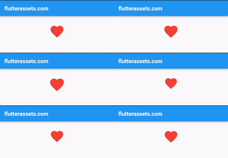
In the code above, we create a StatefulWidget with an AnimationController that repeats continuously. We use the IconButton widget with the Icons.favorite icon and a size that increases and decreases continuously with the value of the AnimationController. Finally, we wrap the IconButton in a Container widget for additional customization options.
This creates a pulsing effect animation on the Flutter Button that runs continuously.
Flutter ElevatedButton Icon Pulse Animation
To create a pulsing effect animation on the Flutter ElevatedButton.icon, we can use the AnimatedContainer widget that allows us to animate the size of the widget. We can wrap the ElevatedButton with this widget and change the size of the container in a continuous loop to create a pulsing effect.
Here is an example code:
import 'package:flutter/material.dart';

void main() {
  runApp(MyApp());
}

class MyApp extends StatelessWidget {

  @override
  Widget build(BuildContext context) {
    return MaterialApp(
      debugShowCheckedModeBanner: false,
      title: 'Flutter Demo',
      theme: ThemeData(
        primarySwatch: Colors.blue,
      ),
      home: MyHomePage(),
    );
  }
}

class MyHomePage extends StatefulWidget {

  @override
  State<MyHomePage> createState() => _MyHomePageState();
}

class _MyHomePageState extends State<MyHomePage> with SingleTickerProviderStateMixin {

  late AnimationController _controller;
  final double _maxSize = 50;
  final double _minSize = 30;

  @override
  void initState() {
    super.initState();
    _controller = AnimationController(
      vsync: this,
      duration: Duration(seconds: 1),
    )..addListener(() {
      setState(() {});
    });

    _controller.repeat(reverse: true);
  }

  @override
  void dispose() {
    _controller.dispose();
    super.dispose();
  }

  double _getSize() {
    double t = _controller.value;
    return _minSize + (1 - t) * (_maxSize - _minSize);
  }

  @override
  Widget build(BuildContext context) {

    return Scaffold(
      appBar: AppBar(
        title: Text('flutterassets.com'),
      ),
      body:  Container(
        alignment: Alignment.topCenter,
        padding: EdgeInsets.all(20),
        child: Column(
          children: [
            AnimatedContainer(
              duration: Duration(milliseconds: 500),
              curve: Curves.easeInOut,
              child: ElevatedButton.icon(
                onPressed: () {},
                icon: Icon(Icons.favorite, size: _getSize()),
                label: Text('Check Your Pulse'),
                style: ElevatedButton.styleFrom(
                  shape: RoundedRectangleBorder(
                    borderRadius: BorderRadius.circular(10),
                  ),
                ),
              ),
            )
          ],
        ),
      ),
    );
  }
}
In this code, we first create an AnimationController with a duration of 1 second and listen to its value changes. Then, we define two sizes: _maxSize and _minSize. _getSize() method returns the size of the icon based on the animation value. We use the repeat method of the AnimationController to continuously run the animation forward and backwards.
Finally, we wrap the ElevatedButton with an AnimatedContainer widget and change its size in a continuous loop by calling _getSize() method in the size property of the Icon widget.
Flutter Button Switch Label with Icon Animation
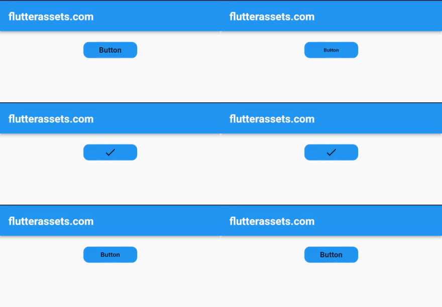
To create a Flutter Button Animation that replaces the button label text with an Icon (Icons.check) onTap or onPressed, we can use the AnimatedSwitcher widget.
First, we need to create a StatefulWidget that will hold the current state of the button. In the build method, we use an AnimatedSwitcher widget to switch between a Text widget and an Icon widget depending on the state of the button.
To change the state of the button, we can use the onPressed or onTap callback of the button. In these callbacks, we update the state of the widget using the setState method, which will trigger a rebuild of the widget and the AnimatedSwitcher will animate the transition between the Text and Icon widgets.
Here is an example code:
bool _showText = true;

@override
Widget build(BuildContext context) {

  return Scaffold(
    appBar: AppBar(
      title: Text('flutterassets.com'),
    ),
    body:  Container(
      alignment: Alignment.topCenter,
      padding: EdgeInsets.all(20),
      child: Column(
        children: [
          GestureDetector(
            onTap: () {
              setState(() {
                _showText = !_showText;
              });
            },
            child: Container(
              width: 100,
              height: 30,
              decoration: BoxDecoration(
                color: Colors.blue,
                borderRadius: BorderRadius.all(Radius.circular(10)),
              ),
              child: AnimatedSwitcher(
                duration: Duration(milliseconds: 500),
                transitionBuilder: (child, animation) {
                  return ScaleTransition(
                    scale: animation,
                    child: child,
                  );
                },
                child: _showText
                    ? Text(
                  'Button',
                  key: ValueKey('text'),
                )
                    : Icon(
                  Icons.check,
                  key: ValueKey('icon'),
                ),
              ),
            ),
          )
        ],
      ),
    ),
  );
}
In this example, we use a GestureDetector with an onTap callback to update the state of the widget. We then use an AnimatedSwitcher widget to animate the transition between the Text and Icon widgets. We set the duration property to control the animation duration, and the transitionBuilder property to specify how the transition should be animated.
In the child property of the AnimatedSwitcher, we use a ternary operator to switch between a Text widget and an Icon widget depending on the _showText state. We set a ValueKey on each child widget to help the AnimatedSwitcher identify which widget it is transitioning from/to.
Overall, this creates a button that can toggle between a label and an icon when pressed.
Disable Flutter Button after tap
You can modify the above code and disable the button/gesture detector onTap, but keep the text to icon change animation, you can simply remove the onTap property from the GestureDetector widget and use a boolean flag to conditionally show the icon or the text.
First, create a boolean variable _isButtonDisabled and set its value to false. Then, in the GestureDetector, remove the onTap property and update the child property of the AnimatedSwitcher widget to conditionally show either the icon or the text based on the _isButtonDisabled flag. Here’s the updated code:
bool _isButtonDisabled = false;

@override
Widget build(BuildContext context) {

  return Scaffold(
    appBar: AppBar(
      title: Text('flutterassets.com'),
    ),
    body:  Container(
      alignment: Alignment.topCenter,
      padding: EdgeInsets.all(20),
      child: Column(
        children: [
          GestureDetector(
            onTap: _isButtonDisabled ? null : () {
              setState(() {
                _isButtonDisabled = true;
              });
            },
            child: Container(
              width: 100,
              height: 30,
              decoration: _isButtonDisabled
                  ?
              const BoxDecoration(
                color: Colors.grey,
                borderRadius: BorderRadius.all(Radius.circular(10)),
              )
                  :
              const BoxDecoration(
                color: Colors.blue,
                borderRadius: BorderRadius.all(Radius.circular(10)),
              ),
              child: AnimatedSwitcher(
                duration: Duration(milliseconds: 500),
                child: _isButtonDisabled
                    ? Icon(Icons.check, key: UniqueKey())
                    : Text('Button', key: UniqueKey()),
              ),
            ),
          )
        ],
      ),
    ),
  );
}
In this updated code, the button will only respond to taps if _isButtonDisabled is false. When the button is tapped, _isButtonDisabled is set to true, and the AnimatedSwitcher will animate the transition from the text to the icon. The UniqueKey is used to force the AnimatedSwitcher to treat the old and new widgets as distinct and animate between them.


