Why use Flutter Drawer with NavigationRail inside
The Flutter Drawer with a NavigationRail inside can be used in a variety of use cases. It allows you to create a custom navigation menu that can be displayed on the left-hand side of the app’s screen. Here are a few potential use cases for the Flutter drawer with a NavigationRail inside:
- Navigation Menu: The most common use case for the Flutter drawer with a NavigationRail inside is to create a custom navigation menu for an app. The NavigationRail allows users to easily navigate between different sections of an app, while the drawer provides additional navigation options.
- Multi-Level Navigation: The drawer can be used to provide a multi-level navigation menu, where users can drill down into different levels of content. This can be particularly useful for apps that have a large amount of content.
- Settings Menu: The Flutter drawer with a NavigationRail can also be used to create a settings menu. The drawer can display a list of settings options, such as changing the app’s theme or language, while the NavigationRail can provide additional options related to the app’s settings.
- User Profile Menu: The Flutter drawer with a NavigationRail can be used to create a user profile menu. The drawer can display the user’s profile picture and basic information, while the NavigationRail can provide additional options related to the user’s profile, such as editing their profile or viewing their activity history.
- Product Catalog Menu: For an e-commerce app, the Flutter drawer with a NavigationRail inside can be used to display a product catalogue menu. The drawer can display different categories of products, while the NavigationRail can provide additional options related to browsing and searching for products.
How to use a NavigationRail in Flutter
A NavigationRail is a widget that provides a navigation paradigm for navigating through an app’s content using a vertical list of destinations. It is commonly used as a navigation menu within a drawer or as a persistent navigation widget on larger screens.
To use a NavigationRail, you need to create an instance of the widget and specify its properties. The destinations property is a required list of NavigationRailDestination objects, which define each destination in the navigation rail. Each NavigationRailDestination needs to have an icon and a label. The selectedIndex property is used to indicate which destination is currently selected, and the onDestinationSelected property is a callback function that is called when a destination is selected. Within the callback function, you can update the selectedIndex property to reflect the new selection.
Here is a simple example of how to use a NavigationRail:
import 'package:flutter/material.dart';

void main() {
  runApp(MyApp());
}

class MyApp extends StatelessWidget {

  @override
  Widget build(BuildContext context) {
    return MaterialApp(
      debugShowCheckedModeBanner: false,
      title: 'Flutter Demo',
      theme: ThemeData(
        primarySwatch: Colors.blue,
      ),
      home: MyHomePage(),
    );
  }
}

class MyHomePage extends StatefulWidget {

  @override
  State<MyHomePage> createState() => _MyHomePageState();
}

class _MyHomePageState extends State<MyHomePage>{

  int _selectedIndex = 0;

  @override
  Widget build(BuildContext context) {

    return Scaffold(
      appBar: AppBar(
        title: Text('flutterassets.com'),
      ),
      body:  Row(
        children: <Widget>[
          NavigationRail(
            destinations: const [
              NavigationRailDestination(
                icon: Icon(Icons.home),
                label: Text('Home'),
              ),
              NavigationRailDestination(
                icon: Icon(Icons.settings),
                label: Text('Settings'),
              ),
            ],
            selectedIndex: _selectedIndex,
            onDestinationSelected: (int index) {
              setState(() {
                _selectedIndex = index;
              });
            },
          ),
          Expanded(
            child: Container(
              padding: EdgeInsets.all(20),
              alignment: Alignment.topCenter,
              child: Text('Selected index: $_selectedIndex'),
            ),
          ),
        ],
      ),
    );
  }
}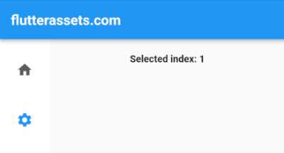
In this example, we create a NavigationRail with two destinations: “Home” and “Settings”. We also define an onDestinationSelected callback that updates the _selectedIndex property when a destination is selected. The selected index is then displayed in the body of the scaffold.
Flutter NavigationRail vertical text label
To make a vertical label text in the NavigationRail we can use the RotatedBox widget to rotate the label text by -90 degrees so that it’s presented vertically. We also add padding to the text to make sure it’s centred within the container. Here us updated code:
return Scaffold(
  appBar: AppBar(
    title: Text('flutterassets.com'),
  ),
  // drawer: MyDrawer(),
  body:  Row(
    children: <Widget>[
      NavigationRail(
        labelType: NavigationRailLabelType.all,
        selectedLabelTextStyle: TextStyle(
          color: Colors.red,
          fontSize: 30,
          letterSpacing: 1,
          decoration: TextDecoration.underline,
          decorationThickness: 2.5
        ),
        selectedIconTheme: const IconThemeData(
          color: Colors.red,
          size: 30
        ),
        unselectedIconTheme: const IconThemeData(
          color: Colors.grey,
          size: 20
        ),
        unselectedLabelTextStyle: TextStyle(
            color: Colors.grey,
            fontSize: 20,
            letterSpacing: 0.8,
        ),
        destinations: const [
          NavigationRailDestination(
            icon: Icon(Icons.home),
            label: Padding(
              padding: EdgeInsets.all(8.0),
              child: RotatedBox(
                quarterTurns: -1,
                  child: Text('Home')
              ),
            ),
          ),
          NavigationRailDestination(
            icon: Icon(Icons.settings),
            // icon: SizedBox.shrink(),
            label: Padding(
              padding: EdgeInsets.all(8.0),
              child: RotatedBox(
                quarterTurns: -1,
                  child: Text('Settings')
              ),
            ),
          ),
          NavigationRailDestination(
            icon: Icon(Icons.person),
            label: Padding(
              padding: EdgeInsets.all(8.0),
              child: RotatedBox(
                quarterTurns: -1,
                  child: Text('About')
              ),
            ),
          ),
        ],
        selectedIndex: _selectedIndex,
        onDestinationSelected: (int index) {
          setState(() {
            _selectedIndex = index;
          });
        },
      ),
      Expanded(
        child: Container(
          padding: EdgeInsets.all(20),
          alignment: Alignment.topCenter,
          child: Text('Selected index: $_selectedIndex'),
        ),
      ),
    ],
  ),
);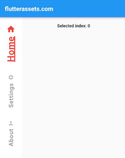
I’ve also added the additional parameters specified in the prompt. The selectedLabelTextStyle property is used to style the text of the currently selected label. We’ve set the font size to 30, the colour to Colors.red, and added an underline using the TextDecoration property. We’ve also set the underline thickness to 2.5 using the decorationThickness property.
Similarly, the unselectedIconTheme and unselectedLabelTextStyle properties are used to style the icons and labels of the unselected destinations. We’ve set the icon size to 20 and the font size of the unselected labels to 20. We’ve also set a letterSpacing value of 0.8 to add some space between the letters of the unselected labels.
Flutter NavigationRail vertical label without icon
To make the icon not visible in the NavigationRail widget, you can replace the icon parameter with an empty SizedBox widget by setting icon: SizedBox.shrink(),. Here’s how you can modify the code:
NavigationRailDestination(
  icon: SizedBox.shrink(),
  label: Padding(
    padding: EdgeInsets.all(8.0),
    child: RotatedBox(
      quarterTurns: -1,
        child: Text('Home')
    ),
  ),
),
The above code specifies that the icon should be an empty SizedBox, effectively making the icon invisible.
The RotatedBox widget is used to rotate the text by -90 degrees (a quarter turn to the left) so that it is displayed vertically instead of horizontally. The quarterTurns property of RotatedBox specifies how many quarter turns (90-degree increments) the child should be rotated by. A negative value is used here to turn the text to the left.
Custom Flutter Drawer widget with NavigationRail
The code below creates a custom Flutter Drawer with a NavigationRail that allows the user to select between three different views. The Drawer is made up of two columns: the NavigationRail in the first column and the selected content in the second column. The selected content is updated based on the selected index of the NavigationRail. I called the file my_drawer.dart.
import 'package:flutter/material.dart';

class MyDrawer extends StatefulWidget {
  const MyDrawer({Key? key}) : super(key: key);

  @override
  _MyDrawerState createState() => _MyDrawerState();
}

class _MyDrawerState extends State<MyDrawer> {
  int _selectedIndex = 0;

  @override
  Widget build(BuildContext context) {
    return Drawer(
      child: Row(
        children: [
          Expanded(
            flex: 1,
            child: NavigationRail(
              backgroundColor: Colors.grey.shade200,
              elevation: 12,
              labelType: NavigationRailLabelType.selected,
              selectedIndex: _selectedIndex,
              selectedIconTheme: const IconThemeData(
                color: Colors.red,
              ),
              selectedLabelTextStyle: TextStyle(color: Colors.red),
              onDestinationSelected: (int index) {
                setState(() {
                  _selectedIndex = index;
                });
              },
              leading: Container(
                margin: const EdgeInsets.only(bottom: 40.0),
                decoration: const BoxDecoration(
                  border: Border(
                    bottom:  BorderSide(width: 1.0, color: Colors.grey),
                  )
                ),
                child: IconButton(
                  icon: Icon(Icons.info_outline_rounded),
                  onPressed: (){print('Info Pressed');},
                ),
              ),
              trailing: Expanded(
                child: Align(
                  alignment: Alignment.bottomCenter,
                  child: Container(
                    margin: const EdgeInsets.only(top: 40.0),
                    decoration: const BoxDecoration(
                        border: Border(
                          top:  BorderSide(width: 1.0, color: Colors.grey),
                        )
                    ),
                    child: IconButton(
                      icon: Icon(Icons.logout, color: Colors.red,),
                      onPressed: (){},
                    ),
                  ),
                ),
              ),
              destinations: const [
                NavigationRailDestination(
                  icon: Icon(Icons.favorite_border),
                  label: Text('Favorites'),
                ),
                NavigationRailDestination(
                  icon: Icon(Icons.history),
                  label: Text('History'),
                ),
                NavigationRailDestination(
                  icon: Icon(Icons.list_alt),
                  label: Text('List'),
                ),
              ],
            ),
          ),
          Expanded(
            flex: 3,
            child: selectedMenu(_selectedIndex),
          ),
        ],
      ),
    );
  }

  Widget selectedMenu(index){
    switch (index) {
      case 0:
        return _buildFavoritesListView();
      case 1:
        return _buildHistoryListView();
      case 2:
        return _buildListView();
      default:
        return _buildFavoritesListView();
    }
  }

  Widget _buildFavoritesListView() {
    return ListView(
      children: [
        ListTile(
          title: Text('Favorite Book'),
          onTap: (){
            //go somewhere or do something
            },
        ),
        ListTile(
          title: Text('Favorite Song'),
          onTap: (){
            //go somewhere or do something
            },
        ),
        ListTile(
          title: Text('Favorite Movie'),
          onTap: (){
            //go somewhere or do something
            },
        ),
      ],
    );
  }

  Widget _buildHistoryListView() {
    return ListView(
      children: [
        ListTile(
          title: Text('My History'),
          onTap: (){
            //go somewhere or do something
          },
        ),
        ListTile(
          title: Text('Your History'),
          onTap: (){
            //go somewhere or do something
          },
        ),
        ListTile(
          title: Text('Our History'),
          onTap: (){
            //go somewhere or do something
          },
        ),
      ],
    );
  }

  Widget _buildListView() {
    return ListView.builder(
      itemCount: 10,
      itemBuilder: (BuildContext context, int index) {
        return ListTile(
          title: Text('List item $index'),
        );
      },
    );
  }
}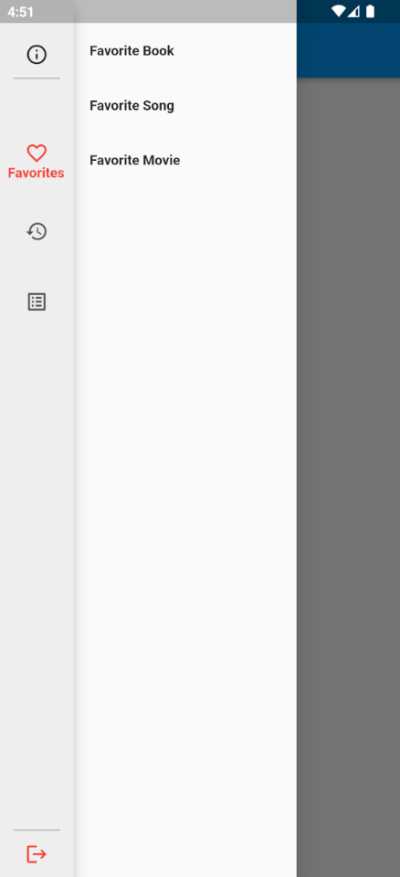
In the above code the build method of _MyDrawerState returns a Row with two children: a NavigationRail widget and a selectedMenu widget. The NavigationRail is in the first column and has three NavigationRailDestination elements: “Favorites”, “History”, and “List”. Each NavigationRailDestination element has an icon and a label. The selectedMenu widget is in the second column and displays the appropriate content based on the selected index of the NavigationRail
The NavigationRail has several properties that customize its appearance and behaviour. The backgroundColor and elevation properties control the background colour and elevation of the NavigationRail. The labelType property determines how the label is displayed when selected. The selectedIndex property specifies the initially selected index.
The selectedIconTheme and selectedLabelTextStyle properties control the appearance of the selected NavigationRailDestination. The onDestinationSelected property is a callback that updates the selected index when a NavigationRailDestination is selected.
The leading property of the NavigationRail displays an IconButton with an “info” icon, while the trailing property displays an IconButton with a “logout” icon. These icons are wrapped in a Container with a BoxDecoration that adds a border to the bottom or top of the NavigationRail.
The selectedMenu method returns the appropriate content based on the selected index of the NavigationRail. It uses a switch statement to determine which content to display. There are three possible options: _buildFavoritesListView(), _buildHistoryListView(), and _buildListView(). If the selected index is not recognized, _buildFavoritesListView() is returned as a default.
Each _build*ListView() method returns a ListView widget with a list of ListTile widgets. The ListTile widgets have a Text widget as their title property and an onTap property that can be used to trigger an action when the ListTile is tapped. These methods are used to build the content displayed in the drawer based on the selected index of the NavigationRail.
Use the Custom Drawer widget in Flutter
To use the custom drawer I presented above, you need to import the file where the MyDrawer class is defined in your Flutter project.
import 'my_drawer.dart';Then, you can use the MyDrawer widget inside your scaffold widget’s drawer property. For example, if you have a scaffold widget like this:
Scaffold(
  appBar: AppBar(
    title: Text('flutterassets.com'),
  ),
  drawer: MyDrawer(),
  body: Center(
    child: Text('Hello, world!'),
  ),
)
The MyDrawer widget will be used as the drawer of your scaffold. When the user taps on the drawer icon on the app bar, the custom drawer with the navigation rail will slide in from the left.
By default, the drawer will show the list of items under the ‘Favorites’ tab, but the user can switch between the ‘Favorites’, ‘History’, and ‘List’ tabs using the navigation rail on the left. The content displayed on the right side of the drawer will change based on the selected tab.
For example, if the user selects the ‘History’ tab, the drawer will display a list of history items, and if they select the ‘List’ tab, the drawer will display a list of generic list items.
You can modify the contents of the MyDrawer widget as needed to customize the look and feel and behaviour of the drawer for your specific use case.
Custom Flutter Drawer widget with NavigationRail and vertical labels
In the code below, the NavigationRail has been modified to have vertical labels instead of icons, and the icons have been removed. The labelType property is changed to NavigationRailLabelType.all to display the labels for all destinations. The selectedLabelTextStyle and unselectedLabelTextStyle properties are added to modify the text styling for selected and unselected items.
import 'package:flutter/material.dart';

class MyDrawer extends StatefulWidget {
  const MyDrawer({Key? key}) : super(key: key);

  @override
  _MyDrawerState createState() => _MyDrawerState();
}

class _MyDrawerState extends State<MyDrawer> {
  int _selectedIndex = 0;

  @override
  Widget build(BuildContext context) {
    return Drawer(
      child: Row(
        children: [
          Expanded(
            flex: 1,
            child: NavigationRail(
              backgroundColor: Colors.grey.shade200,
              elevation: 12,
              selectedIndex: _selectedIndex,
              labelType: NavigationRailLabelType.all,
              selectedLabelTextStyle: TextStyle(
                  color: Colors.blue,
                  fontSize: 30,
                  letterSpacing: 1,
                  decorationThickness: 2.5
              ),
              unselectedLabelTextStyle: TextStyle(
                color: Colors.grey,
                fontSize: 20,
                letterSpacing: 0.8,
              ),
              onDestinationSelected: (int index) {
                setState(() {
                  _selectedIndex = index;
                });
              },
              leading: Container(
                margin: const EdgeInsets.only(bottom: 40.0),
                decoration: const BoxDecoration(
                    border: Border(
                      bottom:  BorderSide(width: 1.0, color: Colors.grey),
                    )
                ),
                child: IconButton(
                  icon: Icon(Icons.info_outline_rounded),
                  onPressed: (){print('Info Pressed');},
                ),
              ),
              trailing: Expanded(
                child: Align(
                  alignment: Alignment.bottomCenter,
                  child: Container(
                    margin: const EdgeInsets.only(top: 40.0),
                    decoration: const BoxDecoration(
                        border: Border(
                          top:  BorderSide(width: 1.0, color: Colors.grey),
                        )
                    ),
                    child: IconButton(
                      icon: Icon(Icons.logout, color: Colors.red,),
                      onPressed: (){},
                    ),
                  ),
                ),
              ),
              destinations: const [
                NavigationRailDestination(
                  icon: SizedBox.shrink(),
                  label: Padding(
                    padding: EdgeInsets.all(8.0),
                    child: RotatedBox(
                        quarterTurns: -1,
                        child: Text('Favorites')
                    ),
                  ),
                ),
                NavigationRailDestination(
                  icon: SizedBox.shrink(),
                  label: Padding(
                    padding: EdgeInsets.all(8.0),
                    child: RotatedBox(
                        quarterTurns: -1,
                        child: Text('History')
                    ),
                  ),
                ),
                NavigationRailDestination(
                  icon: SizedBox.shrink(),
                  label: Padding(
                    padding: EdgeInsets.all(8.0),
                    child: RotatedBox(
                        quarterTurns: -1,
                        child: Text('List')
                    ),
                  ),
                ),
              ],
            ),
          ),
          Expanded(
            flex: 3,
            child: selectedMenu(_selectedIndex),
          ),
        ],
      ),
    );
  }

  Widget selectedMenu(index){
    switch (index) {
      case 0:
        return _buildFavoritesListView();
      case 1:
        return _buildHistoryListView();
      case 2:
        return _buildListView();
      default:
        return _buildFavoritesListView();
    }
  }

  Widget _buildFavoritesListView() {
    return ListView(
      children: [
        ListTile(
          title: Text('Favorite Book'),
          onTap: (){
            //go somewhere or do something
          },
        ),
        ListTile(
          title: Text('Favorite Song'),
          onTap: (){
            //go somewhere or do something
          },
        ),
        ListTile(
          title: Text('Favorite Movie'),
          onTap: (){
            //go somewhere or do something
          },
        ),
      ],
    );
  }

  Widget _buildHistoryListView() {
    return ListView(
      children: [
        ListTile(
          title: Text('My History'),
          onTap: (){
            //go somewhere or do something
          },
        ),
        ListTile(
          title: Text('Your History'),
          onTap: (){
            //go somewhere or do something
          },
        ),
        ListTile(
          title: Text('Our History'),
          onTap: (){
            //go somewhere or do something
          },
        ),
      ],
    );
  }

  Widget _buildListView() {
    return ListView.builder(
      itemCount: 10,
      itemBuilder: (BuildContext context, int index) {
        return ListTile(
          title: Text('List item $index'),
        );
      },
    );
  }
}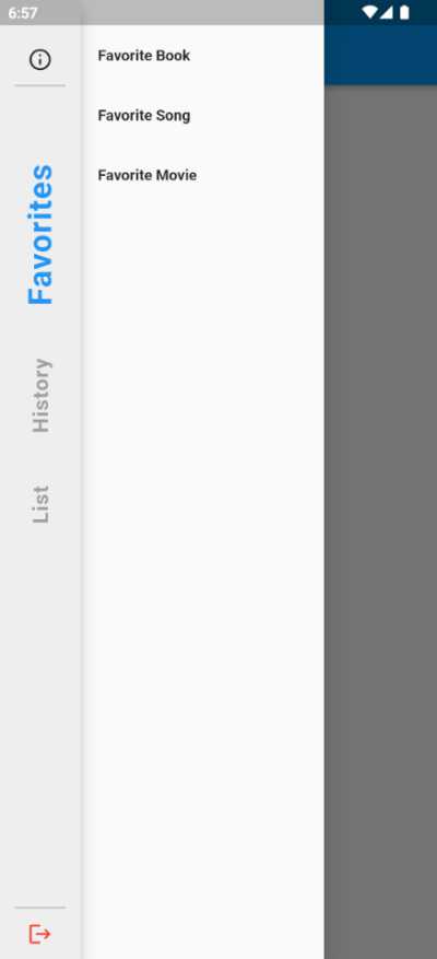
Here are the main changes made to the second code:
- NavigationRailLabelType.all was used instead of NavigationRailLabelType.selected in the above code. This change made all the labels in the NavigationRail visible, not just the selected one.
- The labels in the NavigationRail were no longer wrapped with the Icon widget as in the previous code. Instead, a Text widget was used to display the label text vertically. To achieve this, the RotatedBox widget was wrapped around the Text widget. The angle property of the RotatedBox widget was set to -90 degrees to rotate the Text widget vertically.
- The selectedIconTheme property was removed in the above code since the icons were not visible anymore.
- The selectedLabelTextStyle property was modified in the above code to give the selected label a blue colour with a font size of 30. The decorationThickness property was also set to 2.5 to make the text appear bolder.
- The unselectedLabelTextStyle property was also modified in the above code to give the unselected labels a grey colour with a font size of 20 and a letterSpacing of 0.8.


