What can be customized in the Flutter Chip widget
In the Flutter Chip widget, you can customize various properties to change its appearance and functionality.
You can change the text label’s colour, font size, font weight, and style. Additionally, you can set the background colour of the chip, the border colour, and the shape of the chip.
The chip’s avatar can also be customized to include an image or icon. Other customizations include whether the chip is enabled or disabled and whether the delete icon is shown.
Finally, you can add callbacks for when the chip is deleted. Overall, the Chip widget offers many ways to customize its appearance and behaviour, making it a versatile component for building user interfaces.
Here are the Chip properties:
Chip Chip({
  Key? key,
  Widget? avatar,
  required Widget label,
  TextStyle? labelStyle,
  EdgeInsetsGeometry? labelPadding,
  Widget? deleteIcon,
  void Function()? onDeleted,
  Color? deleteIconColor,
  String? deleteButtonTooltipMessage,
  BorderSide? side,
  OutlinedBorder? shape,
  Clip clipBehavior = Clip.none,
  FocusNode? focusNode,
  bool autofocus = false,
  Color? backgroundColor,
  EdgeInsetsGeometry? padding,
  VisualDensity? visualDensity,
  MaterialTapTargetSize? materialTapTargetSize,
  double? elevation,
  Color? shadowColor,
  Color? surfaceTintColor,
  IconThemeData? iconTheme,
  bool useDeleteButtonTooltip = true,
})
How to use an avatar in Flutter Chip
The avatar property in the Flutter Chip widget is used to add an image or icon to the left side of the chip. To use this property, you can set its value to a widget that represents the image or icon that you want to use. For example, you can use the CircleAvatar widget to create a circular image and then set it as the value of the avatar property. Here’s an example:
Chip(
  avatar: CircleAvatar(
    backgroundImage: AssetImage('assets/logo.png'),
  ),
  label: Text('flutterassets.com'),
),
In this example, the CircleAvatar widget is used to create a circular image, and the AssetImage class is used to load the image from the assets folder. The CircleAvatar widget is then set as the value of the avatar property, and the label property is used to set the text that appears on the chip.
Flutter Chip widget avatar with Image
To use an asset image in the Flutter Chip avatar, you can simply set the avatar property of the Chip widget to an AssetImage widget. Here’s an example:
Chip(
  avatar: CircleAvatar(
    backgroundImage: AssetImage('assets/logo.png'),
  ),
  label: Text('flutterassets.com'),
),
In the above example, we have set the avatar property to a CircleAvatar widget, and passed an AssetImage widget to its backgroundImage property. This will display an avatar image in the Chip.
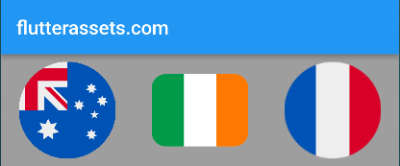
Here’s an example of using a network image in a Chip widget as the avatar:
Chip(
  avatar: CircleAvatar(
    backgroundImage: NetworkImage('https://picsum.photos/250?image=9'),
  ),
  label: Text('flutterassets.com'),
),
In this example, the CircleAvatar widget is used as the Chip‘s avatar, with its backgroundImage property set to a NetworkImage widget. This loads the image from the specified URL and uses it as the avatar.
The label property is set to a Text widget with the text “John Doe”, which will be displayed next to the avatar.
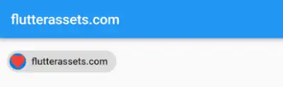
Flutter Chip widget avatar with Icon
To use an Icon in the Flutter RawChip avatar, you can set the avatar property of the RawChip widget to an Icon widget. Here’s an example:
Chip(
  avatar: Icon(Icons.favorite, color: Colors.red),
  label: Text('flutterassets.com'),
),
In the above example, we have set the avatar property to an Icon widget, and passed the Icons.favorite icon to it. This will display the heart icon in the RawChip’s avatar.
You can also use the CircleAvatar with the Icon:
Chip(
  avatar: CircleAvatar(
      child: Icon(Icons.favorite, color: Colors.red)
  ),
  label: Text('flutterassets.com'),
),
How to customize the colours of the Chip in Flutter
To customize the colours of a Flutter RawChip widget, you can use the following properties:
deleteIconColor: Sets the colour of the delete icon that appears when the chip is deletable.backgroundColor: Sets the background colour of the chip.shadowColor: Sets the colour of the chip’s shadow.surfaceTintColor: Sets the colour of the chip’s surface. This property is used to create a material-like effect on the chip’s surface.
Chip(
  label: Text('Customize me!'),
  labelStyle: TextStyle(color: Colors.white),
  backgroundColor: Colors.blue,
  shadowColor: Colors.black,
  deleteIconColor: Colors.white,
  surfaceTintColor: Colors.grey,
  avatar: CircleAvatar(
    backgroundImage: NetworkImage('https://picsum.photos/250?image=9'),
  ),
  onDeleted: () {},
),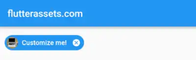
In the above code, the background colour of the chip is set to blue, the shadow colour is set to black, the delete icon colour is set to white, and the surface tint colour is set to grey. You can experiment with different colour values to achieve the desired look and feel of the chip.
How to use onDeleted in Flutter Chip
The onDeleted property in the Flutter Chip widget allows you to define a callback function that will be triggered when the user clicks on the delete icon. This is useful when you want to remove the Chip from the list or perform any other action when the user deletes the Chip.
To use onDeleted, you simply define a function that takes no arguments and set it as the value of the onDeleted property. For example:
Chip(
  label: Text('Delete me'),
  onDeleted: () {
    // Perform any action you want here when the user clicks on the delete icon
  },
)
In this example, when the user presses the delete icon on the chip, the function provided to onDeleted will be called. You can perform any action you want inside this function.
How to change an onDeleted Icon in the Flutter Chip
To change the onDeleted icon in a Flutter Chip, you can use the deleteIcon property. The deleteIcon property takes a widget as its value, so you can use any widget as the delete icon.
For example, you can use an Icon widget as the delete icon by setting the deleteIcon property to an Icon widget with the desired icon and colour:
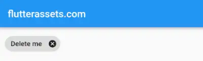
Chip(
  label: Text('Delete me'),
  deleteIcon: Icon(Icons.delete, color: Colors.red),
  onDeleted: () {
    // Perform any action you want here when the user clicks on the delete icon
  },
)
In this example, we set the deleteIcon property to an Icon widget with the delete icon and red colour. When the user taps the delete icon, the onDeleted callback is called, which can be used to remove the chip.
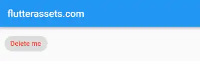
How to customize the Label in the Flutter Chip widget
The label of the Flutter Chip can be customized using various properties. Here are a few customization options:
Change Chip text colour :
You can change the text colour of the label by using the “labelStyle” property and passing a TextStyle object with the desired colour.
Chip(
  label: Text('Delete me'),
  labelStyle: TextStyle(
    color: Colors.red,
  ),
)
Change Chip font size:
You can change the font size of the label by using the “labelStyle” property and passing a TextStyle object with the desired font size.
Chip(
  label: Text('Customize me!'),
  labelStyle: TextStyle(
    fontSize: 20,
  ),
)
Add an icon to the Chip:
You can add an icon to the label by using the “avatar” property and passing an Icon widget.
hip(
  label: Text('Customize me!'),
  avatar: Icon(Icons.star),
)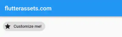
Change the background colour of the Chip:
You can change the background colour of the label by using the “backgroundColor” property and passing a Color object.
Chip(
  label: Text('Customize me!'),
  backgroundColor: Colors.green,
)
Add padding to the Chip:
You can add the padding by using the “padding” property.
Chip(
  padding: EdgeInsets.symmetric(horizontal: 30, vertical: 10),
  label: Text('Customize me!'),
  backgroundColor: Colors.green)
How to disable the Flutter Chip after onDelete pressed
One of the features of a Chip is the ability to add an “onDelete” function which can be used to remove the Chip from the user interface. However, in some cases, we may want to disable this function after it has been clicked once.
To disable the onDelete function in a Chip widget after it has been clicked, we can use a boolean variable that keeps track of whether the Chip has been disabled or not. In the below code, the _isDisabled variable is initialized to false. When the user clicks on the onDelete function, the _isDisabled variable is set to true using the setState method.
To disable the onDelete function after it has been clicked, we can use a ternary operator to check if the _isDisabled variable is true or false. If it is true, then we set the onDeleted property to null, which disables the onDelete function. If it is false, then the onDeleted property is set to a function that updates the _isDisabled variable to true.
Here is an example of how to disable the onDelete function after a user clicks on a Chip:
bool _isDisabled = false;
@override
Widget build(BuildContext context) {
return Scaffold(
appBar: AppBar(
title: Text('flutterassets.com'),
),
body: Container(
padding: EdgeInsets.all(10),
child: Chip(
label: Text('My Chip'),
onDeleted: _isDisabled ? null : () {
setState(() {
_isDisabled = true;
});
},
)
)
);
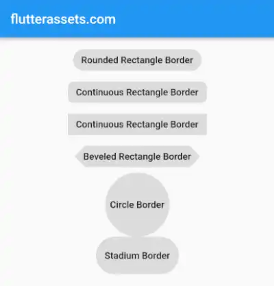
}How to change the shape of the Flutter Chip
To change the shape of the Flutter Chip, you can use the “shape” property and set it to any of the available shape classes in Flutter. The available shapes include:
- RoundedRectangleBorder: Creates a rectangular shape with rounded corners.
- ContinuousRectangleBorder: Creates a rectangular shape with continuous corners.
- CircleBorder: Creates a circular shape.
- StadiumBorder: Creates a rounded rectangle shape.
- BeveledRectangleBorder: creates a rectangle with bevelled edges.
Here is an example of how to use the above shapes:
Container(
  alignment: Alignment.center,
  padding: EdgeInsets.all(10),
  child: Column(
    children: [
      Chip(
        label: Text('Rounded Rectangle Border'),
        shape: RoundedRectangleBorder(
          borderRadius: BorderRadius.circular(20.0),
        ),
      ),
      Chip(
        label: Text('Continuous Rectangle Border'),
        shape: ContinuousRectangleBorder(
          borderRadius: BorderRadius.circular(20.0),
        ),
      ),
      Chip(
        label: Text('Continuous Rectangle Border'),
        shape: ContinuousRectangleBorder(
        ),
      ),
      Chip(
        label: Text('Beveled Rectangle Border'),
        shape: BeveledRectangleBorder(
          borderRadius: BorderRadius.circular(15.0),
        ),
      ),
      Chip(
        label: Text('Circle Border'),
        padding: EdgeInsets.symmetric(horizontal: 5, vertical: 40),
        shape: CircleBorder(),
      ),
      Chip(
        label: Text('Stadium Border'),
        padding: EdgeInsets.symmetric(horizontal: 5, vertical: 20),
        shape: StadiumBorder(),
      ),
    ],
  )
)
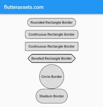
How to add a border to the Flutter Chip
To add a black border to the Flutter Chip, you can use the shape property in conjunction with the border property. The shape property defines the shape of the Chip and the border property defines the border around the Chip.
Here’s an example of adding a black border to the Flutter Chip with a RoundedRectangleBorder shape:
Chip(
  label: Text('My Chip'),
  backgroundColor: Colors.grey[300],
  shape: RoundedRectangleBorder(
    borderRadius: BorderRadius.circular(20),
    side: BorderSide(color: Colors.black),
  ),
),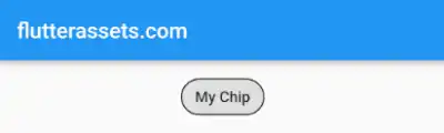
In this example, the RoundedRectangleBorder shape has a circular border radius of 20 and a black border with a width of 1. You can also use other shapes such as CircleBorder, StadiumBorder, ContinuousRectangleBorder, and BeveledRectangleBorder in the same way.
Container(
  alignment: Alignment.center,
  padding: EdgeInsets.all(10),
  child: Column(
    children: [
      Chip(
        label: Text('Rounded Rectangle Border'),
        shape: RoundedRectangleBorder(
          borderRadius: BorderRadius.circular(20.0),
          side: BorderSide(color: Colors.black, width: 1),
        ),
      ),
      Chip(
        label: Text('Continuous Rectangle Border'),
        shape: ContinuousRectangleBorder(
          borderRadius: BorderRadius.circular(20.0),
          side: BorderSide(color: Colors.black, width: 1),
        ),
      ),
      Chip(
        label: Text('Continuous Rectangle Border'),
        shape: ContinuousRectangleBorder(
          side: BorderSide(color: Colors.black, width: 1),
        ),
      ),
      Chip(
        label: Text('Beveled Rectangle Border'),
        shape: BeveledRectangleBorder(
          borderRadius: BorderRadius.circular(15.0),
          side: BorderSide(color: Colors.black, width: 1),
        ),
      ),
      Chip(
        label: Text('Circle Border'),
        padding: EdgeInsets.symmetric(horizontal: 5, vertical: 40),
        shape: CircleBorder(
          side: BorderSide(color: Colors.black, width: 1),
        ),
      ),
      Chip(
        label: Text('Stadium Border'),
        padding: EdgeInsets.symmetric(horizontal: 5, vertical: 20),
        shape: StadiumBorder(
          side: BorderSide(color: Colors.black, width: 1),
        ),
      ),
    ],
  )
)