
In Flutter, the Text widget is used to display a short piece of text. It is one of the most basic and essential widgets in Flutter.
Here is an example of how to use the Text widget:
Text(
  'Hello World',
  style: TextStyle(fontSize: 24),
)
The Text widget takes in a string as its first argument and an optional TextStyle object as its second argument. The TextStyle object can be used to specify the font size, colour, font weight, and other styling options for the text.
What is a colour gradient in Flutter?
In Flutter, a gradient is a way to fill a container with a colour that gradually changes from one colour to another. This is accomplished using a LinearGradient or a RadialGradient.
A LinearGradient is a gradient that flows in a straight line, and a RadialGradient is a gradient that radiates out from a central point.
To use a gradient in Flutter, you can use the BoxDecoration widget and set the gradient property to a LinearGradient or RadialGradient object.
Here is an example of how to use a linear gradient in Flutter:
Container(
  width: 100,
  height: 50,
  decoration: BoxDecoration(
    gradient: LinearGradient(
      begin: Alignment.topLeft,
      end: Alignment.bottomRight,
      colors: [Colors.red, Colors.yellow, Colors.green],
    ),
  ),
),
This will create a container with a gradient that starts at the top left corner and ends at the bottom right corner, with the colours red, yellow, and green.
You can also specify the stops property to specify the location of each colour in the gradient, as well as the tileMode property to control how the gradient repeats if the container is larger than the gradient itself.
What is the Flutter ShaderMask widget?
The ShaderMask widget is a very powerful tool for applying colour filters to widgets in Flutter. It can be used to create a variety of visual effects, such as fading, colour shifting, and gradients.
To use the ShaderMask widget, you need to specify a shaderCallback function that returns a Shader object. The Shader object defines the colour filter that will be applied to the child widget. You can create a Shader object using one of the provided Shader classes in Flutter, such as LinearGradient, RadialGradient, or SweepGradient.
The child property specifies the widget that will be masked by the ShaderMask widget. The ShaderMask widget will clip its child widget to the shape of the Shader, and apply the colour filter defined by the Shader to the child widget.
You can also use the blendMode property of the ShaderMask widget to specify how the colour filter should be blended with the child widget. The default value is BlendMode.srcIn, which means that the colour filter will be applied to the child widget and the alpha channel of the child widget will be faded according to the colour filter.
ShaderMask(
  shaderCallback: (bounds) => LinearGradient(
    colors: [Colors.yellow, Colors.deepOrange],
  ).createShader(bounds),
  child: Text('Hello World',
    style: TextStyle(
      fontSize: 40.0,
      color: Colors.white,
    ),
  ),
)
This will apply a linear gradient colour filter to the text “Hello World”. The shaderCallback property specifies the shader to apply to the child widget, and the child property specifies the child widget to which the shader will be applied.
Use the blendMode with Flutter shaderMask
You can use the blendMode property of the ShaderMask widget to specify how the colour filter should be blended with the child widget. The blendMode property takes a value of the BlendMode enum, which defines various blend modes that can be used to combine the colour of the Shader with the colour of the child widget.
Here is an example of how to use the blendMode property with the ShaderMask widget:
ShaderMask(
  blendMode: BlendMode.multiply,
  shaderCallback: (bounds) => LinearGradient(
    colors: [Colors.yellow, Colors.deepOrange],
  ).createShader(bounds),
  child: Text('Hello World',
    style: TextStyle(
      fontSize: 40.0,
      color: Colors.green,
    ),
  ),
)
In this example, the BlendMode.multiply blend mode is used, which multiplies the colour of the Shader with the colour of the child widget. This can be used to create a variety of different visual effects.
There are many different blend modes available in the BlendMode enum, so you can experiment with different blend modes to see how they affect the appearance of the ShaderMask widget.
How to add the colour gradient to the Text in Flutter
To add a colour gradient to text in Flutter, you can use the ShaderMask widget. The ShaderMask widget takes a gradient shader and applies it to its child widget, which in this case, would be the text.
Flutter ShaderMask LinearGradient
Here’s an example of how you can use the ShaderMask widget to apply a linear gradient to text:
ShaderMask(
          shaderCallback: (Rect bounds) {
            return LinearGradient(
              colors: [Colors.yellow, Colors.red],
            ).createShader(bounds);
          },
          child: Text(
            'Hello World',
            style: TextStyle(
              fontSize: 30.0,
              color: Colors.white,
            ),
          ),
        ),
This will create a text widget with a linear gradient that transitions from yellow to red. You can customize the gradient by using different colours and different gradient types, such as RadialGradient or SweepGradient.
Flutter ShaderMask RadialGradient
To use a RadialGradient with the example I provided above, you can simply replace the LinearGradient with a RadialGradient and customize the gradient as needed.
Here’s an example of how you can use a RadialGradient with the ShaderMask widget:
ShaderMask(
          shaderCallback: (Rect bounds) {
            return RadialGradient(
              center: Alignment.topLeft,
              radius: 1.0,
              colors: [Colors.yellow, Colors.red],
              tileMode: TileMode.mirror,
            ).createShader(bounds);
          },
          child: Text(
            'Hello World',
            style: TextStyle(
              fontSize: 30.0,
              color: Colors.white,
            ),
          ),
        ),
This will create a text widget with a radial gradient that starts at the top left corner and transitions from yellow to red. You can customize the gradient by adjusting the center, radius, colors, and tileMode properties of the RadialGradient.
Flutter ShaderMask SweepGradient
Here’s an example of how you can use a SweepGradient with the ShaderMask widget:
ShaderMask(
          shaderCallback: (Rect bounds) {
            return SweepGradient(
              center: Alignment.center,
              startAngle: 0.0,
              endAngle: 3.14 * 2,
              colors: [Colors.yellow, Colors.red],
              tileMode: TileMode.mirror,
            ).createShader(bounds);
          },
          child: Text(
            'Hello World',
            style: TextStyle(
              fontSize: 30.0,
              color: Colors.white,
            ),
          ),
        ),
This will create a text widget with a sweep gradient that starts at the centre and transitions from yellow to red in a circular fashion. You can customize the gradient by adjusting the center, startAngle, endAngle, colors, and tileMode properties of the SweepGradient.
Create a custom GradientText widget.
To create a custom widget in Flutter with the ShaderMask and Text create a new class that extends StatelessWidget. This class will define your custom widget.
class GradientText extends StatelessWidget {
  @override
  Widget build(BuildContext context) {
    // Add your widget code here
  }
}
Inside the build method, add the ShaderMask and Text code.
class GradientText extends StatelessWidget {
  const GradientText(
      this.text, {
        required this.gradient,
        this.style,
      });

  final String text;
  final TextStyle? style;
  final Gradient gradient;

  @override
  Widget build(BuildContext context) {
    return ShaderMask(
      blendMode: BlendMode.srcIn,
      shaderCallback: (bounds) => gradient.createShader(
        Rect.fromLTWH(0, 0, bounds.width, bounds.height),
      ),
      child: Text(text, style: style),
    );
  }
}
You can now use your custom widget by simply including an instance of it in your Flutter app’s widget tree. For example:
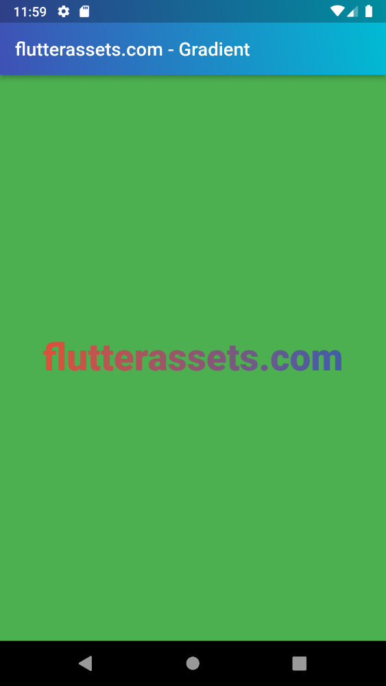
      body: Center(
        child: Container(
            height: MediaQuery.of(context).size.height,
            width: MediaQuery.of(context).size.width,
          color: Colors.green,
          alignment: Alignment.center,
          child: GradientText(
            'flutterassets.com',
            style: const TextStyle(fontSize: 40, fontWeight: FontWeight.w900),
            gradient: LinearGradient(colors: [
              Colors.red,
              Colors.indigo,
            ]),
          ),
        ),
      ),
You can read more about the Text widget in this post: Flutter Basics – What is and how to use Text widget in Flutter
You can read more about colour gradients in this post:How do you add a gradient background color in Flutter?
