Flutter Shadow
Flutter shadow is a visual effect that is used to give the impression of a raised or lowered element in a user interface. Shadows can be used to add depth and visual interest to elements such as text, buttons, and images.
In Flutter, shadows are often implemented using the BoxShadow class, which defines a box shadow in terms of its colour, blur radius, and offset. The BoxShadow class can be used to define a shadow for any box-like widget, such as a Container or a Card.
For example, here is how you can use the BoxShadow class to add a shadow to a Container widget in Flutter:
Container(
  width: 100.0,
  height: 100.0,
  decoration: BoxDecoration(
    color: Colors.green,
    boxShadow: [
      BoxShadow(
        color: Colors.black,
        blurRadius: 10.0,
        offset: Offset(5.0, 5.0),
      ),
    ],
  ),
)
This will create a green Container widget with a shadow that has a black colour, a blur radius of 10.0, and an offset of (5.0, 5.0). You can adjust these values to achieve the desired shadow effect.

In addition to the BoxShadow class, Flutter also provides the TextStyle class, which includes a shadows property that can be used to add shadows to text.
Flutter Text Shadow
To add a shadow to text in Flutter, you can use the TextStyle class, which provides several options for styling text, including the shadows property.
Here is an example of how you can use the TextStyle class to add a shadow to text in Flutter:
Padding(
  padding: const EdgeInsets.all(8.0),
  child: Text(
    'flutterassets.com',
    style: TextStyle(
      fontSize: 34,
      shadows: [
        Shadow(
          blurRadius: 10.0,
          color: Colors.black,
          offset: Offset(5.0, 5.0),
        ),
      ],
    ),
  ),
),
In this example, the Text widget is wrapped with padding and is displayed with a shadow that has a blur radius of 10.0, a black colour, and an offset of (5.0, 5.0). You can adjust these values to achieve the desired shadow effect.

Flutter Text with two Shadows
To create a text widget with a text style that includes two shadows in Flutter, you can use the Text widget and specify a TextStyle object with the shadows property set to a list of Shadow objects. Here’s an example of how you could do this:
Text(
  'Two Shadows',
  style: TextStyle(
    color: Colors.white,
    fontSize: 24.0,
    fontWeight: FontWeight.bold,
    letterSpacing: 1.5,
    shadows: [
      Shadow(
        blurRadius: 4.0,
        color: Colors.black,
        offset: Offset(2.0, 2.0),
      ),
      Shadow(
        blurRadius: 4.0,
        color: Colors.black,
        offset: Offset(-2.0, -2.0),
      ),
    ],
  ),
)
This will create a text widget with a custom text style that includes two shadows, with the shadows offset by 2 pixels in both the horizontal and vertical directions. You can customize the blur radius and colour of the shadows, as well as the text style, to achieve the desired effect.
Neumorphic text in Flutter
Neumorphism, or “neumorphic design,” refers to a style of user interface design that features soft, subtle, and slightly elevated elements. It is characterized by the use of gradients, shadows, and highlights to create a sense of depth and realism.
To create neumorphic text in Flutter, you can use the Text widget and customize its appearance using a combination of styles and effects.
Here’s an example of how you could create neumorphic text in Flutter:
Container(
  color: Colors.grey[300],
  padding: EdgeInsets.all(20),
  child: Text(
    'Neumorphic Text',
    style: TextStyle(
      fontSize: 34,
      color: Colors.grey[300],
      fontWeight: FontWeight.w900,
      shadows: [
        Shadow(
          blurRadius: 10,
          color: Colors.white,
          offset: Offset(-2, -2),
        ),
        Shadow(
          blurRadius: 10,
          color: Colors.black45,
          offset: Offset(2, 2),
        ),
      ],
    ),
  ),
)
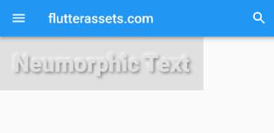
This will create a grey container with grey text inside with two shadows, one with white colour and a negative offset, and the other with black colour and a positive offset. The blurRadius property of the Shadow widget controls the amount of blur applied to the shadow.

In Flutter, you can use various techniques to achieve a neumorphic look and feel for your app’s user interface. This can include using the BoxDecoration class to apply gradients and shadows to widgets, using the TextStyle class to apply shadows to text, and use the InkWell or InkResponse widgets to create interactive neumorphic elements.
neumorphic button with neumorphic text in Flutter
Here’s an example of how you could create a neumorphic button with neumorphic text in Flutter:

body: Container(
  width: screenWidth,
  color: Colors.grey.shade300,
  child: Column(
    mainAxisAlignment: MainAxisAlignment.start,
    children: <Widget>[Padding(
        padding: const EdgeInsets.all(18.0),
        child: InkWell(
          onTap: () {
            // handle tap event
          },
          child: Container(
            padding: const EdgeInsets.all(8.0),
            width: 350,
            height: 50,
            decoration: BoxDecoration(
              color: Colors.grey[300],
              borderRadius: BorderRadius.circular(10),
              gradient: LinearGradient(
                colors: [Colors.grey.shade400, Colors.grey.shade200],
                begin: Alignment.topCenter,
                end: Alignment.bottomCenter,
              ),
              boxShadow: [
                BoxShadow(
                  color: Colors.grey.shade600,
                  blurRadius: 10,
                  offset: Offset(3, 3),
                ),
                BoxShadow(
                  color: Colors.white,
                  blurRadius: 10,
                  offset: Offset(-3, -3),
                ),
              ],
            ),
            child: Center(
              child: Text(
                'Neumorphic Button',
                style: TextStyle(
                  color: Colors.grey[300],
                  fontWeight: FontWeight.w900,
                  fontSize: 28,
                  shadows: [
                    Shadow(
                      blurRadius: 5,
                      color: Colors.grey.shade400,
                      offset: Offset(-2.5, -2.5),
                    ),
                    Shadow(
                      blurRadius: 5,
                      color: Colors.black45,
                      offset: Offset(2.5, 2.5),
                    ),
                  ],
                ),
              ),
            ),
          ),
        ),
      )
    ],
  ),
),
This will create a button with a soft, elevated appearance, using gradients, shadows, and highlights to give it a neumorphic look.
Flutter container shadow
To create a container with a shadow in Flutter, you can use the BoxDecoration class and specify the boxShadow property. Here’s an example:
Container(
  width: 200,
  height: 50,
  decoration: BoxDecoration(
    color: Colors.white,
    boxShadow: [
      BoxShadow(
        color: Colors.grey,
        blurRadius: 10,
        spreadRadius: 5,
      ),
    ],
  ),
)
This will create a container with a white background and a grey shadow with a blur radius of 10 and a spread radius of 5. You can adjust the properties of the BoxShadow to customize the appearance of the shadow.
Flutter Card shadow
In Flutter, the Card widget is a material design card. It has a elevation property that determines the depth of the shadow that is drawn when the card is lifted above the surface.
The elevation property takes a double value that specifies the z-coordinate at which to place the card. The higher the value, the greater the elevation and the more prominent the shadow will be.
Here’s an example of how you can use the elevation property:
Card(
  elevation: 8.0,
  shape: RoundedRectangleBorder(borderRadius: BorderRadius.circular(10.0)),
  child: Container(
    height: 50.0,
    width: 250.0,
    child: Text('My Card'),
  ),
)
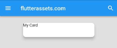
In this example, the Card widget has an elevation of 8.0, which gives it a medium-sized shadow.

You can adjust the elevation to suit your needs. A higher value will create a more prominent shadow, while a lower value will create a less prominent shadow.
Flutter FloatingActionButton shadow
In Flutter, the FloatingActionButton widget is a circular button that is displayed in the app as a secondary action. It has a elevation property that determines the depth of the shadow that is drawn when the button is lifted above the surface.
The elevation property takes a double value that specifies the z-coordinate at which to place the button. The higher the value, the greater the elevation and the more prominent the shadow will be.
Here’s an example of how you can use the elevation property:
floatingActionButton: FloatingActionButton(
  onPressed: () {},
  child: Icon(Icons.add),
  elevation: 8.0,
),
In this example, the FloatingActionButton has an elevation of 8.0, which gives it a medium-sized shadow.
Flutter ElevatedButton shadow
The style property of the ElevatedButton widget is used to customize the appearance of the button. In this case, the ElevatedButton.styleFrom method is used to create a ButtonStyle object with a custom elevation. The elevation property determines the size of the drop shadow displayed under the button. In this example, the elevation is set to 6.

ElevatedButton(
  child: const Text('Submit'),
  onPressed: () {},
  style: ElevatedButton.styleFrom(
    elevation: 6,
  ),
),
Flutter Icon shadow

Icon(
  Icons.battery_alert,
  shadows: <Shadow>[
    Shadow(color: Colors.red, blurRadius: 25.0),
    Shadow(color: Colors.red, blurRadius: 25.0),
  ],
  size: 60,
  color: Colors.black,
)
This code creates an icon widget that displays a battery alert icon with two red shadows, a size of 60 pixels, and a color of black. The Icons.battery_alert constant refers to a specific predefined icon from the Flutter material design icon set.
The shadows property takes a list of Shadow widgets, each of which allows you to specify the color and blur radius of a shadow to be drawn behind the icon. The size property sets the size of the icon in pixels, and the color property sets the color of the icon.
When this code is executed, it will display the battery alert icon with the specified shadows, size, and color on the screen.
Use stack of two icons to create shadow in Flutter
You can use a Stack widget to overlap two icons and create a shadow effect in Flutter. The Stack widget allows you to overlap multiple children widgets, with the last child appearing on top.
To move the shadow icon relative to the actual icon, you can wrap it in a Positioned widget and set the left and top properties to specify the distance to move the shadow icon.
Here is an example of how you can use a Stack to overlap two icons and create a shadow effect:
Stack(
  children: <Widget>[
    // The first icon is the shadow
    Positioned(
      left: 5,
      top: 5,
      child: Icon(
        Icons.battery_alert,
        color: Colors.grey[400],
        size: 60,
      ),
    ),
    // The second icon is the actual icon
    Icon(
      Icons.battery_alert,
      color: Colors.black,
      size: 60,
    ),
  ],
)
In this example, the shadow icon is wrapped in a Positioned widget and moved 5 pixels to the left and 5 pixels up relative to the actual icon. This creates the effect of a shadow to the bottom right of the actual icon.
You can adjust the left and top values as needed to achieve the desired shadow position. You can also adjust the size and color of the shadow and actual icon as needed to achieve the desired shadow effect.
Flutter Image shadow
Container(
  decoration: BoxDecoration(
    boxShadow: [
      BoxShadow(
        color: Colors.black54,
        blurRadius: 10.0,
        offset: Offset(5.0, 5.0),
      ),
    ],
  ),
  child: Image(
    image: NetworkImage('https://picsum.photos/250?image=9'),
  ),
)
In this example, we are using the decoration property of the Container widget to specify a BoxDecoration object that includes a shadow. The shadow is specified using a BoxShadow object, which has a color of Colors.black54, a blur radius of 10.0, and an offset of (5.0, 5.0).
The Image widget is then added as the child of the Container, which means that it will be displayed inside the container.
You can customize the shadow by adjusting the values of the BoxShadow properties. For example, you can change the color of the shadow by using a different color, such as Colors.blue or Colors.red. You can also adjust the blur radius and offset to control the appearance of the shadow.

Container(
  height: 250,
  width: 250,
  decoration: BoxDecoration(
    image: DecorationImage(
      image: NetworkImage('https://picsum.photos/250?image=9'),
    ),
    boxShadow: [
      BoxShadow(
        color: Colors.black54,
        blurRadius: 10.0,
        offset: Offset(5.0, 5.0),
      ),
    ],
  ),
)
In this example, we are using the decoration property of the Container widget to specify a BoxDecoration object that includes a shadow and an image. The shadow is specified using a BoxShadow object, which has a color of Colors.black54, a blur radius of 10.0, and an offset of (5.0, 5.0). The image is specified using a DecorationImage object, which has an image property that specifies the image to be displayed.
Flutter AppBar shadow

n Flutter, you can use the elevation property of the AppBar widget to give it a shadow. The elevation property specifies the z-coordinate at which to place the AppBar. The higher the value of elevation, the more shadow the AppBar will have.
Here is an example of how you can set the elevation property of an AppBar in Flutter:
appBar: AppBar(
  title: Text('flutterassets.com'),
  elevation: 6.0, // This gives the AppBar a shadow
    shadowColor: Colors.red,
),
The above code also change the colour of the shadow.


