What is Flutter ListTile
The Flutter ListTile is a single fixed-height row that is typically used to display a title, leading and trailing widgets, and up to three lines of content. It is typically used in a ListView widget, which is a scrollable list of items. The ListTile widget is a convenient wrapper that allows you to easily add a list tile with a single line of code, rather than having to manually add a row with multiple widgets. You can customize the appearance of the ListTile by changing the values of its various properties.
Here is an example of how to use a ListTile in Flutter:
ListTile(
  leading: Icon(Icons.star),
  title: Text('Title'),
  subtitle: Text('Subtitle'),
  trailing: Icon(Icons.arrow_forward),
),
This would create a ListTile with a leading icon, a title, a subtitle, and a trailing icon. The ListTile would take up a single row in a ListView.

Whare the Flutter ListTile can be used
ListTile is commonly used in ListView widgets, which are used to display scrolling lists of items. ListView widgets can be used in a variety of situations, such as:
- Displaying a list of items in a drawer or sidebar
- Displaying a list of options in a menu or settings screen
- Displaying a list of items in a shopping cart or wish list
- Displaying a list of search results
- Displaying a list of items in a social media feed or timeline
ListTile is a convenient widget to use in a ListView because it allows you to easily specify the content of a single row in the list, including the leading and trailing widgets, and up to three lines of content. This saves you from having to manually create a row with multiple widgets for each item in the list.
In addition to being used in ListView widgets, ListTile can also be used in other contexts where you want to display a single row with a leading and trailing widget, and up to three lines of content. For example, you could use a ListTile to display a row in a table or to display a row in a card.
What is the Flutter ListTile Leading element?
The leading element of a ListTile in Flutter is a widget that appears at the beginning of the row, before the title and subtitle. It is usually an icon, but it can be any widget.
Here’s an example of how you might use the leading element in a ListTile:
ListTile(
  leading: Icon(Icons.account_circle),
)
In this example, the leading element is an Icon widget that displays an account icon.
What is the Flutter ListTile Title element?
The title element of a ListTile in Flutter is the primary text in the ListTile. It is displayed in a large font and is the most prominent part of the ListTile.
Here’s an example of how you might use the title element in a ListTile:
ListTile(
  leading: Icon(Icons.account_circle),
  title: Text('User account'),

)
In this example, the title element is a Text widget that displays the text “User account”.
What is the Flutter ListTile Subtitle element?
The subtitle element of a ListTile in Flutter is secondary text that appears under the title. It is displayed in a smaller font than the title.
Here’s an example of how you might use the subtitle element in a ListTile:
ListTile(
  leading: Icon(Icons.account_circle),
  title: Text('User account'),
  subtitle: Text('Click to manage your account settings'),
)
In this example, the subtitle element is a Text widget that displays the text “Click to manage your account settings”.
What is the Flutter ListTile Trailing element?
The trailing element of a ListTile in Flutter is a widget that appears at the end of the row, after the title and subtitle. It is usually an icon, but it can be any widget.
Here’s an example of how you might use the trailing element in a ListTile:
ListTile(
  leading: Icon(Icons.account_circle),
  title: Text('User account'),
  subtitle: Text('Click to manage your account settings'),
  trailing: Icon(Icons.arrow_forward),
)
In this example, the trailing element is an Icon widget that displays an arrow icon.
How to use the onTap element in Flutter ListTile
The onTap property of a ListTile in Flutter is a callback that is called when the user taps the ListTile. You can use the onTap property to specify an action that should be taken when the ListTile is tapped.
Here’s an example of how you might use the onTap property in a ListTile:
ListTile(
  leading: Icon(Icons.account_circle),
  title: Text('User account'),
  subtitle: Text('Click to manage your account settings'),
  onTap: () {
    // Navigate to the account settings page
  },
)
In this example, the onTap property is set to a callback that is called when the ListTile is tapped.
Customize ListTile in Flutter
There are several ways to customize the appearance of a ListTile in Flutter:
- Change the values of the
leading,title,subtitle, andtrailingproperties: These properties allow you to specify the widgets that should be displayed as the leading and trailing icons, as well as the title and subtitle text. You can use any widget as the leading and trailing widget, and you can style the text using theTextwidget’s built-in styling options. - Change the value of the
contentPaddingproperty: This property allows you to specify the padding around the content of theListTile. You can use this to adjust the distance between the leading and trailing widgets and the title and subtitle text. - Change the values of the
denseandenabledproperties: Thedenseproperty determines whether theListTileshould have reduced vertical padding. Setting this totruewill make theListTilesmaller in height. Theenabledproperty determines whether theListTileis interactive. Setting this tofalsewill disable theListTileand make it appear greyed out. - Change the values of the
selectedandselectedColorproperties: Theselectedproperty determines whether theListTileshould be highlighted as selected. TheselectedColorproperty allows you to specify the colour that should be used to highlight theListTilewhen it is selected.
Here is an example of how you can customize a ListTile in Flutter:
Column(
  children: [
    const ListTile(
      leading: Icon(Icons.star, color: Colors.red),
      title: Text('Title', style: TextStyle(fontSize: 20)),
      subtitle: Text('Subtitle', style: TextStyle(fontSize: 16)),
      trailing: Icon(Icons.arrow_forward),
      contentPadding: EdgeInsets.symmetric(horizontal: 10, vertical: 5),
      dense: true,
      enabled: false,
      selected: true,
      selectedColor: Colors.blue,
    ),
    const ListTile(
      leading: Icon(Icons.star, color: Colors.red),
      title: Text('Title', style: TextStyle(fontSize: 20)),
      subtitle: Text('Subtitle', style: TextStyle(fontSize: 16)),
      trailing: Icon(Icons.arrow_forward),
      contentPadding: EdgeInsets.symmetric(horizontal: 10, vertical: 5),
      dense: true,
      enabled: true,
      selected: true,
      selectedColor: Colors.blue,
    ),
  ],
),
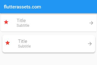
This would create a ListTile with a red star as the leading icon, a larger title, a smaller subtitle, and a trailing arrow. The ListTile would have symmetrical horizontal and vertical padding around the content, it would be smaller in height due to the dense property being set to true, it would be disabled and appear greyed out due to the enabled property being set to false, and it would be highlighted in blue when selected due to the selected and selectedColor properties being set to true and Colors.blue, respectively.

Use Flutter Card with ListTile
To wrap the ListTile in a Card widget, you would simply nest the ListTile inside a Card widget like this:
Card(
  child: ListTile(
    leading: Icon(Icons.star, color: Colors.red),
    title: Text('Title', style: TextStyle(fontSize: 20)),
    subtitle: Text('Subtitle', style: TextStyle(fontSize: 16)),
    trailing: Icon(Icons.arrow_forward),
    contentPadding: EdgeInsets.symmetric(horizontal: 10, vertical: 5),
    dense: true,
    enabled: false,
    selected: true,
    selectedColor: Colors.blue,
  ),
),
This would create a Card widget with a ListTile as its child. The ListTile would have the same customization options as in the previous example. The Card widget adds a box-like container around the ListTile, which you can customize by setting the values of its various properties.
Here is an example of how you could further customize the Card widget:
Card(
  elevation: 4,
  margin: EdgeInsets.all(10),
  shape: RoundedRectangleBorder(borderRadius: BorderRadius.circular(10)),
  child: ListTile(
    leading: Icon(Icons.star, color: Colors.red),
    title: Text('Title', style: TextStyle(fontSize: 20)),
    subtitle: Text('Subtitle', style: TextStyle(fontSize: 16)),
    trailing: Icon(Icons.arrow_forward),
    contentPadding: EdgeInsets.symmetric(horizontal: 10, vertical: 5),
    dense: true,
    enabled: false,
    selected: true,
    selectedColor: Colors.blue,
  ),
),
This would create a Card widget with a 4px shadow, a 10px margin around all sides, and a rounded border with a radius of 10px. The Card would contain the same ListTile as in the previous example.

Use Image in the Flutter ListTile
To add an image as the leading element of the ListTile in the previous example, you can replace the Icon widget with an Image widget. Here is how you can do this:
Card(
  elevation: 4,
  margin: EdgeInsets.all(10),
  shape: RoundedRectangleBorder(borderRadius: BorderRadius.circular(10)),
  child: ListTile(
    leading: Image.network('https://picsum.photos/250?image=9'),
    title: Text('Title', style: TextStyle(fontSize: 20)),
    subtitle: Text('Subtitle', style: TextStyle(fontSize: 16)),
    trailing: Icon(Icons.arrow_forward),
    contentPadding: EdgeInsets.symmetric(horizontal: 10, vertical: 5),
    dense: true,
    enabled: false,
    selected: true,
    selectedColor: Colors.blue,
  ),
),
This would create a Card widget with a ListTile as its child. The ListTile would have an image as the leading element, which is loaded from the network using the Image.network constructor. The ListTile would have the same customization options as in the previous example. The Card widget would have a 4px shadow, a 10px margin around all sides, and a rounded border with a radius of 10px.

Change Flutter ListTile background colour
To change the background colour of a ListTile in Flutter, you can wrap the ListTile in a Container widget and set the decoration property of the Container to a BoxDecoration with the desired background colour.
Here is an example of how you can change the background colour of a ListTile using a Container with a BoxDecoration:
Container(
  decoration: BoxDecoration(
    color: Colors.blue,
  ),
  child: ListTile(
    leading: Image.network('https://picsum.photos/250?image=9'),
    title: Text('Title', style: TextStyle(fontSize: 20)),
    subtitle: Text('Subtitle', style: TextStyle(fontSize: 16)),
    trailing: Icon(Icons.arrow_forward),
    contentPadding: EdgeInsets.symmetric(horizontal: 10, vertical: 5),
    dense: true,
  ),
),
This would create a Container with a blue background colour and a ListTile as its child. The ListTile would have the same customization options as in the previous example. The background colour of the ListTile would be the same as the background colour of the Container, which is blue.
Alternatively, you can also use the color property of the Card widget to set the background colour of the ListTile.
Here is an example of how you can change the background colour of a ListTile using the color property of the Card widget:
Card(
  color: Colors.blue,
  child: ListTile(
    leading: Image.network('https://picsum.photos/250?image=9'),
    title: Text('Title', style: TextStyle(fontSize: 20)),
    subtitle: Text('Subtitle', style: TextStyle(fontSize: 16)),
    trailing: Icon(Icons.arrow_forward),
    contentPadding: EdgeInsets.symmetric(horizontal: 10, vertical: 5),
    dense: true,
  ),
),
This would create a Card with a blue background colour and a ListTile as its child. The ListTile would have the same customization options as in the previous example. The background colour of the ListTile would be the same as the background colour of the Card, which is blu

Add Flutter ListTile Background Image
To add an image as the background of a ListTile in Flutter, you can wrap the ListTile in a Container widget and set the decoration property of the Container to a BoxDecoration with an image parameter.
Here is an example of how you can add an image as the background of a ListTile using a Container with a BoxDecoration:
Container(
  decoration: BoxDecoration(
    image: DecorationImage(
      image: NetworkImage('https://picsum.photos/500'),
      fit: BoxFit.cover,
    ),
  ),
  child: ListTile(
    leading: Image.network('https://picsum.photos/200'),
    title: Text('Title', style: TextStyle(fontSize: 20)),
    subtitle: Text('Subtitle', style: TextStyle(fontSize: 16)),
    trailing: Icon(Icons.arrow_forward, color: Colors.red,),
    contentPadding: EdgeInsets.symmetric(horizontal: 10, vertical: 5),
    dense: true,
  ),
),
This would create a Container with an image as its background and a ListTile as its child. The image is loaded from the network using the NetworkImage class and is set to cover the entire Container using the fit: BoxFit.cover option. The ListTile would have the same customization options as in the previous example. The background image of the ListTile would be the same as the background image of the Container.
Here is how you can wrap the above code for adding an image as the background of a ListTile using a Container with a BoxDecoration inside a Card widget:
Card(
  elevation: 4,
  margin: EdgeInsets.all(10),
  shape: RoundedRectangleBorder(borderRadius: BorderRadius.circular(10)),
  child: Container(
    decoration: BoxDecoration(
      borderRadius: new BorderRadius.all(new Radius.circular(10.0)),
      image: DecorationImage(
        image: NetworkImage('https://picsum.photos/500'),
        fit: BoxFit.cover,
      ),
    ),
    child: ListTile(
      leading: Image.network('https://picsum.photos/200'),
      title: Text('Title', style: TextStyle(fontSize: 20)),
      subtitle: Text('Subtitle', style: TextStyle(fontSize: 16)),
      trailing: Icon(Icons.arrow_forward),
      contentPadding: EdgeInsets.symmetric(horizontal: 10, vertical: 5),
      dense: true,
    ),
  ),
),
This would create a Card widget with a Container as its child. The Container would have an image as its background and a ListTile as its child. The image is loaded from the network using the NetworkImage class and is set to cover the entire Container using the fit: BoxFit.cover option. The ListTile would have the same customization options as in the previous example. The Card widget would have a 4px shadow, a 10px margin around all sides, and a rounded border with a radius of 10px. The background image of the ListTile would be the same as the background image of the Container.

Flutter ListTile with Button
To add an ElevatedButton to a ListTile in Flutter, you can use the trailing property of the ListTile and specify an ElevatedButton widget as the trailing element.
Here is an example:
ListTile(
  title: Text('ListTile Title'),
  subtitle: Text('ListTile Subtitle'),
  trailing: ElevatedButton(
    child: Text('Button'),
    onPressed: () {
      // button press logic
    },
  ),
)
This will display the ElevatedButton to the right of the ListTile.

Flutter ListTile with two Buttons
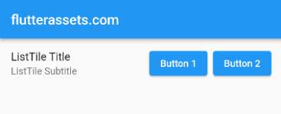
To add two buttons to a ListTile in Flutter, you can use the trailing property of the ListTile and specify a Row widget as the trailing element, with the two buttons as children of the Row.
Here is an example:
ListTile(
  title: Text('ListTile Title'),
  subtitle: Text('ListTile Subtitle'),
  trailing: Row(
    mainAxisSize: MainAxisSize.min,
    children: [
      ElevatedButton(
        child: Text('Button 1'),
        onPressed: () {
          // button 1 press logic
        },
      ),
      SizedBox(width: 8),
      ElevatedButton(
        child: Text('Button 2'),
        onPressed: () {
          // button 2 press logic
        },
      ),
    ],
  ),
)
This will display the two ElevatedButton widgets to the right of the ListTile.

Can I use any button in the Flutter ListTile trailing
Yes, you can use any widget as the trailing element in a ListTile. The trailing property takes any widget, so you can use a button, an icon, an image, or any other widget that you want to display after the title and subtitle content.
Here’s an example of how you can use a custom button as the trailing element in a ListTile:
ListTile(
  title: Text('Item'),
  trailing: TextButton(
    onPressed: () {
      // Handle button press
    },
    child: Text('Button'),
  ),
)
Keep in mind that the ListTile widget is designed to be used in a vertical scrolling list. If you want to use it in a different context, you may need to adjust the layout and behaviour accordingly.

Can I use any button in a leading element of Flutter ListTile
Yes, you can use any widget as the leading element in a ListTile. The leading property takes any widget, so you can use a button, an icon, an image, or any other widget that you want to display before the title and subtitle content.
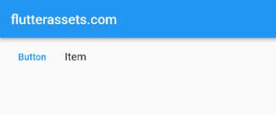
Here’s an example of how you can use a custom button as the leading element in a ListTile:
ListTile(
  leading: TextButton(
    onPressed: () {
      // Handle button press
    },
    child: Text('Button'),
  ),
  title: Text('Item'),
)


