What is a Banner widget in Flutter?
The Flutter banner widget is a user interface element that is used to draw attention to important information or actions in an application. It consists of a rectangular container with a diagonal strip of colour that overlays one of the corners of the container. The colour and text inside the banner can be customized to suit the needs of the application. Banners are often used to display status information, warnings, or error messages to the user.
The banner widget is commonly used in mobile and web applications to provide feedback to the user about the status of the application or a specific task. For example, a banner might be used to indicate that a user’s internet connection is currently offline or to provide a warning that a user is about to delete important data.
Banners are easy to use in Flutter and can be customized to suit the specific needs of an application. They can be added to the user interface using simple code and can be customized with different colours, fonts, and icons to make them stand out or fit in with the overall design of the application.
Overall, the banner widget is a useful and flexible user interface element that can help to improve the usability and functionality of mobile and web applications. By drawing attention to important information and providing feedback to the user, banners can help to improve the user experience and make it easier for users to navigate and use the application.
Other names for the Flutter Banner widget
Here’s a list of some other terms that might be used to describe a banner widget or a similar visual element in different contexts:
Ribbon:
A graphical element that is similar to a banner, but is typically longer and thinner, and may be used to draw attention to a specific area of a screen or document.
Corner badge:
A small graphical element that is typically placed in one corner of a larger element, such as an image or button, to provide additional information or context.
Corner label:
A visual label that is placed in one corner of a larger element to provide information about that element, such as a status indicator or a label for a tab or section.
Corner tag:
A graphical tag that is typically placed in one corner of an element to provide additional information or context. Tags may be used to highlight important information, provide context, or indicate the status of an element.
Alert box:
A pop-up window or dialog box that is used to display important information or alerts to the user. Alert boxes may be used to provide warnings, errors, or other types of feedback to the user.
Notification:
A small message or alert that is displayed to the user to provide information or feedback about an event or action. Notifications may be displayed in a banner or pop-up window or may appear as a small icon or message in the user interface.
Overall, the terms used to describe visual elements like banners can vary depending on the context and the specific design language or framework being used. However, in most cases, these elements are designed to draw attention to important information or actions and to provide feedback and context to the user.
How to use the Banner widget in Flutter
Using the Banner widget in Flutter is simple and straightforward. Here’s an example of how to use the Banner widget:
Banner(
  message: 'This is a banner message',
  location: BannerLocation.topEnd,
  color: Colors.red,
  child: // Your widget goes here
)
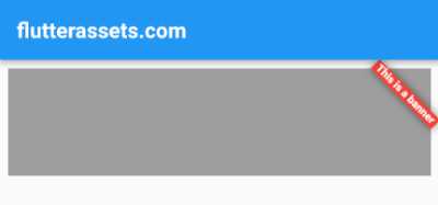
In this example, the Banner widget is being used to display a message at the top end of the widget it is wrapping. The message parameter specifies the text to be displayed in the banner, while the location parameter specifies where the banner should be placed relative to the child widget (in this case, at the top end). The color parameter specifies the colour of the diagonal strip of colour that appears over the banner.
The child widget that the banner is wrapping can be any widget that you would like to display with the banner. For example, you might use the Banner widget to display a warning message above a form that the user is filling out or to provide feedback on the status of a long-running task.

Padding(
  padding: const EdgeInsets.all(8.0),
  child: Banner(
      message: 'This is a banner',
      location: BannerLocation.topEnd,
      color: Colors.red,
      child: Container(
        height: 100,
        width: double.infinity,
        color: Colors.grey,
      )
  ),
),
How to customize the Flutter Banner
Customizing a Flutter banner is easy, and there are several properties that can be used to modify the appearance and behaviour of the banner. Here is a list of some of the properties that can be used to customize a banner:
message: A string that specifies the text to be displayed in the banner.location: An enum that specifies where the banner should be placed relative to the child widget. Possible values includetopStart,topEnd,bottomStart, andbottomEnd.color: The colour of the diagonal strip that appears over the banner.textDirection: The text directionality of the banner message.textStyle: The style of the text in the banner.child: The child widget that the banner is wrapping.
Here is an example of how to use these properties to customize a banner:
Padding(
  padding: const EdgeInsets.all(8.0),
  child: Banner(
      message: 'This is a banner message',
      location: BannerLocation.topStart,
      color: Colors.red,
      textDirection: TextDirection.ltr,
      textStyle: TextStyle(
        color: Colors.lightGreenAccent,
        fontWeight: FontWeight.bold,
        fontSize: 16,
      ),
      child: Container(
        height: 100,
        width: double.infinity,
        color: Colors.grey,
      )
  ),
),
In this example, the message property is set to display the text “This is a banner message”. The location property is set to topStart, which means that the banner will appear at the top left corner of the child widget. The color property is set to red, and the textDirection property is set to left-to-right. The textStyle property is used to customize the font size, weight, and colour of the banner text.
Finally, the child property is set to a grey container that the banner is wrapping. This child widget can be replaced with any other widget that you want to display in the banner.
Please note: At the moment of writing, the Banner widget does not have the property to change the size or thickness of the corner ribbon.
Create a custom Corner Clickable Banner in Flutter
Flutter Corner Clickable Banner is a custom widget that can be added to your Flutter app. This banner is designed to sit in the corner of your screen and feature a clickable icon. It is an excellent way to showcase important information to users while still allowing them to navigate throughout the app.
To create a Flutter Corner Clickable Banner, you can use the above code as a starting point. The code consists of a stateless widget called CornerBanner that takes in parameters such as color, size, icon, iconColor, iconSize, and onTap.
class ColoredCorner extends StatelessWidget {
  final Color color;
  final double size;
  final Widget child;
  final IconData icon;
  final double iconSize;
  final Color iconColor;
  final VoidCallback? onTap;

  ColoredCorner({
    this.color = Colors.red,
    this.size = 50,
    required this.child,
    this.icon = Icons.home,
    this.iconSize = 24,
    this.iconColor = Colors.white,
    this.onTap,
  });

  @override
  Widget build(BuildContext context) {
    return Stack(
      children: [
        child,
        Positioned(
          top: 0,
          right: 0,
          child: CustomPaint(
            painter: _TrianglePainter(color),
            size: Size(size, size),
          ),
        ),
        Positioned(
          top: 0,
          right: 0,
          child: GestureDetector(
            onTap: onTap,
            child: Icon(
              icon,
              size: iconSize,
              color: iconColor,
            ),
          ),
        ),
      ],
    );
  }
}

class _TrianglePainter extends CustomPainter {
  final Color color;

  _TrianglePainter(this.color);

  @override
  void paint(Canvas canvas, Size size) {
    final paint = Paint()..color = color;

    final path = Path()
      ..moveTo(size.width, 0)
      ..lineTo(0, 0)
      ..lineTo(size.width, size.height)
      ..close();

    canvas.drawPath(path, paint);
  }

  @override
  bool shouldRepaint(_TrianglePainter oldDelegate) => false;
}
The CornerBanner widget is built on top of a Stack widget, allowing you to layer your icon over other widgets. The banner’s coloured corner is created by a custom painter called _TrianglePainter. The _TrianglePainter class takes in the color parameter and uses it to paint a triangular shape in the top-right corner of the banner.
The icon in the CornerBanner widget is clickable, and you can pass a function to the onTap parameter to determine what happens when a user clicks on it. You can customize the icon parameter with different icons and adjust the iconColor and iconSize to your preference.
To use the CornerBanner widget in your app, you can simply instantiate it and pass in the required parameters. For example:
ColoredCorner(
  color: Colors.red,
  size: 50,
  icon: Icons.settings,
  iconSize: 30,
  iconColor: Colors.white,
  onTap: (){ print('Banner Clicked'); },
  child: Container(
    width: double.infinity,
    height: 200,
    color: Colors.grey,
  ),
)
What could be added to the Flutter Corner Clickable Banner
Here are some functionalities that could be added to the Flutter Corner Clickable Banner:
- Dynamic placement: Currently, the banner is only positioned in the top right corner. It would be nice to add the ability to place the banner in any corner of the container based on the user’s needs. This could be achieved by adding a parameter to the widget that specifies which corner the banner should be placed in.
- Animations: Animations can add a nice touch to any widget. It would be nice to add some animations to the banner, such as fading in and out or moving the banner up and down. Flutter provides many built-in animations that can be easily added to the widget.
- Border radius: The current implementation of the banner only supports a right-angle triangle. Adding support for a rounded corner triangle would allow for a more diverse set of designs. This can be achieved by using the
Containerwidget to wrap the child and add aBoxDecorationwith a custom border. - Gradient support: Adding support for a gradient background colour would allow for a more complex set of designs. This could be achieved by adding a parameter to the widget that specifies the gradient colour.
- Multiple clickable areas: Adding support for multiple clickable areas within the banner would allow for more complex interactions. This could be achieved by adding a parameter to the widget that specifies the number of clickable areas and their positions within the banner.
- Text Label: Add the ability to display a text label alongside the icon in the banner. This can be achieved by placing a
Rowwidget inside theStackand adding aTextwidget alongside theIconwidget.
These are just a few examples of functionalities that could be added to the Flutter Corner Clickable Banner. The possibilities are endless and depend on the specific needs of your app or project.
How to create a Custom Corner Tag widget in Flutter
To create a custom corner tag widget in Flutter, we can use a combination of a Stack and a Column widget. The Stack widget will allow us to position the tag in the corner of the parent widget, and the Column widget will allow us to display a list of tags with their own style.
We can define the following parameters for the custom corner tag widget:
child: This is the widget that the tag will be attached to.tagStyle: This is the TextStyle for the tag text.tags: This is a list of tags that will be displayed in the tag area.tagAlignment: This is the alignment of the tag area within the corner. We can use theAlignmentclass to define this parameter.tagAreaColor: This is the background colourof the tag area.tagColor: This is the border colour of each individual tag.tagBorderRadius: This is the border radius of each individual tag.
To create the custom corner tag widget, we can use the following code:
class CornerTag extends StatelessWidget {
  final Widget child;
  final TextStyle tagStyle;
  final List<String> tags;
  final Alignment tagAlignment;
  final Color tagColor;
  final Color tagAreaColor;
  final double tagBorderRadius;

  CornerTag({
    required this.child,
    this.tagStyle = const TextStyle(color: Colors.black),
    this.tags = const [],
    this.tagAlignment = Alignment.topRight,
    this.tagColor = Colors.red,
    this.tagAreaColor = Colors.transparent,
    this.tagBorderRadius = 8.0,
  });

  @override
  Widget build(BuildContext context) {
    return Stack(
      children: [
        child,
        Positioned(
          top: 0,
          right: 0,
          child: Container(
            margin: EdgeInsets.only(top: 2, right: 2),
            decoration: BoxDecoration(
              color: tagAreaColor,
              borderRadius: BorderRadius.only(
                topLeft: Radius.circular(tagBorderRadius),
                bottomLeft: Radius.circular(tagBorderRadius),
              ),
            ),
            child: Column(
              crossAxisAlignment: CrossAxisAlignment.end,
              children: tags
                  .map(
                    (tag) => Container(
                      margin: EdgeInsets.all(2),
                  padding: EdgeInsets.symmetric(
                    vertical: 4.0,
                    horizontal: 8.0,
                  ),
                  decoration: BoxDecoration(
                    color: tagColor,
                    borderRadius: BorderRadius.all(Radius.circular(tagBorderRadius)),
                    // borderRadius: BorderRadius.only(
                    //   topLeft: Radius.circular(tagBorderRadius),
                    //   bottomLeft: Radius.circular(tagBorderRadius),
                    // ),
                  ),
                  child: Text(
                    tag,
                    style: tagStyle,
                  ),
                ),
              )
                  .toList(),
            ),
          ),
        ),
      ],
    );
  }
}
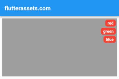
In the code above, we use a Stack widget to position the tag area in the top-right corner of the parent widget. We use a Container widget with a BoxDecoration to define the background colour and border radius of the tag area. We also use a Column widget to display the list of tags.
Each tag is defined as a Container with its own BoxDecoration to define the border colour and border-radius. The text for each tag is defined as a Text widget with the tagStyle parameter. We use the map function to convert the list of tags into a list of Container widgets, and then use the toList function to convert the result into a List.
We can customize the appearance of the custom corner tag widget by changing the values of the parameters. For example, we can change the background colour of the tag area by changing the tagAreaColor parameter. We can also change the border radius of each individual tag by changing the tagBorderRadius parameter.
Here is how to use the above widget:
Padding(
  padding: const EdgeInsets.all(8.0),
  child: CornerTag(
    tags: ['red', 'green', 'blue'],
    tagStyle: TextStyle(color: Colors.white),
    child: Container(
      width: double.infinity,
      height: 200,
      color: Colors.grey,
    ),
  )
),


