What is the Flutter ActionChip Widget
Flutter ActionChip widget is a UI component that displays a short text label and an optional icon that represents an actionable item. It’s a user interface element that allows users to interact with an app by selecting options or performing actions.
ActionChips are designed to be compact and efficient, occupying minimal space on the screen. They’re often used in situations where there are a limited number of actions available, such as filtering a list of items or selecting a category.
When a user taps on an ActionChip, it triggers an action associated with it. This could be anything from filtering a list of items to adding an item to a shopping cart. The action that is triggered is defined by the developer, and can be customized to meet the needs of the app.
ActionChips can be customized to match the look and feel of the app by changing the text label, icon, background colour, and more. They can also be grouped together to form a set of related actions, making it easy for users to find and select the action they want.
What is the difference between Chip and ActionChip widget
The Flutter Chip widget and the Flutter ActionChip widget are both UI components in Flutter that display a short text label and an optional icon. However, there are some key differences between the two.
The Flutter Chip widget is used to display static information, such as a category label or a tag. It’s a read-only component, meaning that it doesn’t have any interactive functionality. When a user taps on a Chip, nothing happens.
On the other hand, the Flutter ActionChip widget is designed to be interactive. It’s used to represent an actionable item, such as a button or a link. When a user taps on an ActionChip, it triggers an action associated with it, such as navigating to a new screen or updating the state of the app.
Another difference between the two widgets is that the ActionChip widget has a slightly different appearance. It has a more pronounced border and a raised effect, making it look more like a button than a label.
Despite these differences, both the Flutter Chip widget and the Flutter ActionChip widget are highly customizable. Developers can change the text label, icon, and background colour of both widgets to match the look and feel of their app.
Where the Flutter ActionChip widget can be used
The Flutter ActionChip widget can be used in a variety of ways to enhance the user experience of a Flutter app. Here are some common use cases:
- Filtering and Sorting – ActionChips can be used to allow users to filter and sort data, such as by price, rating, or date. Each ActionChip can represent a different sorting or filtering option, allowing users to easily select the criteria they want.
- Navigation – ActionChips can be used as buttons to navigate to different screens or views within an app. For example, a “Home” ActionChip could be used to take the user back to the app’s home screen.
- Sharing – ActionChips can be used to share content from an app on social media or other platforms. For example, a “Share” ActionChip could be used to share an article or image on Facebook, Twitter, or Instagram.
- Selection – ActionChips can be used to allow users to select one or more items from a list or grid. Each ActionChip could represent a different item, allowing users to easily select the items they want.
- Call to Action – ActionChips can be used as a call to action to encourage users to take a specific action, such as signing up for a newsletter or downloading an app.
ActionChip widget as a Button in Flutter
Yes, you can use it as a button. The ActionChip widget has an onPressed property that you can use to define the action that should be performed when the chip is pressed.
ActionChip(
  label: Text('Button Text'),
  backgroundColor: Colors.blue,
  onPressed: () {
    // Perform the desired action here
    print('Button Pressed');
  },
),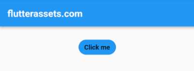
In this example, we’ve defined an ActionChip widget with a label of “Click me” and a blue background colour. We’ve also defined the onPressed event, which is triggered when the button is pressed.
When the user taps on the ActionChip, the onPressed event is triggered, and we can perform the desired action here, such as navigating to a new screen or updating the state of the app.
The onPressed event can be used to define any action you want to perform when the button is pressed. You can use it to call a function, update a variable, or perform any other action you want.
Using the Flutter ActionChip widget as a button is a simple and effective way to add interactivity to your app.
How to disable the Flutter ActionChip Widget after pressed
To disable a Flutter ActionChip Widget after it has been pressed, you can use the StatefulWidget class to create a widget that can be updated dynamically.
First, you will need to create a variable that will store the current state of the widget. You can do this by creating a boolean variable and setting it to true initially.
Next, you can use the onPressed property of the ActionChip Widget to change the state of the variable to false when the chip is pressed. This will disable the chip from being pressed again.
To update the widget based on the new state of the variable, you can use the setState method within the onPressed property. This will cause the widget to rebuild with the updated state.
Here’s an example code snippet to illustrate the process:
bool _isEnabled = true;

@override
Widget build(BuildContext context) {
  return Scaffold(
    appBar: AppBar(
      title: Text('flutterassets.com'),
    ),
    body: Container(
      alignment: Alignment.topCenter,
      padding: EdgeInsets.all(16),
      child: ActionChip(
        label: Text('My Action Chip'),
        backgroundColor: Colors.blue,
        onPressed: _isEnabled
            ? () {
          setState(() {
            _isEnabled = false;
          });
        }
            : null, // If _isEnabled is false, onPressed is disabled
      )
    ),
  );
}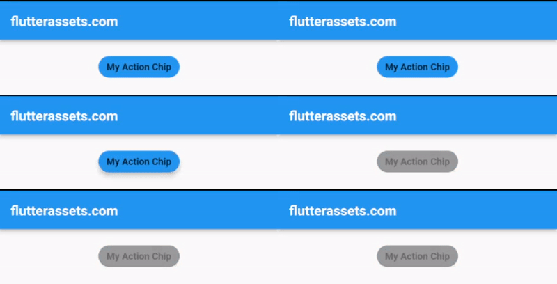
In this example, the ActionChip is initially enabled because the _isEnabled variable is set to true. When the chip is pressed, the setState method updates the state of the variable to false, which disables the onPressed property of the ActionChip.
Use the Flutter ActionChip widget for Filtering and Sorting
Here is an example of how to use the Flutter ActionChip widget as filtering and sorting options:
import 'package:flutter/material.dart';

void main() {
  runApp(MyApp());
}

class MyApp extends StatelessWidget {

  @override
  Widget build(BuildContext context) {
    return MaterialApp(
      debugShowCheckedModeBanner: false,
      title: 'Flutter Demo',
      theme: ThemeData(
        primarySwatch: Colors.blue,
      ),
      home: MyHomePage(),
    );
  }
}

class MyHomePage extends StatefulWidget {

  @override
  State<MyHomePage> createState() => _MyHomePageState();
}
class _MyHomePageState extends State<MyHomePage>{

  List<Product> _products = [
    Product('Product 1', 9.99, 4.5, DateTime.now().subtract(Duration(days: 7))),
    Product('Product 2', 4.99, 3.0, DateTime.now().subtract(Duration(days: 2))),
    Product('Product 3', 14.99, 5.0, DateTime.now().subtract(Duration(days: 5))),
    Product('Product 4', 7.99, 4.0, DateTime.now().subtract(Duration(days: 3))),
  ];

  String _selectedFilter = 'All';
  String _selectedSort = 'Name';

  List<Product> get _filteredProducts {
    switch (_selectedFilter) {
      case 'All':
        return _products;
      case 'Rating':
        return _products.where((product) => product.rating >= 4.0).toList();
      case 'Price':
        return _products.where((product) => product.price <= 10.0).toList();
      default:
        return _products;
    }
  }

  List<Product> get _sortedProducts {
    switch (_selectedSort) {
      case 'Name':
        return _filteredProducts..sort((a, b) => a.name.compareTo(b.name));
      case 'Rating':
        return _filteredProducts..sort((a, b) => b.rating.compareTo(a.rating));
      case 'Price':
        return _filteredProducts..sort((a, b) => a.price.compareTo(b.price));
      case 'Date':
        return _filteredProducts..sort((a, b) => b.date.compareTo(a.date));
      default:
        return _filteredProducts;
    }
  }

  @override
  Widget build(BuildContext context) {

    return Scaffold(
      appBar: AppBar(
        title: Text('flutterassets.com'),
      ),
      body: Column(
          children: [
          SizedBox(height: 16),
        Wrap(
          spacing: 8,
          children: [
            ActionChip(
              label: Text('All'),
              backgroundColor: _selectedFilter == 'All' ? Colors.blue : Colors.grey,
              onPressed: () {
                setState(() {
                  _selectedFilter = 'All';
                });
              },
            ),
            ActionChip(
              label: Text('Rating >= 4'),
              backgroundColor: _selectedFilter == 'Rating' ? Colors.blue : Colors.grey,
              onPressed: () {
                setState(() {
                  _selectedFilter = 'Rating';
                });
              },
            ),
            ActionChip(
              label: Text('Price <= \$10'),
              backgroundColor: _selectedFilter == 'Price' ? Colors.blue : Colors.grey,
              onPressed: () {
                setState(() {
                  _selectedFilter = 'Price';
                });
              },
            ),
          ],
        ),
        SizedBox(height: 16),
        Wrap(
            spacing: 8,
            children: [
        ActionChip(
        label: Text('Name'),
          backgroundColor: _selectedSort == 'Name' ? Colors.blue : Colors.grey,
          onPressed: () {
            setState(() {
              _selectedSort = 'Name';
            });
          },
        ),
              ActionChip(
                label: Text('Rating'),
                backgroundColor: _selectedSort == 'Rating' ? Colors.blue : Colors.grey,
                onPressed: () {
                  setState(() {
                    _selectedSort = 'Rating';
                  });
                },
              ),
              ActionChip(
                label: Text('Price'),
                backgroundColor: _selectedSort == 'Price' ? Colors.blue : Colors.grey,
                onPressed: () {
                  setState(() {
                    _selectedSort = 'Price';
                  });
                },
              ),
              ActionChip(
                label: Text('Date'),
                backgroundColor: _selectedSort == 'Date' ? Colors.blue : Colors.grey,
                onPressed: () {
                  setState(() {
                    _selectedSort = 'Date';
                  });
                },
              ),
            ],
        ),
            SizedBox(height: 16),
            Expanded(
              child: ListView.builder(
                itemCount: _sortedProducts.length,
                itemBuilder: (context, index) {
                  final product = _sortedProducts[index];
                  return ListTile(
                    title: Text(product.name),
                    subtitle: Column(
                      crossAxisAlignment: CrossAxisAlignment.start,
                      children: [
                        Text('Price: \$${product.price}'),
                        Text('Rating: ${product.rating.toStringAsFixed(1)}'),
                        Text('Date: ${product.date.toString()}'),
                      ],
                    ),
                  );
                },
              ),
            ),
          ],
      ),
    );
  }
}

class Product {
  final String name;
  final double price;
  final double rating;
  final DateTime date;

  Product(this.name, this.price, this.rating, this.date);
}
In the example above, the home page is defined by the MyHomePage class that extends the StatefulWidget class. The class contains a list of products defined in the _products variable. The class also has two private methods _filteredProducts and _sortedProducts that filter and sort the products based on the selected criteria.
The build method of the MyHomePage class returns a Scaffold widget that includes an AppBar and a Column containing two Wrap widgets and a ListView.builder.
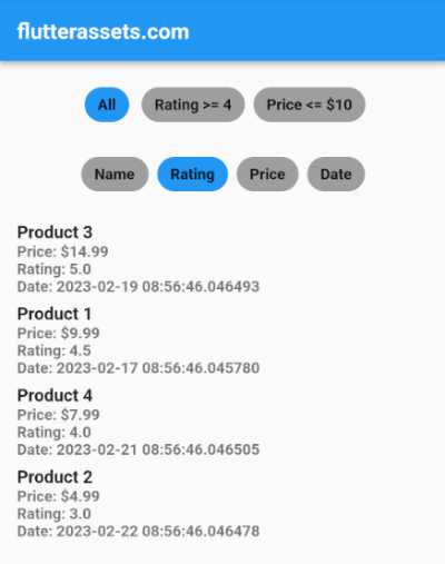
The first Wrap widget includes ActionChip widgets that allow the user to select a filter criteria, such as ‘All’, ‘Rating >= 4’, or ‘Price <= $10’. The backgroundColor of each ActionChip changes to blue if the user selects it, and to grey if it’s not selected. When the user selects a filter, the _selectedFilter variable is updated, and the setState() method is called to rebuild the app’s UI with the new filter.
The second Wrap widget includes ActionChip widgets that allow the user to select a sort criteria, such as ‘Name’, ‘Rating’, ‘Price’, or ‘Date’. The backgroundColor of each ActionChip changes to blue if the user selects it, and to grey if it’s not selected. When the user selects a sort, the _selectedSort variable is updated, and the setState() method is called to rebuild the app’s UI with the new sort.
Finally, the ListView.builder widget displays the filtered and sorted list of products. Each product is displayed as a ListTile widget that includes the product name, price, rating, and date. The itemBuilder method is called for each product in the _sortedProducts list, and the final product variable is used to retrieve the product’s properties.
Use the Flutter ActionChip widget for Navigation
Here’s an example of using ActionChip as a navigation button:
import 'package:flutter/material.dart';

void main() {
  runApp(MyApp());
}

class MyApp extends StatelessWidget {

  @override
  Widget build(BuildContext context) {
    return MaterialApp(
      debugShowCheckedModeBanner: false,
      title: 'Flutter Demo',
      theme: ThemeData(
        primarySwatch: Colors.blue,
      ),
      home: MyHomePage(),
    );
  }
}

class MyHomePage extends StatefulWidget {

  @override
  State<MyHomePage> createState() => _MyHomePageState();
}
class _MyHomePageState extends State<MyHomePage>{


  @override
  Widget build(BuildContext context) {

    return Scaffold(
      appBar: AppBar(
        title: Text('flutterassets.com'),
      ),
      body: Container(
        alignment: Alignment.topCenter,
        child: Column(
          mainAxisAlignment: MainAxisAlignment.start,
          children: [
            SizedBox(height: 20,),
            Text(
              'Welcome to the Home Screen',
              style: TextStyle(fontSize: 24),
            ),
            SizedBox(height: 32),
            ActionChip(
              label: Text('Go to Profile'),
              onPressed: () {
                Navigator.push(
                  context,
                  MaterialPageRoute(
                    builder: (context) => ProfileScreen(),
                  ),
                );
              },
            ),
          ],
        ),
      ),
    );
  }
}

class ProfileScreen extends StatelessWidget {
  const ProfileScreen({Key? key}) : super(key: key);

  @override
  Widget build(BuildContext context) {
    return Scaffold(
      appBar: AppBar(
        title: Text('Profile Screen'),
      ),
      body: Container(
        alignment: Alignment.topCenter,
        child: Column(
          mainAxisAlignment: MainAxisAlignment.start,
          children: [
            SizedBox(height: 20,),
            Text(
              'Welcome to the Profile Screen',
              style: TextStyle(fontSize: 24),
            ),
            SizedBox(height: 32),
            ActionChip(
              label: Text('Go Back'),
              onPressed: () {
                Navigator.pop(context);
              },
            ),
          ],
        ),
      ),
    );
  }
}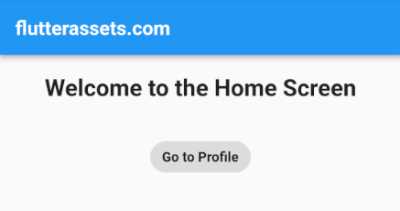
In this example, we have two screens: HomeScreen and ProfileScreen. The HomeScreen has a single ActionChip widget that navigates to the ProfileScreen when pressed. The ProfileScreen also has a single ActionChip widget that navigates back to the HomeScreen when pressed.
To navigate between screens using ActionChip, we use the Navigator.push method to push the destination screen onto the navigation stack, and the Navigator.pop method to pop the current screen off the navigation stack and return to the previous screen. We pass a MaterialPageRoute object to the Navigator.push method, which provides the transition animation and other navigation options.
Use the Flutter ActionChip widget for Sharing with url_launcher
Here is an example of how to use the Flutter ActionChip widget for sharing with url_launcher:
First, you need to add the package to your project dependencies in pubspec.yaml file.
dependencies:
  url_launcher: ^6.1.10
import 'package:flutter/material.dart';
import 'package:url_launcher/url_launcher.dart';
void main() {
runApp(MyApp());
}
class MyApp extends StatelessWidget {
@override
Widget build(BuildContext context) {
return MaterialApp(
debugShowCheckedModeBanner: false,
title: 'Flutter Demo',
theme: ThemeData(
primarySwatch: Colors.blue,
),
home: MyHomePage(),
);
}
}
class MyHomePage extends StatefulWidget {
@override
State<MyHomePage> createState() => _MyHomePageState();
}
class _MyHomePageState extends State<MyHomePage>{
@override
Widget build(BuildContext context) {
void _shareContent(String title, String url) async {
final String encodedTitle = Uri.encodeFull(title);
final String encodedUrl = Uri.encodeFull(url);
final String sharedText = '$encodedTitle: $encodedUrl';
if (await launchUrl(Uri.parse('https://twitter.com'))) {
await launchUrl(Uri.parse('https://twitter.com/intent/tweet?text=$sharedText'));
} else {
throw 'Could not launch https://twitter.com';
}
}
return Scaffold(
appBar: AppBar(
title: Text('flutterassets.com'),
),
body: Container(
alignment: Alignment.topCenter,
child: Column(
mainAxisAlignment: MainAxisAlignment.start,
children: <Widget>[
const SizedBox(height: 20),
Image.network(
'https://picsum.photos/200/300',
height: 200,
width: 300,
),
const SizedBox(height: 20),
Text(
'Check out this cool image!',
style: Theme.of(context).textTheme.headlineSmall,
),
const SizedBox(height: 20),
ActionChip(
onPressed: () {
_shareContent(
'Check out this cool image!',
'https://picsum.photos/200/300',
);
},
avatar: const Icon(Icons.share),
label: const Text('Share on Twitter'),
),
],
),
),
);
}
}
In this example, we have a ShareScreen widget that displays an image and a label. We use the ActionChip widget to create a “Share” button that, when pressed, will share the image and label on Twitter.
When the “Share on Twitter” button is pressed, the _shareContent method is called, which takes the title and URL of the image as parameters. We encode the title and URL to make sure they’re properly formatted for use in a URL, and then we create a string that contains both the encoded title and encoded URL.
We check if the user’s device can launch the Twitter app or website, and if it can, we launch the Twitter share intent with the shared text. If it can’t, we throw an error.
Use the Flutter ActionChip widget for Sharing with share_plus
Here is an example of how to use the Flutter ActionChip widget for sharing using the share_plus package:
First, you need to add the package to your project dependencies in pubspec.yaml file.
dependencies:
  share_plus: ^6.3.1
void _shareContent(String title, String url) async {
final String sharedText = '$title: $url';
await Share.share(sharedText);
}
@override
Widget build(BuildContext context) {
return Scaffold(
appBar: AppBar(
title: Text('flutterassets.com'),
),
body: Container(
alignment: Alignment.topCenter,
child: Column(
mainAxisAlignment: MainAxisAlignment.start,
children: <Widget>[
const SizedBox(height: 20),
Image.network(
'https://picsum.photos/200/300',
height: 200,
width: 300,
),
const SizedBox(height: 20),
Text(
'Check out this cool image!',
style: Theme.of(context).textTheme.headlineSmall,
),
const SizedBox(height: 20),
ActionChip(
onPressed: () {
_shareContent(
'Check out this cool image!',
'https://picsum.photos/200/300',
);
},
avatar: const Icon(Icons.share),
label: const Text('Share'),
),
],
),
),
);
}
In this example, we display an image and a label. We use the ActionChip widget to create a “Share” button that, when pressed, will share the image and label using the share_plus package.
When the “Share” button is pressed, the _shareContent method is called, which takes the title and URL of the image as parameters. We create a string that contains both the title and URL.
We then use the Share.share method from the share_plus package to share the content. This method takes the shared text as a parameter and will open the system’s share sheet, allowing the user to choose how they want to share the content.
Use the Flutter ActionChip widget for the Selection
Here is an example of how to use the Flutter ActionChip widget for selection:
List<String> _selectedItems = [];

final List<String> _items = [
  'Item 1',
  'Item 2',
  'Item 3',
  'Item 4',
  'Item 5',
];

@override
Widget build(BuildContext context) {
  return Scaffold(
    appBar: AppBar(
      title: Text('flutterassets.com'),
    ),
    body: Container(
      padding: EdgeInsets.all(16),
      child: ListView.builder(
        itemCount: _items.length,
        itemBuilder: (BuildContext context, int index) {
          final String item = _items[index];

          return ActionChip(
            onPressed: () {
              setState(() {
                if (_selectedItems.contains(item)) {
                  _selectedItems.remove(item);
                } else {
                  _selectedItems.add(item);
                }
              });
            },
            label: Text(item),
            backgroundColor:
            _selectedItems.contains(item) ? Colors.blue : Colors.grey,
          );
        },
      ),

    ),
    floatingActionButton: FloatingActionButton(
      onPressed: () {
        print('Selected Items: $_selectedItems');
      },
      child: const Icon(Icons.check),
    ),
  );
}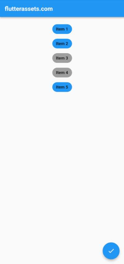
In this example, we have a SelectionScreen widget that displays a list of items using the ListView.builder widget. We use the ActionChip widget to create a chip for each item in the list.
When an ActionChip is pressed, the _selectedItems list is updated to either add or remove the item from the list of selected items. The background color of the ActionChip is also updated to reflect whether or not the item is currently selected.
We also have a floating action button that, when pressed, will print out the list of selected items to the console.
Use the Flutter ActionChip widget for a Call to Action
Here is an example of using the Flutter ActionChip widget for the Call to Action button:
@override
Widget build(BuildContext context) {
  return Scaffold(
    appBar: AppBar(
      title: Text('flutterassets.com'),
    ),
    body: Container(
      padding: EdgeInsets.all(16),
      child: Column(
        children: [
          Text(
            'Click the ActionChip below to sign up for our newsletter!',
            textAlign: TextAlign.center,
            style: TextStyle(fontSize: 18.0),
          ),
          SizedBox(height: 20.0),
          ActionChip(
            onPressed: () {
              // Replace this with your own code for signing up for the newsletter
              print('You have signed up for our newsletter!');
            },
            label: Text(
              'Sign up now',
              style: TextStyle(color: Colors.white),
            ),
            backgroundColor: Colors.blue,
          ),
        ],
      ),
    ),
  );
}
In this example, we have a simple app with an AppBar and a Column in the body of the Scaffold. The Column has a Text widget and an ActionChip widget. The Text widget displays a message prompting the user to click the ActionChip to sign up for a newsletter, and the ActionChip widget has a label that says “Sign up now” and a blue background colour.
When the user taps the ActionChip, the onPressed callback is called, which currently just prints a message to the console. You can replace this with your own code for signing up for the newsletter or performing any other call to action you want your users to take.


