Why add an animation to the Flutter Buttons
Adding animation to Flutter Button can make them feel more responsive and engaging to users. Animations can help provide visual feedback when a button is pressed, indicating that the user’s action has been registered. By making the user interface more dynamic and interactive, animations can enhance the overall user experience and make the app feel more polished.
In addition to enhancing the user experience, animations can also serve a functional purpose. For example, animating the elevation of a button when it is pressed can create the illusion of depth, making the button appear more clickable and drawing the user’s attention to it. This can be especially useful in interfaces where buttons need to stand out, such as in forms or dialogs.
Overall, adding animations to Flutter buttons is a great way to improve the user experience and create a more polished, professional-looking app. By making buttons more responsive and engaging, animations can help users feel more in control and create a sense of satisfaction when using the app.
Animating Flutter Buttons: Properties That Can Be Animated
Flutter provides a number of properties that can be animated for buttons. Some of the commonly animated properties for buttons include:
backgroundColor– The background colour of the button can be animated to change colour on tap or other user interactions.foregroundColor– The colour of the text or icon within the button can also be animated.elevation– The elevation of the button can be animated to create a “pressed” effect on tap.borderRadius– The border-radius of the button can be animated to create a more dynamic shape.scale– The size of the button can be animated to create a zoom-in effect on tap.
These are just a few examples of the properties that can be animated for buttons in Flutter. With a bit of creativity, you can create all kinds of custom animations and effects for your buttons.
How to animate an ElevatedButton elevation on tap in Flutter
To animate the elevation of an ElevatedButton in Flutter when it is tapped, you can use the AnimatedContainer widget to create a smooth transition from the original elevation value to a new elevation value. Here is an example implementation of a custom widget:
import 'package:flutter/material.dart';

class AnimatedElevatedButton extends StatefulWidget {
  final String label;
  final VoidCallback onPressed;

  const AnimatedElevatedButton({
    Key? key,
    required this.label,
    required this.onPressed,
  }) : super(key: key);

  @override
  _AnimatedElevatedButtonState createState() => _AnimatedElevatedButtonState();
}

class _AnimatedElevatedButtonState extends State<AnimatedElevatedButton> {
  double _elevation = 20.0;

  @override
  Widget build(BuildContext context) {
    return GestureDetector(
      onTapDown: _onTapDown,
      onTapUp: _onTapUp,
      onTapCancel: _onTapCancel,
      child: AnimatedContainer(
        duration: Duration(milliseconds: 200),
        curve: Curves.easeInOut,
        decoration: BoxDecoration(
          borderRadius: BorderRadius.circular(8),
          boxShadow: [
            BoxShadow(
              color: Colors.grey[400]!,
              offset: Offset(0, _elevation),
              blurRadius: _elevation,
            )
          ],
        ),
        child: ElevatedButton(
          onPressed: widget.onPressed,
          child: Text(widget.label),
          style: ElevatedButton.styleFrom(
            elevation: 0,
            shape: RoundedRectangleBorder(
              borderRadius: BorderRadius.circular(8),
            ),
            padding: EdgeInsets.symmetric(vertical: 10, horizontal: 24),
          ),
        ),
      ),
    );
  }

  void _onTapDown(TapDownDetails details) {
    setState(() {
      _elevation = 2.0;
    });
  }

  void _onTapUp(TapUpDetails details) {
    setState(() {
      _elevation = 20.0;
    });
    widget.onPressed();
  }

  void _onTapCancel() {
    setState(() {
      _elevation = 20.0;
    });
  }
}
In this implementation, we set the initial _elevation value to 20.0 to give the button an elevated appearance. When the user taps down on the button, we set the _elevation value to 2.0, which is the new elevation value we want to animate to. When the user lifts their finger from the button or cancels the tap, we set the _elevation value back to the original value of 20.0.
Note that we swap the values of _onTapDown and _onTapUp methods, as we want to reduce the elevation to 2.0 when the button is pressed and restore it back to 20.0 when it is released.
We wrap the ElevatedButton in an AnimatedContainer and use the _elevation value to set the boxShadow values, which creates the elevation effect. We also set the duration and curve properties of the AnimatedContainer to control the animation timing.
By wrapping the ElevatedButton in this AnimatedContainer and using GestureDetector to detect the tap events, we create a smooth elevation animation effect when the button is pressed and released.
Use the Animated ElevatedButtom custom widget
Here’s an example of how to use the AnimatedElevatedButton widget:
import 'AnimatedElevatedButton.dart';Container(
alignment: Alignment.topCenter,
padding: const EdgeInsets.all(8.0),
child: AnimatedElevatedButton(
label: 'Elevated Button',
onPressed: () { print( 'Button pressed!' ); },
)
),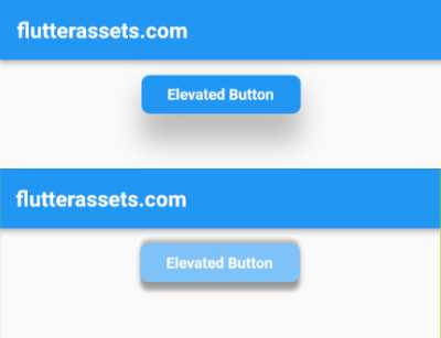
The AnimatedElevatedButton widget has two required properties – label and onPressed. The label property is used to specify the text to display within the button and the onPressed property is a callback function that is called when the button is pressed.
When the AnimatedElevatedButton is tapped, it will animate the elevation of the button to create a “pressed” effect, and then call the onPressed callback provided by the parent widget
Flutter ElevatedButton animation with AnimationController
Yes, you can achieve the same effect of animating the elevation of an ElevatedButton using an AnimationController. Here’s how you can do it:
import 'package:flutter/material.dart';

class AnimatedElevatedButton extends StatefulWidget {
  final String label;
  final VoidCallback onPressed;

  const AnimatedElevatedButton({
    Key? key,
    required this.label,
    required this.onPressed,
  }) : super(key: key);

  @override
  _AnimatedElevatedButtonState createState() => _AnimatedElevatedButtonState();
}

class _AnimatedElevatedButtonState extends State<AnimatedElevatedButton> with SingleTickerProviderStateMixin {
  late AnimationController _animationController;
  late Animation<double> _elevationAnimation;

  @override
  void initState() {
    super.initState();
    _animationController = AnimationController(
      vsync: this,
      duration: const Duration(milliseconds: 200),
    );

    _elevationAnimation = Tween<double>(
      begin: 20.0,
      end: 2.0,
    ).animate(CurvedAnimation(
      parent: _animationController,
      curve: Curves.easeInOut,
    ));
  }

  @override
  void dispose() {
    _animationController.dispose();
    super.dispose();
  }

  @override
  Widget build(BuildContext context) {
    return GestureDetector(
      onTapDown: _onTapDown,
      onTapUp: _onTapUp,
      onTapCancel: _onTapCancel,
      child: AnimatedBuilder(
        animation: _animationController,
        builder: (context, child) {
          return Container(
            decoration: BoxDecoration(
              borderRadius: BorderRadius.circular(8),
              boxShadow: [
                BoxShadow(
                  color: Colors.grey[400]!,
                  offset: Offset(0, _elevationAnimation.value),
                  blurRadius: _elevationAnimation.value,
                ),
              ],
            ),
            child: ElevatedButton(
              onPressed: widget.onPressed,
              child: Text(widget.label),
              style: ElevatedButton.styleFrom(
                elevation: 0,
                shape: RoundedRectangleBorder(
                  borderRadius: BorderRadius.circular(8),
                ),
                padding: EdgeInsets.symmetric(vertical: 10, horizontal: 24),
              ),
            ),
          );
        },
      ),
    );
  }

  void _onTapDown(TapDownDetails details) {
    _animationController.forward();
  }

  void _onTapUp(TapUpDetails details) {
    _animationController.reverse();
    widget.onPressed();
  }

  void _onTapCancel() {
    _animationController.reverse();
  }
}
In this implementation, we create an AnimationController with a duration of 200 milliseconds and an Animation<double> that interpolates between an elevation of 20.0 (the starting value) and 2.0 (the ending value).
We use an AnimatedBuilder to animate the button’s elevation as the _elevationAnimation changes value. We also use the onTapDown, onTapUp, and onTapCancel methods of the GestureDetector to control the animation.
When the user taps down on the button, we call _animationController.forward() to start the animation. When the user lifts their finger from the button or cancels the tap, we call _animationController.reverse() to reverse the animation. When the animation finishes reversing (i.e., the elevation is back to its original value of 20.0), we call the onPressed callback provided by the parent widget.
Note that we use with SingleTickerProviderStateMixin in the widget’s state to provide the vsync parameter for the AnimationController. This parameter is required to synchronize the animation with the widget’s lifecycle.
AnimatedElevatedButton work with different button
If you want to use the same animation effect for other types of buttons in Flutter, you would need to modify the code to work with the specific ButtonStyle used by those buttons. For example, the TextButton widget has a different ButtonStyle than ElevatedButton, so you would need to create a custom animation for the TextButton widget.
However, the general approach of animating a button’s properties to create a visual effect can be applied to any type of button in Flutter. With a bit of modification, you can create custom animations for any type of button to enhance the user experience and create a more engaging interface.
Create a Custom Flutter Button with Animated Background Colour
Creating a custom Flutter button with animated background colour is a great way to add some visual flair to your app. Here’s an example of how to create a custom button with an animated background colour in Flutter:
import 'package:flutter/material.dart';

class AnimatedBackgroundButton extends StatefulWidget {
  final String label;
  final Function onPressed;

  AnimatedBackgroundButton({
    required this.label,
    required this.onPressed,
  });

  @override
  _AnimatedBackgroundButtonState createState() =>
      _AnimatedBackgroundButtonState();
}

class _AnimatedBackgroundButtonState extends State<AnimatedBackgroundButton>
    with SingleTickerProviderStateMixin {
  late AnimationController _controller;
  late Animation<Color?> _colorAnimation;

  @override
  void initState() {
    super.initState();

    _controller = AnimationController(
      vsync: this,
      duration: Duration(milliseconds: 500),
    );

    _colorAnimation = ColorTween(
      begin: Colors.blue,
      end: Colors.red,
    ).animate(_controller);
  }

  @override
  void dispose() {
    _controller.dispose();
    super.dispose();
  }

  @override
  Widget build(BuildContext context) {
    return AnimatedBuilder(
      animation: _controller,
      builder: (BuildContext context, Widget? child) {
        return TextButton(
          onPressed: () {
            _controller.forward().then((value) => _controller.reverse());
            widget.onPressed();
          },
          child: Text(widget.label, style: TextStyle(color: Colors.white),),
          style: ButtonStyle(
            backgroundColor: MaterialStateProperty.all(_colorAnimation.value),
          ),
        );
      },
    );
  }
}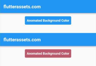
The AnimatedBackgroundButton widget has two required properties – label and onPressed. The label property is used to specify the text to display within the button, and the onPressed property is a callback function that is called when the button is pressed.
The button animates its background colour using a ColorTween and an AnimationController. When the button is pressed, the controller starts the animation, which updates the backgroundColor of the ButtonStyle using an AnimatedBuilder. The animation runs for 500 milliseconds and reverses back to its original state when complete.
To use the AnimatedBackgroundButton widget, simply import the file containing the widget and use it in your code like any other Flutter widget:
import 'AnimatedBackgroundButton.dart';Container(
alignment: Alignment.topCenter,
padding: const EdgeInsets.all(8.0),
child: AnimatedBackgroundButton(
label: 'Anomated Background Color',
onPressed: () { print( 'Button pressed!' ); },
)
),Create a Custom Flutter Button with Animated Scale
Here’s an example of how to create a custom Flutter button with an animated button scale:
import 'package:flutter/material.dart';

class AnimatedScaleButton extends StatefulWidget {
  final String label;
  final Function onPressed;

  AnimatedScaleButton({
    required this.label,
    required this.onPressed,
  });

  @override
  _AnimatedScaleButtonState createState() => _AnimatedScaleButtonState();
}

class _AnimatedScaleButtonState extends State<AnimatedScaleButton>
    with SingleTickerProviderStateMixin {
  late AnimationController _controller;
  late Animation<double> _animation;

  @override
  void initState() {
    super.initState();

    _controller = AnimationController(
      duration: const Duration(milliseconds: 200),
      vsync: this,
    );

    _animation = Tween<double>(
      begin: 1.0,
      end: 0.9,
    ).animate(_controller);
  }

  @override
  void dispose() {
    _controller.dispose();
    super.dispose();
  }

  void _onTapDown(TapDownDetails details) {
    _controller.forward();
  }

  void _onTapUp(TapUpDetails details) {
    _controller.reverse();
    widget.onPressed();
  }

  @override
  Widget build(BuildContext context) {
    return GestureDetector(
      onTapDown: _onTapDown,
      onTapUp: _onTapUp,
      onTapCancel: () {
        _controller.reverse();
      },
      child: ScaleTransition(
        scale: _animation,
        child: ElevatedButton(
          onPressed: () {},
          child: Text(widget.label),
          style: ElevatedButton.styleFrom(
            padding: const EdgeInsets.symmetric(horizontal: 20, vertical: 10),
            shape: RoundedRectangleBorder(
              borderRadius: BorderRadius.circular(20.0),
            ),
          ),
        ),
      ),
    );
  }
}
The AnimatedScaleButton widget has two required properties – label and onPressed. The label property is used to specify the text to display within the button and the onPressed property is a callback function that is called when the button is pressed.
The button animates its scale using an AnimationController and a ScaleTransition. The controller is used to manage the animation, which updates the scale factor of the button in response to user input. When the user presses the button, the controller is started, which triggers the ScaleTransition to animate the button’s scale factor.
To use the AnimatedScaleButton widget, simply import the file containing the widget and use it in your code like any other Flutter widget:
import 'AnimatedScaleButton.dart';Container(
alignment: Alignment.topCenter,
padding: const EdgeInsets.all(8.0),
child: AnimatedScaleButton(
label: 'Anomated Scale',
onPressed: () { print( 'Button pressed!' ); },
)
),Create a Custom Flutter Button with Animated Border Radius
Here’s an example of how to create a custom Flutter button with an animated button borderRadius:
import 'package:flutter/material.dart';

class AnimatedBorderRadiusButton extends StatefulWidget {
  final String label;
  final Function onPressed;

  AnimatedBorderRadiusButton({
    required this.label,
    required this.onPressed,
  });

  @override
  _AnimatedBorderRadiusButtonState createState() => _AnimatedBorderRadiusButtonState();
}

class _AnimatedBorderRadiusButtonState extends State<AnimatedBorderRadiusButton>
    with SingleTickerProviderStateMixin {
  late AnimationController _controller;
  late Animation<double> _animation;

  @override
  void initState() {
    super.initState();

    _controller = AnimationController(
      duration: const Duration(milliseconds: 200),
      vsync: this,
    );

    _animation = Tween<double>(
      begin: 0.0,
      end: 20.0,
    ).animate(_controller);
  }

  @override
  void dispose() {
    _controller.dispose();
    super.dispose();
  }

  void _onTapDown(TapDownDetails details) {
    _controller.forward();
  }

  void _onTapUp(TapUpDetails details) {
    _controller.reverse();
    widget.onPressed();
  }

  @override
  Widget build(BuildContext context) {
    return GestureDetector(
      onTapDown: _onTapDown,
      onTapUp: _onTapUp,
      onTapCancel: () {
        _controller.reverse();
      },
      child: AnimatedBuilder(
        animation: _controller,
        builder: (BuildContext context, Widget? child) {
          return ElevatedButton(
            onPressed: () {},
            child: Text(widget.label),
            style: ElevatedButton.styleFrom(
              padding: const EdgeInsets.symmetric(horizontal: 20, vertical: 10),
              shape: RoundedRectangleBorder(
                borderRadius: BorderRadius.circular(_animation.value),
              ),
            ),
          );
        },
      ),
    );
  }
}
The AnimatedBorderRadiusButton widget has two required properties – label and onPressed. The label property is used to specify the text to display within the button, and the onPressed property is a callback function that is called when the button is pressed.
The button animates its borderRadius using an AnimationController and an AnimatedBuilder. The controller is used to manage the animation, which updates the borderRadius value of the buttons ShapeBorder in response to user input. When the user presses the button, the controller is started, which triggers the AnimatedBuilder to rebuild the button with a new borderRadius value based on the current value of the animation.
To use the AnimatedBorderRadiusButton widget, simply import the file containing the widget and use it in your code like any other Flutter widget:
import 'AnimatedBorderRadiusButton.dart';Container(
alignment: Alignment.topCenter,
padding: const EdgeInsets.all(8.0),
child: AnimatedBorderRadiusButton(
label: 'Anomated Border Radius',
onPressed: () { print( 'Button pressed!' ); },
)
),Create a Custom Flutter Button with Animated Foreground Colour
To create a custom Flutter button with an animated foreground colour, you can use an AnimatedDefaultTextStyle widget. This widget animates between two TextStyle objects, allowing you to change the foreground colour of the text when the button is pressed.
Here’s an example code that shows how to create a custom button with an animated foreground colour:
import 'package:flutter/material.dart';

class AnimatedColorButton extends StatefulWidget {
  final String label;
  final VoidCallback onPressed;

  AnimatedColorButton({required this.label, required this.onPressed});

  @override
  _AnimatedColorButtonState createState() => _AnimatedColorButtonState();
}

class _AnimatedColorButtonState extends State<AnimatedColorButton> {
  Color _color = Colors.blue;
  FontWeight _fontWeight = FontWeight.normal;

  @override
  Widget build(BuildContext context) {
    return GestureDetector(
      onTapDown: (details) {
        setState(() {
          _color = Colors.red;
          _fontWeight = FontWeight.bold;
        });
      },
      onTapUp: (details) {
        setState(() {
          _color = Colors.blue;
          _fontWeight = FontWeight.normal;
        });
        widget.onPressed();
      },
      child: AnimatedDefaultTextStyle(
        style: TextStyle(
          color: _color,
          fontWeight: _fontWeight,
        ),
        duration: Duration(milliseconds: 200),
        child: Container(
          decoration: BoxDecoration(
            color: Colors.white,
            borderRadius: BorderRadius.circular(10),
            boxShadow: [
              BoxShadow(
                color: Colors.grey.withOpacity(0.5),
                spreadRadius: 2,
                blurRadius: 5,
                offset: Offset(0, 3),
              ),
            ],
          ),
          padding: EdgeInsets.symmetric(vertical: 10, horizontal: 20),
          child: Text(
            widget.label,
          ),
        ),
      ),
    );
  }
}
In this example, we use a GestureDetector to detect taps on the button. When the user taps down, we update the state to change the colour and font weight of the text, and when the user releases the tap, we update the state again to reset the colour and font weight, and also call the onPressed callback.
The button is wrapped in an AnimatedDefaultTextStyle widget, which animates between two text styles based on the state. The duration parameter controls the speed of the animation.
Note that we also added a simple box shadow to the button to give it a bit of depth.
Here is how to use the button:
import 'AnimatedColorButton.dart';Container(
alignment: Alignment.topCenter,
padding: const EdgeInsets.all(8.0),
child: AnimatedColorButton(
label: 'Anomated Text Colour',
onPressed: () { print( 'Button pressed!' ); },
)
),