What is a border in Flutter?
A border in Flutter refers to a visual element that surrounds a widget, acting as a frame or a divider. It helps to create a visual separation between different parts of the user interface and adds some visual interest to the overall design. Borders can have various styles such as a solid colour, a gradient, or an image.
In Flutter, you can add borders to a widget by wrapping it in a Container widget and specifying the border property in its decoration property. The decoration property allows you to customize the appearance of the Container, including adding a border. You can specify the width, colour, and style of the border to match your desired look and feel.
For example, you can create a Container widget with a red border of 2.0 pixels width by writing:
Container(
  decoration: BoxDecoration(
    border: Border.all(color: Colors.red, width: 2.0),
  ),
  child: ...
)
By using the right combination of properties and styles, you can create a border that complements your design and makes your user interface look polished and professional.
What is a border radius in Flutter?
Border radius in Flutter refers to the roundedness of the corners of a widget’s border. It adds a curved or rounded appearance to the corners of a widget, giving it a softer and more organic look. The border-radius can be set by using the “borderRadius” property within the widget. The value of the property can be set in pixels or as a percentage of the widget’s size. A higher value results in a more rounded appearance, while a lower value results in more square corners. By using border-radius, you can add a unique and eye-catching touch to your Flutter interface, creating a more dynamic and visually appealing experience for your users.
Here’s an example with a border radius on a Container widget:
Container(
  padding: EdgeInsets.all(20),
  width: 200,
  height: 100,
  decoration: BoxDecoration(
    border: Border.all(width: 2.0, color: Colors.red),
    borderRadius: BorderRadius.circular(30.0),
  ),
  child: Text("Hello, World!"),
),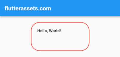
Here I used the Border.all constructor to create a border of width 2.0 and colour red. Then, we use the BorderRadius.circular constructor to specify the radius of the rounded corners. We set the borderRadius property to BorderRadius.circular(30.0) to make the corners 30 pixels rounded.
Built-in Flutter widgets that support borders
Here is a short list of the most common built-in Flutter widgets that support borders:
- Container: The Container widget is one of the most versatile widgets in Flutter and it allows you to add a border to its content through the “decoration” property. This property takes a BoxDecoration object that can be customized to set a border with a specific width, colour, and radius.
- OutlinedButton: The OutlinedButton is a Material Design raised button that has a border instead of a filled background. You can customize the border by setting the “shape” property to a RoundedRectangleBorder and the “side” property to a BorderSide object with a specific width and colour.
- ElevatedButton: The ElevatedButton is another Material Design raised button that can also have a border by setting the “shape” property to a RoundedRectangleBorder and the “side” property to a BorderSide object with a specific width and colour.
- TextField: The TextField widget is used to receive user input and it can also have a border by setting the “decoration” property to an InputDecoration object with a specific border.
- Card: The Card widget is a Material Design container that can be used to group related information and it supports a border through the “shape” property which can be set to a RoundedRectangleBorder.
These are the most common built-in Flutter widgets that support borders. By using the described properties, you can easily add a border to any of these widgets in your Flutter app.
Addition:
- Image: The Flutter Image widget does not have direct support for adding borders. However, you can add a border to an image by wrapping the Image widget inside a Container and applying a BoxDecoration with a Border to the Container.
How to add a border to a Container in Flutter
A border can be added to a Flutter Container widget to create a visually appealing element on the screen. This can be done by using the decoration property of the Container widget. The decoration property takes a BoxDecoration object, which allows you to specify various aspects of the Container’s appearance, including its border.
Container(
  padding: EdgeInsets.all(20),
  decoration: BoxDecoration(
    border: Border.all(
      color: Colors.blue,
      width: 2,
    ),
  ),
  child: Text("Container with border"),
),
The code snippet you provided demonstrates how to add a border to a Container widget. The Container has a padding of 20 on all sides, specified using the padding property and its EdgeInsets.all method. The decoration property is then set to a BoxDecoration object that has a border defined using the Border.all method. The Border.all method takes two parameters: the colour of the border and its width. In this case, the colour is set to blue, and the width is set to 2.
How to add a border radius to a Container in Flutter
In Flutter, you can add a rounded edge to a Container widget by using the borderRadius property in its BoxDecoration. The BorderRadius class is used to specify the degree of rounding for the corners of a box.
To add a border radius to your container, you can wrap the Container widget with a BoxDecoration and set the borderRadius property to a BorderRadius object. You can use the circular method to create a circular border-radius.
Here’s an example of adding a border radius to a Container:
Container(
  padding: EdgeInsets.all(20),
  decoration: BoxDecoration(
    border: Border.all(
      color: Colors.blue,
      width: 2,
    ),
    borderRadius: BorderRadius.circular(10),
  ),
  child: Text("Container with border and border radius"),
)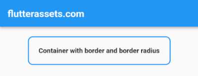
In this example, we set the borderRadius property to BorderRadius.circular(10) to create a circular border-radius with a 10-pixel radius. The Border.all property sets a border with a blue colour and 2-pixel width. The padding property adds 20 pixels of padding all around the text.
How to add a border to one side of a Container in Flutter
Adding a border to one side of a Container in Flutter is a straightforward process. The Container widget can be decorated using the “BoxDecoration” property, which allows us to specify the border properties. The border property takes in a “Border” object, which in turn takes in the “BorderSide” objects that define the width and colour of the border.
Flutter Container with one side border
Container(
  padding: EdgeInsets.all(20),
  decoration: BoxDecoration(
    color: Colors.grey.shade200,
    border: const Border(
      left:  BorderSide(width: 15.0, color: Colors.red),
    ),
  ),
  child: Text("Container with left border",
    style: TextStyle(color: Colors.black),
  ),
),
In the example above, the Container has a “padding” property set to “EdgeInsets.all(20)” which gives a padding of 20 pixels on all sides. The “decoration” property is set to a “BoxDecoration” object with a “color” property of “Colors.grey.shade200” and a “border” property that defines a border on the left side of the container. The border is defined with a width of 15 pixels and a red colour.
The child of the Container is a Text widget with the text “Container with border” and the text colour is set to black using the “TextStyle” property.
This code will produce a Container with a red border of 15 pixels width on the left side and with a padding of 20 pixels on all sides.
Flutter Container with one side rounded border
This is a Flutter widget that demonstrates how to clip the border of a Container to a custom shape.
ClipPath(
  clipper: ShapeBorderClipper(
      shape: RoundedRectangleBorder(
          borderRadius: BorderRadius.circular(20)
      )
  ),
  child: Container(
    padding: EdgeInsets.all(20),
    decoration: BoxDecoration(
      color: Colors.grey.shade200,
      border: const Border(
        right:  BorderSide(width: 35.0, color: Colors.red),
      ),
      // borderRadius: BorderRadius.circular(10),
    ),
    child: Text("Container with right border",
      style: TextStyle(color: Colors.black),
    ),
  ),
),
The ClipPath widget is used to clip its child widget to a specific path. The shape of the path is determined by the ShapeBorderClipper widget, which is passed to the clipper property of the ClipPath widget. In this example, the ShapeBorderClipper uses a RoundedRectangleBorder to clip the Container to a rounded rectangle shape with a border radius of 20.
The Container widget is given a padding of 20 on all sides, a grey colour, and a border on the right side with a width of 15 and a red colour. The child widget is a Text widget with the text “Container with border” and a black colour.
How to add a border to a Card in Flutter
In Flutter, adding a border to a Card widget is quite simple. You can accomplish this by specifying the shape property of the Card widget. The shape property takes an object of type ShapeBorder which can be any of the ShapeBorder subclasses, for example, RoundedRectangleBorder.
The RoundedRectangleBorder class allows you to specify the border radius of the rectangle and the side property of RoundedRectangleBorder allows you to specify the border sides and their width, colour, etc.
You can use the Card widget along with the shape property and the RoundedRectangleBorder class to add a border to a Card in Flutter. This is demonstrated in the following code snippet:
Card(
  shape: RoundedRectangleBorder(
    side: BorderSide(
      color: Colors.black,
    ),
    borderRadius: BorderRadius.circular(10),
  ),
  elevation: 5,
  child: Padding(
    padding: const EdgeInsets.all(18.0),
    child: Text("Card with border"),
  ),
)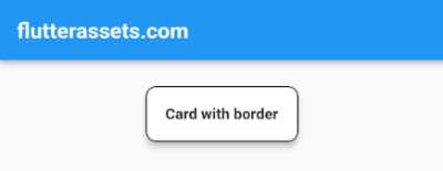
In the above code snippet, we set the shape property of the Card widget to an instance of RoundedRectangleBorder. The side property is then set to a BorderSide object, which allows us to specify the border colour. The borderRadius property is set to BorderRadius.circular(10), which rounds the corners of the Card to a radius of 10 pixels.
Add one side border to a card in Flutter
In order to add a border to one side of a card in Flutter, you can utilize the BoxDecoration widget in the Container. This widget allows you to apply various styles and decorations to the card container. To add a border on the left side of the card, you can specify a Border object in the BoxDecoration, with the left property set to a BorderSide object. The BorderSide object takes in a color and a width property, which you can use to define the colour and width of the border.
Flutter Card with one side border
Here’s an example code snippet that demonstrates how to add a border on the left side of a card using the BoxDecoration widget:
Container(
  padding: EdgeInsets.all(20),
  decoration: BoxDecoration(
    border: Border(
      left: BorderSide(
        color: Colors.blue,
        width: 30,
      ),
    ),
  ),
  child: Text("Card with border on left side"),
)
In this example, the Container widget is given a padding of 20 on all sides and a BoxDecoration with a Border object on the left side, specified by the left property. The BorderSide object takes in a blue colour and a width of 30. Finally, the container holds a Text widget with the message “Card with border on left side”.
Flutter Card elevated with one side border
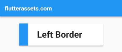
Here is another example:
Card(
  elevation: 3,
  child: Container(
    padding: const EdgeInsets.only(
        top: 20, bottom: 20, left: 30, right: 70),
    decoration: const BoxDecoration(
      border: Border(
        left: BorderSide(color: Colors.blue, width: 30),
      ),
    ),
    child: const Text(
      'Left Border',
      style: TextStyle(fontSize: 30),
    ),
  ),
),
Flutter Card elevated with one side rounded border
In this example I used ClipPath to add a rounded border:
Card(
  elevation: 4,
  shape: const RoundedRectangleBorder(
    borderRadius: BorderRadius.all(Radius.circular(20)),
  ),
  child: ClipPath(
    clipper: ShapeBorderClipper(
        shape: RoundedRectangleBorder(
            borderRadius: BorderRadius.circular(20))),
    child: Container(
      padding: const EdgeInsets.only(
          top: 20, bottom: 20, left: 30, right: 70),
      decoration: const BoxDecoration(
        border: Border(
          left: BorderSide(color: Colors.amber, width: 30),
        ),
      ),
      child: const Text(
        'Left Border',
        style: TextStyle(fontSize: 30),
      ),
    ),
  ),
),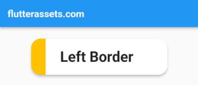
The child of the card is a ClipPath widget, which is used to clip the child widget according to a specific shape. The clipper is defined using ShapeBorderClipper and the shape is set to a RoundedRectangleBorder with a borderRadius of 20.
The child of the ClipPath is a Container widget, which is used to add padding and a border to the card. The padding property is set to have a top and bottom padding of 20 and a left and right padding of 30 and 70 respectively. The decoration property is set using BoxDecoration and includes a border on the left side with a width of 30 and a colour set to Colors.amber.
How to add a border to an Image in Flutter
Here is an example to add a border to an Image in Flutter. You can add a border to an Image by wrapping it in a Container and then setting the decoration property. You can define a BoxDecoration with a border and set its color and width.
Container(
  decoration: BoxDecoration(
    border: Border.all(
      color: Colors.black,
      width: 5,
    ),
  ),
  child: Image.network(
    'https://picsum.photos/250?image=9',
  ),
),
Flutter Image Border
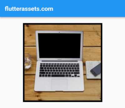
In the code snippet, we wrap the Image widget inside a Container widget and set the decoration property to BoxDecoration with the border property set to Border.all. The Border.all takes the color of the border and its width as parameters. The Image.network widget is used to display an image from the network by passing the image URL as a parameter.
How to add a rounded border to an Image in Flutter
In Flutter, you can add a rounded border to an image using the BoxDecoration widget. The BoxDecoration widget allows you to add various decorative elements to a container, including borders. To add a rounded border to an image, you can set the borderRadius property to BorderRadius.all(Radius.circular(30)) to create a circular border with a radius of 30. Additionally, you can add a border to the image by setting the border property to Border.all(color: Colors.black, width: 4). Here’s an example code snippet that demonstrates how to do this:
Container(
  width: 200,
  height: 200,
  decoration: BoxDecoration(
    borderRadius: BorderRadius.all(Radius.circular(30)),
    border: Border.all(
        color: Colors.black,
        width: 4
    ),
    image: DecorationImage(
      image: NetworkImage('https://picsum.photos/250?image=9'),
      fit: BoxFit.cover,
    ),
  ),
)
Flutter Image rounded border

How to add a border to a Button in Flutter
Adding a border to a button in Flutter is easy and straightforward. It can be achieved by using the built-in decoration property in the button widget and setting the border property in the InputDecoration widget. By doing this, you can customize the appearance of your button and add a border to it, such as a rounded border or a specific color border.
Flutter TextButton with rounded border
To add a rounded border to a TextButton in Flutter, we can wrap the TextButton with a Container and use the BoxDecoration property to add a border. Here’s an example:
Container(
  decoration: BoxDecoration(
    borderRadius: BorderRadius.all(Radius.circular(30)),
    border: Border.all(
        color: Colors.black,
        width: 4
    ),
  ),
  child: TextButton(
    onPressed: () {
      // Do something
    },
    child: Text("TextButton with Rounded Border"),
  ),
),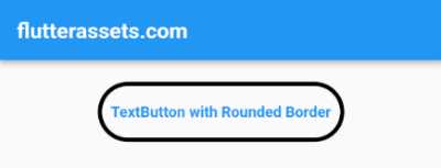
In this code snippet, the Container has a BoxDecoration property that defines a border with a radius of 30 and a width of 4. The border colour is set to black. The TextButton is a child of the Container, so it is automatically surrounded by a rounded border.
Flutter OutlinedButton with rounded border
The rounded border of an OutlinedButton in Flutter can be achieved by applying the shape property of the style property in an OutlinedButton. The shape property is an instance of the RoundedRectangleBorder class, which can take the borderRadius property to determine the roundedness of the button’s corners. The side property of the style property is of type BorderSide and it is used to set the width and colour of the border.
OutlinedButton(
  style: OutlinedButton.styleFrom(
    shape: RoundedRectangleBorder(
      borderRadius: BorderRadius.circular(18.0),
    ),
    side: BorderSide(width: 2, color: Colors.black),
  ),
  onPressed: () {},
  child: Text('OutlinedButton with rounded border'),
)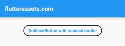
In this example, RoundedRectangleBorder class is used to set a rounded shape to the OutlinedButton and BorderSide class is used to specify the width and colour of the border. The borderRadius property is set to 18.0, giving the button a circular shape, the border width is set to 2 and its colour is set to black.
Flutter ElevatedButton with rounded border
To add a rounded border to a ElevatedButton in Flutter, you need to use the shape property of ElevatedButton.styleFrom method. This property takes in an instance of the RoundedRectangleBorder class, which allows you to define the border radius of the button.
The RoundedRectangleBorder class has a property borderRadius that you can use to specify the radius of the rounded corners of the button. In this case, we have set the radius to 30.0.
Additionally, you can use the side property to add a border with a specified width and color. In this case, the width of the border is set to 2 and the colour is set to Colors.black.
Here is the code snippet to add a rounded border to a ElevatedButton:
ElevatedButton(
    onPressed: () {},
    style: ElevatedButton.styleFrom(
      shape: RoundedRectangleBorder(
        borderRadius: BorderRadius.circular(30.0),
      ),
      side: BorderSide(width: 2, color: Colors.black),
    ),
    child: const Text(' Elevated Button with rounded border')
)
Flutter IconButton with rounded border
I think the Flutter IconButton doesn’t have a direct property to add a border to it. I tried and I couldn’t. However, it can be achieved by wrapping the IconButton inside a Container widget and applying a BoxDecoration with a desired border. Here is an example of how you could do this:
Container(
  decoration: BoxDecoration(
      border: Border.all(
          color: Colors.black,
          width: 2.0
      ),
      borderRadius: BorderRadius.circular(30.0)
  ),
  child: IconButton(
    icon: Icon(Icons.cached_outlined),
    onPressed: () {},
  ),
),
In the above example, a Container widget is used to add a BoxDecoration with a border and border-radius. The IconButton is then placed inside the Container as its child. The BorderRadius can be adjusted to achieve the desired rounded border for the IconButton.
Flutter Custom Button with rounded border
To add a rounded border to a custom button in Flutter, you can utilize the InkWell widget and BoxDecoration class. The InkWell widget is a material design gesture that provides a visual effect of ink splash on press and release of the button. The BoxDecoration class provides a means of styling the background and border of a box.
Here is an example code for a custom button with a rounded border:
InkWell(
  borderRadius: BorderRadius.circular(30),
  onTap: () {
    // Your code here
  },
  child: Container(
    decoration: BoxDecoration(
        shape: BoxShape.rectangle,
        borderRadius: BorderRadius.circular(30.0),
        border: Border.all(width: 2, color: Colors.black)
    ),
    padding: EdgeInsets.all(20.0),
    child: Text(
      'Custom Button',
      style: TextStyle(
        color: Colors.black,
        fontSize: 16.0,
      ),
    ),
  ),
),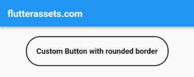
In this example, the InkWell widget is given a border radius of 30 to make it rounded. The border and border-radius properties of the BoxDecoration are set to add a black border with a width of 2. The Container widget has the BoxDecoration as its decoration and a Text widget as its child, displaying the label for the button.
How to add a rounded border to a TextField in Flutter
To add a rounded border to a TextField in Flutter, you can use the built-in InputDecoration widget. The InputDecoration widget provides a convenient way to customize the look and feel of a TextField. You can set the border property of the InputDecoration to an OutlineInputBorder widget, which will give you a border around the TextField.
To add a rounded border to the TextField, set the borderRadius property of the OutlineInputBorder to BorderRadius.circular(30), like this:
TextField(
  decoration: InputDecoration(
    border: OutlineInputBorder(
      borderRadius: BorderRadius.circular(30),
    ),
  ),
)
This will give you a TextField with a rounded border and a radius of 30 pixels. By changing the value of the borderRadius, you can control the degree of rounding of the border.
How to add a rounded border to any widget in Flutter
To add a border to any widget in Flutter, you can wrap the widget in a Container and use BoxDecoration. The BoxDecoration property takes in several parameters including a border parameter that allows you to specify the width, style, and colour of the border.
Here’s a code example of how you can add a rounded border with a width of 2 and black colour to a widget:
Container(
  decoration: BoxDecoration(
    border: Border.all(width: 2, color: Colors.black),
    borderRadius: BorderRadius.circular(30),
  ),
  child: yourWidgetHere(),
)
In this example, yourWidgetHere() would be the widget you want to add a border to, and borderRadius: BorderRadius.circular(30) would give the border a rounded shape with a radius of 30. You can adjust the values as needed to get the desired border style.


