What is the SizeTransition in Flutter
The Flutter SizeTransition is a widget that allows you to animate the size of a child widget. This can be useful if you want to gradually increase or decrease the size of a widget over time, for example, to create a “zoom in” or “zoom out” effect.
The animation can be controlled by specifying a curve and a duration. The curve determines how the animation progresses over time, for example, whether it starts slow and then speeds up or starts fast and then slows down. The duration is how long the animation takes to complete.
You can use the SizeTransition widget by wrapping the child widget you want to animate in a SizeTransition widget and providing the animation details.
It is important to note that this widget only animates the size of the child, not its position, so if you want to animate the position too you would need to use another widget such as PositionTransition.
Where the SizeTransition widget can be used in Flutter
Here are a few examples of where the SizeTransition widget can be used in Flutter:
- Zoom In/Out effect: You can use the SizeTransition widget to create a zoom-in/out effect on an image. By gradually increasing or decreasing the size of the image over time, you can create the illusion that the image is getting closer or farther away.
- Expand/Collapse effect: You can use the SizeTransition widget to create an expand/collapse effect on a container. By gradually increasing or decreasing the size of the container over time, you can create the illusion that the container is opening or closing.
- Loading animation: You can use the SizeTransition widget to create a loading animation. By gradually increasing and decreasing the size of a loading icon over time, you can create the illusion that the icon is pulsating or “breathing”.
- Reveal effect: You can use the SizeTransition widget to create a reveal effect. By gradually increasing the size of a widget over time, you can create the illusion that the widget is being revealed from underneath another widget.
- Progress Indicator: You can use the SizeTransition widget to create an animation for a progress indicator. By gradually increasing the size of an indicator over time, you can create the illusion that the indicator is filling up as the progress increases.
- Card Flip Animation: You can use the SizeTransition widget to create a card flip animation. By gradually increasing and decreasing the size of a card over time, you can create the illusion that the card is flipping over.
- Pop-up Animation: You can use the SizeTransition widget to create a pop-up animation. By gradually increasing the size of a widget over time, you can create the illusion that the widget is popping up from a smaller size.
- Carousel Animation: You can use the SizeTransition widget to create a carousel animation. By gradually increasing and decreasing the size of images or widgets over time, you can create the illusion that the images or widgets are rotating in a carousel.
- Tab Bar Animation: You can use the SizeTransition widget to create a tab bar animation. By gradually increasing and decreasing the size of tabs over time, you can create the illusion that the tabs are being selected or deselected.
- Loader Animation: You can use the SizeTransition widget to create a loader animation. By gradually increasing and decreasing the size of a loading icon over time, you can create the illusion that the icon is spinning or rotating.
- Fade-In/Out Animation: You can use the SizeTransition widget to create a fade-in/out animation. By gradually increasing and decreasing the size of a widget over time, you can create the illusion that the widget is fading in or out.
- In-App Notification Animation: You can use the SizeTransition widget to create an animation for in-app notifications. By gradually increasing the size of the notification over time, you can create the illusion that the notification is popping up from the bottom of the screen.
- Sliding Animation: You can use the SizeTransition widget to create a sliding animation. By gradually increasing and decreasing the size of a widget over time, you can create the illusion that the widget is sliding in or out from the side of the screen.
- Swipe Animation: You can use the SizeTransition widget to create a swipe animation. By gradually increasing and decreasing the size of a widget over time, you can create the illusion that the widget is being swiped in or out of the screen.
- Scroll Animation: You can use the SizeTransition widget to create a scroll animation. By gradually increasing and decreasing the size of a widget over time, you can create the illusion that the widget is scrolling up or down on the screen.
Note: these are examples, you can use this widget for many other scenarios, the most important thing is to have a good imagination and creativity when using the SizeTransition widget.
How to use the Flutter SizeTransition widget
To use the Flutter SizeTransition widget, you will need to follow these steps:
- Wrap the child widget that you want to animate in a SizeTransition widget. You can do this by creating a new instance of the SizeTransition widget and passing the child widget as an argument to the constructor.
- Set the sizeFactor property of the SizeTransition widget. This property controls the size of the child widget during the animation. You can set this property to an Animation object, which can be created using the AnimationController class.
- Create an AnimationController object and set its duration. The duration is how long the animation will take to complete.
- Bind the AnimationController’s value to the sizeFactor property of the SizeTransition widget. This will ensure that the child widget’s size changes as the animation progresses.
- Call the
forward()method of the AnimationController to start the animation. - Optionally, you can set the curve property of the AnimationController, this property determines how the animation progresses over time.
- When the animation is complete, you should dispose of the AnimationController object to free up resources.
This code is a simple example of how to use the SizeTransition widget in Flutter:
import 'package:flutter/material.dart';

void main() {
  runApp(MyApp());
}

class MyApp extends StatefulWidget {

  @override
  _MyAppState createState() => _MyAppState();
}

class _MyAppState extends State<MyApp> {
  @override
  Widget build(BuildContext context) {
    return MaterialApp(
      debugShowCheckedModeBanner: false,
      title: 'Flutter Demo',
      theme: ThemeData(
        primarySwatch: Colors.blue,
      ),
      home: MyHomePage(),
    );
  }
}

class MyHomePage extends StatefulWidget {

  @override
  State<MyHomePage> createState() => _MyHomePageState();
}

class _MyHomePageState extends State<MyHomePage> with SingleTickerProviderStateMixin {

  late final AnimationController _controller = AnimationController(
    duration: const Duration(seconds: 3),
    vsync: this,
  )..repeat();
  late final Animation<double> _animation = CurvedAnimation(
    parent: _controller,
    curve: Curves.fastOutSlowIn,
  );
  @override
  void dispose() {
    _controller.dispose();
    super.dispose();
  }

  @override
  Widget build(BuildContext context) {

    return Scaffold(
        appBar: AppBar(
          title: Text('flutterassets.com'),
        ),
        body: Center(
          child: SizeTransition(
            sizeFactor: _animation,
            child: Image.asset("assets/logo.png"),
          ),
        )
    );
  }
}
Variables
final AnimationController _controller: A variable of typeAnimationControllerthat is used to control the animation. It’s created with a duration of 3 seconds and the vsync is set tothis, which is the current state.AnimationControlleris set to repeat indefinitely by using..repeat()after creating it.final Animation<double> _animation: A variable of typeAnimation<double>that is used to store the animation. It’s created using theCurvedAnimationclass and its parent is the_controller, it also uses theCurves.fastOutSlowIncurve, this means that the animation will start slow and speed up as it progresses.
void dispose()
_controller.dispose(): This is used to dispose the animation controller when the state is no longer needed to free up resources.
build
Scaffold: TheScaffoldwidget is the basic layout structure of the screen, it provides a white background and a top app bar.AppBar: TheAppBarwidget is a top app bar that contains the title of the screen.SizeTransition: TheSizeTransitionwidget is used to change the size of the logo image over time based on the animation that is passed to thesizeFactorproperty.Image: TheImagewidget is used to display the logo image.
The SizeTransition widget is used to change the size of the logo image over time based on the animation that is passed to the sizeFactor property. The sizeFactor property accepts an animation of type Animation<double> which is the _animation variable that we created earlier.
Animate the size of the image with SizeTransition in Flutter
import 'package:flutter/material.dart';

void main() {
  runApp(MyApp());
}

class MyApp extends StatefulWidget {

  @override
  _MyAppState createState() => _MyAppState();
}

class _MyAppState extends State<MyApp> {
  @override
  Widget build(BuildContext context) {
    return MaterialApp(
      debugShowCheckedModeBanner: false,
      title: 'Flutter Demo',
      theme: ThemeData(
        primarySwatch: Colors.blue,
      ),
      home: MyHomePage(),
    );
  }
}

class MyHomePage extends StatefulWidget {

  @override
  State<MyHomePage> createState() => _MyHomePageState();
}

class _MyHomePageState extends State<MyHomePage> with SingleTickerProviderStateMixin {

  late final AnimationController _controller = AnimationController(
    duration: const Duration(seconds: 2),
    vsync: this,
  );
  late final Animation<double> _animation = CurvedAnimation(
    parent: _controller,
    curve: Curves.fastOutSlowIn,
  );

  @override
  void dispose() {
    _controller.dispose();
    super.dispose();
  }

  @override
  Widget build(BuildContext context) {

    return Scaffold(
        appBar: AppBar(
          title: Text('flutterassets.com'),
        ),
        body: Column(
          mainAxisAlignment: MainAxisAlignment.start,
          children: <Widget>[
            ElevatedButton(
              child: Text('Click me'),
              onPressed: () {
                if (_controller.isCompleted) {
                  _controller.reverse();
                } else {
                  _controller.forward();
                }
              },
            ),
            SizeTransition(
              sizeFactor: _animation,
              child: Image.asset("assets/logo.png"),
            ),
          ],
        )
    );
  }
}
Variables
_controller: This is an instance of theAnimationControllerclass. It controls the animation by providing methods to start, stop, and reverse the animation. In this code, it is set to have a duration of 2 seconds and is linked to the lifecycle of the_MyHomePageStateclass through thevsync: thisproperty._animation: This is an instance of theAnimationclass and is a child of the_controller. It defines the curve of the animation, in this case, it is set toCurves.fastOutSlowInwhich means animation will start fast and end slow.
void dispose()
The dispose() method is used to release resources that are no longer needed by the app. In this specific code, it is used to release the resources associated with the _controller object.
The dispose() method is called when the widget is removed from the widget tree. This happens when the user navigates to another screen, for example. By releasing the resources associated with the _controller object, it ensures that the app does not continue to use unnecessary resources, which can improve performance and prevent memory leaks.
It calls _controller.dispose() to release the resources associated with the _controller object, and then calls super.dispose() to ensure that any other resources that need to be released are properly disposed.
Widget build
Scaffold: TheScaffoldwidget provides a basic layout structure for the app and includes an app bar and a body. The app bar is represented by theAppBarwidget and includes a title, in this case ‘flutterassets.com’.AppBar: This widget creates a Material Design app bar. It takes a title property that is used to set the text of the app bar.Column: This widget organizes widgets vertically. It takes an array of widgets as children and positions them in a vertical list. ThemainAxisAlignmentproperty is set toMainAxisAlignment.start, which means the children will be placed at the start of the column.ElevatedButton: This widget creates a Material Design raised button. It takes a child property that is used to set the text of the button and anonPressedproperty which is a callback function that is called when the button is pressed. In this code, when the button is pressed, it will check if the animation is completed. If it is completed, it will reverse the animation. Otherwise, it will forward the animation.SizeTransition: This widget animates the size of a child. It takes asizeFactorproperty that is used to set the size factor of the animation and achildproperty that is used to set the child widget. In this code, it’ssizeFactorproperty is set to_animationand thechildproperty is set to anImagewidget.SizeTransitionwill animate the size of the image according to the_animationcurve, which is defined by the_animationvariable.Image.asset: This widget used to display an image from the assets bundle. TheImage.assetconstructor takes a single argument, which is a string representing the path to the image file in the assets bundle. In this code, it’s using"assets/logo.png"which means it will look for the image with the name logo.png inside the assets folder.
How it works
When the app is run, it will display a button labelled “Click me” and an image. When the button is clicked once, it will cause the image to animate and become larger in size. The animation is defined by the _animation variable, which uses a CurvedAnimation with a fastOutSlowIn curve. This means that the animation will start quickly, slow down in the middle, and then speed up again towards the end.
When the button is clicked again while the animation is still running, it will reverse the animation and the image will become smaller in size until it reaches its original size. The _animation variable is controlled by the _controller variable, which is an instance of the AnimationController class.
When the button is clicked again after the animation has completed, it will start the animation again and the image will become larger in size.
The _controller.isCompleted check is used to check the status of the animation. If the animation is completed, it will call _controller.reverse() to reverse the animation. Otherwise, it will call _controller.forward() to start the animation.
It’s worth noting that the AnimationController is a special type of Animation that can be used to control the animation, like starting and stopping it. Also, the SingleTickerProviderStateMixin is used to provide a single ticker to the state.
Create a menu with the SizeTransition widget in Flutter
This is a simple menu created with SizeTransition widget:
import 'package:flutter/material.dart';
void main() {
runApp(MyApp());
}
class MyApp extends StatefulWidget {
@override
_MyAppState createState() => _MyAppState();
}
class _MyAppState extends State<MyApp> with SingleTickerProviderStateMixin {
late final AnimationController _controller = AnimationController(
duration: const Duration(milliseconds: 200),
vsync: this,
);
late final Animation<double> _animation = CurvedAnimation(
parent: _controller,
curve: Curves.easeInOut,
);
bool _isMenuOpen = false;
@override
void dispose() {
_controller.dispose();
super.dispose();
}
@override
Widget build(BuildContext context) {
return MaterialApp(
debugShowCheckedModeBanner: false,
title: 'Flutter Demo',
theme: ThemeData(
primarySwatch: Colors.blue,
),
home: Scaffold(
appBar: AppBar(
title: Text('flutterassets.com'),
actions: <Widget>[
IconButton(
icon: Icon(Icons.menu),
onPressed: () {
if (_controller.isCompleted) {
_controller.reverse();
_isMenuOpen = false;
} else {
_controller.forward();
_isMenuOpen = true;
}
},
)
],
),
body: Stack(
children: <Widget>[
GestureDetector(
onTap: () {
if(_isMenuOpen){
_controller.reverse();
_isMenuOpen = false;
}
},
child: Container(
height: double.infinity,
// color: Colors.transparent,
child: Container(
alignment: Alignment.topCenter,
child: Image.asset("assets/logo.png")),
),
),
Positioned(
right: 0,
top: 0,
child: SizeTransition(
sizeFactor: _animation,
child: Container(
decoration: BoxDecoration(
color: Colors.white,
borderRadius: BorderRadius.circular(20),
border: Border.all(color: Colors.black, width: 1),
image: DecorationImage(
image: AssetImage("assets/logo.png"),
fit: BoxFit.cover,
)
),
width: 250,
// width: double.infinity,
height: 300,
padding: EdgeInsets.all(20),
child: Column(
children: <Widget>[
ListTile(
title: Text("Menu Item 1", style: TextStyle(fontWeight: FontWeight.w900),),
onTap: (){
_controller.reverse();
_isMenuOpen = false;
},
),
ListTile(
title: Text("Menu Item 2", style: TextStyle(fontWeight: FontWeight.w900),),
onTap: (){
_controller.reverse();
_isMenuOpen = false;
},
),
ListTile(
title: Text("Menu Item 3", style: TextStyle(fontWeight: FontWeight.w900),),
onTap: (){
_controller.reverse();
_isMenuOpen = false;
},
),
Spacer(),
ListTile(
title: Text("Close", style: TextStyle(fontWeight: FontWeight.w900),),
onTap: (){
_controller.reverse();
_isMenuOpen = false;
},
),
],
),
),
),
)
],
),
),
);
}
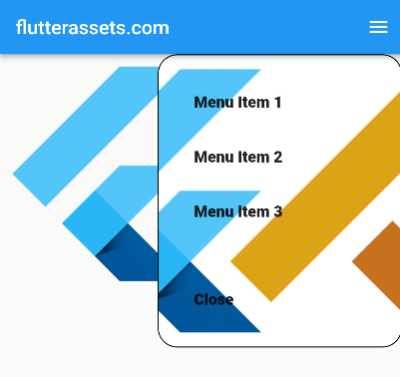
}This is a code that demonstrates how to create an animation for a menu that slides in from the right side of the screen when an icon button is pressed.
- The first thing that is defined in the code is the AnimationController and Animation.
AnimationControlleris responsible for controlling the animation andAnimationis the animation that is being controlled. Thedurationproperty is set to 200 milliseconds, and thevsyncproperty is set to “this”, which means that the animation will be synced with the app’s display. _isMenuOpenvariable is being set to false, which is used to check if the menu is open or not.dispose()method is being override to dispose of the animation controller when the widget is disposed.build()method is the main method that creates the layout of the app.- A
MaterialAppis created, with aScaffoldwidget as the home. TheScaffoldwidget has anAppBarwith a title and anIconButtonwith an icon of three horizontal lines, which is commonly used as a menu icon. - When the menu icon is pressed, an
onPressedcallback is called. Theifstatement checks if the animation is completed or not. If it is completed, the animation controller will reverse the animation, which will close the menu and_isMenuOpenvariable is set to false. If the animation is not completed, the animation controller will forward the animation, which will open the menu and_isMenuOpenvariable is set to true. - A
Stackwidget is created as the body of theScaffoldwidget. TheStackwidget has two children: aGestureDetectorand aPositionedwidget. - The
GestureDetectoris used to detect taps on the screen. If the menu is open and the screen is tapped, the animation controller will reverse the animation and_isMenuOpenvariable is set to false. - The
Positionedwidget is used to position the menu on the screen. Therightandtopproperties are set to 0, which positions the menu at the top-right corner of the screen. The child of thePositionedwidget is aSizeTransitionwidget. - The
SizeTransitionwidget is used to animate the size of its child. ThesizeFactorproperty is set to the animation defined earlier, and thecurveproperty is set toCurves.easeInOut, which creates a smooth animation. - The child of the
SizeTransitionwidget is aContainerwidget that has adecorationproperty, which is used to define the appearance of the menu. Thewidthandheightproperties are set to 250 and 300 respectively. The child of the container is aColumnwidget that contains a list ofListTilewidgets which represents the menu items. - Each of the
ListTilewidgets has atitleproperty that displays the title of the menu item and anonTapcallback that is called when the menu item is tapped. When a menu item is tapped, the animation controller will reverse the animation and_isMenuOpenvariable is set to false, closing the menu.
In summary, this code defines an animation for a menu that slides in from the right side of the screen when an iconbutton is pressed, and also allows for the menu to be closed when the screen is tapped or when a menu item is selected.
The animation is controlled by the AnimationController and Animation widgets, and the layout of the menu is created using the Positioned and SizeTransition widgets. The GestureDetector widget is used to detect taps on the screen and the ListTile widgets are used to create the menu items.
Overall, this code demonstrates a basic implementation of a sliding menu animation in a Flutter app.
