What is the Flutter BoxDecoration
In Flutter, the BoxDecoration of a Container widget specifies the visual appearance of the container. It allows you to decorate the background of the container with a colour, gradient, image, or a combination of these. You can use BoxDecoration to create a variety of visual effects, such as adding a border, changing the background colour of the container, or applying a gradient to the background.
In simple words, it adds decoration to the Container. It is a Container visual enhancement. In this post, I will try to show what you can do with BoxDecoration.
How to use Flutter BoxDecoration
To use BoxDecoration in Flutter, you will need to use the decoration property of the Container widget. The decoration property takes a BoxDecoration object as its value.
Here is an example of how you can use BoxDecoration to change the background colour of a Container widget:
Container(
  height: 100,
  width: 100,
  decoration: BoxDecoration(
    color: Colors.red,
  ),
)
This will create a Container widget with a red background.
You can also use BoxDecoration to apply a gradient to the background of a Container widget:
Container(
  height: 100,
  width: 100,
  decoration: BoxDecoration(
    gradient: LinearGradient(
      begin: Alignment.topLeft,
      end: Alignment.bottomRight,
      colors: [Colors.red, Colors.yellow],
    ),
  ),
)
This will create a Container widget with a gradient that goes from red to yellow, starting from the top left corner and ending at the bottom right corner.
You can also use the border property of BoxDecoration to add a border to the container:
Container(
  height: 100,
  width: 100,
  decoration: BoxDecoration(
    border: Border.all(
      color: Colors.black,
      width: 3,
    ),
  ),
)
This will create a Container widget with a black border that is 3 pixels wide.
In this example, I used an Icon as a child of the container.
You can read more about Icons in This post: Flutter Basics – How to use Icons in Flutter
      Container(
        margin: const EdgeInsets.all(20.0),
        alignment: Alignment(-0.7, -0.8),
        child: Icon(Icons.favorite, size: 100, color: Colors.red,),

        decoration: BoxDecoration(
          color: Colors.black45
        ),

      )
What is the border-radius in Flutter
In Flutter, the borderRadius property of the BoxDecoration class is used to specify the radius of the rounded corners of a container. The borderRadius property takes a BorderRadius object as its value.
The BorderRadius class allows you to specify different radii for each corner of the container, or use the same radius for all corners. For example, you can use the BorderRadius.all method to set the same radius for all corners:
borderRadius: BorderRadius.all(Radius.circular(10)),
This will set the radius of all corners to 10 pixels.
You can also use the BorderRadius.only method to specify different radii for each corner:
borderRadius: BorderRadius.only(
  topLeft: Radius.circular(10),
  topRight: Radius.circular(20),
  bottomLeft: Radius.circular(30),
  bottomRight: Radius.circular(40),
),
This will set the radius of the top left corner to 10 pixels, the top right corner to 20 pixels, the bottom left corner to 30 pixels, and the bottom right corner to 40 pixels.
You can use the borderRadius property in combination with the color and gradient properties of BoxDecoration to create a variety of visual effects. For example, you can use a gradient and rounded corners to create a button with a glossy effect:
Container(
  height: 50,
  width: 150,
  decoration: BoxDecoration(
    gradient: LinearGradient(
      begin: Alignment.topCenter,
      end: Alignment.bottomCenter,
      colors: [Colors.red, Colors.orange],
    ),
    borderRadius: BorderRadius.all(Radius.circular(10)),
  ),
  child: Center(
    child: Text(
      "flutterassets.com",
      style: TextStyle(color: Colors.white),
    ),
  ),
)

How to add border-radius to the container in Flutter
To add a border radius to a Container widget in Flutter, you can use the borderRadius property of the BoxDecoration class. The borderRadius property takes a BorderRadius object that specifies the radius of the corners of the Container.
      Container(
        margin: const EdgeInsets.all(20.0),
        alignment: Alignment(-0.7, -0.8),
        child: Icon(Icons.favorite, size: 100, color: Colors.red,),

        decoration: BoxDecoration(
          color: Colors.black45,
          borderRadius: BorderRadius.all(Radius.circular(40)),
        ),

      ),
In this example, the Container has a border radius of 40 pixels on all corners. The BorderRadius class has a variety of methods for specifying border-radius, such as only and vertical.
You can also specify different radii for each corner of the container using the BorderRadius class:
Container(
  height: 100,
  width: 100,
  decoration: BoxDecoration(
    color: Colors.red,
    borderRadius: BorderRadius.only(
      topLeft: Radius.circular(10),
      topRight: Radius.circular(10),
      bottomLeft: Radius.circular(10),
      bottomRight: Radius.circular(80),
    ),
  ),
)
This will create a Container widget with red background and rounded corners with different radii for each corner.
It’s worth mentioning that the BoxDecoration class is used to specify the visual properties of a Container, and the borderRadius property is just one of many properties that can be set.
You can use BorderRadius.only to specify the radius for each corner.
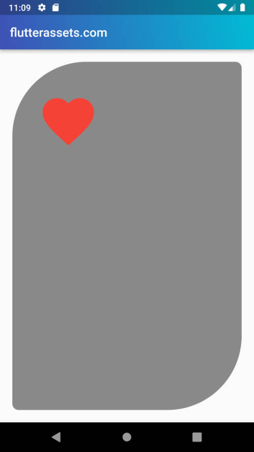
      Container(
        margin: const EdgeInsets.all(20.0),
        alignment: Alignment(-0.7, -0.8),
        child: Icon(Icons.favorite, size: 100, color: Colors.red,),

        decoration: BoxDecoration(
          color: Colors.black45,
          borderRadius: BorderRadius.only(
              topRight: Radius.circular(10.0),
              bottomRight: Radius.circular(120.0),
              topLeft: Radius.circular(120.0),
              bottomLeft: Radius.circular(10.0)),
        ),

      ),
How to do an oval shape in Flutter
To create an oval shape in Flutter, you can use the ClipOval widget. The ClipOval widget clips its child widget to an oval shape.
Here is an example of how you can use the ClipOval widget to create an oval shape:
ClipOval(
      child: Container(
        width: 200.0,
        height: 100.0,
        color: Colors.red,
      ),
    )
In this example, the Container is clipped to an oval shape by the ClipOval widget. The Container has a width and height of 100 pixels, so it will be clipped to a circle. If the width and height are different, the oval will be elongated in one direction.
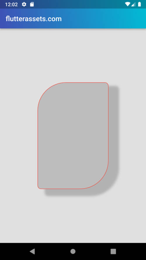
Make an oval shape using Radius.elliptical in Flutter
To create an oval shape using the Radius.elliptical property in the BoxDecoration class in Flutter, you can set the borderRadius property of the BoxDecoration to a BorderRadius.elliptical object.
Here is an example of how you can use the Radius.elliptical property to create an oval shape in a BoxDecoration:
      Container(
        margin: const EdgeInsets.all(20.0),
        alignment: Alignment(-0.7, -0.8),
        child: Icon(Icons.favorite, size: 100, color: Colors.red,),

        decoration: BoxDecoration(
          color: Colors.blue.shade100,
          border: Border.all(
            color: Colors.red,
          ),
          borderRadius: new BorderRadius.all(Radius.elliptical(200, 300)),
        ),

      ),
In this example, the Container has an oval border-radius with a horizontal radius of 200 pixels and a vertical radius of 300 pixels. The oval will be elongated in the vertical direction.

Here is another example of how you can create an oval-shaped Container widget:
Container(
  height: 100,
  width: 200,
  decoration: BoxDecoration(
    color: Colors.red,
    borderRadius: BorderRadius.all(Radius.elliptical(100, 50)),
  ),
)
This will create a Container widget that is 100 pixels tall and 200 pixels wide, with a red background and rounded corners that form an oval shape. The Radius.elliptical method takes two arguments: the horizontal radius and the vertical radius. In this case, the horizontal radius is set to 100 pixels and the vertical radius is set to 50 pixels, which creates an oval shape.
How to add a border to the container in Flutter
To add a border to a Container widget in Flutter, you can use the border property of the BoxDecoration class. The border property takes a Border object that specifies the colour, width, and style of the border.
Here is an example of how you can use the border property to add a border to a Container:
Padding(
  padding: const EdgeInsets.all(8.0),
  child: Container(
    padding: EdgeInsets.all(10),
    decoration: BoxDecoration(
      border: Border.all(color: Colors.red, width: 4.0),
    ),
    child: Text('Hello World'),
  ),
)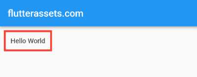
In this example, the Container has a red border with a width of 4 pixels. The Border class has a variety of methods for specifying border properties, such as only and symmetric.
This example draws the red border with a width = 5.
      Container(
        margin: const EdgeInsets.all(20.0),
        alignment: Alignment(0.7, -0.8),
        child: Icon(Icons.favorite, size: 150, color: Colors.red,),

        decoration: BoxDecoration(
          color: Colors.blue.shade200,
          border: Border.all(
            color: Colors.red,
            width: 5,
          ),
          borderRadius: BorderRadius.only(
              topRight: Radius.circular(10.0),
              bottomRight: Radius.circular(120.0),
              topLeft: Radius.circular(120.0),
              bottomLeft: Radius.circular(10.0)),
        ),

      ),
What is a box shadow in box decoration in Flutter?
In Flutter, a box shadow is a visual effect that adds a shadow to the background of a box (a widget that has a rectangular area). You can use the boxShadow property of the BoxDecoration class to add a box shadow to the background of a widget.
The boxShadow property takes a list of BoxShadow objects as its value. Each BoxShadow object specifies the properties of a single shadow, such as its color, offset, and blur radius.
Here is an example of how you can use boxShadow to add a shadow to the background of a Container widget:
Container(
  height: 100,
  width: 100,
  decoration: BoxDecoration(
    color: Colors.red,
    boxShadow: [
      BoxShadow(
        color: Colors.black,
        offset: Offset(5, 5),
        blurRadius: 10,
      ),
    ],
  ),
)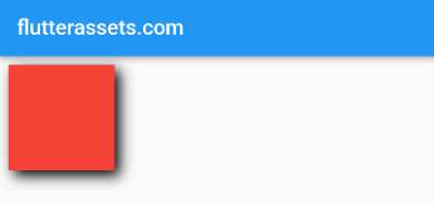
This will create a Container widget with a red background and a black shadow with an offset of 5 pixels to the right and 5 pixels down, and a blur radius of 10 pixels.
You can add multiple shadows to the same widget by including multiple BoxShadow objects in the boxShadow list. In BoxShadow you can control:
- color
- spreadRadius
- blurRadius
- offset
boxShadow: [
    BoxShadow(
      color: Colors.grey.withOpacity(0.7),
      spreadRadius: 8,
      blurRadius: 10,
      offset: Offset(30, 30), // changes position of shadow
    ),
    BoxShadow(
      color: Colors.grey.withOpacity(0.7),
      spreadRadius: 4,
      blurRadius: 5,
      offset: Offset(-20, -5), // changes position of shadow
    ),
],
Container(
height: 100,
width: 100,
decoration: BoxDecoration(
color: Colors.red,
boxShadow: [
BoxShadow(
color: Colors.black,
offset: Offset(5, 5),
blurRadius: 10,
),
BoxShadow(
color: Colors.blue,
offset: Offset(-5, -5),
blurRadius: 10,
),
],
),
)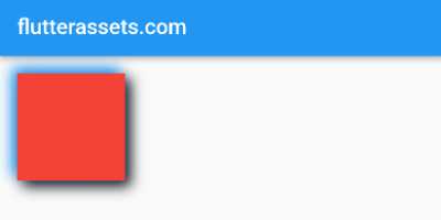
This will create a Container widget with a red background and two shadows: a black shadow with an offset of 5 pixels to the right and 5 pixels down, and a blue shadow with an offset of 5 pixels to the left and 5 pixels up.
How to add shadow to the container in Flutter
To add a shadow to a Container widget using the BoxDecoration class in Flutter, you can use the boxShadow property of the BoxDecoration class. The boxShadow property takes a list of BoxShadow objects that specify the colour, blur radius and offset of the shadow.
Here is an example of how you can use the boxShadow property to add a shadow to a Container:
Container(
  padding: EdgeInsets.all(10),
  height: 50,
  width: 100,
  decoration: BoxDecoration(
    color: Colors.white,
    boxShadow: [
      BoxShadow(
        color: Colors.grey,
        blurRadius: 4.0,
        offset: Offset(4.0, 4.0),
      ),
    ],
  ),
  child: Text('Hello World'),
)
In this example, the Container has a grey box shadow with a blur radius of 4 pixels and an offset of 4 pixels in both the horizontal and vertical directions. The BoxShadow class has a variety of methods for specifying shadow properties, such as spreadRadius and color.
      Container(
        color: Colors.grey.shade300,
        child: Center(
          child: Container(
            width: 200,
            height: 300,
            margin: const EdgeInsets.all(20.0),
            decoration: BoxDecoration(
              color: Colors.grey.shade400,
              border: Border.all(
                color: Colors.red,
                width: 1,
              ),
              borderRadius: BorderRadius.only(
                  topRight: Radius.circular(10.0),
                  bottomRight: Radius.circular(80.0),
                  topLeft: Radius.circular(80.0),
                  bottomLeft: Radius.circular(10.0)
              ),

              boxShadow: [
                BoxShadow(
                  color: Colors.grey.withOpacity(0.7),
                  spreadRadius: 5,
                  blurRadius: 5,
                  offset: Offset(25, 15), // changes position of shadow
                ),
              ],

            ),

          ),
        ),
      ),
How to add two / multiple shadows to the container in Flutter
To add multiple shadows to a Container widget in Flutter, you can use the boxShadow property of the BoxDecoration class. The boxShadow property takes a list of BoxShadow objects that specify the colour, blur radius and offset of each shadow.
Here is an example of how you can use the boxShadow property to add two shadows to a Container:
Container(
      decoration: BoxDecoration(
        boxShadow: [
          BoxShadow(
            color: Colors.grey,
            blurRadius: 4.0,
            offset: Offset(4.0, 4.0),
          ),
          BoxShadow(
            color: Colors.black,
            blurRadius: 8.0,
            offset: Offset(-4.0, -4.0),
          ),
        ],
      ),
      child: Text('Hello World'),
    )
In this example, the Container has two shadows: a grey shadow with a blur radius of 4 pixels and an offset of 4 pixels in both the horizontal and vertical directions, and a black shadow with a blur radius of 8 pixels and an offset of -4 pixels in both the horizontal and vertical directions.
Another example
      Container(
        color: Colors.grey.shade300,
        child: Center(
          child: Container(
            width: 200,
            height: 300,
            decoration: BoxDecoration(
              color: Colors.grey.shade300,
              borderRadius: BorderRadius.only(
                  topRight: Radius.circular(10.0),
                  bottomRight: Radius.circular(80.0),
                  topLeft: Radius.circular(80.0),
                  bottomLeft: Radius.circular(10.0)
              ),

              boxShadow: [
                BoxShadow(
                  color: Colors.grey.withOpacity(0.7),
                  spreadRadius: 8,
                  blurRadius: 10,
                  offset: Offset(10, 10), // changes position of shadow
                ),
                BoxShadow(
                  color: Colors.white.withOpacity(0.7),
                  spreadRadius: 8,
                  blurRadius: 10,
                  offset: Offset(-10, -10), // changes position of shadow
                ),
              ],

            ),

          ),
        ),
      ),
How to add an image to the container in Flutter
To add an image to a container in Flutter, you can use the Container widget’s decoration property and pass it an BoxDecoration widget that has an image property. Here’s an example:
Padding(
  padding: const EdgeInsets.all(16.0),
  child: Container(
    height: 200,
    decoration: BoxDecoration(
      image: DecorationImage(
        image: NetworkImage('https://picsum.photos/250?image=9'),
        fit: BoxFit.cover,
      ),
    ),
  )
)
Padding(
padding: const EdgeInsets.all(16.0),
child: Container(
height: 200,
decoration: BoxDecoration(
image: DecorationImage(
image: AssetImage('assets/image.png'),
fit: BoxFit.cover,
),
),
)
)
How to add a radius border to the image in Flutter
To add a rounded border to an image in Flutter, you can use the Container widget’s decoration property and pass it an BoxDecoration widget that has a borderRadius property. Here’s an example:
      Container(
        color: Colors.grey.shade300,
        child: Center(
          child: Container(
            width: 200,
            height: 300,
            decoration: BoxDecoration(
              color: Colors.grey.shade400,
              borderRadius: BorderRadius.all(Radius.circular(30.0),
              ),
              image: DecorationImage(
                image: AssetImage(
                    'assets/FlutterAssets_logo_BG.jpg'),
                fit: BoxFit.cover,
              )
            ),

          ),
        ),
      ),
This will display the image with a circular border radius. You can also use the BorderRadius.all constructor to specify different border radii for each corner of the container. For example:
How to add a border to the Image in Flutter
To add a border to an image in Flutter, you can use the Container widget’s decoration property and pass it an BoxDecoration widget that has a border property. Here’s an example:
Also, you can read more about images in Flutter in this post: Flutter Basics – How to use an image in Flutter
Container(
  color: Colors.grey.shade300,
  child: Center(
    child: Container(
      width: 200,
      height: 300,
      decoration: BoxDecoration(
        color: Colors.grey.shade400,
        borderRadius: BorderRadius.all(Radius.circular(30.0),
        ),
        image: DecorationImage(
          image: AssetImage(
              'assets/FlutterAssets_logo_BG.jpg'),
          fit: BoxFit.cover,
        ),
        border: Border.all(
          color: Colors.black,
          width: 2,
        ),
      ),

    ),
  ),
),
How to add a shadow to the image in Flutter
To add a shadow to an image in Flutter, you can use the Container widget’s decoration property and pass it an BoxDecoration widget that has a boxShadow property. Here’s an example:
Container(
  color: Colors.grey.shade300,
  child: Center(
    child: Container(
      width: 200,
      height: 300,
      decoration: BoxDecoration(
        color: Colors.grey.shade400,
        borderRadius: BorderRadius.all(Radius.circular(30.0),
        ),
        image: DecorationImage(
          image: AssetImage(
              'assets/FlutterAssets_logo_BG.jpg'),
          fit: BoxFit.cover,
        ),
        border: Border.all(
          color: Colors.black,
          width: 2,
        ),

        boxShadow: [
          BoxShadow(
            color: Colors.grey.withOpacity(0.5),
            spreadRadius: 8,
            blurRadius: 10,
            offset: Offset(30, 30), // changes position of shadow
          ),
          BoxShadow(
            color: Colors.grey.withOpacity(0.5),
            spreadRadius: 4,
            blurRadius: 5,
            offset: Offset(-20, -5), // changes position of shadow
          ),
        ],
      ),

    ),
  ),
),
