In this post, we will look into the MediaQueryData object in Flutter and explore some of the most commonly used properties that it offers. It is important to note that this is not an exhaustive list of all the properties available within the MediaQueryData object, but rather a selection of the ones that are most frequently utilized. If you want to see a full list of all the properties, you can refer to the Flutter documentation.
Here is a list:
size: The size of the display screen in logical pixels (width and height).devicePixelRatio: The ratio of the physical pixels on the screen to the logical pixels.textScaleFactor: The scaling factor for fonts.platformBrightness: The brightness of the platform, which can be eitherBrightness.lightorBrightness.dark.padding: The padding around the display screen.viewInsets: The insets (e.g., status bar, keyboard) that reduce the available screen space.viewPadding: The padding around the viewable area of the display screen.alwaysUse24HourFormat: Whether to always use the 24-hour format for displaying time.accessibleNavigation: Whether accessible navigation is enabled.orientation: The display orientation, portrait or landscape
MediaQueryData in Flutter
MediaQueryData in Flutter, is a class that contains information about the current media query. A media query is a set of rules that specifies how an app should display its content based on the characteristics of the device it is running on, such as the screen size, orientation, and pixel density.
MediaQueryData contains a number of properties that provide information about the current media query, including the screen size, screen orientation, device pixel ratio, and more. You can use this information to adjust the layout and appearance of your app to match the characteristics of the device it is running on.
To access the MediaQueryData for the current app, you can use the MediaQuery.of(context) method. This will return the MediaQueryData for the given BuildContext, which you can then use to retrieve information about the current media query.
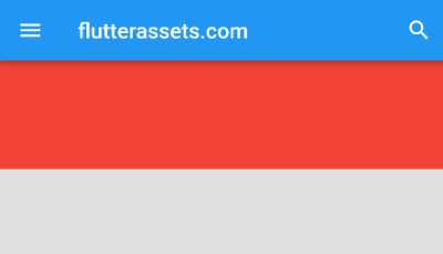
Here is an example of how you might use MediaQueryData in a Flutter app:
//add to build widget
double screenWidth = MediaQuery.of(context).size.width;
MediaQueryData mediaQuery = MediaQuery.of(context);

Container(
  child: mediaQuery.orientation == Orientation.portrait
      ? Container(
    width: screenWidth,
    height: 100,
    color: Colors.red,
  )
      : Container(
    width: screenWidth,
    height: 100,
    color: Colors.green,
  ),
)
The above code can be presented like this:
// Check the screen orientation
if (mediaQuery.orientation == Orientation.portrait) {
  // The screen is in portrait orientation
} else {
  // The screen is in landscape orientation
}
In this example, the app uses the MediaQueryData to check the screen orientation.

What is MediaQuery size in Flutter
In Flutter, MediaQuery.size is a property that tells you the width and height of the device’s screen in logical pixels. Logical pixels are a unit of measurement that’s used to make sure that the layout of a Flutter app looks the same on all devices, regardless of the device’s pixel density.
To access MediaQuery.size, you need to use the MediaQuery.of(context) method, which returns an object called MediaQueryData. MediaQueryData has a property called size, which is the Size object that holds the width and height of the screen.
Here’s an example of how you might use MediaQuery.size to get the screen width and height:
 @override
  Widget build(BuildContext context) {
    // Get the MediaQueryData for the current build context
    MediaQueryData mediaQueryData = MediaQuery.of(context);

    // Get the screen width and height in logical pixels
    double screenWidth = mediaQueryData.size.width;
    double screenHeight = mediaQueryData.size.height;

    return MaterialApp(
      // ...
    );
  }
How to use MediaQuery size in Flutter
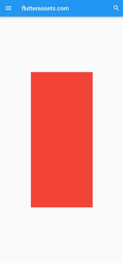
Here’s an example of how you can make a container half the size of the screen:
double screenWidth = MediaQuery.of(context).size.width;
double screenHeight = MediaQuery.of(context).size.height;

body: Center(
  child: Container(
    width: screenWidth / 2, // Half the screen width
    height: screenHeight / 2, // Half the screen height
    color: Colors.red,
  ),
),
Read more about screen width and height im this post: https://flutterassets.com/flutter-screen-width-and-height/
What is MediaQuery devicePixelRatio in Flutter?
MediaQuery.devicePixelRatio is a property that tells you the ratio of physical pixels to logical pixels on a device’s screen. Logical pixels are a unit of measurement that’s used to make sure that the layout of a Flutter app looks the same on all devices, regardless of the device’s pixel density.
The device pixel ratio is important because it helps Flutter scale the layout of an app for different devices. For example, if a device has a high pixel density (a high device pixel ratio), Flutter will use more physical pixels to draw the same layout, which can result in a higher-quality image.
To access MediaQuery.devicePixelRatio, you need to use the MediaQuery.of(context) method, which returns an object called MediaQueryData. MediaQueryData has a property called devicePixelRatio, which is the device pixel ratio of the screen.
Here’s an example of how you might use MediaQuery.devicePixelRatio:
// Get the MediaQueryData for the current build context
MediaQueryData mediaQueryData = MediaQuery.of(context);

// Get the device pixel ratio
double devicePixelRatio = mediaQueryData.devicePixelRatio;
Shorter version of the above code:
// Get the device pixel ratio
double devicePixelRatio = MediaQuery.of(context).devicePixelRatio;
body: Container(
padding: EdgeInsets.all(20),
width: screenWidth, // Half the screen width
height: 100, // Half the screen height
color: Colors.red,
child: Text('Device Pixel Ratio: $devicePixelRatio'),
),
How to use MediaQuery devicePixelRatio in Flutter
This can be useful if you want to create responsive layouts that adapt to different screen sizes and resolutions.
Here’s an example of how you might use MediaQuery.devicePixelRatio in a Flutter app:
@override
  Widget build(BuildContext context) {
    // Get the device pixel ratio
    double devicePixelRatio = MediaQuery.of(context).devicePixelRatio;

    // Use the pixel ratio to adjust the size of the widget
    return Container(
      width:100 * devicePixelRatio ,
      height: 50 * devicePixelRatio ,
      color: Colors.blue,

      child: Text('Device Pixel Ratio: $devicePixelRatio'),
    );
  }
What is MediaQuery textScaleFactor in Flutter?
MediaQuery.textScaleFactor is a property in Flutter that tells you the size of text on the display screen. It’s a number that represents how much bigger or smaller the text should be compared to the default size. You can use it to adjust the size of the text in your app to make it more legible or to match the user’s preferred text size.
To use MediaQuery.textScaleFactor, you need to import the flutter:material.dart package and then call MediaQuery.of(context).textScaleFactor in your app’s code. This will give you the current text scaling factor for the display screen. You can then use this value to adjust the size of the text in your app as needed.
Here’s an example of how you might use MediaQuery.textScaleFactor in your Flutter app:
// Get the text scaling factor
double textScaleFactor = MediaQuery.of(context).textScaleFactor;

Text('Text Scale Factor: $textScaleFactor'),
How to use MediaQuery textScaleFactor in Flutter?
This can be helpful if you want to change the size of the text in your app to match the text scaling setting on the device.
Here is an example of how you might use MediaQuery.textScaleFactor in a Flutter app:
// Get the text scaling factor
    double textScaleFactor = MediaQuery.of(context).textScaleFactor;

Container(
  padding: EdgeInsets.all(20),
  color: Colors.blue,
  child: Text(
    'Hello, world!',
    style: TextStyle(
      fontSize: 18 * textScaleFactor,
    ),
  )
),
This code will show the text “Hello, world!” on the screen. The size of the text will be 18 pixels on devices with a text scaling factor of 1.0. If the text scaling factor is bigger, the text will be bigger too. This helps make sure the text in your app is easy to read and looks good on different devices.
You can use MediaQuery.textScaleFactor anywhere in your Flutter app where you want to adjust the text size based on the system text scaling setting.
what is MediaQuery platformBrightness in Flutter?
In Flutter, the MediaQueryData.platformBrightness is a way to see if the device’s screen is set to “dark mode” or “light mode”. It has two values: Brightness.light for light mode and Brightness.dark for dark mode. You can use platformBrightness to change how your app looks based on the device’s screen setting. For example, you might use a light theme for light mode and a dark theme for dark mode.
To use platformBrightness, you can check its value like this:
if (MediaQuery.of(context).platformBrightness == Brightness.light) {
  // Use a light theme
} else {
  // Use a dark theme
}
It’s important to remember that platformBrightness shows the device’s screen setting, which might be different from the app’s theme setting. To see the app’s theme setting, you can use the ThemeData.brightness property.
How to use MediaQuery platformBrightness in Flutter?
body: MediaQuery.of(context).platformBrightness == Brightness.light
  ?
    Container(
      width: screenWidth,
      height: 100,
      padding: EdgeInsets.all(20),
      color: Colors.black12,
      child: Text(
        'Light mode',
        style: TextStyle(
          fontSize: 18, color: Colors.black
        ),
      )
    )
    :
    Container(
        width: screenWidth,
        height: 100,
        padding: EdgeInsets.all(20),
        color: Colors.black54,
        child: Text(
          'Dark mode',
          style: TextStyle(
            fontSize: 18, color: Colors.white
          ),
        )
    )
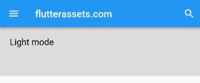
The MediaQuery.of(context).platformBrightness property is used to determine the brightness of the platform’s screen. If it is set to light mode, the app will display a Container with a black12 (faded black or light grey) background and black text; if it is set to dark mode, the app will display a Container with a dark grey background and white text. This allows the app to tailor its appearance based on the platform’s screen setting.

What is MediaQuery padding in Flutter?
In Flutter, the MediaQuery.padding property tells you how much space around the screen is not available for displaying content. This space is called padding and it can include things like the system status bar or a virtual navigation bar on Android phones. The MediaQuery.padding property returns an object called EdgeInsets, which has information about the padding on each side of the screen (top, right, bottom, and left). You can use the EdgeInsets object to find out how much padding there is on each side. For example:
double topPadding = MediaQuery.of(context).padding.top;
double rightPadding = MediaQuery.of(context).padding.right;
double bottomPadding = MediaQuery.of(context).padding.bottom;
double leftPadding = MediaQuery.of(context).padding.left;
You can use the MediaQuery.padding property to make sure your app’s content does not get covered up by the system status bar or navigation bar, or to make use of extra screen space on iOS devices.
How to use MediaQuery padding in Flutter?
Imagine you are building a messaging app that displays a list of messages at the bottom of the screen, and you want to ensure that the messages are not obscured by the system status bar or virtual navigation bar. You could use the MediaQuery.padding property to adjust the position of the messages so that they are not obscured:
List<String> messages = ["Message 1","Message 2","Message 3","Message 4"];

body: Container(
  margin: EdgeInsets.only(top: topPadding),
  child: ListView.builder(
    itemCount: messages.length,
    itemBuilder: (context, index) {
      return Text(messages[index]);
    },
  ),
)
In this example, the topPadding variable is used to set the top margin of the container that holds the list of messages. This will ensure that the messages are not obscured by the system status bar or virtual navigation bar, as the container will be positioned below the padded area of the screen.
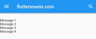
Here is an example where the mediaquery.padding was not used:
List<String> messages = ["Message 1","Message 2","Message 3","Message 4"];

body: Container(
  child: ListView.builder(
    itemCount: messages.length,
    itemBuilder: (context, index) {
      return Text(messages[index]);
    },
  ),
)
What is MediaQuery viewInsets in Flutter?
In Flutter, MediaQuery.of(context).viewInsets is a property that tells you the size of any system UI elements (like the on-screen keyboard or status bar) that are currently displayed on the screen. It can be helpful when building a layout that needs to work on different screen sizes and configurations.
viewInsets is an instance of the EdgeInsets class, which is used to describe the space around the edges of a rectangle. In this case, the rectangle is the screen and the child is your app’s user interface. viewInsets tells you the space between the edges of the screen and the edges of the user interface. You can use this information to adjust your app’s layout to make room for system UI elements.
How to use MediaQuery viewInsets in Flutter?
For example, here’s some code that uses viewInsets to give some extra space at the top and bottom of a container:
@override
  Widget build(BuildContext context) {
    // Get the current view insets
    EdgeInsets viewInsets = MediaQuery.of(context).viewInsets;

    return Scaffold(
      body: Container(
        // Apply the view insets to the container's padding
        padding: EdgeInsets.only(
          top: viewInsets.top,
          bottom: viewInsets.bottom,
        ),
        child: Text('Hello, World!'),
      ),
    );
  }
This will make sure that the text inside the container isn’t covered up by any system UI elements that are currently being displayed.
Here’s another example of how you might use the MediaQuery.of(context).viewInsets property in a Flutter app:
EdgeInsets viewInsets = MediaQuery.of(context).viewInsets;

body: SingleChildScrollView(
  // Apply the view insets to the SingleChildScrollView's padding
  padding: EdgeInsets.only(
    top: viewInsets.top,
    bottom: viewInsets.bottom,
  ),
  child: Column(
    children: [
      Container(
        height: 200,
        width: screenWidth,
        color: Colors.blue,
        child: Text('Content 1'),
      ),
      Container(
        height: 200,
        width: screenWidth,
        color: Colors.red,
        child: Text('Content 2'),
      ),
      Container(
        height: 200,
        width: screenWidth,
        color: Colors.green,
        child: Text('Content 3'),
      ),
      Container(
        height: 200,
        width: screenWidth,
        color: Colors.grey,
        child: Text('Content 4'),
      ),
      Container(
        height: 200,
        width: screenWidth,
        color: Colors.yellow,
        child: Text('Content 5'),
      ),
    ],
  ),
)
In this example, the viewInsets.bottom and viewInsets.top value is applied to the top and bottom padding of a SingleChildScrollView widget. This ensures that the content inside the SingleChildScrollView is not obscured by an on-screen keyboard or other system UI element that may be displayed at the bottom of the screen.
This can be especially useful in cases where the user is interacting with an input field or text field that may trigger the display of an on-screen keyboard, as it ensures that the keyboard does not obscure important content or UI elements in the app.
What is MediaQuery viewPadding in Flutter?
MediaQuery.viewPadding is a property of the MediaQuery class, which is used to provide information about the display screen of the device running your Flutter app. The viewPadding property specifically represents the padding applied to the display screen. This padding is typically used to account for hardware elements such as physical buttons or other hardware features that may be present around the edges of the screen.
The viewPadding property returns a EdgeInsets object, which is a class that represents padding applied to each edge of a rectangular area. The EdgeInsets class has four properties: left, top, right, and bottom, which represent the padding applied to the left, top, right, and bottom edges of the rectangular area, respectively.
You can use the viewPadding property in your Flutter app by retrieving it from the MediaQuery object and using it to adjust the layout of your app. For example, you can use it to add padding to a widget to ensure that its content is not obscured by the screen bezel or other hardware elements.
How to use MediaQuery viewPadding in Flutter?
Here is an example of how you might use the viewPadding property in a Flutter app:
EdgeInsets viewPadding = MediaQuery.of(context).viewPadding;

body: Container(
  height: 50,
  width: screenWidth,
  padding: viewPadding,
  color: Colors.green,
  child: Text('Hello World'),
)
Here is another example of how you might use MediaQuery.viewPadding in a Flutter app:
EdgeInsets viewPadding = MediaQuery.of(context).viewPadding;

body: Container(
  color: Colors.black12,
  width: screenWidth,
  padding: viewPadding,
  child: Column(
    mainAxisAlignment: MainAxisAlignment.start,
    children: <Widget>[
      Text(
        'Welcome to the app!',
        style: TextStyle(fontSize: 24),
      ),
      SizedBox(height: 20),
      Text(
        'The view padding is $viewPadding',
        style: TextStyle(fontSize: 16),
      ),
    ],
  ),
)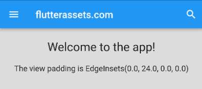
In this example, the Container widget in the body of the Scaffold has padding applied to its edges equal to the view padding of the display screen. This will ensure that the content is not obscured by the screen bezel or other hardware elements.
Additionally, the example displays the value of the viewPadding property in a Text widget, so that you can see how it is being used in the layout of the app.
What is MediaQuery alwaysUse24HourFormat in Flutter?
mediaquery.alwaysUse24HourFormat is a property in Flutter that tells you whether the device’s system clock is set to use a 24-hour time format or a 12-hour time format with AM/PM indicators. This information can be useful if you want to display time values in your Flutter app.
To access this property, you can use the MediaQueryData object, which is available through the BuildContext of a widget. Here’s an example of how you might use it:
bool alwaysUse24HourFormat = MediaQuery.of(context).alwaysUse24HourFormat;
This will give you a bool value that is true if the device is using a 24-hour time format, and false if it is using a 12-hour time format. You can use this value to decide how to display time values in your app. For example, you might use a TimeOfDay widget if the value is true, or a Text widget with a custom format if the value is false.
It’s important to note that the value of alwaysUse24HourFormat can change at any time, if the user changes their device’s system clock settings. To make sure your app always displays the correct time format, you may want to use this property only when you need it, and cache the value if you use it repeatedly.
How to use MediaQuery alwaysUse24HourFormat in Flutter?
Here is an example of how you might use the mediaquery.alwaysUse24HourFormat property in a practical way in a Flutter app:
Imagine that you are building a scheduling app that allows users to create events and set the time and date for those events. You want to display the time of the events in a way that is consistent with the device’s system clock settings.
To do this, you could use the mediaquery.alwaysUse24HourFormat property to determine whether to display the time in a 24-hour format or a 12-hour format with AM/PM indicators. Here’s some example code that demonstrates how you might use this property:
bool alwaysUse24HourFormat = MediaQuery.of(context).alwaysUse24HourFormat;

if (alwaysUse24HourFormat) {
  // Display the time in a 24-hour format
  Text("The event starts at ${event.startTime.hour}:${event.startTime.minute}");
} else {
  // Display the time in a 12-hour format with AM/PM indicators
  Text("The event starts at ${event.startTime.format(context)}");
}
In this example, the event object is assumed to have a startTime property that is a TimeOfDay value. The format method of the TimeOfDay class can be used to format the time value for display in a 12-hour format with AM/PM indicators, taking into account the device’s system clock settings.
This example shows another way how the above parameter can be used:
DateTime now = DateTime.now();
String formattedDate24 = DateFormat('kk:mm:ss').format(now);
String formattedDate12 = DateFormat('h:mm:ss a').format(now);

bool alwaysUse24HourFormat = MediaQuery.of(context).alwaysUse24HourFormat;

Container(
  // Apply the view insets to the container's padding
  padding: EdgeInsets.all(12),
  child: alwaysUse24HourFormat == true
  ?
  Text('24 hour time format:\nTime: $formattedDate24 \n \24 format: $alwaysUse24HourFormat ')
      :
  Text('12 hour time format:\nTime: $formattedDate12 \n \24 format:  $alwaysUse24HourFormat ')
),

What is MediaQuery accessibleNavigation in Flutter?
In Flutter, the mediaquery.accessibleNavigation property is a boolean value that indicates whether the device has a mechanism for accessing the app’s content using a keyboard or other assistive technology. This property can be used to customize the app’s user interface for accessibility.
For example, if mediaquery.accessibleNavigation is true, the app might display additional information or controls that are only visible when using a keyboard, or it might rearrange elements in the interface to make them easier to navigate with a keyboard.
To access the mediaquery.accessibleNavigation property in Flutter, you can use the MediaQuery widget. This widget provides access to various media-related properties of the app, including the dimensions of the display, the device pixel ratio, and the text scale factor.
Here is an example of how you might use the mediaquery.accessibleNavigation property in a Flutter app:
class MyApp extends StatelessWidget {
  @override
  Widget build(BuildContext context) {
    // Use the MediaQuery widget to access the media-related properties of the app
    var media = MediaQuery.of(context);

    return MaterialApp(
      home: Scaffold(
        body: Column(
          children: [
            Text('Accessible Navigation: ${media.accessibleNavigation}'),
            // Other widgets go here
          ],
        ),
      ),
    );
  }
}
This example displays a Text widget that shows the value of the mediaquery.accessibleNavigation property. You can use this property to customize the app’s user interface based on the capabilities of the device.
How to use MediaQuery accessibleNavigation in Flutter?
Here is an example of how you might use the mediaquery.accessibleNavigation property in a Flutter app:
Imagine that you have a list of items that you want to display to the user. When the app is running on a device with accessible navigation enabled, you want to provide additional information and controls to help the user navigate the list using a keyboard. When accessible navigation is not enabled, you want to display the list in a more compact format without the additional controls.
Here is how you might implement this using the mediaquery.accessibleNavigation property:
import 'package:flutter/material.dart';

void main() {
  runApp(const MyApp());
}

class MyApp extends StatelessWidget {
  const MyApp({super.key});

  @override
  Widget build(BuildContext context) {
    return MaterialApp(
      debugShowCheckedModeBanner: false,
      title: 'Flutter Demo',
      theme: ThemeData(
        primarySwatch: Colors.blue,
        primaryColor: Colors.green,
      ),
      home: const MyHomePage(title: 'Flutter Demo'),
    );
  }
}

class MyHomePage extends StatefulWidget {
  const MyHomePage({super.key, required this.title});
  final String title;

  @override
  State<MyHomePage> createState() => _MyHomePageState();
}

class _MyHomePageState extends State<MyHomePage> {

  @override
  Widget build(BuildContext context) {

    var media = MediaQuery.of(context);

    return Scaffold(
      appBar: AppBar(
        title: Text('flutterassets.com'),
      ),
      body:ListView.builder(
        itemCount: 20,
        itemBuilder: (context, index) {
          // Check the value of the mediaquery.accessibleNavigation property
          if (media.accessibleNavigation) {
            // If accessible navigation is enabled, return a widget with additional controls
            return AccessibleListItem(index: index);
          } else {
            // If accessible navigation is not enabled, return a more compact widget
            return CompactListItem(index: index);
          }
        },
      ),
    );
  }
}


// This is the widget that will be used when accessible navigation is enabled
class AccessibleListItem extends StatelessWidget {
  final int? index;

  const AccessibleListItem({Key? key, this.index}) : super(key: key);

  @override
  Widget build(BuildContext context) {
    return Container(
      height: 100,
      child: Row(
        children: [
          Text('Item $index'),
          Spacer(),
          IconButton(
            icon: Icon(Icons.edit),
            onPressed: () {
              // Handle edit button press
            },
          ),
          IconButton(
            icon: Icon(Icons.delete),
            onPressed: () {
              // Handle delete button press
            },
          ),
        ],
      ),
    );
  }
}

// This is the widget that will be used when accessible navigation is not enabled
class CompactListItem extends StatelessWidget {
  final int? index;

  const CompactListItem({Key? key, this.index}) : super(key: key);

  @override
  Widget build(BuildContext context) {
    return Container(
      height: 50,
      child: Text('Compact Item $index'),
    );
  }
}
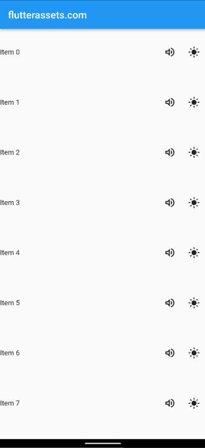
In this example, the app uses a ListView to display a list of items. The itemBuilder callback function uses the mediaquery.accessibleNavigation property to decide which widget to use for each list item. If accessible navigation is enabled, the AccessibleListItem widget is used, which displays the item’s index and provides buttons for editing and deleting the item. If accessible navigation is not enabled, the CompactListItem widget is used, which just displays the item’s index.

What is MediaQuery orientation in Flutter?
In Flutter, mediaquery.orientation is a property that specifies the orientation of a device’s screen. The orientation can either be portrait (vertical) or landscape (horizontal).
This property is useful when you want to design a Flutter app that is responsive to different screen orientations. For example, you might want to display different layouts or UI elements depending on whether the device is in portrait or landscape mode.
@override
Widget build(BuildContext context) {
  Orientation orientation = MediaQuery.of(context).orientation;

  if (orientation == Orientation.portrait) {
    // Display portrait layout
  } else {
    // Display landscape layout
  }
}
This code will check the orientation of the device’s screen and display the appropriate layout depending on whether the device is in portrait or landscape mode.
How to use MediaQuery orientation in Flutter?
In the example below, the code first retrieves the current orientation of the device’s screen using the MediaQuery widget and the orientation property. It then checks whether the orientation is portrait or landscape using a if statement.
If the orientation is a portrait, the code returns a Scaffold widget with an AppBar widget and a red Container widget as its body. If the orientation is landscape, the code returns a Scaffold widget with an AppBar widget and a green Container widget as its body.
@override
Widget build(BuildContext context) {

  Orientation orientation = MediaQuery.of(context).orientation;

  if (orientation == Orientation.portrait) {
    // Display portrait layout
    return Scaffold(
        appBar: AppBar(
          title: Text('flutterassets.com - Portrait'),
        ),
        body: Container(
          color: Colors.red,
        )
    );
  } else {
    // Display landscape layout
    return Scaffold(
        appBar: AppBar(
          title: Text('flutterassets.com - Landscape'),
        ),
        body: Container(
          color: Colors.green,
        )
    );
  }
}