What is a Flutter Chip Widget
A Flutter Chip Widget is a small visual component that is used to represent a piece of information or a filter option within a user interface. It’s called a “chip” because it looks like a small rectangular chip that you might find in a board game or a casino.
Chips are often used to display categories, tags, or other types of labels. They are also frequently used in filtering interfaces, where users can select one or more options to narrow down a list of results.
The Flutter Chip Widget consists of a rounded rectangular shape with text inside. You can customize the appearance of the chip by changing the colour, border, and text style. You can also add an icon or image to the chip to make it more visually appealing.
One of the benefits of using a Flutter Chip Widget is that it is highly customizable and can be easily integrated into any Flutter app. It’s also very flexible and can be used in a variety of different ways to display different types of information.
How to use the Flutter Chip Widget
You can create a chip widget by using the Chip class and providing the necessary properties. One simple example is to create a chip with an avatar icon, label, and onDelete function:
Chip(
  avatar: Icon(Icons.person),
  label: Text('John Doe'),
  onDeleted: () {
    // Do something when the chip is deleted
  },
),
In this example, the avatar property is set to an Icon widget with the person icon, which will display to the left of the label text. The label property is set to a Text widget with the text “John Doe”. Finally, the onDeleted property is set to a function that will be called when the user clicks the delete icon on the chip.
You can customize the appearance and behaviour of the chip widget by providing additional properties, such as backgroundColor, deleteIcon, or selected. You can also use the chip widget in different layouts, such as a list or a wrap widget, to display multiple chips.
Chip widget as a Button in Flutter
It is possible to use the Flutter Chip widget as a button even though it does not have an onTap or onPressed property. You can use the GestureDetector widget to detect a tap on the Chip widget and perform an action accordingly.
Here’s an example code snippet that demonstrates how to use the Chip widget as a button using the GestureDetector widget:
bool _isSelected = false;

@override
Widget build(BuildContext context) {

  return Scaffold(
    appBar: AppBar(
      title: Text('flutterassets.com'),
    ),
    body: Container(
      alignment: Alignment.topCenter,
      padding: const EdgeInsets.all(8.0),
      child: GestureDetector(
        onTap: () {
          setState(() {
            _isSelected = !_isSelected;
          });
          // Perform any action you want here
        },
        child: Chip(
          label: Text('My Chip Button'),
          backgroundColor: _isSelected ? Colors.blue : Colors.grey,
        ),
      )
    ),
  );
}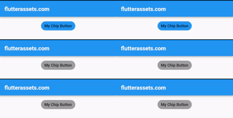
In this example, we wrap the Chip widget with a GestureDetector widget and set the onTap property to a callback function that toggles the _isSelected variable when the Chip widget is tapped. We also set the backgroundColor property of the Chip widget based on the value of the _isSelected variable to visually indicate whether the button is selected or not.
You can modify the onTap callback function to perform any action you want when the Chip widget is tapped.
How to disable the Flutter Chip widget after pressed
The Flutter Chip Widget does not have an onPressed or onTap property so we cannot tet its value to null.
If you use the Chip Widget with GestureDetector then the GestureDetector can handle the onTap event. You can then use a boolean variable to keep track of whether the chip has been pressed, and update the variable within the onTap event handler.
Here’s an example code snippet to illustrate the process:
bool _isEnabled = true;

@override
Widget build(BuildContext context) {
  return Scaffold(
    appBar: AppBar(
      title: Text('flutterassets.com'),
    ),
    body: Container(
      alignment: Alignment.topCenter,
      padding: EdgeInsets.all(16),
      child: GestureDetector(
        onTap: _isEnabled
            ? () {
          setState(() {
            _isEnabled = false;
          });
        }
            : null,
        child: Chip(
          backgroundColor: _isEnabled ? Colors.blue : Colors.grey,
          label: Text('My Chip'),
        ),
      )
    ),
  );
}
In this example, the GestureDetector is used to handle the onTap event, and the _isEnabled variable is used to keep track of whether the chip has been pressed. When the chip is pressed, the setState method updates the state of the variable to false, which disables the chip.
Disable the Flutter Chip widget with onDelete
The situation here is similar to the above. You can use a boolean variable to keep track of whether the delete icon has been pressed and update the variable within the onDelete event handler.
If you set the onDelete property of a Flutter Chip Widget to null after the chip has been pressed, the delete icon will no longer be displayed and the onDeleted event will no longer be triggered when the chip is deleted.
bool _isEnabled = true;

@override
Widget build(BuildContext context) {
  return Scaffold(
    appBar: AppBar(
      title: Text('flutterassets.com'),
    ),
    body: Container(
      alignment: Alignment.topCenter,
      padding: EdgeInsets.all(16),
      child: Chip(
        backgroundColor: _isEnabled ? Colors.blue : Colors.grey,
        label: Text('My Chip'),
        onDeleted: _isEnabled
            ? () {
          setState(() {
            _isEnabled = false;
          });
        }
            : null,
      )
    ),
  );
}
Where to use the Chip widget in Flutter
The Flutter Chip Widget is a versatile component that can be used in a variety of ways within a user interface. Here are 10 common usages of the Flutter Chip Widget:
- Filter options: One of the most common uses of the chip widget is to display filter options. You can use chips to represent different categories or tags and allow users to select one or more options to filter a list of results.
- User input: You can use chips as a way for users to input data within your app. For example, you could allow users to select multiple interests or skills using chips.
- Tags: You can use chips to display tags associated with a piece of content. For example, you could use chips to display tags such as “comedy” or “action” for a movie listing.
- Categories: You can use chips to display categories of items within your app. For example, you could use chips to display different types of products in a shopping app.
- User selection: You can use chips to allow users to select one option from a list of choices. For example, you could use chips to allow users to select their preferred language.
- Status indicators: You can use chips to display status indicators such as “New” or “Featured” for items within your app.
- Contact information: You can use chips to display contact information for users, such as their email addresses or phone number.
- Quantity selection: You can use chips to allow users to select a number of items. For example, you could use chips to allow users to select the number of tickets they want to purchase.
Use the Flutter Chip widget with user input
Here’s an example of how you could use the Flutter Chip widget for user input:
late TextEditingController _controller;
late List<String> _interests;

@override
void initState() {
  super.initState();
  _interests = [];
  _controller = TextEditingController();
}

void _addInterest(String interest) {
  setState(() {
    _interests.add(interest);
  });
}

void _removeInterest(String interest) {
  setState(() {
    _interests.remove(interest);
  });
}

@override
Widget build(BuildContext context) {

  return Scaffold(
    appBar: AppBar(
      title: Text('flutterassets.com'),
    ),
    body: Column(
      crossAxisAlignment: CrossAxisAlignment.start,
      children: [
        const SizedBox(height: 16),
        Text(
          'Interests:',
          style: Theme.of(context).textTheme.subtitle1,
        ),
        Wrap(
          spacing: 8,
          children: _interests.map((interest) {
            return Chip(
              label: Text(interest),
              onDeleted: () => _removeInterest(interest),
            );
          }).toList(),
        ),
        const SizedBox(height: 16),
        TextField(
          decoration: InputDecoration(
            labelText: 'Add an Interest',
            suffixIcon: IconButton(
              icon: const Icon(Icons.add),
              onPressed: () {
                _addInterest(_controller.text.trim());
                _controller.clear();
              },
            ),
          ),
          controller: _controller,
        ),
      ],
    ),
  );
}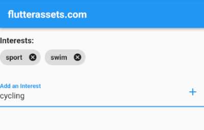
In this example, we have a List<String> called _interests that will store the selected interests as strings. We also have two methods called _addInterest and _removeInterest that will be used to add and remove interests from the _interests list.
The build method creates a Wrap widget that will display the selected interests as Chip widgets. Each Chip widget has a label property that displays the interest text and an onDeleted property that removes the interest from the list when the user clicks on the delete icon.
Finally, we have a TextField widget that allows the user to enter new interests. When the user clicks on the add icon, the _addInterest method is called with the entered interest text, which adds it to the _interests list and clears the TextField widget.
Use the Flutter Chip widget as Tags
Here is an example of how to use the Flutter Chip widget with tags:
import 'package:flutter/material.dart';

void main() {
  runApp(MyApp());
}

class MyApp extends StatelessWidget {

  @override
  Widget build(BuildContext context) {
    return MaterialApp(
      debugShowCheckedModeBanner: false,
      title: 'Flutter Demo',
      theme: ThemeData(
        primarySwatch: Colors.blue,
      ),
      home: MyHomePage(),
    );
  }
}

class MyHomePage extends StatefulWidget {

  @override
  State<MyHomePage> createState() => _MyHomePageState();
}

class Movie {
  final String title;
  final List<String> tags;

  Movie({required this.title, required this.tags});
}

class _MyHomePageState extends State<MyHomePage>{

  final List<Movie> movies = [    Movie(title: "The Godfather", tags: ["crime", "drama"]),
    Movie(title: "The Shawshank Redemption", tags: ["drama"]),
    Movie(title: "The Dark Knight", tags: ["action", "crime", "drama"]),
  ];

  @override
  Widget build(BuildContext context) {

    return Scaffold(
      appBar: AppBar(
        title: Text('flutterassets.com'),
      ),
      body: ListView.builder(
        itemCount: movies.length,
        itemBuilder: (context, index) {
          return Card(
            child: Padding(
              padding: const EdgeInsets.all(8.0),
              child: Column(
                crossAxisAlignment: CrossAxisAlignment.start,
                children: [
                  Text(
                    movies[index].title,
                    style: TextStyle(
                      fontSize: 18,
                      fontWeight: FontWeight.bold,
                    ),
                  ),
                  SizedBox(height: 8),
                  Wrap(
                    spacing: 8,
                    children: movies[index].tags.map((tag) {
                      return Chip(
                        label: Text(tag),
                        backgroundColor: Colors.grey[300],
                      );
                    }).toList(),
                  ),
                ],
              ),
            ),
          );
        },
      ),
    );
  }
}
In this example, we have a Movie class with a title and a list of tags. We then create a movies list with some sample movies and their associated tags.
In the build method of MovieListingPage, we create a ListView.builder that iterates over the movies list and displays each movie’s title and tags. We use a Wrap widget to display the tags in a horizontal layout, and we create a Chip widget for each tag.
The Chip widget’s label property is set to the tag text, and we set the backgroundColor property to Colors.grey[300] to give the chips a grey background.
With this implementation, users can easily see the tags associated with each movie and can quickly filter the movie listings based on the tags they are interested in.
Use the Flutter Chip widget as Status indicators
Here’s an example of how to use the Flutter Chip widget as a status indicator:
import 'package:flutter/material.dart';

void main() {
  runApp(MyApp());
}

class MyApp extends StatelessWidget {

  @override
  Widget build(BuildContext context) {
    return MaterialApp(
      debugShowCheckedModeBanner: false,
      title: 'Flutter Demo',
      theme: ThemeData(
        primarySwatch: Colors.blue,
      ),
      home: MyHomePage(),
    );
  }
}

class MyHomePage extends StatefulWidget {

  @override
  State<MyHomePage> createState() => _MyHomePageState();
}

class Product {
  final String name;
  final bool isNew;
  final bool isFeatured;

  Product({required this.name, required this.isNew, required this.isFeatured});
}

class _MyHomePageState extends State<MyHomePage>{

  final List<Product> products = [
    Product(name: 'Product A', isNew: true, isFeatured: true),
    Product(name: 'Product B', isNew: false, isFeatured: true),
    Product(name: 'Product C', isNew: true, isFeatured: false),
    Product(name: 'Product D', isNew: false, isFeatured: false),
  ];

  @override
  Widget build(BuildContext context) {

    return Scaffold(
      appBar: AppBar(
        title: Text('flutterassets.com'),
      ),
      body: ListView.builder(
        itemCount: products.length,
        itemBuilder: (BuildContext context, int index) {
          final product = products[index];
          final chips = <Widget>[];
          if (product.isNew) {
            chips.add(Chip(
              label: const Text('New'),
              backgroundColor: Colors.green,
            ));
          }
          if (product.isFeatured) {
            chips.add(Chip(
              label: const Text('Featured'),
              backgroundColor: Colors.orange,
            ));
          }
          return ListTile(
            title: Text(product.name),
            subtitle: Wrap(
              spacing: 8.0,
              runSpacing: 4.0,
              children: chips,
            ),
          );
        },
      ),
    );
  }
}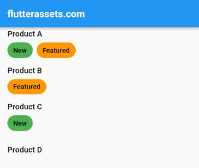
In this example, we have a Product class that has a name property as well as boolean properties for isNew and isFeatured. We then have a list of Product objects that we display using a ListView.builder.
In the itemBuilder function for the ListView.builder, we create a list of Chips to represent the status indicators for the current product. If the product is new, we add a green “New” chip to the list. If the product is featured, we add an orange “Featured” chip to the list. We then display the list of chips as the subtitle of the ListTile.
This creates a simple list of products with status indicators represented by chips.
Use the Flutter Chip widget as Categorie
Here’s an example of using the Flutter Chip widget to display categories of items in a shopping app:
List<String> _categories = [
  'Electronics',
  'Clothing',
  'Books',
  'Home Goods',
  'Beauty'
];

List<String> _selectedCategories = [];

void _onCategorySelected(String category) {
  setState(() {
    if (_selectedCategories.contains(category)) {
      _selectedCategories.remove(category);
    } else {
      _selectedCategories.add(category);
    }
  });
}

@override
Widget build(BuildContext context) {

  return Scaffold(
    appBar: AppBar(
      title: Text('flutterassets.com'),
    ),
    body: Padding(
      padding: const EdgeInsets.all(8.0),
      child: Wrap(
        spacing: 8.0,
        runSpacing: 8.0,
        children: _categories
            .map((category) => InkWell(
          onTap: () {
            _onCategorySelected(category);
          },
          child: Chip(
            label: Text(category),
            backgroundColor: _selectedCategories.contains(category)
                ? Colors.blue
                : Colors.grey[300],
          ),
        ))
            .toList(),
      ),
    ),
  );
}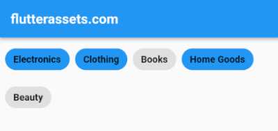
In this example, we wrap each Chip widget with an InkWell widget that has an onTap callback. When the user taps on the Chip, it triggers the onTap callback and updates the list of selected categories. We use the setState method to rebuild the widget tree and display the changes.
We also use the backgroundColor property of the Chip widget to indicate whether or not a category has been selected. If the category is selected, we set the background colour to blue; otherwise, we set it to grey.
Use the Flutter Chip widget as a User selection
Here’s an example of using the Chip widget to allow users to select one language from a list of choices:
late String _selectedLanguage = 'English';

  @override
  Widget build(BuildContext context) {

    return Scaffold(
      appBar: AppBar(
        title: Text('flutterassets.com'),
      ),
      body: Padding(
        padding: const EdgeInsets.all(8.0),
        child: Wrap(
          spacing: 8.0,
          children: [
            GestureDetector(
              onTap: () {
                setState(() {
                  _selectedLanguage = 'English';
                });
              },
              child: Chip(
                label: Text('English'),
                backgroundColor:
                _selectedLanguage == 'English' ? Colors.blue : Colors.grey,
                labelStyle: TextStyle(
                  color: _selectedLanguage == 'English' ? Colors.white : Colors.black,
                ),
              ),
            ),
            GestureDetector(
              onTap: () {
                setState(() {
                  _selectedLanguage = 'French';
                });
              },
              child: Chip(
                label: Text('French'),
                backgroundColor:
                _selectedLanguage == 'French' ? Colors.blue : Colors.grey,
                labelStyle: TextStyle(
                  color: _selectedLanguage == 'French' ? Colors.white : Colors.black,
                ),
              ),
            ),
            GestureDetector(
              onTap: () {
                setState(() {
                  _selectedLanguage = 'Spanish';
                });
              },
              child: Chip(
                label: Text('Spanish'),
                backgroundColor:
                _selectedLanguage == 'Spanish' ? Colors.blue : Colors.grey,
                labelStyle: TextStyle(
                  color: _selectedLanguage == 'Spanish' ? Colors.white : Colors.black,
                ),
              ),
            ),
          ],
        )
      ),
    );
  }
In this example, we use a Wrap widget to display the list of language options as a row of chips. We set the backgroundColor and labelStyle properties of the Chip based on whether or not it’s currently selected. When the user selects a chip, we update the _selectedLanguage variable using the GestureDetector.
Use the Flutter Chip widget with contact information
Here’s an example of how you could use the Flutter Chip widget to display contact information:
final List<String> _contacts = [
  'johndoe@gmail.com',
  'janedoe@yahoo.com',
  'bobsmith@gmail.com',
  'sarahjones@gmail.com',
];

@override
Widget build(BuildContext context) {

  return Scaffold(
    appBar: AppBar(
      title: Text('flutterassets.com'),
    ),
    body: Container(
      alignment: Alignment.topCenter,
      padding: EdgeInsets.all(20),
      child: Padding(
        padding: const EdgeInsets.all(16.0),
        child: Wrap(
          spacing: 8.0,
          runSpacing: 8.0,
          children: _contacts
              .map((contact) => Chip(
            label: Text(contact),
            avatar: Icon(Icons.email),
            backgroundColor: Colors.blueGrey[100],
            onDeleted: () {
              setState(() {
                _contacts.remove(contact);
              });
            },
          )).toList(),
        ),
      ),
    ),
  );
}
In this example, we create a list of contact emails and display them as chips using the Wrap widget to allow them to wrap to the next line if necessary. We also add an avatar icon to each chip using the avatar property and set a background colour using the backgroundColor property.
Finally, we add an onDeleted callback to each chip so that users can delete a contact by tapping on the delete icon.
Use the Flutter Chip widget as a Quantity selection
Here’s an example of how you can use the Flutter Chip widget as a quantity selection:
int _quantity = 1;

@override
Widget build(BuildContext context) {

  return Scaffold(
    appBar: AppBar(
      title: Text('flutterassets.com'),
    ),
    body: Center(
      child: Column(
        children: [
          SizedBox(height: 20,),
          const Text(
            'Select the quantity of items',
            style: TextStyle(fontSize: 18),
          ),
          const SizedBox(height: 20),
          Chip(
            label: Text(
              '$_quantity',
              style: TextStyle(fontSize: 20, fontWeight: FontWeight.bold),
            ),
          ),
          const SizedBox(height: 20),
          Row(
            mainAxisAlignment: MainAxisAlignment.center,
            children: [
              IconButton(
                onPressed: () {
                  setState(() {
                    if (_quantity > 1) {
                      _quantity--;
                    }
                  });
                },
                icon: const Icon(Icons.remove),
              ),
              const SizedBox(width: 20),
              IconButton(
                onPressed: () {
                  setState(() {
                    _quantity++;
                  });
                },
                icon: const Icon(Icons.add),
              ),
            ],
          ),
        ],
      ),
    ),
  );
}
In this example, we have a Chip widget that displays the current quantity selected. The user can increase or decrease the quantity by clicking on the add or remove button. The quantity is stored in the _quantity variable and is updated using the setState() method.


