What is the Flutter animated_text_kit
The Flutter animated_text_kit package is a set of text animation widgets that make it easy to create animations with text. These widgets allow you to create animations where text appears letter by letter, rotates, and more. It also provides a TextSequence class that allows you to easily specify the text and animation styles for each word or sentence in a piece of text.
It is a simple way to add some motion to the text in your app, which can make your app look more interesting and engaging. For example, you can use this package to create a text animation that appears letter by letter, like a typewriter. This can be used for things like displaying a loading message or creating an interactive tutorial.
You can also use the package to create a scrolling text ticker, which is a common UI element used to display scrolling text on a screen. This could be used to display live updates, news headlines, or other types of information.
The package is easy to use and provides a lot of customization options, allowing you to create unique and interesting text animations that match the style of your app.
How to use Flutter animated_text_kit
To use the Flutter animated_text_kit package in your project, you will first need to add it as a dependency in your pubspec.yaml file. You can do this by adding the following line under the dependencies section:
animated_text_kit: ^4.2.2Once you’ve added the dependency, you can import the package in your dart file:
import 'package:animated_text_kit/animated_text_kit.dart';Now you can use the animated_text_kit widgets in your app. Here’s an example of how you can use the TyperAnimatedText widget to create a text animation that appears letter by letter:
AnimatedTextKit(
    isRepeatingAnimation: true,
    animatedTexts: [
      TyperAnimatedText(
          'Welcome to my app',
          textStyle: TextStyle(fontSize: 40, fontWeight: FontWeight.w100),
          speed: Duration(milliseconds: 100)
      ),
    ]
),
This will create a text animation that displays the text “Welcome to my app” letter by letter, with a typing speed of 100 milliseconds.
You can also use the RotateAnimatedText to create a text animation that rotates in a loop:
AnimatedTextKit(
    isRepeatingAnimation: true,
    animatedTexts: [
      RotateAnimatedText('Welcome'),
      RotateAnimatedText('To'),
      RotateAnimatedText('My App'),
    ]
),
Flutter animated_text_kit properties
displayFullTextOnTap: Should the animation ends up early and display full text if you tap on it. By default, it is set to false.
displayFullTextOnTap: false,stopPauseOnTap: If on pause, should a tap remove the remaining pause time. By default, it is set to false.
stopPauseOnTap: false,repeatForever: Sets if the animation should repeat forever. isRepeatingAnimation also needs to be set to true if you want to repeat forever. By default it is set to false, if set to true, [totalRepeatCount] is ignored.
repeatForever: true,isRepeatingAnimation: Set if the animation should not repeat by changing the value of it to false. By default, it is set to true.
isRepeatingAnimation: true,totalRepeatCount: Sets the number of times animation should repeat. By default, it is set to 3.
totalRepeatCount: 5,pause: Define the [Duration] of the pause between texts. By default, it is set to 1000 milliseconds.
pause: Duration(milliseconds: 500),onNextBeforePause: Adds the onNextBeforePause callback to the animated widget. Will be called at the end of n-1 animation, before the pause parameter.
onNextBeforePause: (int, bool) {},onNext: Adds the onNext callback to the animated widget. Will be called right before the next text, after the pause parameter
onNext: (int, bool) {},onTap: Adds the onTap VoidCallback to the animated widget.
onTap: () {
  print("Tap Event");
},onFinished: Adds the onFinished VoidCallback to the animated widget. This method will run only if [isRepeatingAnimation] is set to false.
onFinished: (){
  print("Finish Event");
},animatedTexts: List of AnimatedText to display subsequently in the animation.
animatedTexts: []List of widgets in the Flutter animated_text_kit package
The Flutter animated_text_kit package provides several widgets that you can use to create text animations in your app, here is a list of the main widgets:
- RotateAnimatedText
- FadeAnimatedText
- TyperAnimatedText
- TypewriterAnimatedText
- ScaleAnimatedText
- ColorizeAnimatedText
- TextLiquidFill
- WavyAnimatedText
- FlickerAnimatedText
These widgets allow you to create different types of text animations, you can use them individually or combine them to create more complex animations.
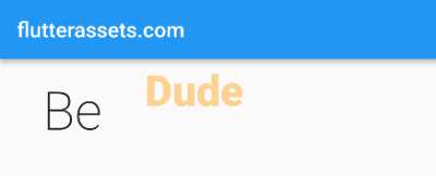
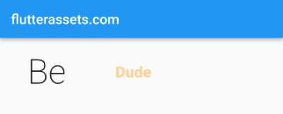
AnimatedTextKit with RotateAnimatedText
Row(
  mainAxisSize: MainAxisSize.min,
  children: <Widget>[
    SizedBox(width: 40.0, height: 100.0),
    Text('Be', style: TextStyle(fontSize: 40),),
    SizedBox(width: 40.0, height: 100.0),
    DefaultTextStyle(
      style: const TextStyle(
        fontSize: 40.0,
        color: Colors.orange
      ),
      child: AnimatedTextKit(
        repeatForever: true,
        animatedTexts: [
          RotateAnimatedText('Iron man'),
          RotateAnimatedText('Superman'),
          RotateAnimatedText('Joker'),
          RotateAnimatedText('Hulk'),
          RotateAnimatedText('Dude'),
        ],

      ),
    ),
  ],
),
Here is a quick code description:
This code is a Flutter widget that creates a horizontal arrangement of widgets, using the Row widget. The mainAxisSize property of the Row widget is set to MainAxisSize.min, meaning that the row will have the minimum amount of space required to accommodate its children.
The first child of the Row is a SizedBox widget with a width of 40.0 and a height of 100.0. This SizedBox acts as a spacer between the widgets in the row.
The second child is a Text widget with the text “Be”, and a font size of 40. The text style is set through the style property of the Text widget.
The third child is another SizedBox widget with the same width and height as the first SizedBox widget.
The fourth child of the Row widget is a DefaultTextStyle widget that sets the default text style for its children. The text style includes a font size of 40.0 and a colour of Colors.orange.
The child of the DefaultTextStyle is an AnimatedTextKit widget. The AnimatedTextKit has a repeatForever property set to true, meaning that the animations will repeat forever. The animatedTexts property of the AnimatedTextKit is a list of RotateAnimatedText widgets, each with a different text, such as “Iron man”, “Superman”, “Joker”, “Hulk”, and “Dude”. These RotateAnimatedText widgets will be animated in a rotating fashion, with each text appearing and disappearing in a loop.
Flutter RotateAnimatedText properties
transitionHeight: Transition height. By default, it is set to [TextStyle.fontSize] * 10 / 3.
transitionHeight: 100,alignment: Adds AlignmentGeometry property to the text in the widget. By default, it is set to Alignment.center.
alignment: Alignment.center,textDirection: Specifies the TextDirection for resolving alignment. By default, it is set to TextDirection.ltr.
textDirection: TextDirection.rtl,textStyle: property used to customize the appearance of the text being animated, such as font size, colour, weight, etc.
textStyle: TextStyle(
  fontSize: 50,
  fontWeight: FontWeight.w900
)textAlign: property used to align the text within the bounds of the widget.
textAlign: TextAlign.start,duration: the amount of time it takes for one animation cycle to complete.
duration: Duration(milliseconds: 1500),rotateOut: Controls whether the text rotates in and out (true), or just rotates in (false). Note that you may want to adjust the [duration] when mixing RotateAnimatedText instances with mixed rotateOut values. By default, it is set to true.
rotateOut: true,AnimatedTextKit with RotateAnimatedText and a List
Here is an example of how you can use a List of strings with the RotateAnimatedText:
import 'package:flutter/material.dart';
import 'package:animated_text_kit/animated_text_kit.dart';

void main() {
  runApp(MyApp());
}

class MyApp extends StatelessWidget {

  @override
  Widget build(BuildContext context) {
    return MaterialApp(
      debugShowCheckedModeBanner: false,
      title: 'Flutter Demo',
      theme: ThemeData(
        primarySwatch: Colors.blue,
      ),
      home: MyHomePage(),
    );
  }
}

class MyHomePage extends StatefulWidget {

  @override
  State<MyHomePage> createState() => _MyHomePageState();
}

class _MyHomePageState extends State<MyHomePage> {

  List<String> animatedTextList = ["Iron man", "Superman", "Joker", "Hulk", "Dude"];
  int index = 0;

  @override
  Widget build(BuildContext context) {

    double screenWidth = MediaQuery.of(context).size.width;

    return Scaffold(
        appBar: AppBar(
          title: Text('flutterassets.com'),
        ),
        body: Column(
          children: [
            Row(
              mainAxisSize: MainAxisSize.min,
              children: <Widget>[
                SizedBox(width: 40.0, height: 100.0),
                Text('Be',
                  style: TextStyle(fontSize: 50.0,
                      fontWeight: FontWeight.w200),
                ),
                SizedBox(width: 40.0, height: 100.0),
                DefaultTextStyle(
                  style: const TextStyle(
                      fontSize: 40.0,
                      color: Colors.orange,
                      fontWeight: FontWeight.w900
                  ),
                  child: AnimatedTextKit(
                    displayFullTextOnTap: false,
                    stopPauseOnTap: false,
                    repeatForever: true,
                    // totalRepeatCount: 5,
                    onNextBeforePause: (int, bool) {
                      setState(() {
                        index = (index + 1) % animatedTextList.length;
                        // print(animatedTextList[index]);
                      });
                    },
                    onNext: (int, bool) {
                      // print(animatedTextList[index]);
                    },
                    animatedTexts: [
                      RotateAnimatedText('${animatedTextList[index]}',
                        transitionHeight: 100,
                        duration: Duration(milliseconds: 1500),
                      ),
                    ],
                    onTap: () {
                      print("Tap Event");
                    },
                    // onFinished: (){print("Finish Event");},

                  ),
                ),
              ],
            ),
          ],
        )
    );
  }
}
In this example, the code starts with 2 variables, a list of animated text strings, animatedTextList, and an index variable, index, to keep track of which string is currently being displayed.
The Row widget contains several SizedBox widgets, a Text widget, and a DefaultTextStyle widget. The SizedBox widgets set the width and height of empty spaces in the Row widget. The Text widget displays the text “Be” with a specified font size and weight. The DefaultTextStyle widget sets the font size, colour, and weight for the animated text.
The animated text is created using the AnimatedTextKit widget. The AnimatedTextKit widget includes a list of animated texts, defined in the animatedTexts parameter, and the RotateAnimatedText widget. The RotateAnimatedText widget rotates the text with a specified height transition and duration.
The state of the index is updated using the setState method whenever the next text is displayed. The text is displayed forever in a repeating animation, and the index is incremented each time the animation completes a full cycle. The onTap parameter is set to print a “Tap Event” message to the console whenever the text is tapped.
AnimatedTextKit with FadeAnimatedText
Row(
  mainAxisSize: MainAxisSize.min,
  children: <Widget>[
    SizedBox(width: 40.0, height: 100.0),
    Text('Be', style: TextStyle(fontSize: 40),),
    SizedBox(width: 40.0, height: 100.0),
    DefaultTextStyle(
      style: const TextStyle(
        fontSize: 40.0,
        color: Colors.orange
      ),
      child: AnimatedTextKit(
        repeatForever: true,
        animatedTexts: [
          FadeAnimatedText('Iron man'),
          FadeAnimatedText('Superman'),
          FadeAnimatedText('Joker'),
          FadeAnimatedText('Hulk'),
          FadeAnimatedText('Dude'),
        ],

      ),
    ),
  ],
),
The above code creates a single row in a Flutter app using the Row widget. The mainAxisSize is set to MainAxisSize.min, which means it will be as small as possible while still containing all its children. The row contains four widgets: a SizedBox with a width of 40 and height of 100, a text widget with the text “Be” and font size of 40, another SizedBox with the same dimensions as the first, and a DefaultTextStyle widget.
The DefaultTextStyle widget sets a text style of font size 40 and orange colour for its child. Its child is an AnimatedTextKit widget, which creates a continuously looping animation of the text strings “Iron man”, “Superman”, “Joker”, “Hulk”, and “Dude”. Each text string is displayed using the FadeAnimatedText widget.
Flutter FadeAnimatedText properties
text:
fadeInEnd: Marks ending of the fade-in interval, default value = 0.5.
fadeInEnd: 0.1,fadeOutBegin: Marks the beginning of the fade-out interval, default value = 0.8.
fadeOutBegin: 0.5,textStyle: property used to customize the appearance of the text being animated, such as font size, colour, weight, etc.
textStyle: TextStyle(
  fontSize: 50,
  fontWeight: FontWeight.w900
)textAlign: property used to align the text within the bounds of the widget.
textAlign: TextAlign.start,duration: the amount of time it takes for one animation cycle to complete.
duration: Duration(milliseconds: 1500),AnimatedTextKit with FadeAnimatedText and a List
import 'package:flutter/material.dart';
import 'package:animated_text_kit/animated_text_kit.dart';

void main() {
  runApp(MyApp());
}

class MyApp extends StatelessWidget {

  @override
  Widget build(BuildContext context) {
    return MaterialApp(
      debugShowCheckedModeBanner: false,
      title: 'Flutter Demo',
      theme: ThemeData(
        primarySwatch: Colors.blue,
      ),
      home: MyHomePage(),
    );
  }
}

class MyHomePage extends StatefulWidget {

  @override
  State<MyHomePage> createState() => _MyHomePageState();
}

class _MyHomePageState extends State<MyHomePage>{

  List<String> animatedTextList = ["Iron man", "Superman", "Joker", "Hulk", "Dude"];
  int index = 0;

  @override
  Widget build(BuildContext context) {

    double screenWidth = MediaQuery.of(context).size.width;

    return Scaffold(
        appBar: AppBar(
          title: Text('flutterassets.com'),
        ),
        body: Column(
          children: [
            Row(
              mainAxisSize: MainAxisSize.min,
              children: <Widget>[
                SizedBox(width: 40.0, height: 100.0),
                Text('Be',
                  style: TextStyle(fontSize: 50.0,
                      fontWeight: FontWeight.w200),
                ),
                SizedBox(width: 40.0, height: 100.0),
                DefaultTextStyle(
                  style: const TextStyle(
                      fontSize: 40.0,
                      color: Colors.orange,
                      fontWeight: FontWeight.w900
                  ),
                  child: AnimatedTextKit(
                    displayFullTextOnTap: false,
                    stopPauseOnTap: false,
                    repeatForever: true,
                    // totalRepeatCount: 5,
                    onNextBeforePause: (int, bool) {
                      setState(() {
                        index = (index + 1) % animatedTextList.length;
                        // print(animatedTextList[index]);
                      });
                    },
                    onNext: (int, bool) {
                      // print(animatedTextList[index]);
                    },
                    animatedTexts: [
                      FadeAnimatedText('${animatedTextList[index]}',
                        duration: Duration(milliseconds: 5500),
                      ),
                    ],
                    onTap: () {
                      print("Tap Event");
                    },
                    // onFinished: (){print("Finish Event");},

                  ),
                ),
              ],
            ),
          ],
        )
    );
  }
}
The above code is almost identical to the RotateAnimatedText.
The AnimatedTextKit widget uses the animatedTexts property to specify a list of text strings that are displayed in sequence. It also sets several properties such as displayFullTextOnTap, stopPauseOnTap, and repeatForever to control the behaviour of the animation.
The widget also defines callbacks for events such as onNextBeforePause, onNext, and onTap. These callbacks are called at various stages of the animation and can be used to update the state of the application. The text style for the animated text is specified using a DefaultTextStyle widget.
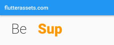
AnimatedTextKit with TyperAnimatedText
Row(
  mainAxisSize: MainAxisSize.min,
  children: <Widget>[
    SizedBox(width: 40.0, height: 100.0),
    Text('Be', style: TextStyle(fontSize: 40),),
    SizedBox(width: 40.0, height: 100.0),
    DefaultTextStyle(
      style: const TextStyle(
        fontSize: 40.0,
        color: Colors.orange
      ),
      child: AnimatedTextKit(
        repeatForever: true,
        animatedTexts: [
          TyperAnimatedText('Iron man'),
          TyperAnimatedText('Superman'),
          TyperAnimatedText('Joker'),
          TyperAnimatedText('Hulk'),
          TyperAnimatedText('Dude'),
        ],

      ),
    ),
  ],
),
This is a code snippet written in Flutter. It’s defining a row layout with the mainAxisSize set to MainAxisSize.min and a number of widgets in it. These widgets include two SizedBox widgets, a Text widget, and an AnimatedTextKit widget.
The first SizedBox has a width of 40.0 and a height of 100.0, the second SizedBox has the same dimensions. The Text widget displays the word “Be” in font size 40. The DefaultTextStyle widget sets the font size to 40.0 and the colour to orange, this style is applied to the child of DefaultTextStyle which is the AnimatedTextKit widget.
The AnimatedTextKit widget is set to repeat forever, and it has an array of TyperAnimatedText widgets in it. These widgets represent a list of five different texts – “Iron man”, “Superman”, “Joker”, “Hulk”, and “Dude”. These texts will be animated one after the other in a repeating manner.
Flutter TyperAnimatedText properties
speed: The Duration of the delay between the apparition of each character. By default, it is set to 40 milliseconds.
speed: Duration(milliseconds: 500),textStyle: property used to customize the appearance of the text being animated, such as font size, colour, weight, etc.
textStyle: TextStyle(
  fontSize: 50,
  fontWeight: FontWeight.w900
)textAlign: property used to align the text within the bounds of the widget.
textAlign: TextAlign.start,curve: The Curve of the rate of change of animation over time. By default, it is set to Curves.linear.
curve: Curves.easeIn,AnimatedTextKit with TyperAnimatedText and a List
import 'package:flutter/material.dart';
import 'package:animated_text_kit/animated_text_kit.dart';

void main() {
  runApp(MyApp());
}

class MyApp extends StatelessWidget {

  @override
  Widget build(BuildContext context) {
    return MaterialApp(
      debugShowCheckedModeBanner: false,
      title: 'Flutter Demo',
      theme: ThemeData(
        primarySwatch: Colors.blue,
      ),
      home: MyHomePage(),
    );
  }
}

class MyHomePage extends StatefulWidget {

  @override
  State<MyHomePage> createState() => _MyHomePageState();
}

class _MyHomePageState extends State<MyHomePage>{

  List<String> animatedTextList = ["Iron man", "Superman", "Joker", "Hulk", "Dude"];
  int index = 0;

  @override
  Widget build(BuildContext context) {

    double screenWidth = MediaQuery.of(context).size.width;

    return Scaffold(
        appBar: AppBar(
          title: Text('flutterassets.com'),
        ),
        body: Column(
          children: [
            Row(
              mainAxisSize: MainAxisSize.min,
              children: <Widget>[
                SizedBox(width: 40.0, height: 100.0),
                Text('Be',
                  style: TextStyle(fontSize: 50.0,
                      fontWeight: FontWeight.w200),
                ),
                SizedBox(width: 40.0, height: 100.0),
                DefaultTextStyle(
                  style: const TextStyle(
                      fontSize: 40.0,
                      color: Colors.orange,
                      fontWeight: FontWeight.w900
                  ),
                  child: AnimatedTextKit(
                    displayFullTextOnTap: false,
                    stopPauseOnTap: false,
                    repeatForever: true,
                    // totalRepeatCount: 5,
                    onNextBeforePause: (int, bool) {
                      setState(() {
                        index = (index + 1) % animatedTextList.length;
                        // print(animatedTextList[index]);
                      });
                    },
                    onNext: (int, bool) {
                      // print(animatedTextList[index]);
                    },
                    animatedTexts: [
                      TyperAnimatedText('${animatedTextList[index]}',
                        speed: Duration(milliseconds: 500),
                        curve: Curves.easeIn,
                        textAlign: TextAlign.start,
                        textStyle: TextStyle(
                          fontSize: 50,
                          fontWeight: FontWeight.w900,
                        ),
                      ),
                    ],
                    onTap: () {
                      print("Tap Event");
                    },
                    // onFinished: (){print("Finish Event");},

                  ),
                ),
              ],
            ),
          ],
        )
    );
  }
}
The above example code is almost the same as the previous codes.
The Row widget has a mainAxisSize of MainAxisSize.min and holds four widgets. The first and third widgets are SizedBox widgets that add a fixed amount of space to the left and right of the Row widget. The second widget is a Text widget that displays the text “Be” with a font size of 50 and a font-weight of 200. The fourth widget is a DefaultTextStyle widget that sets the font size and colour of the animated text.
The child of the DefaultTextStyle widget is an AnimatedTextKit widget, which displays the animated text. The AnimatedTextKit widget has several properties such as repeatForever, which sets whether the animation should repeat indefinitely, and animatedTexts, which is a list of AnimatedText widgets. In this code, the animated text is a TyperAnimatedText widget that displays each element of the animatedTextList one at a time.
The onNextBeforePause property of the AnimatedTextKit widget is set to a function that updates the index of the animatedTextList whenever the animation moves to the next element. The font size and font weight of the animated text are set using a TextStyle widget.
AnimatedTextKit with TypewriterAnimatedText
Row(
  mainAxisSize: MainAxisSize.min,
  children: <Widget>[
    SizedBox(width: 40.0, height: 100.0),
    Text('Be', style: TextStyle(fontSize: 40),),
    SizedBox(width: 40.0, height: 100.0),
    DefaultTextStyle(
      style: const TextStyle(
        fontSize: 40.0,
        color: Colors.orange
      ),
      child: AnimatedTextKit(
        repeatForever: true,
        animatedTexts: [
          TypewriterAnimatedText('Iron man'),
          TypewriterAnimatedText('Superman'),
          TypewriterAnimatedText('Joker'),
          TypewriterAnimatedText('Hulk'),
          TypewriterAnimatedText('Dude'),
        ],
      ),
    ),
  ],
),
This code creates an AnimatedTextKit widget in Flutter. The repeatForever property is set to true which means that the animation will repeat forever. The animation consists of 5 separate elements, each of which is a TypewriterAnimatedText widget that displays the text “Iron man”, “Superman”, “Joker”, “Hulk”, and “Dude”. These elements are stored in an array animatedTexts and the AnimatedTextKit widget displays them in sequence, animating each one in a typewriter-like fashion.
Flutter TypewriterAnimatedText properties
cursor: Cursor text. Defaults to underscore.
cursor: '_',speed: The Duration of the delay between the apparition of each character. By default, it is set to 40 milliseconds.
speed: Duration(milliseconds: 500),textStyle: property used to customize the appearance of the text being animated, such as font size, colour, weight, etc.
textStyle: TextStyle(
  fontSize: 50,
  fontWeight: FontWeight.w900
)textAlign: property used to align the text within the bounds of the widget.
textAlign: TextAlign.start,curve: The Curve of the rate of change of animation over time. By default, it is set to Curves.linear.
curve: Curves.easeIn,AnimatedTextKit with TypewriterAnimatedText and a List
import 'package:flutter/material.dart';
import 'package:animated_text_kit/animated_text_kit.dart';

void main() {
  runApp(MyApp());
}

class MyApp extends StatelessWidget {

  @override
  Widget build(BuildContext context) {
    return MaterialApp(
      debugShowCheckedModeBanner: false,
      title: 'Flutter Demo',
      theme: ThemeData(
        primarySwatch: Colors.blue,
      ),
      home: MyHomePage(),
    );
  }
}

class MyHomePage extends StatefulWidget {

  @override
  State<MyHomePage> createState() => _MyHomePageState();
}

class _MyHomePageState extends State<MyHomePage>{

  List<String> animatedTextList = ["Iron man", "Superman", "Joker", "Hulk", "Dude"];
  int index = 0;

  @override
  Widget build(BuildContext context) {

    double screenWidth = MediaQuery.of(context).size.width;

    return Scaffold(
        appBar: AppBar(
          title: Text('flutterassets.com'),
        ),
        body: Column(
          children: [
            Row(
              mainAxisSize: MainAxisSize.min,
              children: <Widget>[
                SizedBox(width: 40.0, height: 100.0),
                Text('Be',
                  style: TextStyle(fontSize: 50.0,
                      fontWeight: FontWeight.w200),
                ),
                SizedBox(width: 40.0, height: 100.0),
                DefaultTextStyle(
                  style: const TextStyle(
                      fontSize: 40.0,
                      color: Colors.orange,
                      fontWeight: FontWeight.w900
                  ),
                  child: AnimatedTextKit(
                    displayFullTextOnTap: false,
                    stopPauseOnTap: false,
                    repeatForever: true,
                    // totalRepeatCount: 5,
                    onNextBeforePause: (int, bool) {
                      setState(() {
                        index = (index + 1) % animatedTextList.length;
                        // print(animatedTextList[index]);
                      });
                    },
                    onNext: (int, bool) {
                      // print(animatedTextList[index]);
                    },
                    animatedTexts: [
                      TypewriterAnimatedText('${animatedTextList[index]}',
                        cursor: '_',
                        speed: Duration(milliseconds: 500),
                        curve: Curves.easeIn,
                        textAlign: TextAlign.start,
                        textStyle: TextStyle(
                          fontSize: 50,
                          fontWeight: FontWeight.w900,
                        ),
                      ),
                    ],
                    onTap: () {
                      print("Tap Event");
                    },
                    // onFinished: (){print("Finish Event");},

                  ),
                ),
              ],
            ),
          ],
        )
    );
  }
}
And again, the above code is almost the same as the other above.
It displays a list of animated texts “Iron man”, “Superman”, “Joker”, “Hulk”, and “Dude”. The texts are stored in a List called “animatedTextList”. A variable “index” is declared and set to 0.
The AnimatedTextKit widget is set to repeat forever with “repeatForever” property set to true. The texts in the list will change every time the animation finishes with the help of the “onNextBeforePause” method. The “index” variable is updated to the next value in the list using the modulo operator.
The “animatedTexts” property of AnimatedTextKit holds a list of TypewriterAnimatedText widgets, each of which displays a single text from the “animatedTextList”. The “cursor” property is set to an underscore to indicate typing, and the speed of the animation is set to 500 milliseconds. The text alignment is set to start, and the font size and weight are set to 50 and w900 respectively.
The “onTap” method is also added to the AnimatedTextKit widget, which is triggered when the widget is tapped and will print “Tap Event” in the console.
AnimatedTextKit with ScaleAnimatedText
Row(
  mainAxisSize: MainAxisSize.min,
  children: <Widget>[
    SizedBox(width: 40.0, height: 100.0),
    Text('Be', style: TextStyle(fontSize: 40),),
    SizedBox(width: 40.0, height: 100.0),
    DefaultTextStyle(
      style: const TextStyle(
        fontSize: 40.0,
        color: Colors.orange
      ),
      child: AnimatedTextKit(
        repeatForever: true,
        animatedTexts: [
          ScaleAnimatedText('Iron man'),
          ScaleAnimatedText('Superman'),
          ScaleAnimatedText('Joker'),
          ScaleAnimatedText('Hulk'),
          ScaleAnimatedText('Dude'),
        ],
      ),
    ),
  ],
),
The above code is a Flutter widget that uses the AnimatedTextKit class to display a list of animated text with a scaling animation effect. The AnimatedTextKit widget has the repeatForever property set to true, which means that the animation will keep repeating indefinitely. The animatedTexts property is set to a list of ScaleAnimatedText widgets, which takes a string parameter that represents the text to be animated.
The ScaleAnimatedText class is a type of animation that scales the text in and out, which gives the effect of the text appearing and disappearing. In this code, there are five different texts in the list that will be animated in a repeating cycle. The AnimatedTextKit widget automatically handles the animation effect and transitions between the texts in the list.
Flutter ScaleAnimatedText properties
scalingFactor: Set the scaling factor of the text for the animation. By default, it is set to double value of 0.5.
scalingFactor: 0.1,duration: the amount of time it takes for one animation cycle to complete.
duration: Duration(milliseconds: 1500),textStyle: property used to customize the appearance of the text being animated, such as font size, colour, weight, etc.
textStyle: TextStyle(
  fontSize: 50,
  fontWeight: FontWeight.w900
)textAlign: property used to align the text within the bounds of the widget.
textAlign: TextAlign.start,AnimatedTextKit with ScaleAnimatedText and a List
import 'package:flutter/material.dart';
import 'package:animated_text_kit/animated_text_kit.dart';

void main() {
  runApp(MyApp());
}

class MyApp extends StatelessWidget {

  @override
  Widget build(BuildContext context) {
    return MaterialApp(
      debugShowCheckedModeBanner: false,
      title: 'Flutter Demo',
      theme: ThemeData(
        primarySwatch: Colors.blue,
      ),
      home: MyHomePage(),
    );
  }
}

class MyHomePage extends StatefulWidget {

  @override
  State<MyHomePage> createState() => _MyHomePageState();
}

class _MyHomePageState extends State<MyHomePage>{

  List<String> animatedTextList = ["Iron man", "Superman", "Joker", "Hulk", "Dude"];
  int index = 0;

  @override
  Widget build(BuildContext context) {

    double screenWidth = MediaQuery.of(context).size.width;

    return Scaffold(
        appBar: AppBar(
          title: Text('flutterassets.com'),
        ),
        body: Column(
          children: [
            Row(
              mainAxisSize: MainAxisSize.min,
              children: <Widget>[
                SizedBox(width: 40.0, height: 100.0),
                Text('Be',
                  style: TextStyle(fontSize: 50.0,
                      fontWeight: FontWeight.w200),
                ),
                SizedBox(width: 40.0, height: 100.0),
                DefaultTextStyle(
                  style: const TextStyle(
                      fontSize: 40.0,
                      color: Colors.orange,
                      fontWeight: FontWeight.w900
                  ),
                  child: AnimatedTextKit(
                    displayFullTextOnTap: false,
                    stopPauseOnTap: false,
                    repeatForever: true,
                    // totalRepeatCount: 5,
                    onNextBeforePause: (int, bool) {
                      setState(() {
                        index = (index + 1) % animatedTextList.length;
                        // print(animatedTextList[index]);
                      });
                    },
                    onNext: (int, bool) {
                      // print(animatedTextList[index]);
                    },
                    animatedTexts: [
                      ScaleAnimatedText('${animatedTextList[index]}',
                        duration: Duration(milliseconds: 1500),
                        scalingFactor: 0.1,
                        textAlign: TextAlign.start,
                        textStyle: TextStyle(
                          fontSize: 50,
                          fontWeight: FontWeight.w900,
                        ),
                      ),
                    ],
                    onTap: () {
                      print("Tap Event");
                    },
                    // onFinished: (){print("Finish Event");},

                  ),
                ),
              ],
            ),
          ],
        )
    );
  }
}
This is a Flutter code that creates an AnimatedTextKit widget. The code creates a list of strings that includes 5 superhero names “Iron man”, “Superman”, “Joker”, “Hulk”, and “Dude”. There’s an integer variable called “index” that’s initialized to 0, it’s used to keep track of which string from the list is being displayed.
The AnimatedTextKit widget has several properties defined, such as:
- repeatForever: This is set to true, meaning that the animation will repeat indefinitely.
- onNextBeforePause: This is a callback function that gets triggered before the next animation starts. In this function, the “index” variable is incremented, and the state is set to the next string from the list.
- onNext: This is a callback function that gets triggered after the next animation starts.
- animatedTexts: This is a list of animations that will be displayed. In this case, there’s a single animation of type ScaleAnimatedText.
- onTap: This is a callback function that gets triggered when the user taps on the widget.
- textAlign: This property determines the text alignment within the widget.
- textStyle: This property sets the font size and weight of the text.
The ScaleAnimatedText animation increases the size of the text gradually to its original size over a duration of 1500 milliseconds. The text starts with a scaling factor of 0.1, which means it will start at 10% of its original size and grow to 100%. The text style properties defined in the textStyle property determine the font size and weight of the text.
AnimatedTextKit with ColorizeAnimatedText
const colorizeColors = [
  Colors.red,
  Colors.green,
  Colors.blue,
];

const colorizeTextStyle = TextStyle(
  fontSize: 50.0,
);

Row(
  mainAxisSize: MainAxisSize.min,
  children: <Widget>[
    SizedBox(width: 40.0, height: 100.0),
    Text('Be', style: TextStyle(fontSize: 40),),
    SizedBox(width: 40.0, height: 100.0),
    DefaultTextStyle(
      style: const TextStyle(
        fontSize: 40.0,
        color: Colors.orange
      ),
      child: AnimatedTextKit(
        repeatForever: true,
        animatedTexts: [
          ColorizeAnimatedText('Iron man',
            textStyle: colorizeTextStyle,
            colors: colorizeColors,),
          ColorizeAnimatedText('Superman',
            textStyle: colorizeTextStyle,
            colors: colorizeColors,),
          ColorizeAnimatedText('Joker',
            textStyle: colorizeTextStyle,
            colors: colorizeColors,),
          ColorizeAnimatedText('Hulk',
            textStyle: colorizeTextStyle,
            colors: colorizeColors,),
          ColorizeAnimatedText('Dude',
            textStyle: colorizeTextStyle,
            colors: colorizeColors,),
        ],

      ),
    ),
  ],
),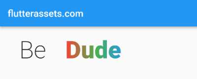
The attached code creates a row of widgets in a Flutter application. In the row, there are several text widgets, sized boxes and an animated text component. The animated text component is a colorize animated text created using the ColorizeAnimatedText class from the AnimatedTextKit library.
The text that is being animated is a list of superhero names: “Iron man”, “Superman”, “Joker”, “Hulk”, and “Dude”. The text style of the animated text is defined in the colorizeTextStyle constant and set as the font size of 50. The colours that the text is animated through are defined in the colorizeColors constant, which is a list of the colours red, green, and blue.
The ColorizeAnimatedText class takes two required parameters, the text to animate and the text style, and two optional parameters, the colours to animate through and the text alignment. In this case, the text style is set to the colorizeTextStyle constant and the colours to animate through are set to the colorizeColors constant.
The DefaultTextStyle widget is used to wrap the animated text component, and the style property is set to a text style with a font size of 40 and the color orange. The row is set to have a minimum size, and the total width of the row is determined by the widths of the sized boxes and text widgets.
Flutter ColorizeAnimatedText properties
colors: Set the colours for the gradient animation of the text. The List should contain at least two values of Color in it.
colors: [Colors.red, Colors.green, Colors.blue],speed: The Duration of the delay between the apparition of each character. By default, it is set to 40 milliseconds.
speed: Duration(milliseconds: 500),textStyle: property used to customize the appearance of the text being animated, such as font size, colour, weight, etc.
textStyle: TextStyle(
  fontSize: 50,
  fontWeight: FontWeight.w900
)textAlign: property used to align the text within the bounds of the widget.
textAlign: TextAlign.start,textDirection: Specifies the TextDirection for animation direction. By default, it is set to TextDirection.ltr.
textDirection: TextDirection.rtl,AnimatedTextKit with ColorizeAnimatedText and a List
import 'package:flutter/material.dart';
import 'package:animated_text_kit/animated_text_kit.dart';

void main() {
  runApp(MyApp());
}

class MyApp extends StatelessWidget {

  @override
  Widget build(BuildContext context) {
    return MaterialApp(
      debugShowCheckedModeBanner: false,
      title: 'Flutter Demo',
      theme: ThemeData(
        primarySwatch: Colors.blue,
      ),
      home: MyHomePage(),
    );
  }
}

class MyHomePage extends StatefulWidget {

  @override
  State<MyHomePage> createState() => _MyHomePageState();
}

class _MyHomePageState extends State<MyHomePage>{

  List<String> animatedTextList = ["Iron man", "Superman", "Joker", "Hulk", "Dude"];
  int index = 0;

  @override
  Widget build(BuildContext context) {

    double screenWidth = MediaQuery.of(context).size.width;

    return Scaffold(
        appBar: AppBar(
          title: Text('flutterassets.com'),
        ),
        body: Column(
          children: [
            Row(
              mainAxisSize: MainAxisSize.min,
              children: <Widget>[
                SizedBox(width: 40.0, height: 100.0),
                Text('Be',
                  style: TextStyle(fontSize: 50.0,
                      fontWeight: FontWeight.w200),
                ),
                SizedBox(width: 40.0, height: 100.0),
                DefaultTextStyle(
                  style: const TextStyle(
                      fontSize: 40.0,
                      color: Colors.orange,
                      fontWeight: FontWeight.w900
                  ),
                  child: AnimatedTextKit(
                    displayFullTextOnTap: false,
                    stopPauseOnTap: false,
                    repeatForever: true,
                    // totalRepeatCount: 5,
                    onNextBeforePause: (int, bool) {
                      setState(() {
                        index = (index + 1) % animatedTextList.length;
                        // print(animatedTextList[index]);
                      });
                    },
                    onNext: (int, bool) {
                      // print(animatedTextList[index]);
                    },
                    animatedTexts: [
                      ColorizeAnimatedText('${animatedTextList[index]}',
                        speed: Duration(milliseconds: 1500),
                        textAlign: TextAlign.start,
                        textStyle: TextStyle(
                          fontSize: 50,
                          fontWeight: FontWeight.w900,
                        ),
                        colors: [Colors.red, Colors.green, Colors.blue],
                      ),
                    ],
                    onTap: () {
                      print("Tap Event");
                    },
                    // onFinished: (){print("Finish Event");},

                  ),
                ),
              ],
            ),
          ],
        )
    );
  }
}
This code is a Flutter widget that uses the “AnimatedTextKit” package to display a series of animated texts. The texts are stored in a list called “animatedTextList”, which contains names like “Iron Man”, “Superman”, “Joker”, etc.
The widget uses the “ColorizeAnimatedText” class to animate the texts in the list. The “speed” property sets the animation speed to 1500 milliseconds. The text is aligned to the start and has a font size of 50 and font-weight of 900. The “colors” property is set to a list of three colours: red, green, and blue, which are used to colourize the text as it animates.
The “repeatForever” property is set to true, which means that the animation will repeat indefinitely. The “onTap” property is also set, which will trigger a “Tap Event” whenever the user taps on the text. The “index” variable keeps track of the current text being displayed and is updated in the “onNextBeforePause” property.
AnimatedTextKit with TextLiquidFill
TextLiquidFill(
  text: 'LIQUID',
  waveColor: Colors.blueAccent,
  boxBackgroundColor: Colors.redAccent,
  textStyle: TextStyle(
    fontSize: 80.0,
    fontWeight: FontWeight.bold,
  ),
  boxHeight: 300.0,
  boxWidth: double.infinity,
)
The attached code creates a “TextLiquidFill” widget in Flutter. This widget displays the text “LIQUID” with a blue accent wave effect, on a red background. The text size is set to 80.0 and the font-weight to bold. The height of the container is set to 300.0 and the width to infinity, allowing it to fill the available space.
Flutter TextLiquidFill properties
textStyle: Gives TextStyle to the text string. By default it is `TextStyle(fontSize: 140, fontWeight: FontWeight.bold)`
textStyle: TextStyle(
  fontSize: 80.0,
  fontWeight: FontWeight.w900,
),textAlign: Gives TextAlign to the text string. By default it is TextAlign.left.
textAlign: TextAlign.center,loadDuration: Specifies the duration the text should fill with liquid. By default, it is set to 6 seconds.
loadDuration: Duration(milliseconds: 2000),waveDuration: Specifies the duration that one wave takes to pass the screen. By default, it is set to 2 seconds.
waveDuration: Duration(milliseconds: 1000),boxHeight: Specifies the height of the box around the text. By default, it is set to 250.
boxHeight: 200.0,boxWidth: Specifies the width of the box around the text. By default, it is set to 400.
boxWidth: double.infinity,boxBackgroundColor: Specifies the backgroundColor of the box. By default, it is set to black colour.
boxBackgroundColor: Colors.redAccent,waveColor: Specifies the colour of the wave. By default, it is set to blueAccent colour.
waveColor: Colors.blueAccent,loadUntil: Specifies the load limit: (0, 1.0]. This may be used to limit the liquid fill effect to less than 100%. By default, the animation will load to 1.0 (100%).
loadUntil: 0.5,Flutter TextLiquidFill example
@override
Widget build(BuildContext context) {

  double screenWidth = MediaQuery.of(context).size.width;

  return Scaffold(
      appBar: AppBar(
        title: Text('flutterassets.com'),
      ),
      body: Column(
        children: [
          Container(
            color: Colors.grey.shade200,
            width: screenWidth,
            height: 300,
            child: TextLiquidFill(
              waveDuration: Duration(milliseconds: 1000),
              loadDuration: Duration(milliseconds: 2000),
              loadUntil: 0.5,
              text: 'LIQUID',
              waveColor: Colors.blueAccent,
              boxBackgroundColor: Colors.redAccent,
              textStyle: TextStyle(
                fontSize: 80.0,
                fontWeight: FontWeight.w900,
              ),
              textAlign: TextAlign.center,
              boxHeight: 200.0,
              boxWidth: double.infinity,
            ),
          )
        ],
      )
  );
}
This code creates a Container in Flutter, with a background colour of “grey.shade200”. The width of the container is set to the “screenWidth”, which is the width of the screen as determined by the “MediaQuery” context. The height of the container is set to 300.
The child of the container is a “TextLiquidFill” widget, which is a custom widget for creating a liquid-filled text effect. The “waveDuration” property is set to 1000 milliseconds, which is the duration of the wave animation. The “loadDuration” property is set to 2000 milliseconds, which is the duration of the loading animation. The “loadUntil” property is set to 0.5, which means the text will be half-filled during the loading animation.
The text inside the liquid fill is set to “LIQUID” and the colour of the wave is set to “blueAccent”. The background colour of the container is set to “redAccent”. The text style is set to have a font size of 80.0 and a font weight of “w900”. The text is also aligned to the centre.
The height of the box for the liquid fill is set to 200.0, and the width of the box is set to “double.infinity”, which means the width of the box will be as wide as the screen.
AnimatedTextKit with WavyAnimatedText
Padding(
  padding: const EdgeInsets.all(40.0),
  child: DefaultTextStyle(
    style: const TextStyle(
      fontSize: 30.0,
      color: Colors.black
    ),
    child: AnimatedTextKit(
      animatedTexts: [
        WavyAnimatedText('Iron man'),
        WavyAnimatedText('Superman'),
        WavyAnimatedText('Joker'),
        WavyAnimatedText('Hulk'),
        WavyAnimatedText('Dude'),
      ],
      isRepeatingAnimation: true,
      onTap: () {
        print("Tap Event");
      },
    ),
  ),
)
The attached flutter code is a widget that displays text with a wavy animation effect. It starts with the text “Iron man” and then cycle through the list of names “Superman,” “Joker,” “Hulk,” and “Dude.” The text is displayed with a font size of 30 and a black colour.
The widget is wrapped in a Padding widget with a padding of 40 pixels on all sides. Within the padding, a DefaultTextStyle widget is used to define the text style. The style is set to a font size of 30 and a black colour.
The core of the widget is the AnimatedTextKit widget, which is used to animate the text. It takes a list of “WavyAnimatedText” objects as an argument, each of which corresponds to one of the names in the animation. The “isRepeatingAnimation” property is set to true, so the animation will repeat indefinitely. Finally, the onTap property is set to a function that will print “Tap Event” to the console when the widget is tapped.
Flutter WavyAnimatedText properties
speed: The Duration of the delay between the apparition of each character. By default, it is set to 40 milliseconds.
speed: Duration(milliseconds: 500),textStyle: property used to customize the appearance of the text being animated, such as font size, colour, weight, etc.
textStyle: TextStyle(
  fontSize: 50,
  fontWeight: FontWeight.w900
)textAlign: property used to align the text within the bounds of the widget.
textAlign: TextAlign.start,AnimatedTextKit with WavyAnimatedText with a List
import 'package:flutter/material.dart';
import 'package:animated_text_kit/animated_text_kit.dart';

void main() {
  runApp(MyApp());
}

class MyApp extends StatelessWidget {

  @override
  Widget build(BuildContext context) {
    return MaterialApp(
      debugShowCheckedModeBanner: false,
      title: 'Flutter Demo',
      theme: ThemeData(
        primarySwatch: Colors.blue,
      ),
      home: MyHomePage(),
    );
  }
}

class MyHomePage extends StatefulWidget {

  @override
  State<MyHomePage> createState() => _MyHomePageState();
}

class _MyHomePageState extends State<MyHomePage>{

  List<String> animatedTextList = ["Iron man", "Superman", "Joker", "Hulk", "Dude"];
  int index = 0;

  @override
  Widget build(BuildContext context) {

    return Scaffold(
        appBar: AppBar(
          title: Text('flutterassets.com'),
        ),
        body: Column(
          mainAxisAlignment: MainAxisAlignment.center,
          children: [
            Row(
              mainAxisSize: MainAxisSize.min,
              children: <Widget>[
                SizedBox(width: 40.0, height: 100.0),
                Text('Be',
                  style: TextStyle(fontSize: 50.0,
                      fontWeight: FontWeight.w200),
                ),
                SizedBox(width: 40.0, height: 100.0),
                DefaultTextStyle(
                  style: const TextStyle(
                      fontSize: 40.0,
                      color: Colors.orange,
                      fontWeight: FontWeight.w900
                  ),
                  child: AnimatedTextKit(
                    displayFullTextOnTap: false,
                    stopPauseOnTap: false,
                    repeatForever: true,
                    onNextBeforePause: (int, bool) {
                      setState(() {
                        index = (index + 1) % animatedTextList.length;
                      });
                    },
                    onNext: (int, bool) {},
                    animatedTexts: [
                      WavyAnimatedText('${animatedTextList[index]}',
                        speed: Duration(milliseconds: 500),
                        textAlign: TextAlign.start,
                        textStyle: TextStyle(
                          fontSize: 50,
                          fontWeight: FontWeight.w900,
                        ),
                      ),
                    ],
                    onTap: () {
                      print("Tap Event");
                    },
                  ),
                ),
              ],
            ),
          ],
        )
    );
  }
}
This code example creates a wave-animated text. The AnimatedTextKit widget takes a list of animatedTexts, which are instances of the WavyAnimatedText widget. The WavyAnimatedText widget displays the text with a wave animation. The animation can be set to repeat forever using the repeatForever property.
The code also has properties such as stopPauseOnTap and displayFullTextOnTap, which controls the behaviour when the user taps on the widget. When the animation reaches the end of the list of texts, it starts over from the beginning, using the index variable and modulo operator to cycle through the animatedTextList. The onNextBeforePause and onNext properties define callbacks for when the animation moves to the next text. The onTap property sets the callback for when the user taps the widget.
AnimatedTextKit with FlickerAnimatedText
double screenWidth = MediaQuery.of(context).size.width;

Container(
  color: Colors.grey,
  width: screenWidth,
  height: 120,
  child: Padding(
    padding: const EdgeInsets.all(40.0),
    child: DefaultTextStyle(
      style: const TextStyle(
        fontSize: 35,
        color: Colors.orange,
        shadows: [
          Shadow(
            blurRadius: 20.0,
            color: Colors.yellow,
            offset: Offset(0, 0),
          ),
        ],
      ),
      child: AnimatedTextKit(
        repeatForever: true,
        animatedTexts: [
          FlickerAnimatedText('Iron man'),
          FlickerAnimatedText('Superman'),
          FlickerAnimatedText("Joker"),
          FlickerAnimatedText("Hulk"),
          FlickerAnimatedText("Dude"),
        ],
        onTap: () {
          print("Tap Event");
        },
      ),
    ),
  ),
)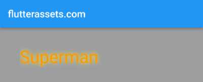
This Flutter code creates a Container widget with a grey colour and a width and height of 120. It contains a DefaultTextStyle widget as its child, which is wrapped inside a Padding widget. The DefaultTextStyle widget sets the default text style for its children and has several properties, such as font size, color, and shadows.
The DefaultTextStyle’s child is an AnimatedTextKit widget, which is used for animating a list of text strings. The AnimatedTextKit widget has a property called “animatedTexts” which holds a list of FlickerAnimatedText widgets. This list contains five strings – “Iron man”, “Superman”, “Joker”, “Hulk”, and “Dude”.
The AnimatedTextKit widget is set to repeat forever, and it also has an onTap property which will trigger a “Tap Event” when the widget is tapped. The screen width is set by retrieving the width of the device screen using the MediaQuery.of method.
Flutter FlickerAnimatedText properties
speed: The Duration of the delay between the apparition of each character. By default, it is set to 40 milliseconds.
speed: Duration(milliseconds: 500),textStyle: property used to customize the appearance of the text being animated, such as font size, colour, weight, etc.
textStyle: TextStyle(
  fontSize: 50,
  fontWeight: FontWeight.w900
)textAlign: property used to align the text within the bounds of the widget.
textAlign: TextAlign.start,entryEnd: Marks ending of flickering entry interval of text. The default value is set to 0.5.
entryEnd: 0.9,AnimatedTextKit with FlickerAnimatedText and a List
import 'package:flutter/material.dart';
import 'package:animated_text_kit/animated_text_kit.dart';

void main() {
  runApp(MyApp());
}

class MyApp extends StatelessWidget {

  @override
  Widget build(BuildContext context) {
    return MaterialApp(
      debugShowCheckedModeBanner: false,
      title: 'Flutter Demo',
      theme: ThemeData(
        primarySwatch: Colors.blue,
      ),
      home: MyHomePage(),
    );
  }
}

class MyHomePage extends StatefulWidget {

  @override
  State<MyHomePage> createState() => _MyHomePageState();
}

class _MyHomePageState extends State<MyHomePage>{

  List<String> animatedTextList = ["Iron man", "Superman", "Joker", "Hulk", "Dude"];
  int index = 0;

  @override
  Widget build(BuildContext context) {

    double screenWidth = MediaQuery.of(context).size.width;

    return Scaffold(
        appBar: AppBar(
          title: Text('flutterassets.com'),
        ),
        body: Column(
          children: [
            Container(
              color: Colors.grey,
              child: Row(
                mainAxisSize: MainAxisSize.max,
                children: <Widget>[
                  SizedBox(width: 40.0, height: 100.0),
                  Text('Be',
                    style: TextStyle(fontSize: 50.0,
                        fontWeight: FontWeight.w200),
                  ),
                  SizedBox(width: 40.0, height: 100.0),
                  DefaultTextStyle(
                    style: const TextStyle(
                        fontSize: 40.0,
                        color: Colors.orange,
                        fontWeight: FontWeight.w900,
                      shadows: [
                        Shadow(
                          blurRadius: 20.0,
                          color: Colors.yellow,
                          offset: Offset(0, 0),
                        ),
                      ],
                    ),
                    child: AnimatedTextKit(
                      displayFullTextOnTap: false,
                      stopPauseOnTap: false,
                      repeatForever: true,
                      // totalRepeatCount: 5,
                      onNextBeforePause: (int, bool) {
                        setState(() {
                          index = (index + 1) % animatedTextList.length;
                          // print(animatedTextList[index]);
                        });
                      },
                      onNext: (int, bool) {
                        // print(animatedTextList[index]);
                      },
                      animatedTexts: [
                        FlickerAnimatedText('${animatedTextList[index]}',
                          entryEnd: 0.9,
                          speed: Duration(milliseconds: 1500),
                          textAlign: TextAlign.start,
                          textStyle: TextStyle(
                            fontSize: 50,
                            fontWeight: FontWeight.w900,
                          ),
                        ),
                      ],
                      onTap: () {
                        print("Tap Event");
                      },
                      // onFinished: (){print("Finish Event");},

                    ),
                  ),
                ],
              ),
            ),
          ],
        )
    );
  }
}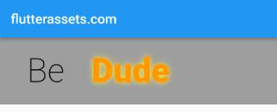
The code is a Flutter widget that displays an animated text in a single line. The widget is an instance of the “AnimatedTextKit” class, which is imported from a library. The animated text is taken from the list “animatedTextList”, which contains five elements. The current text that is being displayed is selected using the “index” variable, which starts at 0 and increments by one each time the animation changes.
The widget is set up to repeat the flicker animation indefinitely, and the text changes every time the animation cycles. The animation speed is set to 1.5 seconds. The text style is set with a font size of 50 and a font-weight of 900, and the text is aligned to the start of the line. The widget also has a function that listens for taps on the text and will print a message to the console when a tap occurs.